
이 글은 Building A Stepper Component 를 참고한 글 입니다.
💻 Horizontal Stepper: 예시 1
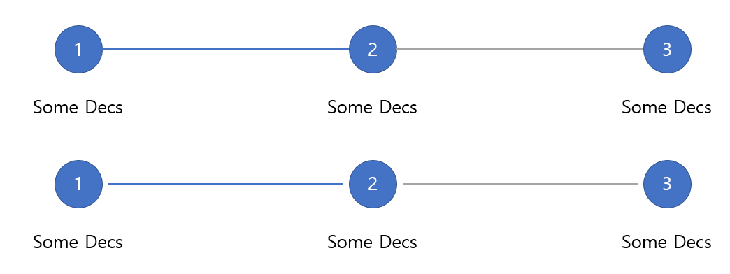
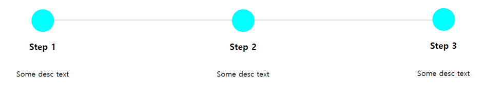
위 그림처럼 아이템들 사이에 선들이 있는 stepper를 만들것 입니다.
 <ol class="c-stepper">
        <li class="c-stepper__item">
            <h3 class="c-stepper__title">Step 1</h3>
            <p class="c-stepper__desc">Some desc text</p>
        </li>
        <li class="c-stepper__item">
            <h3 class="c-stepper__title">Step 2</h3>
            <p class="c-stepper__desc">Some desc text</p>
        </li>
        <li class="c-stepper__item">
            <h3 class="c-stepper__title">Step 3</h3>
            <p class="c-stepper__desc">Some desc text</p>
        </li>
    </ol>
.c-stepper {
display: flex;
flex-wrap: wrap;
margin: 0;
padding: 0;
}
.c-stepper__item {
flex: 1;
display: flex;
flex-direction: column;
text-align: center;
}
.c-stepper__item:before {
--size: 3rem;
content: '';
position: relative;
z-index: 1;
display: block;
width: var(--size);
height: var(--size);
border-radius: 50%;
margin: 0 auto;
background-color: aqua;
}위 코드의 결과는 아래의 그림과 같이 나오게 됩니다.
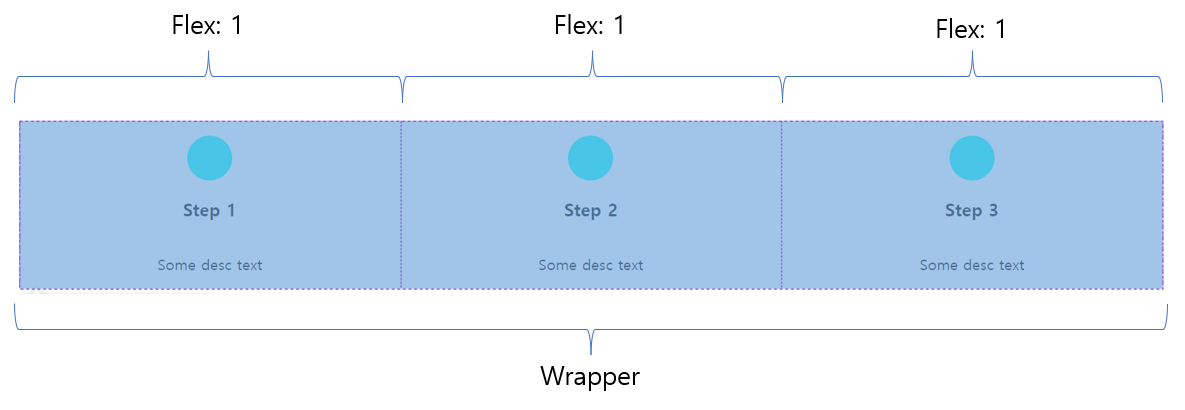
그림과 같이 내용들은 가운데 정렬이 되어있고, 각각의 아이템들은 flex:1로 인해 같은 너비를 가지고 있습니다. 다음으로 아이템들 사이에 선을 어떻게 넣어야 하는지 살펴보도록 하겠습니다.
.c-stepper__item:not(:last-child):after {
 content: '';
 height: 2px;
 background-color: #e0e0e0;
}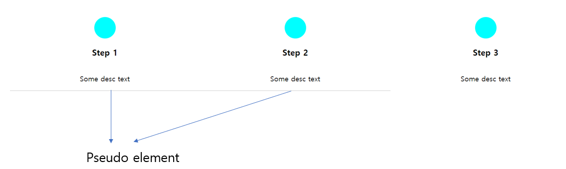
어떻게 psuedo-element가 명시적으로 width를 정해주지 않았는데도, 너비 전체로 늘어난 이유는 아이템이 display:flex 이기 때문입니다.
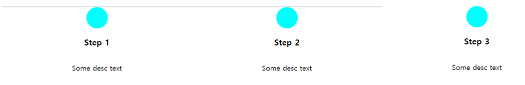
우선, 이 요소들을 위로 옮겨야 합니다. flex 아이템이므로 order property를 사용할 수 있습니다.
.c-stepper__item:not(:last-child):after {
content: '';
height: 2px;
background-color: #e0e0e0;
order: -1;
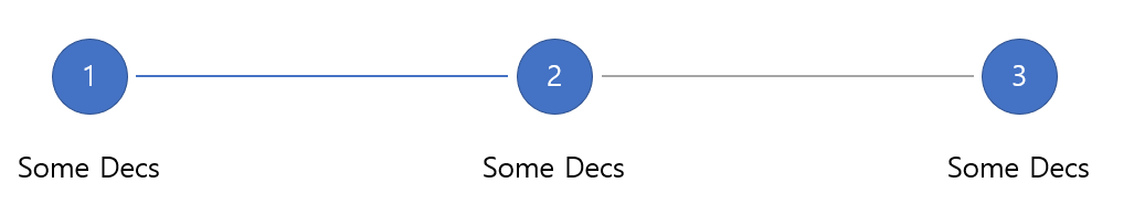
}위의 결과는 아래와 같습니다.
이제 선의 위치를 position:absolute를 사용하지 않고 이동시킬 것 입니다.
.c-stepper__item:not(:last-child):after {
 content: '';
 position: relative;
 top: 1.5rem;
 left: 50%;
 height: 2px;
 background-color: #e0e0e0;
 order: -1;
}
위의 CSS property를 설명하자면 아래와 같이 할 수 있습니다.
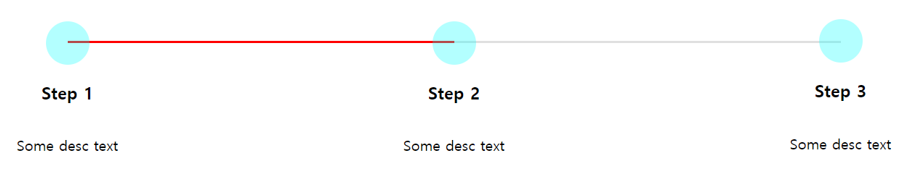
position:relative는 document flow에 벗어나지 않고 요소를 컨트롤 하기위해 사용했습니다.top의 값은 원의 높이(3rem)의 절반과 같습니다.left:50%은 선을 원의 중심에서 시작해 다음 원의 중심에서 끝나기 위해 사용했습니다. 필요하다면 진행상황에 따라 선의 색을 다르게 적용할 수도 있습니다.
💻 A Version Where There Is Spacing Before And After The Line
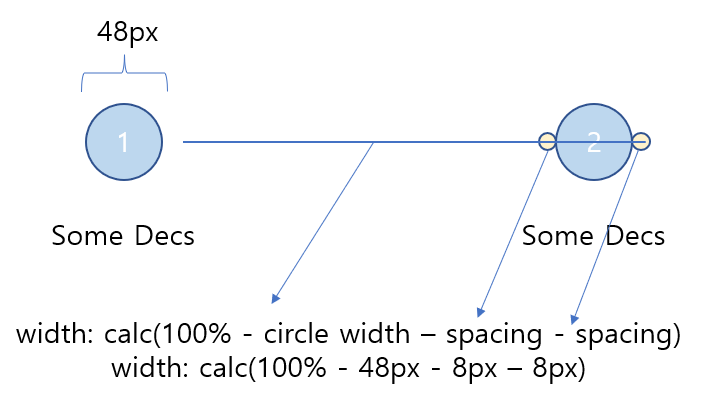
위 그림처럼 선과 아이템사이에 간격이 있는 stepper를 만들어 볼것입니다.
들어가기 전에 선들이 원들 밑에 어떤식으로 위치해 있는지를 보기위해 opacity를 적용해 보겠습니다.
위의 결과는 선에 left:50%를 적용했기 때문입니다. left:50% 때문에 부모요소의 가운데에서 시작합니다.
우리가 넣고자 하는 간격(이 경우 8px)을 calc()으로 추가하면 왼쪽에 간격이 생깁니다.
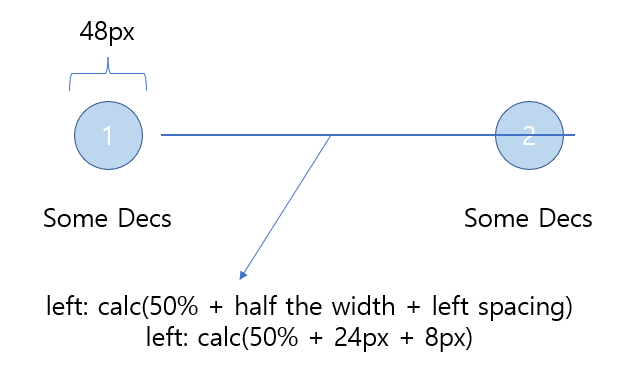
이제 반대편에도 간격을 추가해야 합니다. 선의 너비가 100%이기 때문에, 너비 100%에서 원의 지름, 원을 넘은 선의 길이와 추가해야하는 간격을 빼야 합니다.
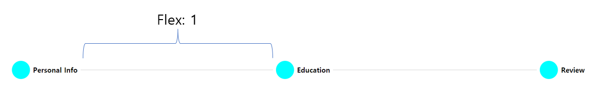
💻 Horizontal Stepper: 예시 2

이번에는 선이 step의 제목 바로옆에 오는 stepper를 만들어 보겠습니다. 이 stepper의 차이점은 step 제목의 길이에 따라 선의 길이가 달라진다는 것입니다.
<ol class="c-stepper">
        <li class="c-stepper__item">
            <h3 class="c-stepper__title">Personal Info</h3>
        </li>
        <li class="c-stepper__item">
            <h3 class="c-stepper__title">Education</h3>
        </li>
        <li class="c-stepper__item">
            <h3 class="c-stepper__title">Review</h3>
        </li>
    </ol>
.c-stepper {
display: flex;
flex-wrap: wrap;
}
.c-stepper__item {
display: flex;
align-items: center;
gap: 0.5rem;
}
.c-stepper__item:not(:last-child) {
flex: 1;
}
.c-stepper__item:before {
--size: 3rem;
content: '';
display: black;
width: var(--size);
height: var(--size);
border-radius: 50%;
}이전 예시와 같지만, flex:1 속성을 마지막 요소에는 사용하지 않았습니다.
.c-stepper__item:not(:last-child):after {
 content: '';
 display: block;
 flex: 1;
 height: 2px;
 background-color: #e0e0e0;
 margin-line-end: 0.5rem;
}
선에 flex:1 속성을 추가하면 남는 공간을 모두 차지하게 됩니다.
gap과 margin-inline-end property를 사용하게되면, LRT, RTL 문서에서 컴포넌트들이 동일한 스타일을 가지게 할 수 있습니다.