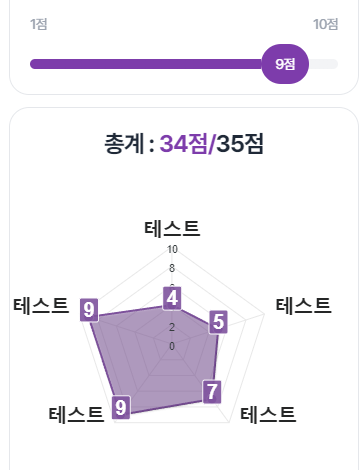
ApexChart Ridar Drag Response input type range
npm install apexcharts --saveimport { Component, ElementRef, OnInit, ViewChild } from '@angular/core';
import ApexCharts from 'apexcharts';
@Component({
selector: 'app-chart',
template: `
<div class="w-full h-full" #chartContainer></div>
`,
})
export class ChartComponent implements OnInit {
@ViewChild('chartContainer') chartContainer!: ElementRef;
chartOptions: any = {
// Chart options here
};
ngOnInit() {
this.initChart();
}
private initChart() {
const chart = new ApexCharts(
this.chartContainer.nativeElement,
this.chartOptions
);
chart.render();
}
}- apexChart rerender
<section
  class="flex flex-col gap-5 p-5 text-sm border border-gray-200 rounded-20"
>
  <div class="flex items-start gap-2 font-semibold text-gray-800">
    <ng-content />
    <div *ngIf="required" class="w-2 h-2 bg-red-500 rounded-full"></div>
  </div>
  <div class="flex items-center justify-between text-gray-400">
    <div>{{ min }}점</div>
    <div>{{ max }}점</div>
  </div>
  <div class="relative range">
    <input
      #range
      type="range"
      class="appearance-none cursor-pointer"
      [min]="min"
      [max]="max"
      [value]="value"
      (input)="handleRange($event)"
      [ngStyle]="{ background: progress() }"
    />
    <div
      #indicator
      class="absolute flex items-center justify-center w-12 h-10 text-white rounded-full pointer-events-none select-none bg-primary -top-1/2"
      [ngStyle]="{ left: indicatorLeft }"
    >
      {{ value }}점
    </div>
  </div>
</section>
- dragable score bar
import { CommonModule } from '@angular/common';
import {
  AfterViewInit,
  Component,
  ElementRef,
  Input,
  OnInit,
  Optional,
  Self,
  ViewChild,
} from '@angular/core';
import { FormsModule, NgControl } from '@angular/forms';
import { ToastService } from '../../../services/toast.service';
import { CustomValueAccessor } from '../../custom-value-accessor';

@Component({
  selector: 'app-input-range',
  standalone: true,
  imports: [CommonModule, FormsModule],
  templateUrl: './input-range.component.html',
  styleUrls: ['./input-range.component.scss'],
})
export class InputRangeComponent
  extends CustomValueAccessor<number>
  implements OnInit, AfterViewInit
{
  @ViewChild('indicator') indicator: ElementRef<HTMLDivElement> | undefined;
  @ViewChild('range') range: ElementRef<HTMLInputElement>;

  @Input() min = 1;
  @Input() max = 10;
  @Input() maximumValue = 35;
  @Input() default: number = 1;
  @Input() override required = false;
  @Input() sum?: number;
  override disabled = false;

  middle: number = Math.ceil((this.max - this.min) / 2);
  timer: NodeJS.Timer;
  constructor(
    @Self() @Optional() public ngControl: NgControl,
    private readonly toastService: ToastService
  ) {
    super();
    if (this.ngControl) {
      this.ngControl.valueAccessor = this;
    }
  }

  ngAfterViewInit(): void {
    if (this.default) {
      this.value = this.default;
    }
  }

  ngOnInit(): void {
    if (this.default) {
      this.value = this.default;
    }
  }

  handleRange(ev: any) {
    const value: number = +ev.target.value;
    if (
      this.sum + (value - this.value - 1) >= this.maximumValue &&
      value > this.value
    ) {
      clearTimeout(this.timer);
      this.timer = setTimeout(() => {
        this.toastService.show('총합 35점을 넘을 수 없습니다.', 'danger');
      }, 500);
      return false;
    } else {
      this.value = value;
      return true;
    }
  }

  progress() {
    return `linear-gradient(to right, #7D3CAB ${this.indicatorLeft}, #F3F4F6 ${this.indicatorLeft})`;
  }

  get indicatorLeft(): string {
    const ratio = ((this.value - 1) / (this.max - 1)) * 100;
    const indicatorWidth = this.indicator?.nativeElement.offsetWidth ?? 0;
    return `calc(${ratio}% - ${(indicatorWidth * ratio) / 100}px)`;
  }
}
progress() 함수는 슬라이더의 배경색을 결정하는데 사용되는 CSS linear-gradient 속성 값을 반환하는 함수입니다. 해당 코드에서는 to right 방향으로 그라데이션을 설정하고 있습니다. 아래는 코드에서 사용된 각 부분의 설명입니다:
linear-gradient: CSS의 그라데이션을 생성하는 함수입니다.to right: 그라데이션의 방향을 수평으로 설정합니다.#7D3CAB: 그라데이션의 시작 색상을 나타냅니다. 이 경우, 보라색(#7D3CAB)이 시작 색상으로 사용됩니다.${this.indicatorLeft}: 그라데이션의 위치를 결정하는 값입니다.this.indicatorLeft는 슬라이더의 현재 위치를 나타내는 문자열입니다.#F3F4F6: 그라데이션의 종료 색상을 나타냅니다. 이 경우, 밝은 회색(#F3F4F6)이 종료 색상으로 사용됩니다.${this.indicatorLeft}: 그라데이션의 위치를 결정하는 값으로, 시작과 종료 색상 사이의 위치와 동일한 값이 사용됩니다.
위 코드에서 this.indicatorLeft는 get indicatorLeft() 메서드를 통해 계산된 값을 사용합니다. indicatorLeft는 슬라이더의 현재 값을 기반으로 슬라이더의 미리보기 위치를 계산하는 데 사용됩니다. 따라서 progress() 함수는 슬라이더의 현재 위치에 따라 배경 그라데이션을 동적으로 변경합니다.
결과적으로, progress() 함수는 슬라이더의 배경색을 시작 색상과 종료 색상으로 그라데이션하며, 그라데이션의 위치는 슬라이더의 현재 위치에 따라 결정됩니다.

DevSecOps, Pentest, Cloud(OpenStack), Develop, Data Engineering, AI-Agent