
Tailwind CSS
Tailwind는Utility-first CSS framework, 즉 미리 정의된 CSS의 특성들을 class 를 통해 불러와 적용시키는 형태의 CSS 프레임워크
Tailwind는 개발자들이 더 빠르고 효율적으로 웹 인터페이스를 디자인할 수 있도록 돕는 혁신적인 CSS 프레임워크입니다.
이 도구는 Utility-First 접근 방식을 채택하여, 수많은 클래스를 이용해 반응형 디자인과 사용자 정의 디자인을 더욱 쉽게 구현할 수 있게 해줍니다.
아래는 동일한 스타일 코드를 Tailwind로 작성하여 비교한 예시입니다.
- 일반 CSS
.chat-notification {
  display: flex;
  max-width: 24rem;
  margin: 0 auto;
  padding: 1.5rem;
  border-radius: 0.5rem;
  background-color: #fff;
  box-shadow: 0 20px 25px -5px rgba(0, 0, 0, 0.1), 0 10px 10px -5px rgba(0, 0, 0, 0.04);
}

.chat-notification-logo-wrapper {
  flex-shrink: 0;
}

.chat-notification-logo {
  height: 3rem;
  width: 3rem;
}

.chat-notification-content {
  margin-left: 1.5rem;
  padding-top: 0.25rem;
}

.chat-notification-title {
  color: #1a202c;
  font-size: 1.25rem;
  line-height: 1.25;
}

.chat-notification-message {
  color: #718096;
  font-size: 1rem;
  line-height: 1.5;
}- Tailwind CSS
<div class="p-6 max-w-sm mx-auto bg-white rounded-xl shadow-md flex items-center space-x-4">
  <div class="flex-shrink-0">
    <img class="h-12 w-12" src="/img/logo.svg" alt="ChitChat Logo">
  </div>
  <div>
    <div class="text-xl font-medium text-black">ChitChat</div>
    <p class="text-gray-500">You have a new message!</p>
  </div>
</div>
Tailwind CSS의 장단점
장점
- 비교적 낮은 러닝커브
Tailwind CSS의 사용을 시작하려면 패키지를 설치하고 설정한 다음, 원하는 HTML 요소에 클래스를 부여하기만 하면 바로 적용할 수 있습니다.
많은 클래스 이름을 알아야 할 필요는 있지만, 이들은 기존 CSS 속성명과 상당히 유사하여 직관적으로 쉽게 사용할 수 있습니다.
또한, Tailwind CSS의 공식 문서나 확장 프로그램을 활용하면 별도의 학습 없이도 클래스를 손쉽게 사용할 수 있습니다.


- 쉬운 커스텀
Tailwind CSS는 처음부터 확장 가능하고 커스터마이징할 수 있도록 설계되었습니다.
그래서 기존 스타일의 값을 수정하거나, 확장하는 방식으로 커스텀이 가능합니다.
커스텀은 tailwind.config.js 파일에서 가능하며, 직접 파일을 생성 및 커스텀을 하거나 npx tailwindcss init --full 명령어를 통해 기존 스타일을 불러와 적용할 수 있습니다.
// tailwind.config.js
module.exports = {
  theme: {
    colors: {
      transparent: 'transparent',
      current: 'currentColor',
      blue: {
        light: '#85d7ff',
        DEFAULT: '#1fb6ff',
        dark: '#009eeb',
      },
      pink: {
        light: '#ff7ce5',
        DEFAULT: '#ff49db',
        dark: '#ff16d1',
      },
      gray: {
        darkest: '#1f2d3d',
        dark: '#3c4858',
        DEFAULT: '#c0ccda',
        light: '#e0e6ed',
        lightest: '#f9fafc',
      }
    }
  }
}
단점
- 코드의 가독성 저해
Tailwind CSS는 앞서 언급한 바와 같이 유틸리티-퍼스트 방식을 채택하고 있어, 다양한 스타일링 클래스를 HTML에 바로 적용합니다.
이 방식은 유연성과 신속한 개발을 가능하게 하지만, 동시에 코드 가독성이 저하되는 문제를 야기할 수 있으며, 이는 유지보수 시 어려움으로 이어질 수 있습니다.
<button class="px-4 py-2 bg-blue-500 hover:bg-blue-700 text-white font-bold text-xs uppercase rounded shadow-md focus:outline-none focus:ring-2 focus:ring-blue-400 focus:ring-opacity-75">
  Click me
</button>
Setting
Tailwind CSS의 설치 과정은 선택한 프레임워크에 따라 조금씩 달라질 수 있습니다.
각각의 상세한 설치 방법은 공식 문서에 잘 소개되어 있으므로, 프로젝트의 환경에 맞춰 설치를 진행하면 됩니다.
본 포스팅에서는 Create-React-App(CRA)을 사용하는 환경에 초점을 맞추어 Tailwind CSS설정을 소개하겠습니다.
1. 패키지 설치
아래 명령어를 통해 패키지를 설치합니다.
npm install -D tailwindcss postcss autoprefixer
tailwindcss: tailwindcss 패키지
postcss: JS 플러그인을 통해 CSS를 변환시키는 툴
autoprefixer: postcss 플러그인의 종류로, vender-prefix를 자동으로 붙여주는 플러그인
2. 확장 파일 생성
아래 명령어를 통해 tailwindcss.config.js, postcss.config.js 파일을 생성하고 세팅합니다.
npx tailwindcss init -p// tailwindcss.config.js
module.exports = {
content: [
"./src/**/*.{js,jsx,ts,tsx}", // tailwindcss를 사용하고자 하는 경로, 파일
],
theme: {},
plugins: [],
};// postcss.config.js
module.exports = {
plugins: {
tailwindcss: {},
autoprefixer: {},
},
}3. 명령문 추가
프로젝트 내 ./src/index.css 파일에서 아래와 같이 tailwind 명령문을 추가합니다.
@tailwind base; /* tailwind 기본 스타일 및 확장된 스타일 주입 */
@tailwind components; /* tailwind 기본 컴포넌트 클래스 및 확장된 컴포넌트 클래스 주입 */
@tailwind utilities; /* tailwind 기본 유틸리티 클래스 및 확장된 유틸리티 클래스 주입 */
How to use
앞서 간단하게 소개했듯 Tailwind CSS의 사용방법은 매우 간단합니다.
HTML 태그에 class or className 속성에 적용하고자 하는 CSS 속성을 작성하면 됩니다.
예를 들어 Flex Box를 사용하여 가운데 정렬 스타일을 적용하고 싶다면 아래와 같이 작성하면 됩니다.
<div class="flex justify-center items-center">
  <h1>Awesome Tailwind!!</h1>
</div>
Responsive Design
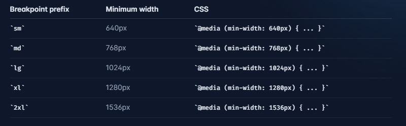
Tailwind CSS는 md, sm, lg 등의 Utility Class를 사용하여 손쉽게 반응형 디자인을 구현할 수 있습니다.
<div class="max-w-md mx-auto bg-white rounded-xl shadow-md overflow-hidden md:max-w-2xl">
  <div class="md:flex">
    <div class="md:shrink-0">
      <img class="h-48 w-full object-cover md:h-full md:w-48" src="/img/building.jpg" alt="Modern building architecture">
    </div>
    <div class="p-8">
      <div class="uppercase tracking-wide text-sm text-indigo-500 font-semibold">Company retreats</div>
      <a href="#" class="block mt-1 text-lg leading-tight font-medium text-black hover:underline">Incredible accommodation for your team</a>
      <p class="mt-2 text-slate-500">Looking to take your team away on a retreat to enjoy awesome food and take in some sunshine? We have a list of places to do just that.</p>
    </div>
  </div>
</div>
Customizing
Dark Mode
Tailwind CSS에서는 보다 쉽게 Dark Mode 또한 적용할 수 있습니다.
해당 기능은 dark라는 Utility Class를 통해 구현되며, 사용자의 브라우저가 다크모드일 때 해당 스타일이 적용됩니다.
tailwind.config.js파일에서 darkMode를 media 혹은 class로 변경해야 가능합니다.
// tailwind.config.js
module.exports = {
  darkMode: 'class',
  // ...
}<div class="bg-white dark:bg-gray-800">
<h1 class="text-gray-900 dark:text-white">Dark mode is here!</h1>
<p class="text-gray-600 dark:text-gray-300">
Lorem ipsum...
</p>
</div>Reusability
Tailwind CSS에서는 반복되는 Utility Class의 문제를 해결하고자 @apply 지시어를 제공합니다.
@apply는 유틸리티 클래스를 사용하여 CSS 규칙을 만들 때 사용되며 여러 유틸리티 클래스를 단일 CSS 클래스에 적용할 수 있습니다.
그래서@apply를 사용하면 기존의 HTML 마크업을 보다 간결하게 유지하면서 재사용 가능한 CSS 클래스를 만들 수 있습니다.
.btn-primary {
  @apply bg-blue-500 text-white font-bold py-2 px-4 rounded;
}

.btn-secondary {
  @apply bg-gray-300 text-gray-700 font-medium py-2 px-4 rounded;
}<button class="btn-primary">Primary Button</button>
<button class="btn-secondary">Secondary Button</button>Base Style
TailWind CSS에서 Base Style을 추가하고 싶다면 @layer를 사용할 수 있습니다.
@layer을 사용한다면 아래와 같이 기본적으로 제공하는 Base style과 components, utilities 등을 수정할 수 있습니다.
@tailwind base;
@tailwind components;
@tailwind utilities;

@layer components {
  .btn-blue {
    @apply bg-blue-500 text-white font-bold py-2 px-4 rounded;
  }
}
참고 자료
Tailwind 공식문서
Tailwind CSS Tutorial(The Net Ninja from youtube)