실습
이전 시간에 배운 css 의 display 속성과 size 단위를 html 코드상으로 삽입하여 변화를 확인해본다
/Users/사용자/PycharmProjects/pragmatic/accountapp/templates/accountapp/hello_world.html
파일에서 작성
base.css 파일에서 따로 분리할수도 있지만 style 태그를 사용해서 그안에 css 내용을 넣어줄 수도 있다.
css 선택자 우선순위
1. 속성 값 뒤에 !important 를 붙인 속성
2. HTML에서 style을 직접 지정한 속성
3. #id 로 지정한 속성
4. .클래스, :추상클래스 로 지정한 속성
5. 태그이름 으로 지정한 속성
6. 상위 객체에 의해 상속된 속성
em 단위가 1rem 이라 하면 16px 이다.
3rem 같은 경우는 3x16 = 48px 이다.
<!--hello_world.html-->
{% extends 'base.html' %}

{% block content %}

    <style>
        .testing {
            background-color: white;
            height: 3rem;
            width: 3rem;
            margin: 1rem;
        }
    </style>

    <div style="height: 20rem; background-color: #38df81; border-radius: 1rem; margin: 2rem;">
        <h1>
            testing
        </h1>

        <div class="testing" style="display: block">block</div>
        <div class="testing" style="display: inline">inline</div>
        <div class="testing" style="display: None">None</div>
        <div class="testing" style="display: inline-block">inline-block</div>
        <div class="testing">default</div>

    </div>

{% endblock %}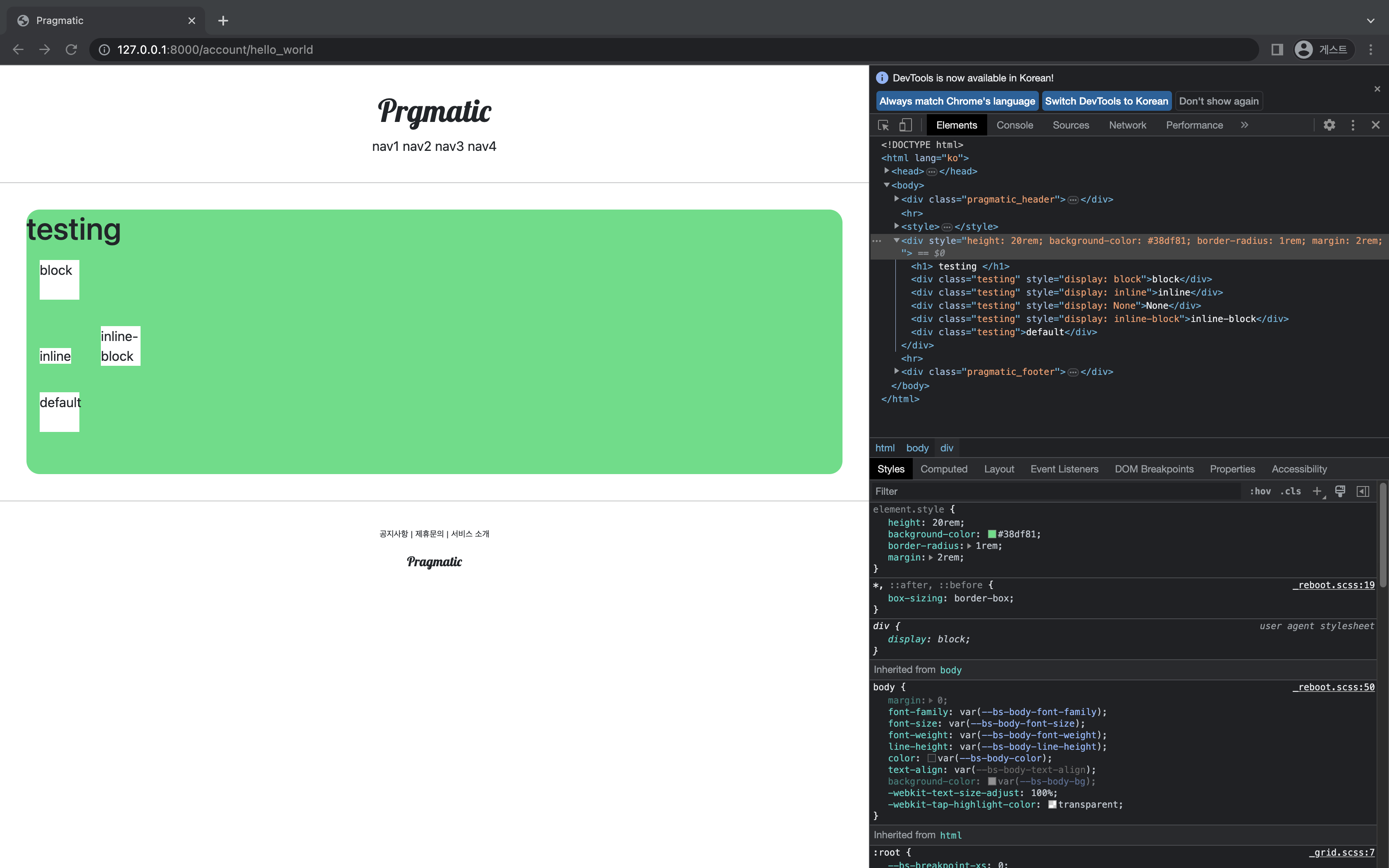
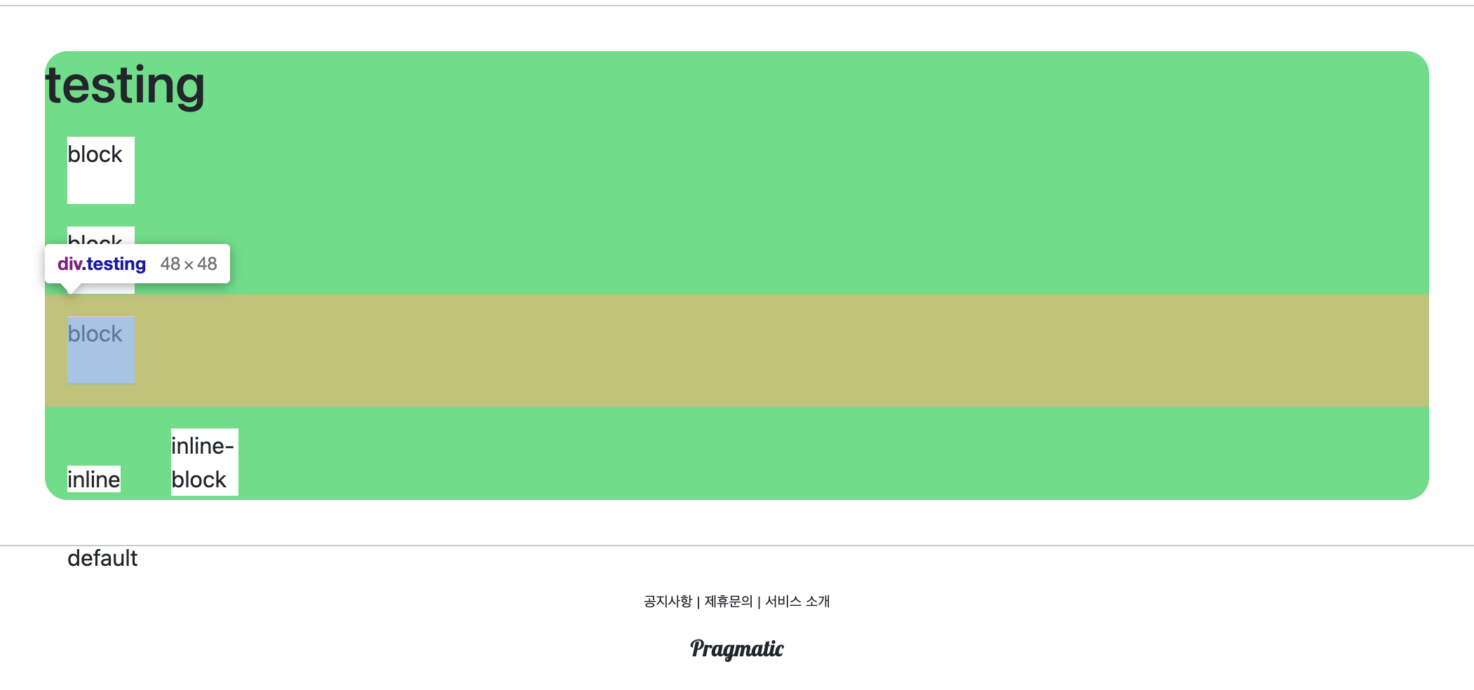
1) block
부모의 모든 너비를 다 가져가는 것을 확인할 수 있다.
<div class="testing" style="display: block">block</div> 코드를 2개 추가해 총 3개를 쌓는다면 우리가 설정한 이 크기랑은 상관없이 수직으로 쌓이게 된다.
2) inline
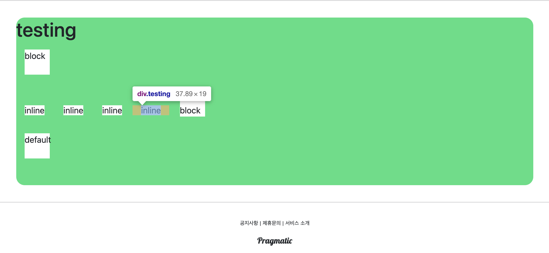
<div class="testing" style="display: inline">inline</div>
텍스만 감쌀 정도로 공간차지
inline 코드를 여러 줄 작성한다면 옆으로 쌓이는 형태를 볼 수 있다.
3) None
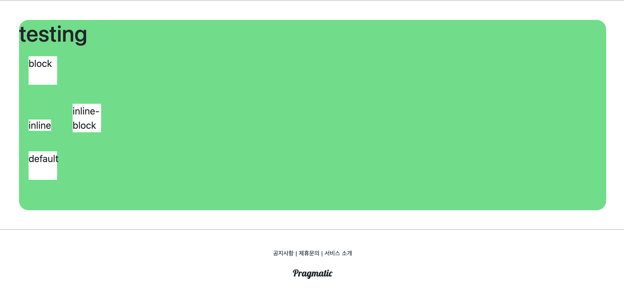
html 태그 상에서는 존재하지만 화면에 보여지진 않는다.
<div class="testing" style="display: None">None</div>
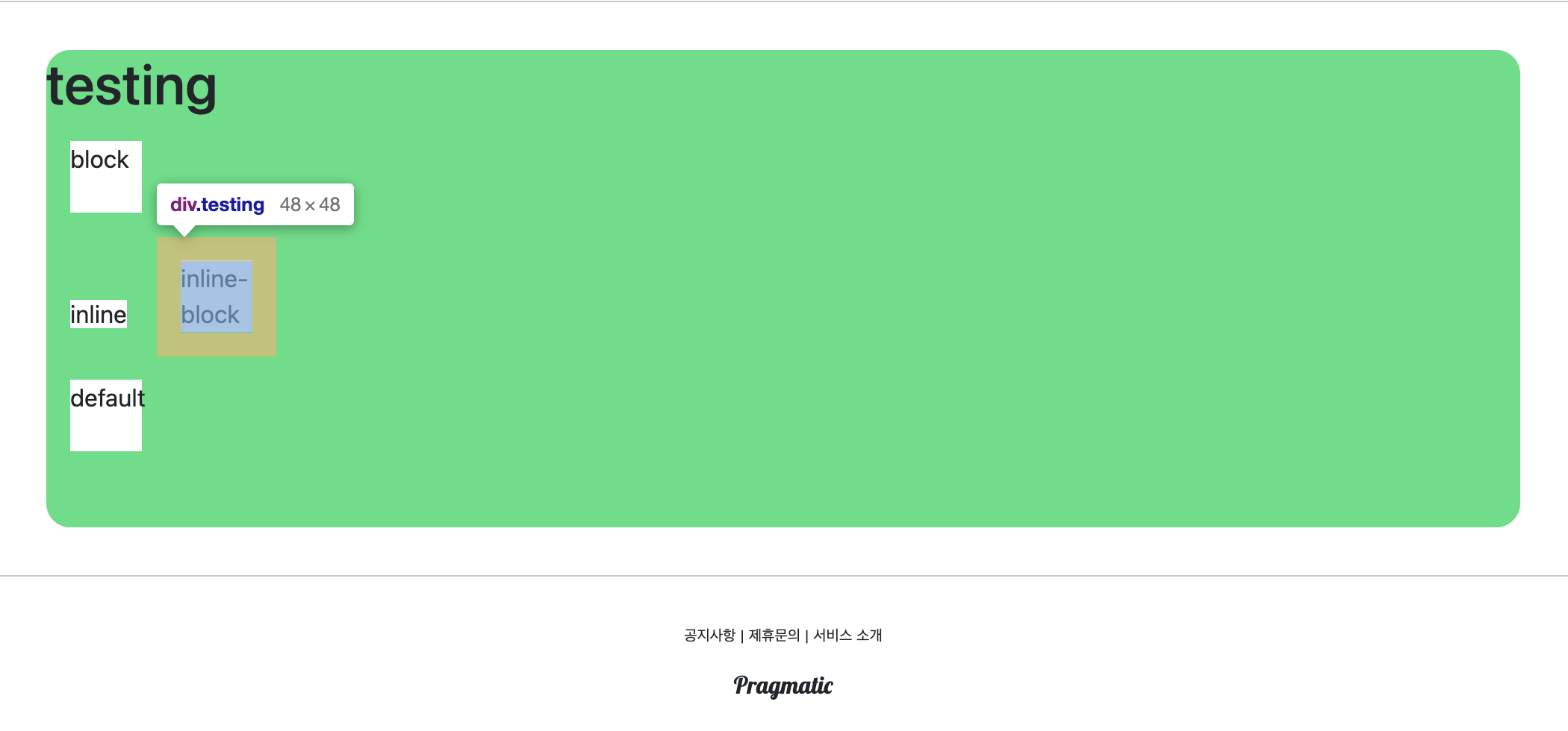
4) inline-block
<div class="testing" style="display: inline-block">inline-block</div>
margin 은 1rem 정도로 설정되어있고, 내부는 우리가 설정한 크기대로 대응되는것을 볼 수 있다.
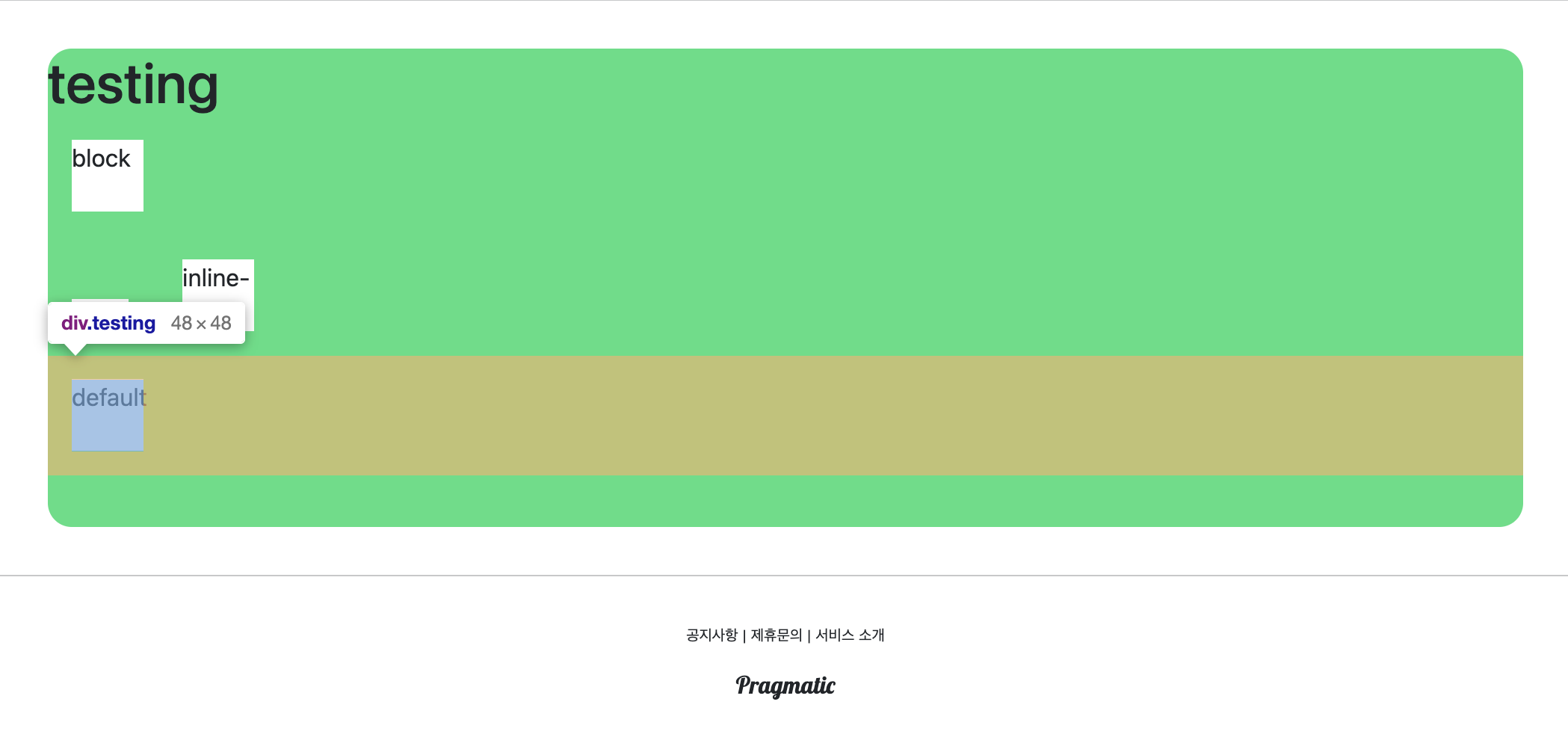
5) default
<div class="testing">default</div>
따로 정해주지 않는 한 display: block 이라는 속성이 기본적으로 적용된다.
div - 블록 단위
span - 인라인 단위
  <span style="height: 3rem; width: 3rem;">
  	test
  </span>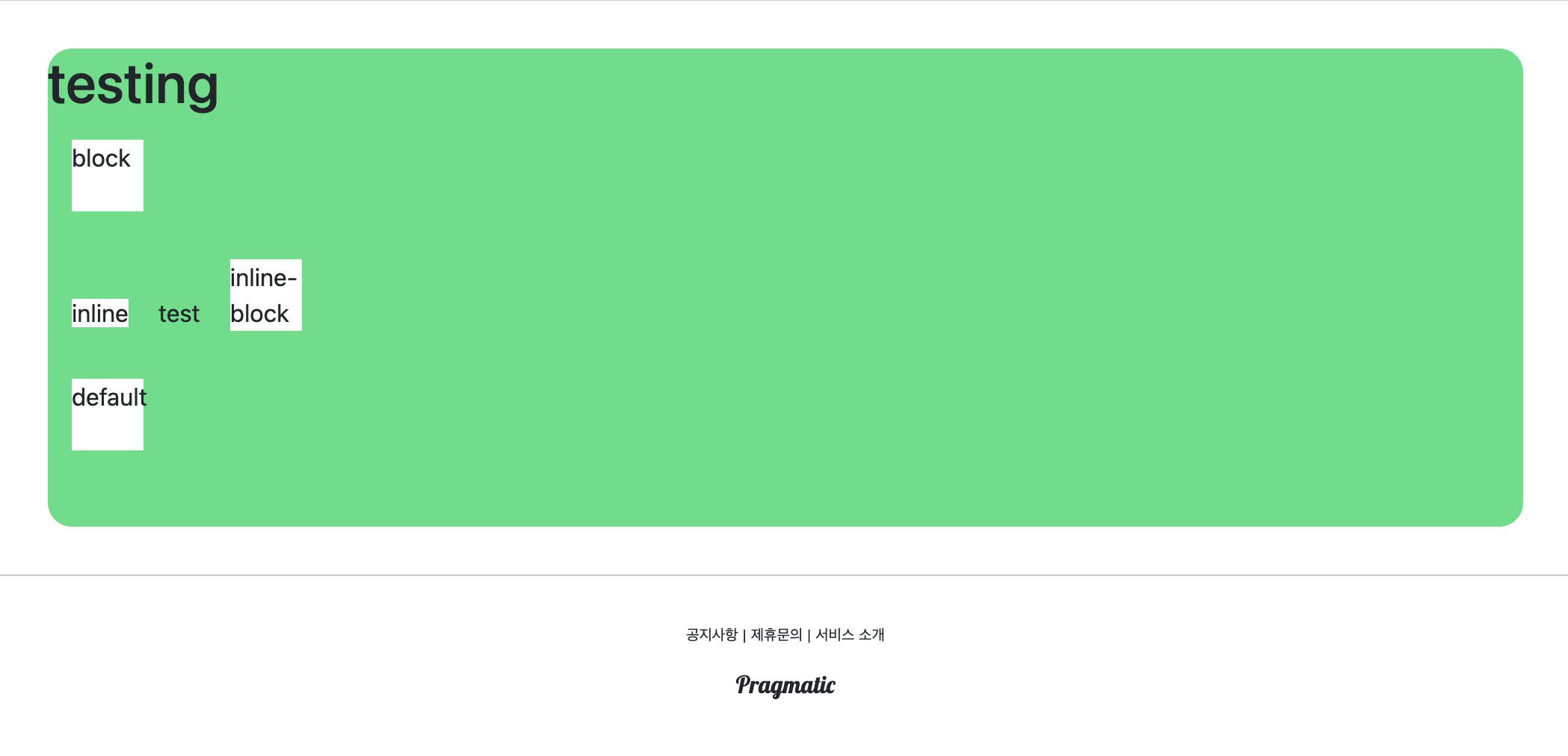
display 속성을 바꿔주지 않는 이상 이런식인데,
만약 html 소스를 고치다가 크기와 너비를 내가 원하는 대로 설정을 헀는데, 내가 생각한대로 크기가 나오지 않는다면 display 설정을 보고 확인하면 된다.
{% extends 'base.html' %}

{% block content %}

    <style>
        .testing {
            background-color: white;
            height: 3rem;
            width: 3rem;
            margin: 1rem;
        }
    </style>

    <div style="height: 20rem; background-color: #38df81; border-radius: 1rem; margin: 2rem;">
        <h1>
            testing
        </h1>

        <div class="testing" style="display: inline-block; width: 48px; height: 48px;">block</div>
        <div class="testing" style="display: inline-block; width: 3em; height: 3em;">block</div>
        <div class="testing" style="display: inline-block; width: 3rem; height: 3rem;">block</div>
        <div class="testing" style="display: inline-block; width: 30%; height: 30%;">block</div>

    </div>

{% endblock %}
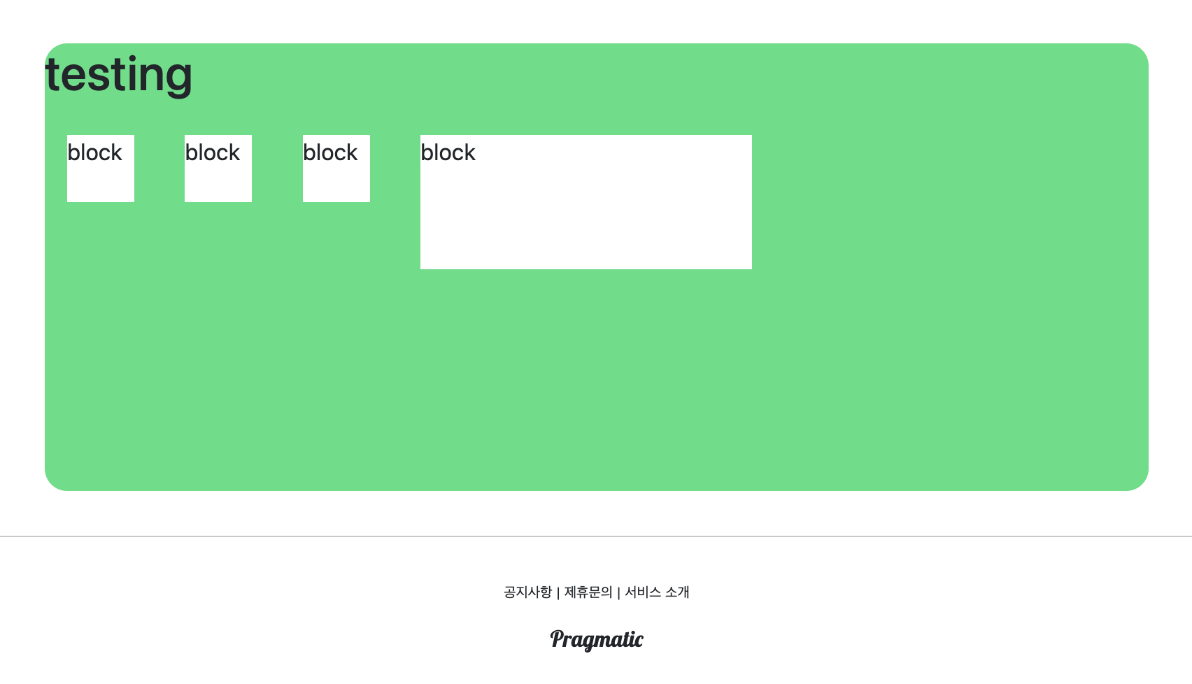
이런식으로 inline 블록을 설정하고 이제 크기 정보에 대한 style 속성을 기입하는데
첫번쨰는 16x4=48px width 와 height 수정, 두번쨰는 rem 을 em 을 수정, 세번쨰는
그대로, 네번쨰는 부모 전체의 30%를 의미하는 30%로 수정해본다. 결과는 다음 그림과 같다.
root html 문서 font-size 바꾸기
48px, 3em, 3rem 모두 동일한 픽셀의 크기를 같는것 처럼 보이지만 여기서 최상위 root html 문서의 폰트 사이즈를 기본 16px -> 32px 로 증가.
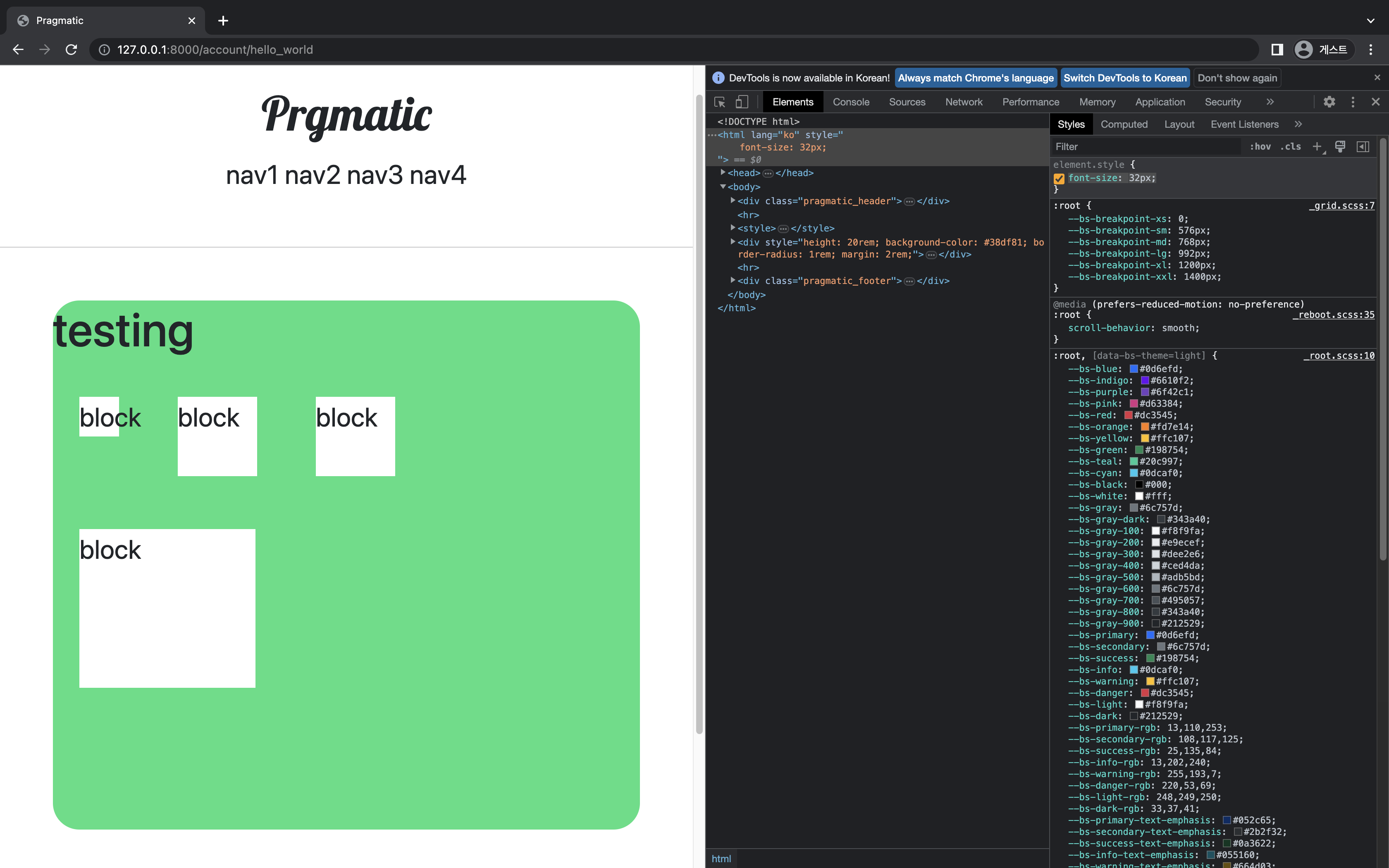
1) display: inline-block; width: 48px; height: 48px;
- 항상 48px 유지
2) display: inline-block; width: 3em; height: 3em; - 96px
3) display: inline-block; width: 3em; height: 3em; - 96px 로 em 과 동일
그렇다면 em 과 rem 의 차이는?
부모 div 태그의 font-size 바꾸기
<div style="height: 20rem; background-color: #38df81; border-radius: 1rem; margin: 2rem; font-size: 2rem">위 코드로 수정한 다음 다시 root html 의 font-size: 32px 로 수정한 결과
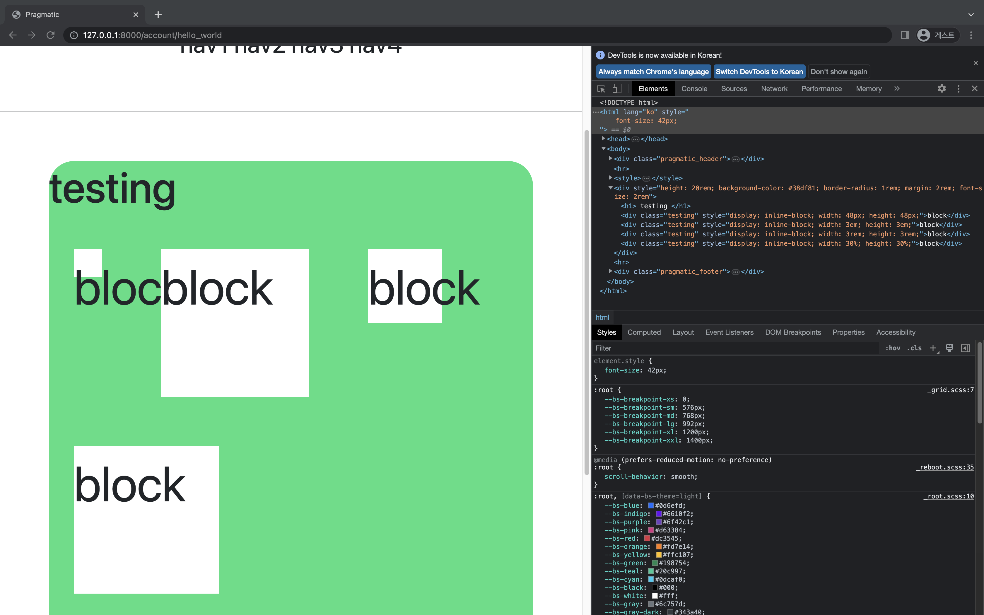
px 은 그대로 있고 em 은 4배가 되었다.
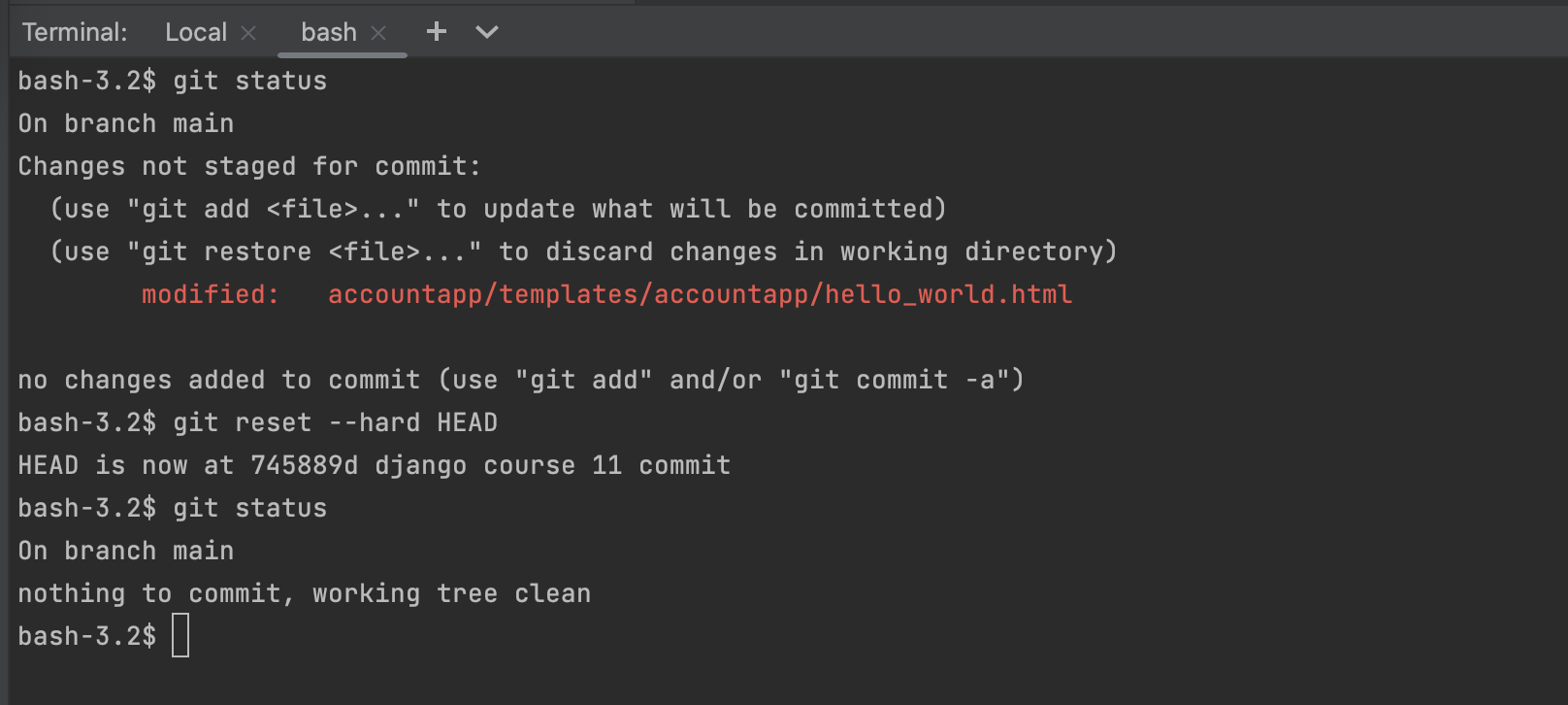
git reset --hard HEAD: 최근에 commit 한것에서 모든 변경사항을 날려 가장 최근의 commit 으로 돌아간다.