Material UI
Material UI는 구글의 Material Design을 구현하는 오픈소스 React 라이브러리다.
Bootstrap처럼 구글이 사전에 스타일링한 컴포넌트를 가져와 사용하는 방식이다.
React에 적용
설치
MUI는 Emotion를 기본 엔진으로 사용한다.
$ npm install @mui/material @emotion/react @emotion/styled만약 styled-components를 사용하고 싶다면 아래와 같이 설치한다.
$ npm install @mui/material @mui/styled-engine-sc styled-components사용법
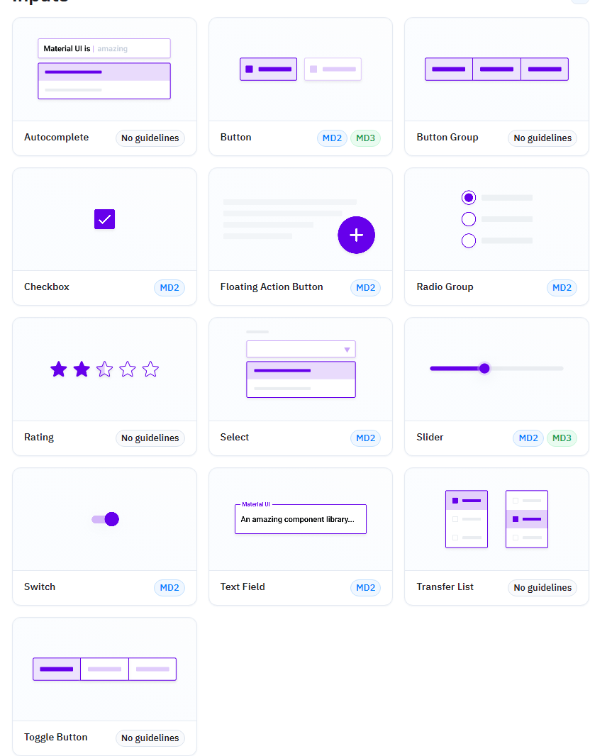
앞서 말했듯이 사전에 스타일링된 컴포넌트를 가져와서 사용하는데, 다양한 컴포넌트들은 아래의 링크에서 찾을 수 있다.
ex.)
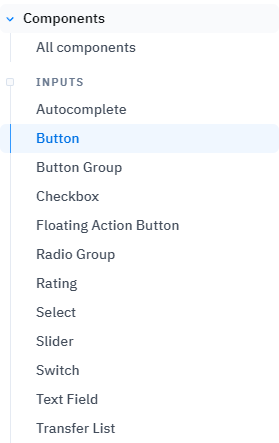
예시로 버튼을 가져오려 한다면 좌측 리스트에서 버튼을 선택하면 된다.
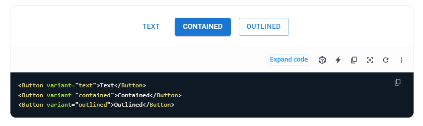
그리고 해당 페이지에서 코드를 가져와서 사용하면 된다.
커스텀
만약 해당 컴포넌트의 스타일을 커스텀 하려면 sx prop으로 커스텀 하면 된다.
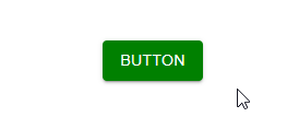
import { Button } from "@mui/material";

export default function Test() {
  return (
    <Button
      variant="contained"
      sx={{ backgroundColor: "green", ":hover": { backgroundColor: "red" } }}
    >
      Button
    </Button>
  );
}
styled-components을 이용한 커스텀
styled-components을 이용해서 커스텀 할 수도 있다.
import { Button, styled } from "@mui/material";

export default function Test() {
  return <StyledButton variant="contained">Button</StyledButton>;
}

const StyledButton = styled(Button)`
  background-color: green;
  &:hover {
    background-color: red;
  }
`;