💡 파이썬으로 그래프를 그린다는 건?
도화지를 펼치고 축을 그리고 그 안에 데이터를 그리는 작업
막대그래프
# 데이터 정의
import matplotlib.pyplot as plt
%matplotlib inline

# 그래프 데이터
subject = ['English', 'Math', 'Korean', 'Science', 'Computer']
points = [40, 90, 50, 60, 100]
%matplotlib inline은 IPython에서 사용하는 매직 메서드입니다.
Rich output에 대한 표현 방식인데요, 그래프와 같은 그림, 소리, 애니메이션과 같은 결과물을 Rich output 이라고 합니다.
IPython과 비슷한 환경인 Jupyter Notebook에서 이 명령어를 입력하면 그래프가 바로 출력됩니다.
# 축 그리기
fig = plt.figure() #도화지(그래프) 객체 생성
ax1 = fig.add_subplot(1,1,1) #figure()객체에 add_subplot 메서드를 이용해 축을 그려준다.
figure()라는 객체는 도화지(그래프)입니다. 이 figure() 객체에 add_subplot 메서드를 이용해 축을 그려줍니다. figsize 인자 값을 주어 그래프의 크기를 정할 수 있습니다.
matplotlib의 공식 문서는 아래에 있습니다.
https://matplotlib.org/stable/api/index.html
fig = plt.figure()
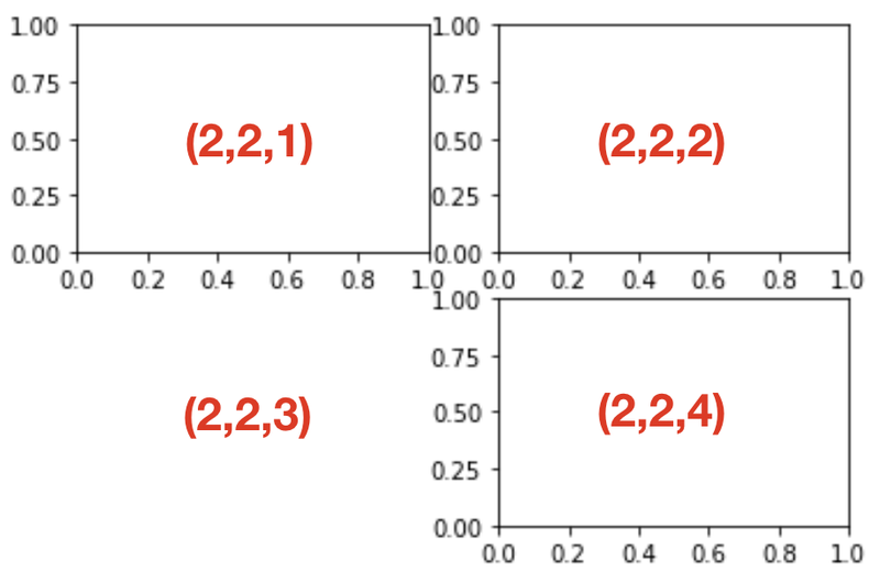
ax1 = fig.add_subplot(2,2,1)
ax2 = fig.add_subplot(2,2,2)
ax3 = fig.add_subplot(2,2,4)
로 작성하게 되면 아래와 같이 나타나게 됩니다.

여기에서 각 좌표가 가지는 의미는 아래와 같습니다.
선그래프
# Q. 날짜별 종가(Close)가 아닌 최고가(High) 데이터를 이용해서 위와 같은 그래프를 그려보세요!
# 그래프 데이터
csv_path = os.getenv("HOME") + "/aiffel/data_visualization/data/AMZN.csv"
data = pd.read_csv(csv_path, index_col=0, parse_dates=True)
price = data['High']

# 축 그리기 및 좌표축 설정
fig = plt.figure()
ax = fig.add_subplot(1,1,1)
price.plot(ax=ax, style='black')
plt.ylim([1600, 2200])
plt.xlim(['2019-05-01', '2020-03-01'])

# 날짜 정보를 python datetime 자료형으로 변환
min_date = price.idxmin().to_pydatetime()
max_date = price.idxmax().to_pydatetime()

# 주석달기
important_data = [(min_date, "Low Price"), (max_date, "Peak Price")]
for d, label in important_data:
    ax.annotate(label, xy=(d, price.asof(d)+10), # 주석을 달 좌표(x,y)
                xytext=(d, price.asof(d)+100), # 주석 텍스트가 위치할 좌표(x,y)
                arrowprops=dict(facecolor='red')) # 화살표 추가 및 색 설정

# 그리드, 타이틀 달기
plt.grid()
ax.set_title('StockPrice')

# 보여주기
plt.show()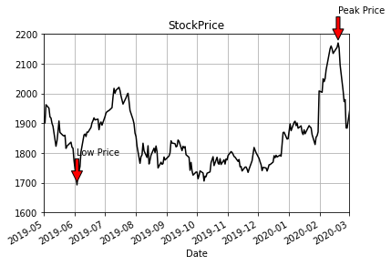
plot 사용법 상세
- pandas.plot 메소드 인자
- label : 그래프 범례 이름
- ax : 그래프를 그릴 matplotlib의 서브플롯 객체
- style : matplotlib에 전달할 'ko--'같은 스타일의 문자열
- alpha : 투명도 (0 ~1)
- kind : 그래프의 종류: line, bar, barh, kde
- logy : Y축에 대한 로그 스케일
- use_index : 객체의 색인을 눈금 이름으로 사용할지의 여부
- rot : 눈금 이름을 로테이션(0 ~ 360)
- xticks, yticks : x축, y축으로 사용할 값
- xlim, ylim : x축, y축 한계
- grid : 축의 그리드 표시할지 여부
- pandas의 data가 DataFrame일 때 plot 메서드 인자
- subplots : 각 DataFrame의 칼럼을 독립된 서브플롯에 그립니다.
- sharex : subplots = True면 같은 X축을 공유하고 축의 범위와 눈금을 연결합니다.
- sharey : subplots = True면 같은 Y축을 공유합니다.
- figsize : 그래프의 크기를 지정합니다. (튜플)
- title : 그래프의 제목을 지정합니다. (문자열)
- sort_columns : 칼럼을 알파벳 순서로 그립니다.
정리해보자
fig = plt.figure(): figure 객체를 선언해 '도화지를 펼쳐'줍니다.ax1 = fig.add_subplot(1,1,1): 축을 그립니다.ax1.bar(x, y)축 안에 어떤 그래프를 그릴지 메서드를 선택한 다음, 인자로 데이터를 넣어줍니다.- 그래프 타이틀 축의 레이블 등을 plt의 여러 메서드
grid,xlabel,ylabel을 이용해서 추가해 주고plt.savefig메서드를 이용해 저장해줍니다.

EDA 실습
- 데이터 불러오기
import pandas as pd
import seaborn as sns

tips = sns.load_dataset("tips")- 데이터 살펴보기
df = pd.DataFrame(tips)

df.head() # 첫 5줄을 보여줍니다.
df.shape # (row, column)의 갯수를 보여줍니다.
df.describe() # 데이터의 기초 통계량 정보를 보여줍니다.
df.info() # 각 column의 정보를 보여줍니다. - bar graph로 시각화해보기 (범주형)
grouped = df['tip'].groupby(df['sex']) # 이렇게하면 각 성별 그룹에 대한 정보가 grouped 객체에 저장됩니다.
sex = dict(grouped.mean()) # 평균 데이터를 딕셔너리 형태로 바꿔줍니다.
x = list(sex.keys())
y = list(sex.values())

plt.bar(x = x, height = y)
plt.ylabel('tip[$]')
plt.title('Tip by Sex')
👏 요일에 따른 평균 tip의 그래프를 그려보기
grouped = df['tip'].groupby(df['day'])
day = dict(grouped.mean())
x = list(day.keys())
y = list(day.values())

plt.bar(x = x, height = y)
plt.ylabel('tip[$]')
plt.title('Tip by Day')
plt.show()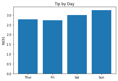
4. matplitlib이 아닌 seaborn으로 나타내기 (범주형)
# 성별에 따른 tip
snsbarplot(data = df, x = 'sex', y = 'tip')

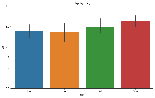
# 요일에 따른 tip
plt.figure(figsize=(10,6))
sns.barplot(data=df, x='day', y='tip')
plt.ylim(0, 4)
plt.title('Tip by day')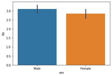
# 다양한 그래프로 나타내기 (범주형)
fig = plt.figure(figsize=(10,7))

ax1 = fig.add_subplot(2,2,1)
sns.barplot(data=df, x='day', y='tip', palette="ch:.25")

ax2 = fig.add_subplot(2,2,2)
sns.barplot(data=df, x='sex', y='tip')

ax3 = fig.add_subplot(2,2,4)
sns.violinplot(data=df, x='sex', y='tip')

ax4 = fig.add_subplot(2,2,3)
sns.violinplot(data=df, x='day', y='tip', palette="ch:.25")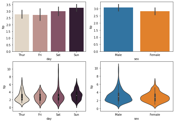
- 산점도 (수치형)
# tip과 total_bill의 관계를 알아보기
sns.scatterplot(data=df, x='total_bill', y='tip', palette="ch:r=-.2,d=.3_r")

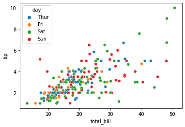
# hue에 'day'를 넣어 요일에 따른 tip과 total_bill의 관계를 한 눈에 알아보기
sns.scatterplot(data=df, x='total_bill', y='tip', hue='day')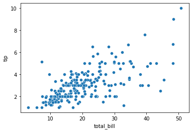
Heatmap
방대한 양의 데이터와 현상을 수치에 따른 색상으로 나타내는 것으로, 데이터 차원에 대한 제한은 없으나 모두 2차원으로 시각화하여 표현합니다.
Heatmap 인자
1. df : 데이터
2. vmin : 최솟값
3. vmax : 최댓값
4. linewidths : 각 칸 사이의 선의 두께
5. annot : 각 셀의 값 표기 유무
6. fmt : 'd'라 설정할 시 정수로 표기
