flexbox의 구성
- flexbox는 복수의 자식 요소인 flex item
그 상위 부모 요소인 flex container로 구성
.box {
display: flex;
}
부모, 자식 요소의 구성
- flex container 속성 : flex-direction, flex-wrap, justify-content, align-items, algin-content
- flex item 속성 : flex, flex-grow, flex-shrink, flex-basis, order
- flex-direction column item 수직 방향 정렬 설정
- flex-shirnk item 축소에 관한 속성 0과 양의 정수로 속성값 선택 기본 값은 1
- flex-basis 기본 크기를 결정하는 속성 기본값 auto
(width에서 활용하는 모든 단위 활용을 통한 속성값 사용 px, %, em, rem)
navbar 레이아웃
- flex-start, center, flex-end, space-around, space-between 활용

.box {
display: flex;

.flex-item {
justify-content: space-between;
}
.box {
display: flex;

.flex-item {
justify-cotent: center;
}
.box {
display: flex;
justify-content: flex-end;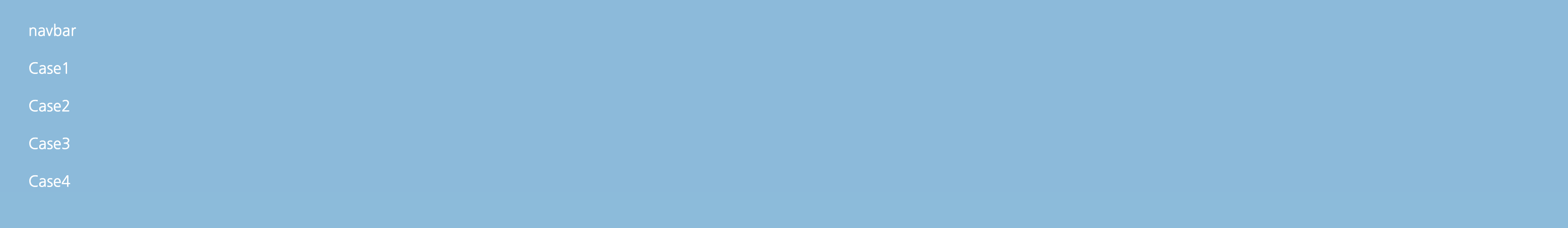
.box {
display: flex;
flex-direction: column;
}
footer 레이아웃
.box {
display: flex;
flex-column: column;

.flex-item {
maragin-top: auto;
}
아이템 중앙 정렬
.box {
display: flex;
algin-item: center;
justify-content: center;
}
뚜벅쵸