
visx a collection of expressive, low-level visualization primitives for React
visx는 airbnb 팀이 D3.js와 react를 사용해 만든 라이브러리다.
기본적으로 러닝커브가 높은 d3.js보다 훨씬 쉽고, 잘 만들어진 sample들이 많아 활용하기 쉽다.
이번 프로젝트에서 차트가 필요한 부분들이 여럿 있었고, visx를 사용해보기로 결정했다.
visx의 장점
- 번들 사이즈로 나눠진 패키지. 작은 규모의 프로젝트로 시작할 수 있고,
내가 원하는대로 커스터마이징 할 수 있다. - CSS-in-JS, 상태 관리 시스템, 애니매에션 라이브러리 등 여러가지를 추가해서 사용할 수 있다.
- 단순한 차트 라이브러리가 아니다. 자유도가 높아 나만의 케이스로 작업하고, 컨트롤 할 수 있다.
- react 친화적이다.
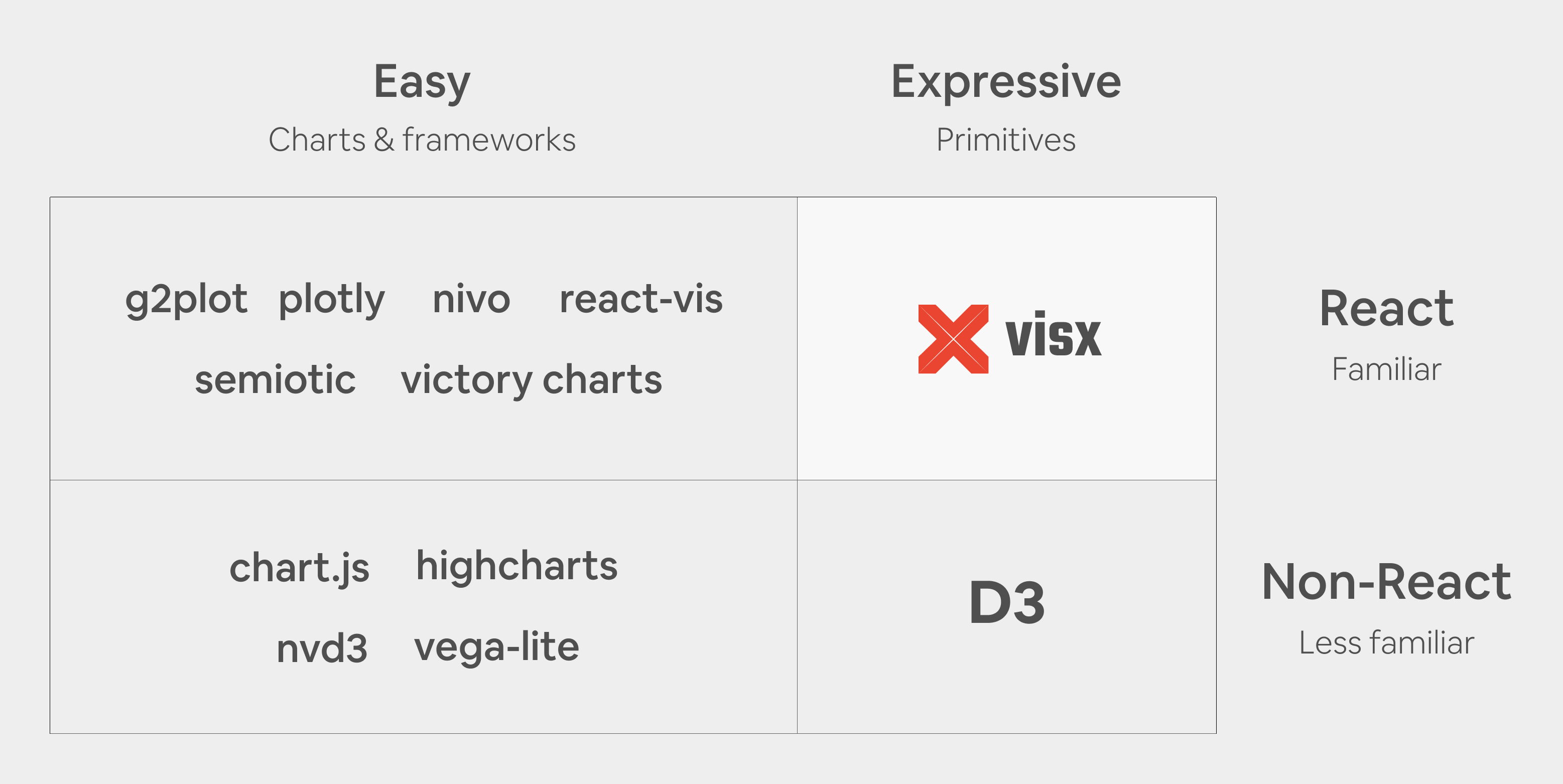
여러 장점들이 있지만 react 기반의 라이브러리인 점이 가장 중요하다.
사용하기 간단한 차트 라이브러리는 찾아보면 많지만,
d3만큼 커스텀이 자유롭고, react 컴포넌트로 작업할 수 있는 라이브러리는 visx 밖에 없다.
우선 d3와 visx의 Example code를 확인해보면
// d3.js Bar-chart example
chart = {
  const svg = d3.create("svg")
      .attr("viewBox", [0, 0, width, height]);

  svg.append("g")
      .attr("fill", color)
    .selectAll("rect")
    .data(data)
    .join("rect")
      .attr("x", (d, i) => x(i))
      .attr("y", d => y(d.value))
      .attr("height", d => y(0) - y(d.value))
      .attr("width", x.bandwidth());

  svg.append("g")
      .call(xAxis);

  svg.append("g")
      .call(yAxis);

  return svg.node();
}

x = d3.scaleBand()
    .domain(d3.range(data.length))
    .range([margin.left, width - margin.right])
    .padding(0.1)

y = d3.scaleLinear()
    .domain([0, d3.max(data, d => d.value)]).nice()
    .range([height - margin.bottom, margin.top])

xAxis = g => g
    .attr("transform", `translate(0,${height - margin.bottom})`)
    .call(d3.axisBottom(x).tickFormat(i => data[i].name).tickSizeOuter(0))

yAxis = g => g
    .attr("transform", `translate(${margin.left},0)`)
    .call(d3.axisLeft(y).ticks(null, data.format))
    .call(g => g.select(".domain").remove())
    .call(g => g.append("text")
        .attr("x", -margin.left)
        .attr("y", 10)
        .attr("fill", "currentColor")
        .attr("text-anchor", "start")
        .text(data.y))
d3.js를 react에서 사용할 경우 이보다 코드가 더 길어지기도 한다.
selection이 기본적으로 type 지정이 어렵기도 하고, axis와 scale 패키지를 사용한 코드들은
optional chaining을 계속 걸어줘야 한다.
보통 react에서는 useEffect()를 활용해서 d3의 svg를 렌더링 하는데 이 과정이 많이 복잡하다.
join(), enter(), exit() 등을 활용해서 여러번 렌더링 해줘야 하고,
data가 변경 될 경우에는 axis와 scale도 다시 불러와 렌더링을 돌려줘야 한다.
그래서 react에서 d3를 사용하는 경험은 매우 불편했다.
// visx Bar-chart example
import React, { useMemo } from 'react';
import { Bar } from '@visx/shape';
import { Group } from '@visx/group';
import { GradientTealBlue } from '@visx/gradient';
import letterFrequency, { LetterFrequency } from '@visx/mock-data/lib/mocks/letterFrequency';
import { scaleBand, scaleLinear } from '@visx/scale';

const data = letterFrequency.slice(5);
const verticalMargin = 120;

// accessors
const getLetter = (d: LetterFrequency) => d.letter;
const getLetterFrequency = (d: LetterFrequency) => Number(d.frequency) * 100;

export type BarsProps = {
  width: number;
  height: number;
  events?: boolean;
};

export default function Example({ width, height, events = false }: BarsProps) {
  // bounds
  const xMax = width;
  const yMax = height - verticalMargin;

  // scales, memoize for performance
  const xScale = useMemo(
    () =>
      scaleBand<string>({
        range: [0, xMax],
        round: true,
        domain: data.map(getLetter),
        padding: 0.4,
      }),
    [xMax],
  );
  const yScale = useMemo(
    () =>
      scaleLinear<number>({
        range: [yMax, 0],
        round: true,
        domain: [0, Math.max(...data.map(getLetterFrequency))],
      }),
    [yMax],
  );

  return width < 10 ? null : (
    <svg width={width} height={height}>
      <GradientTealBlue id="teal" />
      <rect width={width} height={height} fill="url(#teal)" rx={14} />
      <Group top={verticalMargin / 2}>
        {data.map(d => {
          const letter = getLetter(d);
          const barWidth = xScale.bandwidth();
          const barHeight = yMax - (yScale(getLetterFrequency(d)) ?? 0);
          const barX = xScale(letter);
          const barY = yMax - barHeight;
          return (
            <Bar
              key={`bar-${letter}`}
              x={barX}
              y={barY}
              width={barWidth}
              height={barHeight}
              fill="rgba(23, 233, 217, .5)"
              onClick={() => {
                if (events) alert(`clicked: ${JSON.stringify(Object.values(d))}`);
              }}
            />
          );
        })}
      </Group>
    </svg>
  );
}
visx의 경우는 기본 짜임새부터가 react component여서 사용하기가 매우 쉽다.
기존의 d3에서는 불편하게 느껴졌던 scaleBand()나 scaleLinear()이 좀 더 사용하기 편해졌다.
d3를 react에서 사용할 경우 하나의 svg element에서 모든 렌더링을 때려박는 스타일이기 때문에
가독성이 좋지 않다. 원하는 그룹에 원하는 svg 객체를 삽입하기가 굉장히 어렵다.
visx는 svg element를 내가 원하는대로 구성하고 렌더링 시킬 수 있다. 원하는 속성을 부여하기가 좀 더 쉽고,
원하는 계층 구조를 설계하기가 d3보다 훨씬 쉽다.
d3에서는 join(), enter(), exit() 등을 사용하여 변환된 데이터를 직접 svg element에 렌더링 해줬었는데
이제 visx를 사용하면 data를 state로 사용하고, state를 변경할 때마다 렌더링의 역할은 react한테 일임하여 d3를 사용하는 것보다 좀 더 활용성 있고, 확장에도 용이한 컴포넌트를 만들 수 있다.
Example Code
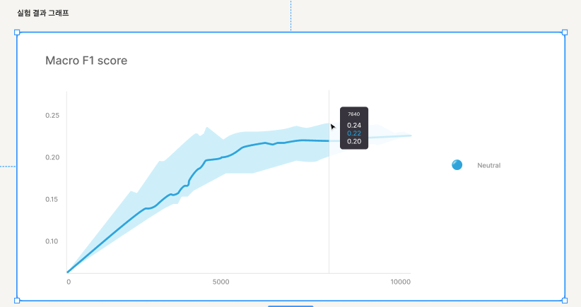
zelly에서 스탠다드 데이터셋 작업을 완료한 후, 실험 결과 값을 받아 차트로 출력해주는 컴포넌트 시안이다.
컴포넌트에서 필요한 기능은 2가지
- f1_max, f1_mean, f1_min 3개의 값을 한 차트안에 렌더링
- 호버 이벤트 시 Tooltip 컴포넌트 출력
우선 visx가 제공하는 Example 중에서 유사한 형태와 기능을 갖춘 코드를 찾는다.
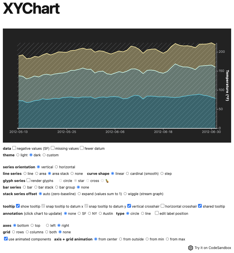
여러 값을 동시에 렌더링 할 수 있고, 자체적으로 Tooltip 컴포넌트를 내장하고 있는 XYChart를 선택했다.
체크박스들로 확인해보니 다양한 형태로 커스터마이징도 가능했고, 변경하는 방법도 간편했다.
XYChart 컴포넌트를 기반으로 작업을 시작했다.
import { AreaSeries, Axis, Tooltip, XYChart, XYChartTheme } from '@visx/xychart';
import { curveLinear } from '@visx/curve';
import { defaultStyles } from '@visx/tooltip';
import { CustomTheme } from './DashboardStyled';
import useDashboard from './useDashboard';
import { GraphDatum } from './atoms';
import _ from 'lodash';

export interface GraphDatum {
  date: string;
  f1_max: number;
  f1_mean: number;
  f1_min: number;
}

export default function DashboardGraph() {
  const {
    dashboardGraph, // 차트에 사용할 데이터 GraphDatum[]
    dashboardGraphMinMax: { min, max }, // data value들의 최소값, 최대값
  } = useDashboard();

  // x축 scaleband config
  const dateScaleConfig = { type: 'band', paddingInner: 0.9 } as SimpleScaleConfig;
  // y축 scalelinear config
  const valueScaleConfig = {
    type: 'linear',
    domain: [min, max],
    zero: false,
    clamp: true,
  } as SimpleScaleConfig;

  // tick value
  const numTicks = 10;

  // accessor 함수들 (data) => d[key]
  const getDate = (d: GraphDatum) => d.date;
  const getMaxValue = (d: GraphDatum) => d.f1_max;
  const getMeanValue = (d: GraphDatum) => d.f1_mean;
  const getMinValue = (d: GraphDatum) => d.f1_min;

  type Accessor = (d: GraphDatum) => number | string;

  interface Accessors {
    f1_max: Accessor;
    f1_mean: Accessor;
    f1_min: Accessor;
  }

  type DataKey = keyof Accessors;

  type SimpleScaleConfig = { type: 'band' | 'linear'; paddingInner?: number };

  type Value = 'f1_max' | 'f1_mean' | 'f1_min';

  const accessors = {
    x: {
      f1_max: getDate,
      f1_mean: getDate,
      f1_min: getDate,
    },
    y: {
      f1_max: getMaxValue,
      f1_mean: getMeanValue,
      f1_min: getMinValue,
    },
    date: getDate,
  };

  return (
    <XYChart theme={CustomTheme} xScale={dateScaleConfig} yScale={valueScaleConfig} height={410}>
      <AreaSeries
        dataKey="f1_max"
        data={dashboardGraph}
        xAccessor={accessors.x.f1_max}
        yAccessor={accessors.y.f1_max}
        fillOpacity={1}
        curve={curveLinear}
      />
      <AreaSeries
        dataKey="f1_mean"
        data={dashboardGraph}
        xAccessor={accessors.x.f1_mean}
        yAccessor={accessors.y.f1_mean}
        fillOpacity={0}
        curve={curveLinear}
        lineProps={{ strokeWidth: 4 }}
      />
      <AreaSeries
        dataKey="f1_min"
        data={dashboardGraph}
        xAccessor={accessors.x.f1_min}
        yAccessor={accessors.y.f1_min}
        fillOpacity={1}
        curve={curveLinear}
      />
      // xAxis
      <Axis
	key={`time-axis-bottom`}
	orientation="bottom"
	numTicks={numTicks}
	stroke="#E0E0E0"
	strokeWidth={1} />

      // yAxis
      <Axis
	key={`value-axis-left`}
	orientation="left"
	numTicks={numTicks}
	stroke="#E0E0E0" />

      // Tooltip component
      <Tooltip<GraphDatum>
        showHorizontalCrosshair
        showVerticalCrosshair
        snapTooltipToDatumX
        style={{
          ...defaultStyles,
          backgroundColor: '#3E3C45',
        }}
        verticalCrosshairStyle={{ stroke: '#E0E0E0', strokeWidth: 1 }}
        renderTooltip={({ tooltipData }) => (
          <>
            <span
              style={{
                fontFamily: 'Inter',
                fontSize: 10,
                lineHeight: '12px',
                fontWeight: 500,
                color: '#FFFFFF',
              }}
            >
              {(tooltipData?.nearestDatum?.datum &&
               accessors.date(tooltipData?.nearestDatum?.datum)) || 'No date'}
            </span>
            <br />
            <br />
            {(Object.keys(tooltipData?.datumByKey!)
              .filter((item) => item) as Value[]).map((item: Value) => {
              const { y } = accessors;
              const value = tooltipData?.nearestDatum?.datum! &&
                    y[item](tooltipData?.nearestDatum?.datum);

              return (
                <div key={item}>
                  <span
                    style={{
                      fontFamily: 'Inter',
                      fontSize: 14,
                      lineHeight: '17px',
                      fontWeight: 500,
                      color: item === 'f1_mean' ? '#10ADDF' : '#FFFFFF',
                    }}
                  >
                    {_.floor(value, 3)}
                  </span>
                </div>
              );
            })}
          </>
        )}
      />
    </XYChart>
  );
}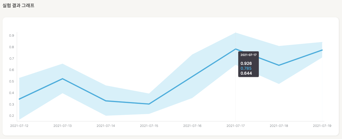
더미 데이터가 충분하지 않아 차트의 형태는 좀 이상하지만 기능은 잘 구현됐다.
d3.js를 사용할 때는 svg안에 렌더링을 일일히 신경써야하지만,
visx는 scale config과 data만 컴포넌트에 props로 부여해주면 된다.