2주차 배운 내용
CSS Flex
1. What is CSS Flex
Flexbox is a one-dimensional layout method for arranging items in rows or columns. Items flex (expand) to fill additional space or shrink to fit into smaller spaces. This article explains all the fundamentals.
출처 MDN CSS flex doc
CSS Flex는 Flexible Box Layout을 줄여서 부르는 명칭이다. 1차원의 레이아웃을 행과 열을 나눠 구성하는 방식이며, float이나 inline-block, table 등을 활용해 레이아웃을 만들던 기존 방식보다 훨씬 간편하고 효율적인 기능들이 많다.
2. How CSS Flex works
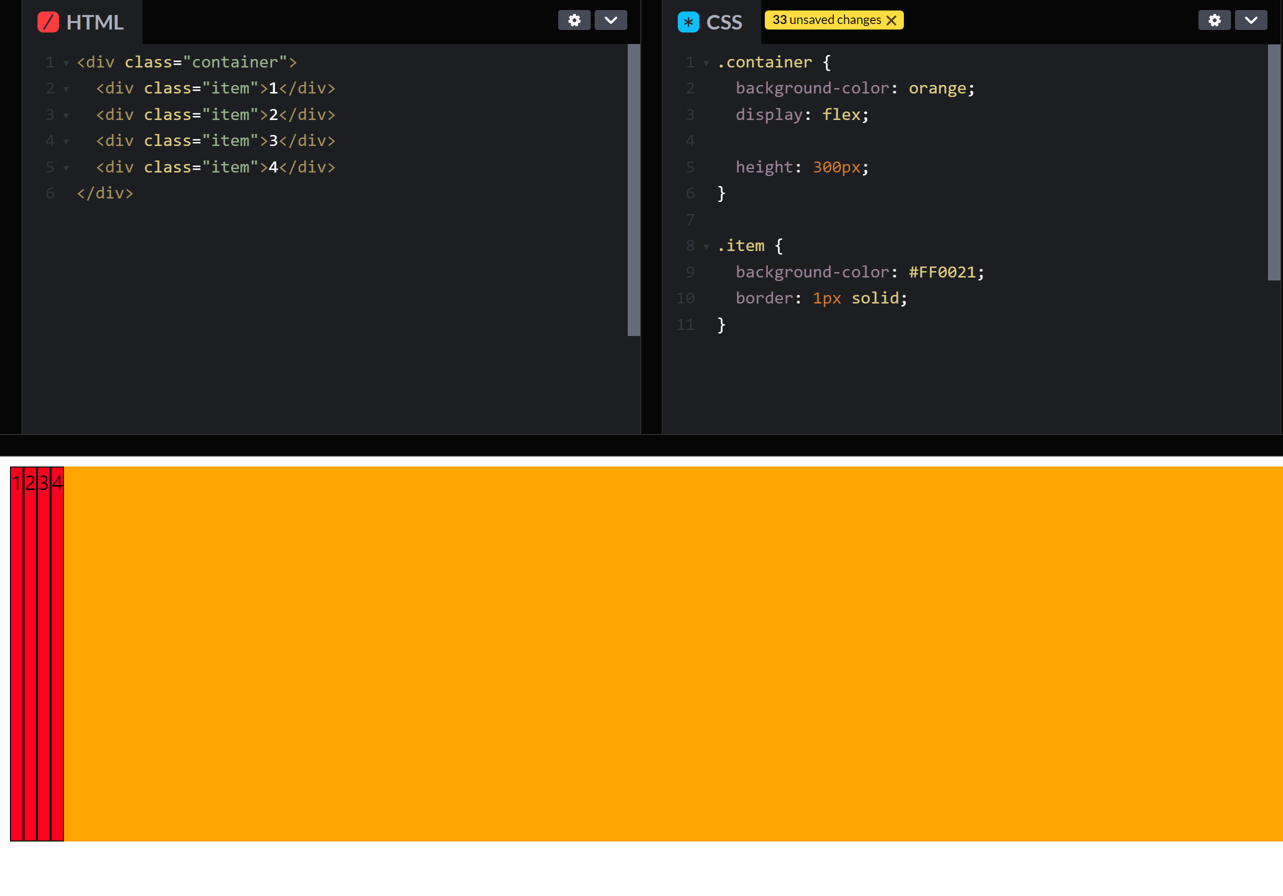
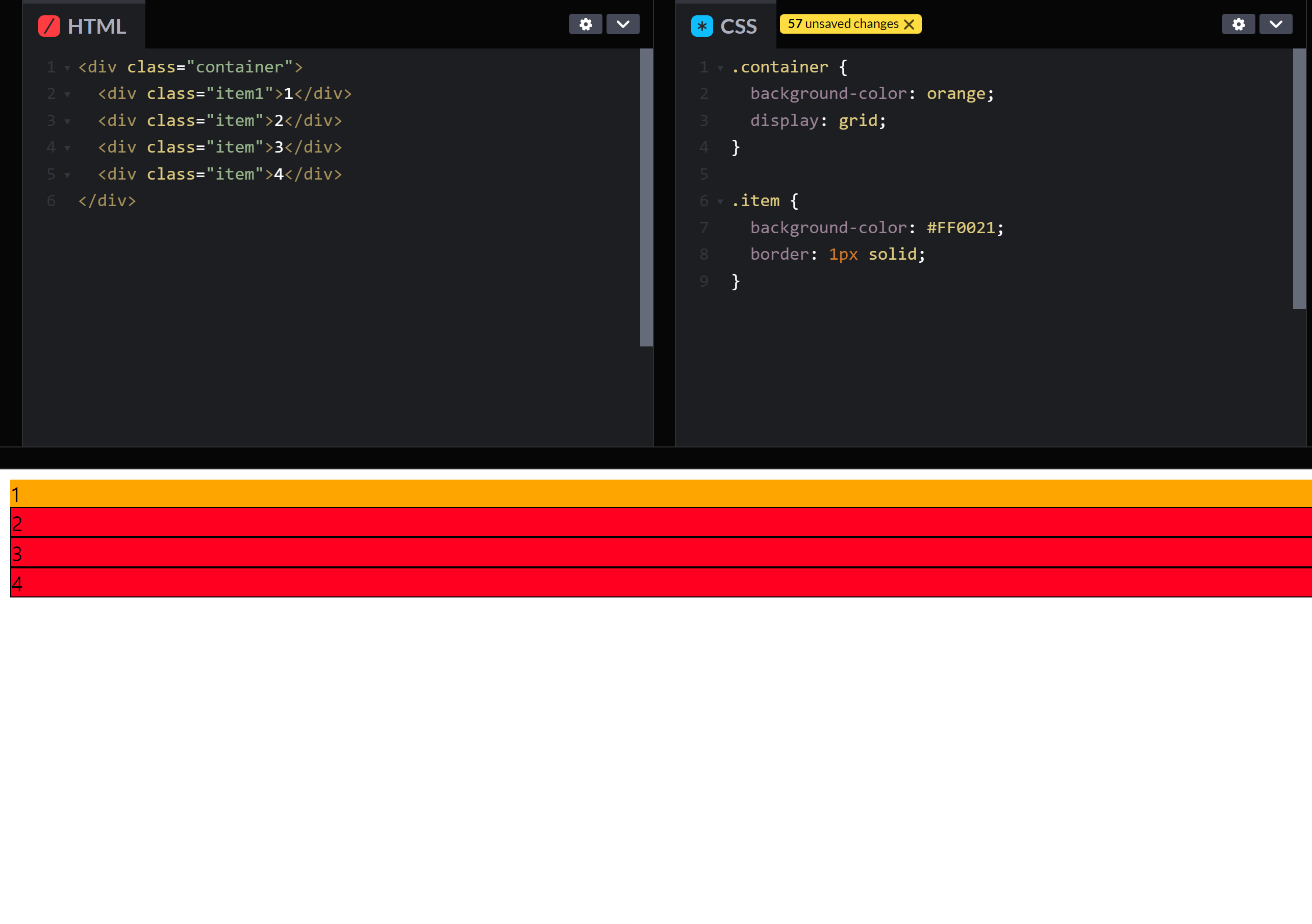
CSS에서의 display 속성은 요소를 어떻게 보여줄지를 결정한다. 요소의 display 값에 block이나 inline-block등을 설정할 때와 마찬가지로 flex 값을 주어 사용할 수 있다.
.parentConatiner {
	display: flex;
}
.childContainer {
	/* child container is flex item */
}
HTML 태그 구조상의 상위(부모) 요소에 display: flex; 값을 주면 통상적으로 이를 flex container라고 부르고 하위(자식) 요소를 flex item이라고 부른다.
Flex container의 기준축은 기본 값인 가로 기준으로 정렬된다.
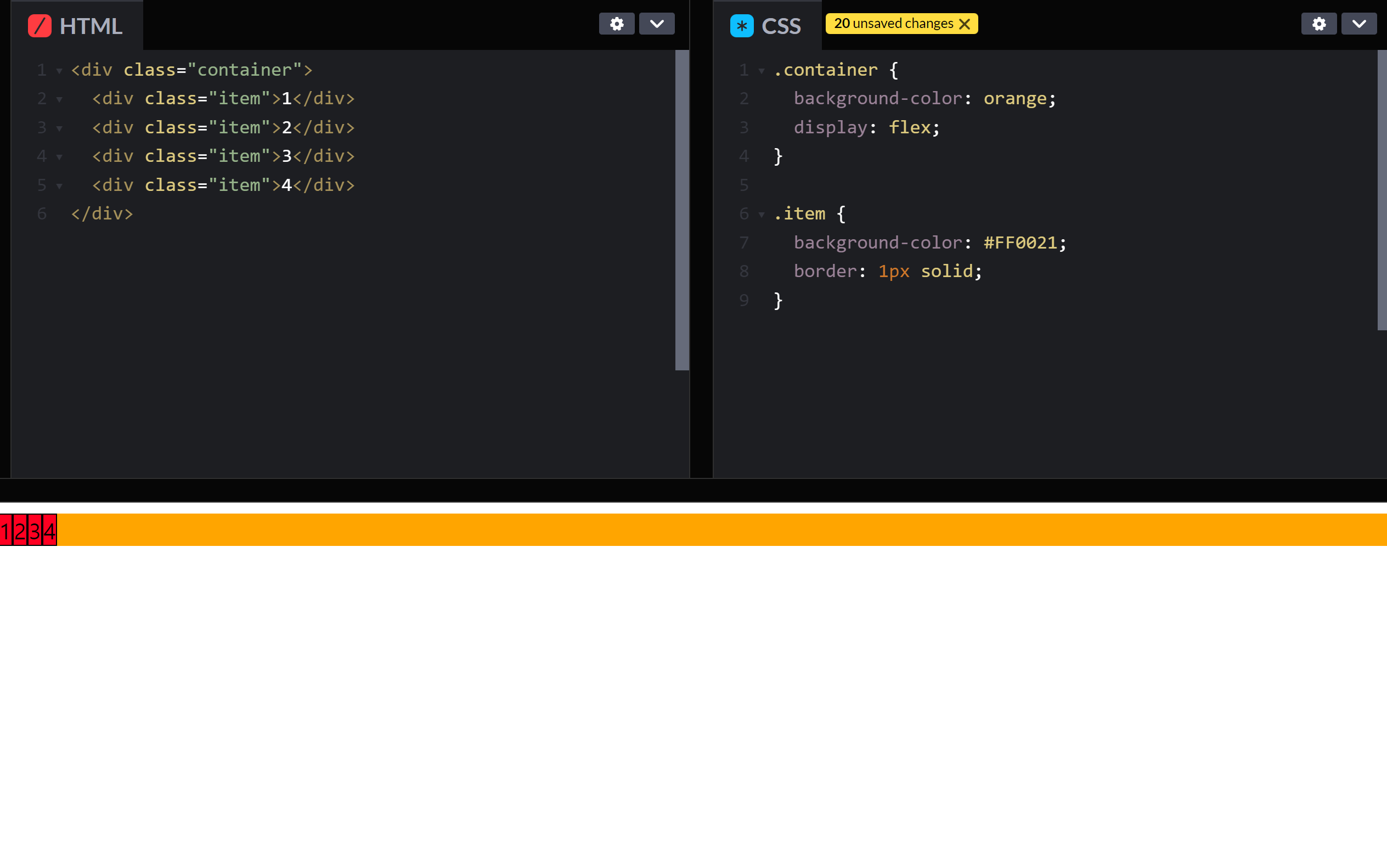
기준축을 기준으로 좌측 정렬이며, flex item들의 높이는 상위 요소의 높이만큼 자동으로 늘어나게된다.
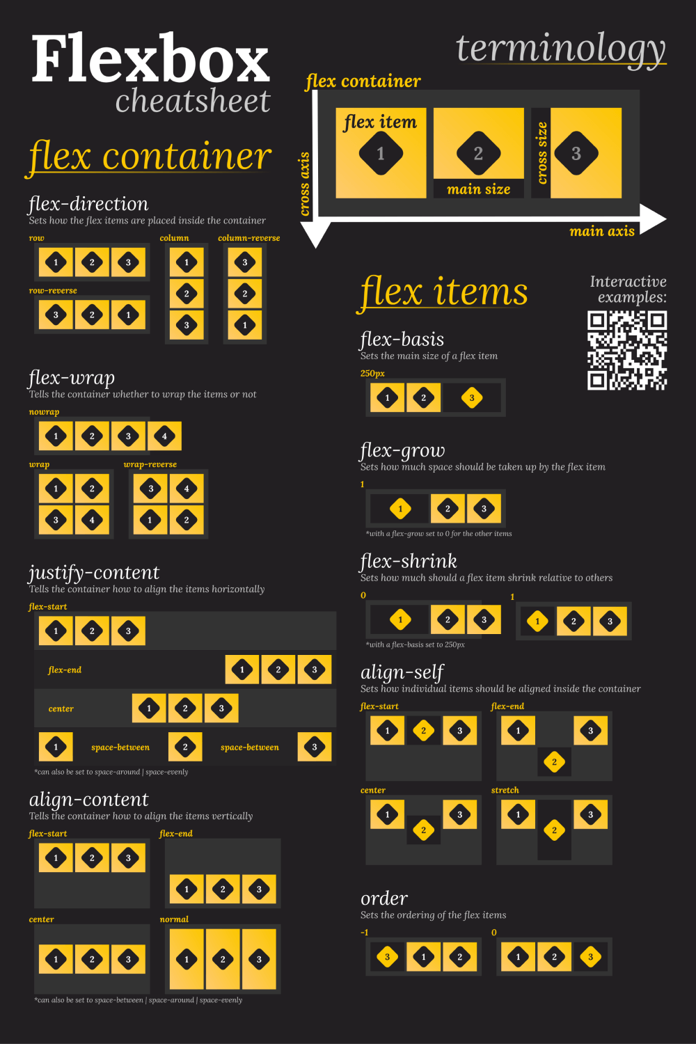
3. Flex container
-
flex-direction: 기준축을 결정
.parentContainer { flex-direction: row; /* by default */ /* row-reverse | column | column-reverse */ } -
flex-wrap: 줄바꿈
.parentContainer { flex-direction: no-wrap; /* by default */ /* wrap | wrap-reverse */ } -
align-items: flex item들을 여러 줄로 취급하여 교차축 정렬
.parentContainer { align-items: stretch; /* by default */ /* flex-start | flex-end | center | baseline | first baseline | last baseline | start | end | self-start | self -end */ } -
align-content: flex item들을 한 줄로 취급하여 교차축 정렬
.parentContainer { align-content: flex-start; /* by default */ /* flex-end | center | space-between | space-around | space-evenly | stretch | start | end | baseline | first baseline | last baseline */ } -
justify-content: flex item들을 한 줄로 취급하여 기준축 정렬
.parentContainer { justify-content: flex-start; /* by default */ /* flex-end | center | space-between | space-around | space-evenly | start | end | left | right */ } -
gap: flex item들 간의 간격을 조절
.parentContainer {
   gap: 0; /* by default */
   row-gap: 0; /* by default */
   column-gap: 0; /* by default */
}
4. Flex item
-
order: z축 기준으로 순서를 부여
.childContainer { order: 0; /* by default */ } -
flex-grow: 상위 요소의 크기에 따른 증가비율
.childContainer { flex-grow: 0; /* by default */ } -
flex-shrink: 상위 요소의 크기에 따른 감소비율
.childContainer { flex-shrink: 1; /* by default */ } -
flex-basis: flex item의 기본 크기 설정
.childContainer { flex-basis: auto; /* based on contet's size by default */ } -
flex: 단축 속성
.childContainer { flex: 0 1 auto; /* by default */ /* flex-grow flex-shrink flex-basis */ } -
align-self: flex item의 개별적인 교차축 정렬
.childContainer { align-self: auto; /* by default */ /* flex-start | flex-end | center | baseline | stretch */ } -
justify-self: flex item의 개별적인 기준축 정렬
childContainer {
    align-self: auto; /* by default */
    /* flex-start | flex-end | center |
    baseline | stretch */
}
CSS Grid
1. What is CSS Grid
CSS Grid Layout excels at dividing a page into major regions or defining the relationship in terms of size, position, and layer, between parts of a control built from HTML primitives.
Like tables, grid layout enables an author to align elements into columns and rows. However, many more layouts are either possible or easier with CSS grid than they were with tables. For example, a grid container's child elements could position themselves so they actually overlap and layer, similar to CSS positioned elements.
출처: MDN CSS Grid
내용 자체는 구조적으로 CSS Flex와 비슷하나 1차원 레이아웃이 아닌 2차원 레이아웃으로 배치할 수 있는 기능이다.
CSS Flex와 마찬가지로 HTML 구조상의 상위 요소를 Grid container, 하위 요소를 Grid item이라고 부르고, 이러한 Grid item이 그리는 가상의 한 칸을 grid cell이라고 부른다.
2. How CSS Grid works
Grid는 Flex와는 다르게 요소들이 inline-block 처럼 작동한다. block의 성질처럼 처음에는 grid item들의 width가 상위 요소의 width 만큼 늘어난다.
Grid 속성을 통해 다음과 같이 배치가 가능하다.
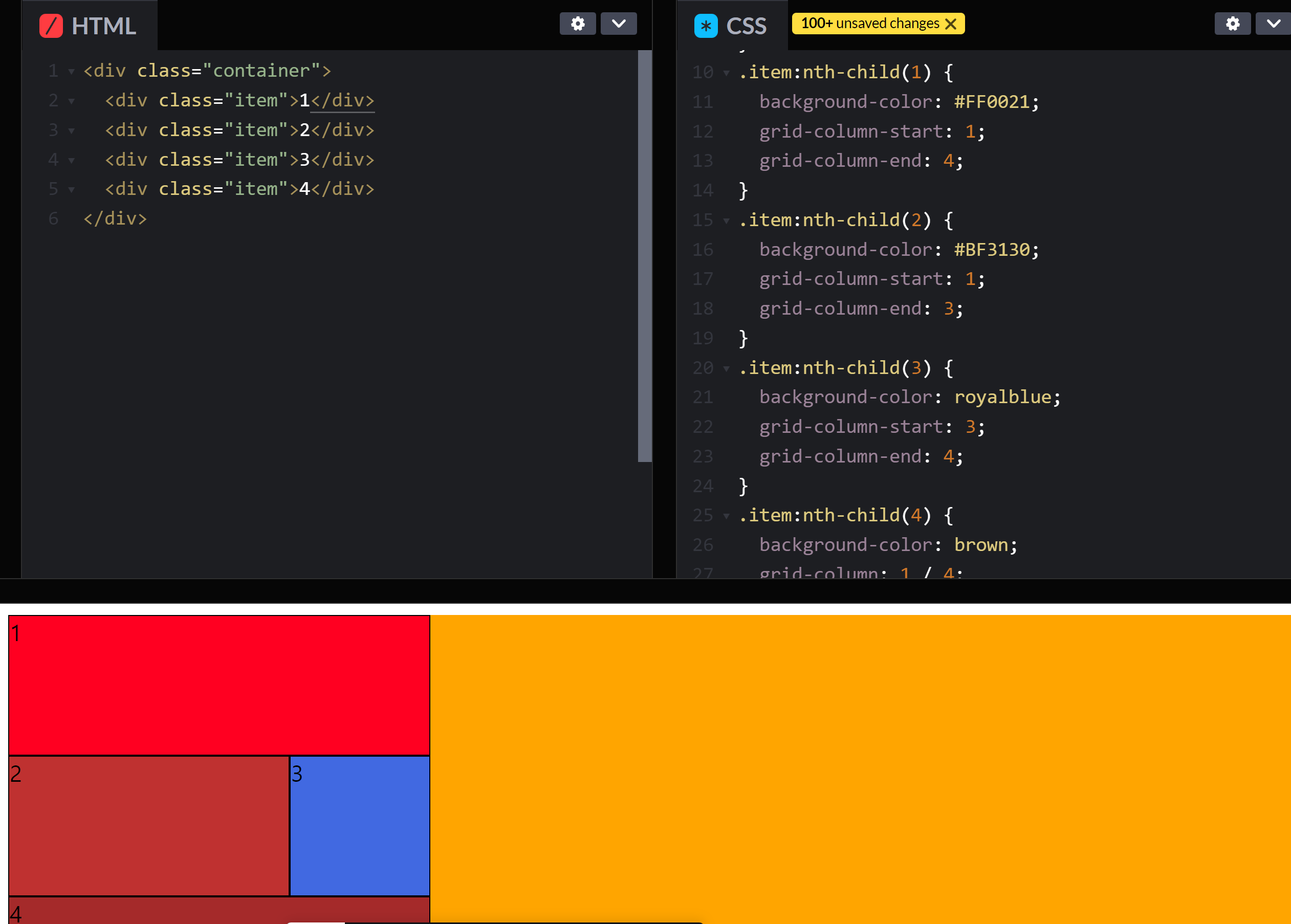
3. Grid container
3-1. 배치
-
grid-template-area: 행렬의 구조를 직관적으로 입력
.gridContainer { grid-template-areas: /* none by default */ "a b b" /* row 2 by column 3 grid */ "a c d" /* each takes 1fr(1/n repect to total size of its container)*/ ; } -
grid-auto-rows || grid-auto-columns: row와 column의 개수를 알아서 지정
.gridContainer { grid-auto-rows: auto; /* default */ } /* : repeat( { number of span }, { size } ); : minmax( { mininum size }, { maximum size} ); : fit-content( { size } );*/ -
grid-template-rows || grid-template-columns: row와 column의 개수를 지정
.gridContainer { grid-template-rows: none; /* default */ /* ex) grid-template-rows: 1fr 1fr 1fr; */ } /* : repeat( { number of span }, { size } ); : minmax( { mininum size }, { maximum size} ); : fit-content( { size } );*/ -
row-gap || column-gap: 각 행과 열의 간격을 설정
span은 칸 수라고 생각하면 편하다..gridContainer { row-gap: auto / auto; /* default */ /* 1 / { ending row or column number } 1 / span { ending row or column span }*/ }
3-2. 정렬
기본적으로 Flex의 align-items, justify-items, align-content, justify-content, align-self, justify-self는 동일하게 적용되며 align과 justify속성을 묶어서 사용하는 단축 속성인 place가 있다.
/* The order is as following: align-XXX,  justify-XXX */
.gridContainer {
	place-items: start start; /* default */
    place-content: start start; /* default */
}

.gridItem {
	place-self: stretch stretch; /* default */
}
4. Grid item
grid-area: grid item의 범위설정
.gridItem{
    grid-area: auto / auto / auto / auto; /* default */
    grid-colmun-start: auto; /* default */
    grid-colmun-end: auto; /* default */
    grid-row-start: auto; /* default */
    grid-row-end: auto; /* default */
    /* { number } | span {number} */
}
Useful links
-
CSS Flex
-
CSS Grid
마치며
어릴 때 잠깐 맡아서 키우던 치와와를 떠오르는 기간이였다. 당최 왜 짖는지 알 수가 없고, 말은 또 왜 이렇게 안 듣던지... 이 개가 어떤 성향인지, 무엇을 좋아하는지, 무슨 이유로 행동을 하는지 차츰 익혀나갈 때 쯤엔, 적어도 앉아와 손은 알아들었고, 참 기뻤다.
클론코딩 하면서 크기 조절과 하위 요소 정렬 및 배치는 치와와보다는 나았지만, 속이 터지기는 마찬가지였다. 중반 정도 되서야 감이 잡히면서 모양이 잡히고, 조그마한 욕심으로 디자인을 바꿔보기도 하면서 기분좋긴 했다.
CSS는 속성의 기본값을 모르면 난감한 경우가 많은 것 같다. 반대로 기본값만 잘 알고 있으면 코드를 길게 쓸 필요가 없어지기도 한다.
브라우저가 기본적으로 제공하는 CSS 스타일을 일일이 염두해서 사용해야 한다는게 상당히 귀찮지만 시간을 갈아넣으며 차츰 익혀나가면 외워지리라 막연하게 생각하고 그냥 하는게 답인 것 같다.
