
flex 실습 1, 2는 기존에 float로 만들었던 예제를 flex로 다시 구현해보는 내용이었다.
비교적 간단해서 따로 정리하지 않고 넘어갔다.
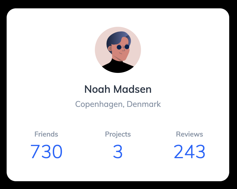
이번 실습은 flexbox를 이용해서 프로필 카드를 만들어보았다.
세로와 가로 정렬을 함께 사용하면서 flex 정렬 방식을 익히는 연습이었다.
처음에는 flex만 쓰면 정렬이 쉽게 끝날 줄 알았지만,
실제로는 정렬을 어디서부터 시작해야 하는지와
정렬과 여백(margin/padding)의 역할 차이가 가장 헷갈렸다.
그래서 강의를 듣기 전에 궁금했던 점들을 정리하고,
개념을 이해한 뒤 다시 혼자 해보면서 정리해보았다.
만들면서 궁금했던 점들
1. 어떤 걸 먼저 해야 할까?
실습을 시작하기 전에 가장 막막했던 건
“무엇부터 해야 하는지”였다.
강의를 듣고 난 뒤에는 정렬 순서가 명확하게 보였지만,
처음에는 어디서부터 시작해야 할지 감이 잘 오지 않았다.
그래서 순서를 정리해보니 다음과 같았다.
- 이미지 사이즈 먼저 조정
- 이미지와 이름 사이 간격 조정
- 이름과 지역, 정보 영역 간 간격 조정
- 프로필 정보들을 가로로 배치
- 카드 크기 설정
- 카드 전체를 가운데 정렬
- 마지막으로 세부 간격 조정
이렇게 위에서 아래로, 큰 구조부터 차근차근 정렬한 뒤
마지막에 세부적인 부분을 맞추는 방식이었다.
2. flex로 전체 정렬하고, 세부 정렬도 하고 싶을 때는 어떻게 해야 할까?
전체적으로는 가운데 정렬이 필요했고,
그 안에서는 정보들을 가로로 배치해야 했다.
그래서
“flex를 한 번 더 써도 되는 걸까? 서로 영향을 주지는 않을까?”
라는 고민이 들었다.
결론은 flex는 중첩해서 사용할 수 있다는 것이었다.
즉,
- 카드 전체 → 가운데 정렬 (부모 flex)
- 프로필 정보 영역 → 가로 배치 정렬 (내부 flex)
이처럼 구조별로 따로 정렬하면 된다.
3. 정렬 vs padding/margin 언제 쓰는 걸까?
정렬은 "위치 배치"
flex 속성으로 해결한다
- 가운데 정렬
- 가로/세로 정렬
- 좌우 분배
padding / margin은 "공간 조정"
padding→ 내부 여백margin→ 요소 간 간격
강의 보면서 정리한 것
프로필 정보 영역에 width를 주는 이유
.profile-detail {
  display: flex;
  justify-content: space-between;
  align-items: center;
  width: 100%;
}
처음에는 space-between을 적용했는데도
요소들이 서로 붙어 있는 것처럼 보였다.
flex는 기본적으로 width를 지정하지 않으면
내용(content) 크기만큼만 줄어든다.
그래서 부모 요소인 .profile의 content 영역 전체 폭을 차지하게 만들면
flex에서 공간 분배가 정상적으로 이루어진다.
코드
html 코드
<!DOCTYPE html>
<html lang="en">
    <head>
        <meta charset="UTF-8" />
        <meta name="viewport" content="width=device-width, initial-scale=1.0" />
        <title>Flexbox 3</title>
        <link href="https://fonts.googleapis.com/css?family=Muli:300,400,600&display=swap" rel="stylesheet" />
        <link rel="stylesheet" href="./style.css" />
    </head>
    <body>
        <section class="profile">
            <img src="./assets/user.jpg" alt="Noah Madsen" class="profile-image" />
            <h1 class="profile-name">Noah Madsen</h1>
            <p class="profile-location">Copenhagen, Denmark</p>

            <dl class="profile-detail">
                <div class="profile-detail-item">
                    <dt>Friends</dt>
                    <dd>730</dd>
                </div>
                <div class="profile-detail-item">
                    <dt>Projects</dt>
                    <dd>3</dd>
                </div>
                <div class="profile-detail-item">
                    <dt>Reviews</dt>
                    <dd>243</dd>
                </div>
            </dl>
        </section>
    </body>
</html>
css 코드
* {
    box-sizing: border-box;
    margin: 0;
}

body {
    font-family: "Muli", sans-serif;
    color: #273444;
}

.profile-name {
    font-size: 18px;
    font-weight: 600;
    line-height: 1.3333333333;
}

.profile-location {
    font-size: 14px;
    line-height: 1.4285714286;
    color: #8492a6;
}

.profile-detail dt {
    font-size: 12px;
    font-weight: 600;
    line-height: 1.6666666667;
    color: #8492a6;
}

.profile-detail dd {
    font-size: 32px;
    font-weight: 300;
    line-height: 1.25;
    color: #0066ff;
}

/* ▼ WHERE YOUR CODE BEGINS */

body {
    display: flex;
    justify-content: center;
    align-items: center;
    width: 100%;
    height: 100vh;
    background-color: #000;
}

.profile {
    display: flex;
    flex-direction: column;
    justify-content: center;
    align-items: center;
    width: 386px;
    padding: 32px 40px;
    border-radius: 16px;
    background-color: #fff;
}

.profile-image {
    display: block;
    width: 80px;
    height: 80px;
    border-radius: 50%;
    margin-bottom: 16px;
}

.profile-name {
    margin-bottom: 4px;
}

.profile-location {
    margin-bottom: 32px;
}

.profile-detail {
    display: flex;
    justify-content: space-between;
    width: 100%;
    text-align: center;
}
이번 실습에서 배운 것
✔ 정렬은 한 번에 끝나는 것이 아니라 단계적으로 적용한다.
✔ flex는 정렬 도구이고, 간격 조정은 margin/padding의 역할이다.
✔ space-between이 이상하게 보이면 컨테이너 width를 먼저 의심해야 한다.