이번 media query 실습은 화면을 디바이스 크기에 따라 다르게 보여주도록 만드는 연습이었다.
처음엔 “PC 버전부터 만들고, 모바일일 때만 따로 바꾸면 되겠지?” 하고 시작했는데, 강의를 들으면서 모바일 버전을 먼저 만드는 게 정설이라는 걸 알게 됐다.
결과적으로 내 코드(PC 먼저)와 수업 코드(모바일 먼저)의 스타일링 방식이 꽤 달라졌고, 왜 다른지도 명확해졌다.
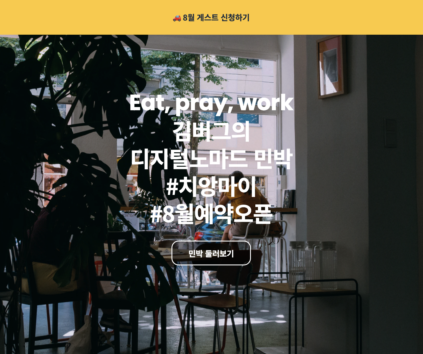
< 모바일 버전 >
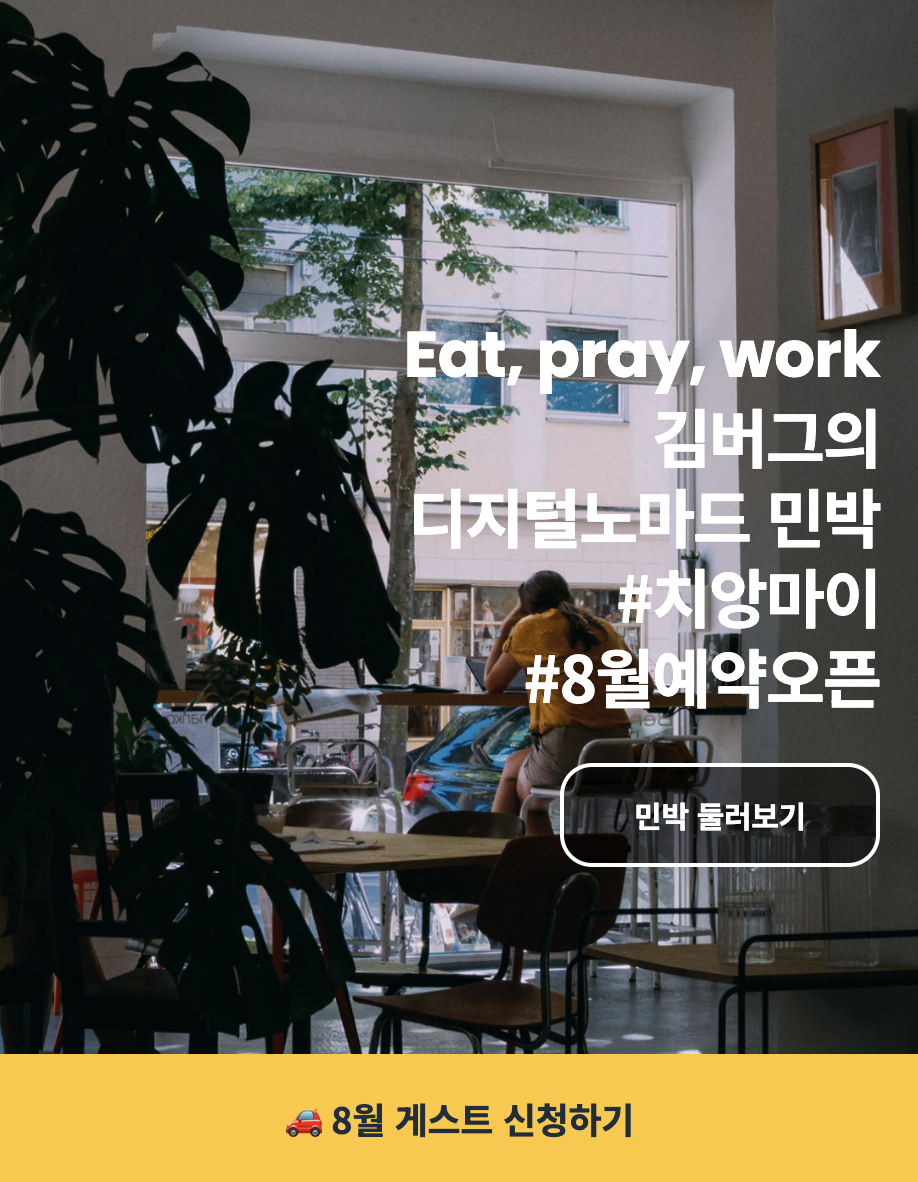
< PC 버전 >
만들면서 궁금했던 점들
1. 반응형을 만들 때 뭐부터 시작해야 할까?
반응형을 만들 때 “뭐부터 시작하지?”가 헷갈린다면,
모바일부터 만드는 게 정설이다.
- 작은 화면(모바일) 기준으로 기본 스타일을 먼저 만들고
- 화면이 커질 때 바뀌는 점만
min-width로 추가한다.
2. 글씨/테두리는 흰색 유지하면서, 버튼 배경만 반투명하게 하려면?
여기서 opacity 를 쓰면 버튼 안 글자까지 같이 투명해져서 원하는 결과가 안 나온다.
그래서 배경색 자체에 투명도를 넣는 방식으로 해결해야 한다.
background-color: rgba(0, 0, 0, 0.5);강의 보면서 정리한 것
1. width: 100% 를 준 이유
.banner {
  width: 100%;
}
width: 100% 는 부모 요소의 가로 전체 영역을 차지하게 만들기 위해서 사용한다.
여기서는 .banner 가 화면 하단에 고정되는 요소이기 때문에,
화면 좌우 끝까지 꽉 차도록 만들어야 했다.
만약 width: 100% 를 주지 않으면,
- 배너의 폭은 내용 크기만큼만 줄어들고
- 화면 양쪽이 비어 보이게 된다.
따라서 배너처럼 화면 전체 너비를 차지해야 하는 요소에는
width: 100% 를 선언하는 것이 일반적이다.
2. height: 100vh 를 준 이유
.landing {
  height: 100vh;
}
여기서 vh 는 viewport height를 의미한다.
즉,
100vh = 현재 화면 높이의 100% 을 뜻한다.
이 값을 준 이유는 .landing 섹션이 화면 높이 전체를 차지하도록 만들기 위해서이다.
만약 height: 100vh 를 주지 않으면,
- 섹션 높이는 내용 크기만큼만 잡히고
- 배경 이미지가 화면 전체를 채우지 못한다.
그래서 화면처럼 풀스크린 레이아웃을 만들 때
height: 100vh 를 자주 사용한다.
3. media query에서 bottom: auto 를 준 이유
.banner {
  bottom: auto;
  top: 0;
}
auto 는 "이 속성을 기본 상태로 되돌려라" 라는 의미를 가진다.
즉,
-
모바일에서는
bottom: 0→ 화면 하단 고정 -
PC에서는
bottom: auto→ 기존 하단 고정 해제
top: 0→ 상단에 고정
이렇게 동작하게 된다.
코드
html 코드
<!DOCTYPE html>
<html lang="ko">
  <head>
    <meta charset="UTF-8" />
    <meta name="viewport" content="width=device-width, initial-scale=1.0" />
    <title>Media Query</title>
    <link
      href="https://fonts.googleapis.com/css2?family=Noto+Sans+KR:wght@700;900&family=Poppins:wght@700&display=swap"
      rel="stylesheet"
    />
    <link rel="stylesheet" href="./style.css" />
  </head>
  <body>
    <aside class="banner">
      <h1 class="banner-title">
        <a href="#">
          🚗 8월 게스트 신청하기
        </a>
      </h1>
    </aside>

    <section class="landing">
      <h1 class="landing-title">
        <strong lang="en">Eat, pray, work</strong>
        김버그의<br />
        디지털노마드 민박<br />
        #치앙마이<br />
        #8월예약오픈
      </h1>
      <a href="#" class="landing-link">
        민박 둘러보기
      </a>
    </section>
  </body>
</html>
css 코드
* {
  box-sizing: border-box;
  margin: 0;
}

body {
  font-family: "Noto Sans KR", sans-serif;
  letter-spacing: -0.01em;
}

a {
  text-decoration: none;
}

.landing {
  background-image: url("./assets/img-bg.jpg");
  background-size: cover;
  background-position: center center;
  background-repeat: no-repeat;
}

.landing-title {
  line-height: 1.25;
  letter-spacing: -0.03em;
  color: #fff;
}

.landing-title strong {
  display: block;
  font-family: "Poppins", sans-serif;
  letter-spacing: -0.01em;
}

.landing-link {
  line-height: 1;
  color: #fff;
}

.banner-title a {
  color: #1f2d3d;
}

/* ▼ WHERE YOUR CODE BEGINS */

.banner {
    position: fixed;
    bottom: 0;
    left: 0;
    width: 100%;
    background-color: #FFC82C;
}

.banner-title a {
    display: flex;
    justify-content: center;
    align-items: center;
    width: 100%;
    height: 64px;
    font-size: 18px;
}

.landing {
    display: flex;
    flex-direction: column;
    justify-content: center;
    align-items: flex-end;
    text-align: right;
    padding: 0 20px;
    width: 100%;
    height: 100vh;
}

.landing-title {
    margin-bottom: 24px;
}

.landing-link {
    display: flex;
    justify-content: center;
    align-items: center;
    text-align: right;
    width: 160px;
    height: 52px;
    border: 2px solid #FFF;
    border-radius: 16px;
    font-size: 15px;
    background-color: rgba(0, 0, 0, 0.5);
}

@media screen and (min-width: 768px) {
    .banner {
        bottom: auto;
        top: 0px;
    }

    .banner-title a {
        height: 80px;
    }

    .landing {
        align-items: center;
    }

    .landing-title {
        text-align: center;
        font-size: 50px;
        margin-bottom: 32px;
    }

    .landing-link {
        width: 180px;
        height: 56px;
        font-size: 18px;
    }
}
이번 실습에서 배운 것
✔ 반응형은 모바일부터 만드는 게 정설이고, 그럴 때 보통 min-width 를 쓴다.
✔ “기본 스타일 = 모바일”, “달라지는 부분만 media query에”로 정리하면 코드가 깔끔해진다.
✔ bottom: auto → 기존에 선언된 bottom: 0 을 해제하고, 위치 기준을 위쪽으로 바꾸기 위해 사용한다.