
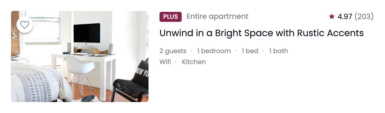
이번 실습은 background 속성과 flexbox를 활용해서 에어비앤비 카드 UI를 만들어보았다.
단순히 배경 이미지를 넣는 게 아니라,
- background-image를 이용한 이미지 처리 방식
- flexbox를 활용한 레이아웃 구성
- 가상요소를 이용한 아이콘과 구분자 표현
- 접근성을 고려한 sr-only 기법
까지 함께 다루면서 여러 개념들을 한 번에 정리할 수 있는 실습이었다.
만들면서 궁금했던 점들
1. background-image 둥근 모서리 적용 안되는 이유?
처음에 border-radius 를 줬는데 적용이 안되었다.
왜 그랬을까?
background-size: contain 을 사용하면,
- 이미지 전체가 보이도록 줄어들기 때문에 요소 안에 여백이 생긴다.
- 그래서 둥근 모서리가 눈에 띄지 않는 것이다.
- 즉, radius가 안 먹은 게 아니라 둥글게 깎일 이미지가 모서리까지 안 왔던 것.
반면
background-size: cover 를 사용하면,
- 요소 영역을 꽉 채우기 때문에 border-radius가 정상적으로 보인다.
또한, 이미지가 둥근 영역 밖으로 삐져나올 수 있기 때문에
overflow: hidden;을 함께 사용하는 것이 좋다.
2. card-image width 값이 안 먹었던 이유
.card 에 display: flex 를 주면
자식들은 flex 요소가 된다.
flex 요소는 기본적으로 공간이 부족하면 줄어들 수 있다.
그래서 .card-image 에 width: 300px 를 줘도 옆의 .card-content 때문에 줄어들었던 것이다.
해결 방법
flex-grow : 남는 공간을 얼마나 가져갈지 정하는 값
즉, 부모(flex container)에 여유 공간이 있을 때 그 공간을 어떤 비율로 나눠 가질지 결정하는 속성이다.
.card {
	display: flex;
}

.card-image {
  width: 300px;
}

.card-content {
  flex-grow: 1;
}
의미는:
- 이미지 = 300px 고정
- 남는 공간 = content가 전부 차지
이 과정을 통해
flex에서는 width가 항상 절대적인 값이 아니라는 것을 이해하게 되었다.
3. 카드 헤더 중앙 정렬이 안 맞았던 이유: align-content vs align-items
카드 헤더의 plus, 텍스트, 별점은
- font-size 다름
- line-height 다름
- inline 요소 특성 다름
그래서 기본 상태에서는 정확히 중앙 정렬이 되지 않는다.
.card-header {
  display: flex;
  align-items: center;
}
align-content 는 여러 줄(wrap)일 때 줄과 줄 사이 간격을 조절하는 속성이기 때문에
지금처럼 한 줄인 flex에서 “세로 가운데”는 align-items 를 적용해야 한다.
4. 별 모양은 어디에 위치시켜야 할까?
별 아이콘은 정보값이 아니기 때문에 HTML에 없었다.
그렇다면 별 모양을 디자인 요소로 어떻게 넣어야 할까?
→ 가상요소를 사용하면 된다.
.property-rate::before {
	content: "";
}
5. sr-only 문구는 어떻게 처리할까?
display: none 을 쓰게 되면
화면에서도 안 보이고 스크린리더도 읽지 않는다.
그래서 다음과 같이 숨긴다:
.sr-only {
    position: absolute;  /* 문서 흐름에서 완전히 제거 */
    z-index: -100;       /* 화면 뒤로 보내기 */
    width: 1px;
    height: 1px;         /* 요소 크기를 거의 0처럼 만들기 */
    overflow: hidden;    /* 내용이 밖으로 튀어나오지 않게 자름 */
    opacity: 0;          /* 완전히 투명하게 만들기 */
}
→ 시각적으로만 숨기고 스크린리더는 읽을 수 있게 유지한다.
6. 사이 점(∙)은 어떻게 만들까?
사이 점도 별 아이콘과 마찬가지로
HTML에 직접 넣지 않고 가상요소로 만든다.
.property-detail dd span::after {
  content: '・';
}
마지막 요소는 제거:
.property-detail dd span:last-child::after {
    content: '';
}
→ 구조적 가상 클래스 선택자를 활용한 방식
강의 보면서 정리한 것
1. <img> 대신 background-image를 쓰는 이유
에어비앤비 카드 이미지는 각 호스트가 업로드하는 사진이라 가로/세로 비율이 일정하지 않다.
그래서 background-image + cover 를 사용하면
정해진 영역 안에서 이미지를 안정적으로 표현할 수 있다.
2. cursor 속성
cursor: pointer;클릭 가능한 요소에 사용하여 커서의 모양이 손모양으로 바뀌게 된다.
코드
html 코드
<!DOCTYPE html>
<html lang="en">
    <head>
        <meta charset="UTF-8" />
        <meta name="viewport" content="width=device-width, initial-scale=1.0" />
        <title>Background</title>
        <link href="https://fonts.googleapis.com/css2?family=Poppins:wght@400;500&display=swap" rel="stylesheet" />
        <link rel="stylesheet" href="./style.css" />
    </head>
    <body>
        <article class="card">
            <div class="card-image">
                <button type="button" class="like-button" aria-label="Like this property"></button>
                <!-- <img/> 대신 background-image를 활용해서 스타일 해보세요!  -->
                <!-- <img src="./assets/img-house.jpg" alt="Seoul AirBnB, hosted by Woohyeon Roh" /> -->
            </div>

            <div class="card-content">
                <header class="card-header">
                    <div class="property-type">
                        <strong class="plus-badge">Plus</strong>
                        <span>Entire apartment</span>
                    </div>

                    <div class="property-rate">
                        <strong aria-label="Review: 4.97">
                        4.97
                        </strong>
                        <span aria-label="Total 203 reviews">(203)</span>
                    </div>
                </header>

                <h1 class="card-title">
                Unwind in a Bright Space with Rustic Accents
                </h1>

                <div class="card-detail">
                    <dl class="property-detail">
                        <div>
                            <dt class="sr-only">Rooms and beds</dt>
                            <dd>
                                <span>2 guests</span>
                                <span>1 bedroom</span>
                                <span>1 bed</span>
                                <span>1 bath</span>
                            </dd>
                        </div>

                        <div>
                            <dt class="sr-only">Amenities</dt>
                            <dd>
                                <span>Wifi</span>
                                <span>Kitchen</span>
                            </dd>
                        </div>
                    </dl>
                </div>
            </div>
        </article>
    </body>
</html>
css 코드
.like-button {
  box-shadow: 0px 4px 4px rgba(0, 0, 0, 0.25);
}

/* ▼ WHERE YOUR CODE BEGINS */

* {
    box-sizing: border-box;
    margin: 0;
}

body {
    font-family: "Poppins", sans-serif;
}

.sr-only {
    position: absolute;
    z-index: -100;
    width: 1px;
    height: 1px;
    overflow: hidden;
    opacity: 0;
}

.card {
    display: flex;
    width: 840px;
    padding: 24px;
}

.card-image {
    position: relative;
    width: 300px;
    height: 200px;
    border-radius: 6px;
    margin-right: 24px;
    background-image: url('./assets/img-house.jpg');
    background-repeat: no-repeat;
    background-position: center center;
    background-size: cover;
    overflow: hidden;
}

.like-button {
    position: absolute;
    top: 12px;
    left: 12px;
    width: 36px;
    height: 36px;
    border: none;
    border-radius: 50%;
    background-color: #FFF;
    background-image: url('./assets/icon-favorite.svg');
    background-repeat: no-repeat;
    background-position: center center;
    background-size: 24px 24px;
    cursor: pointer;
}

.card-content {
    flex-grow: 1;
}

.card-header {
    display: flex;
    justify-content: space-between;
    align-items: center;
    margin-bottom: 8px;
}

.plus-badge {
    display: inline-block;
    padding: 1px 8px;
    margin-right: 6px;
    border-radius: 4px;
    font-size: 14px;
    font-weight: 500;
    line-height: 1.4285714286;
    color: #FFF;
    text-transform: uppercase;
    background-color: #92174D;
}

.property-type span {
    font-size: 16px;
    line-height: 1.25;
    color: #7D858F;
}

.property-rate {
    font-size: 16px;
    line-height: 1.25;
}

.property-rate strong {
    font-weight: 400;
    color: #151B26;
}

.property-rate span {
    color: #7D858F;
}

.property-rate::before {
    content: '';
    display: inline-block;
    position: relative;
    top: 2px;
    width: 16px;
    height: 16px;
    background-image: url('./assets/icon-star.svg');
    background-repeat: no-repeat;
    background-position: center center;
    background-size: contain;
}

.card-title {
    margin-bottom: 16px;
    font-size: 20px;
    font-weight: 400;
    line-height: 1.6;
    color: #151B26;
}

.property-detail {
    font-size: 14px;
    line-height: 1.1428571429;
    color: #7D858F;
}

.property-detail dd span::after {
    content: '・';
    margin: 0 8px;
}

.property-detail dd span:last-child::after {
    content: '';
    margin: 0;
}

.property-detail div:first-child {
    margin-bottom: 8px;
}
이번 실습에서 배운 것
✔ flexbox에서는 width가 항상 고정값이 아니며 공간 분배 개념을 이해하는 것이 중요하다.
✔ 디자인 요소(아이콘, 구분자)는 가상요소로 처리하면 HTML이 더 깔끔해진다.
✔ 접근성을 고려해 텍스트를 숨길 때는 sr-only 기법을 사용해야 한다.