결과
코드
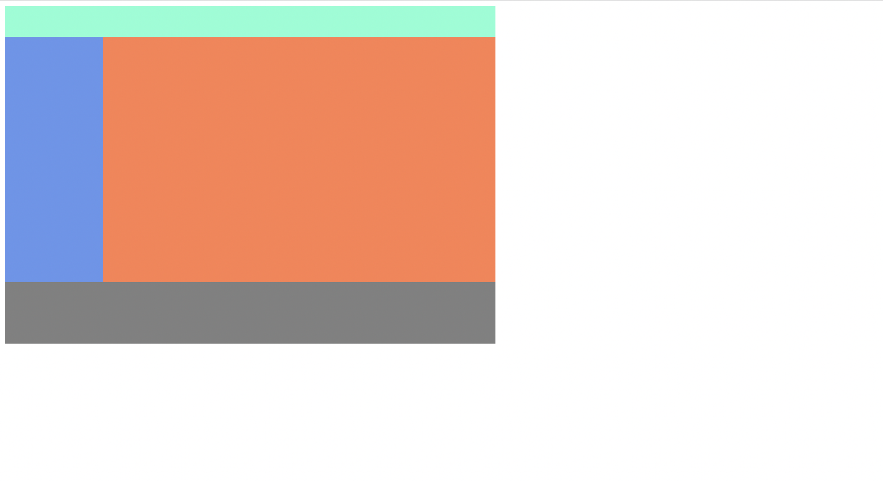
<div class="container">
        <div class="header"></div>
        <div class="left-menu"></div>
        <div class="content"></div>
        <div class="footer"></div>
    </div>
각각의 박스를 하나의 박스 안에 담아 표현.
.container{
    width: 800px;
}

.header{
    width: 100%;
    height: 50px;
    background-color: aquamarine;
}

.left-menu{
    width: 20%;
    height: 400px;
    background-color: cornflowerblue;
    float: left;
}

.content{
    width: 80%;
    height: 400px;
    background: coral;
    float: right;
}

.footer{
    width: 100%;
    height: 100px;
    background-color: grey;
    clear: both;
}
요소를 공중에 띄워 왼쪽/오른쪽 정렬하는 float 속성을 사용하여
한 줄에 두개의 박스를 표현.
float를 쓰고 나면 항상 clear 속성이 필요. (공중에 띄어져 표현되므로 다음 박스가 가려져버림)
-> clear: both로 float을 사용함으로써 나타나는 오류를 바로 잡음.
참고로 float : none 이것도 추가해주는게 나중에 생길 버그예방차원에서도 좋을 수 있다.
++ %단위를 사용하여 상대적인 크기를 나타낼 수 있다. (부모태그 기준)