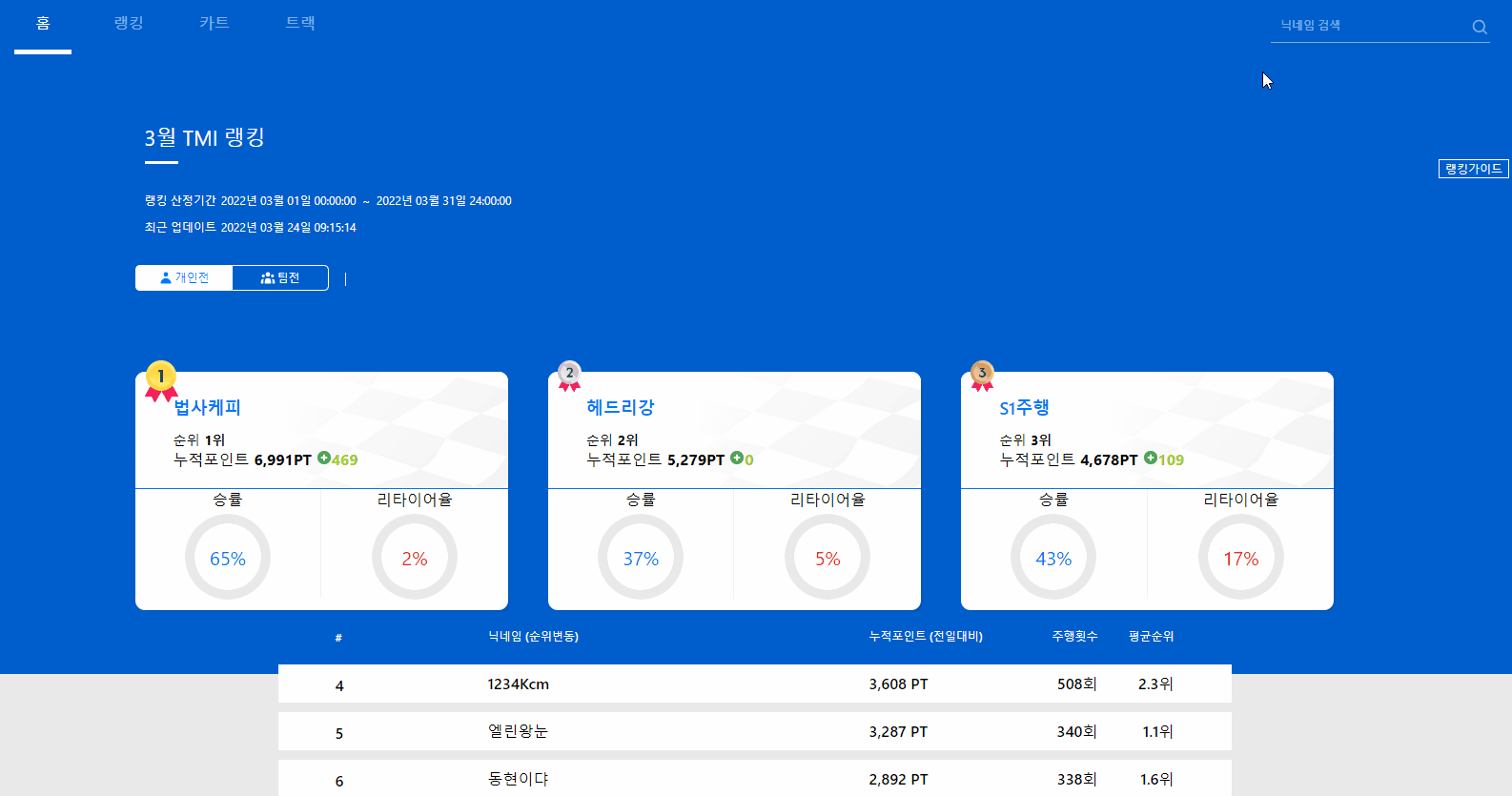
애니메이션
CSS 애니메이션을 통해 사용자에게 강한 인상을 줄 수 있으며 때로는 자연스러운 애니메이션을 통해 이질적인 느낌을 없앨 수 있습니다.
@keyframes
@keyframes 애니메이션 이름 {
	from {
    	css 속성: 속성 값;
    }

    원하는 num 값% {
    	css 속성: 속성 값;
    }

    60% {
    	transform: rotate(200deg);
    }

    to {
    	css 속성: 속성 값;
    }
}
애니메이션 속성
selector(클래스,id 등등) {
	animation: 애니메이션 이름;
    animation-duration: 지정할 시간; /*0s는 애니메이션 작동X*/
    animation-delay: 지정할 시간;
    animation-direction: (noraml, reverse, alternate, alternate-reverse);
}
예시
이미지 애니메이션
const daoAction = keyframes`
  0%{
    top: 50px;
    opacity: 0;
  }
  50%{
    top: 100px;
  }
  100%{
    top:70px
    opacity:1;
  }
`;

const bazzieAction = keyframes`
  0%{
    top: 165px;
    opacity:0;
  }
  50%{
    top: 130px;
  }
  100%{
    top:154px
    opacity:1;
  }
`;
로딩 애니메이션
import React from "react";
import styled, { keyframes } from "styled-components";

export default function Loading() {
  return (
    <Load>
      <svg>
        <circle cx="70" cy="70" r="70"></circle>
      </svg>
    </Load>
  );
}

const rotate = keyframes`
  0%{
    transform: rotate(0deg);
  }
  100%{
    transform: rotate(360deg)
  }
`;

const animate = keyframes`
  0%,100%{
    stroke-dashoffset: 440;
  }
  50%{
    stroke-dashoffset: 0;
  }
  50.1%{
    stroke-dashoffset: 880;
  }
`;

const Load = styled.div`
  display: flex;
  justify-content: center;
  align-items: center;
  min-height: 100vh;

  & svg {
    position: relative;
    width: 150px;
    height: 150px;
    animation: ${rotate} 2s linear infinite;

    & circle {
      width: 100%;
      height: 100%;
      fill: none;
      stroke-width: 10;
      stroke: #07f;
      stroke-linecap: round;
      transform: translate(5px, 5px);
      stroke-dasharray: 440;
      stroke-dashoffset: 440;
      animation: ${animate} 4s linear infinite;
    }
  }
`;

🐣차근차근 무럭무럭🐣