CSS 3 is the latest evolution of CSS, where we've added new properties and new features so that we can make our design even better.
img{
	width: 450px;
	height: 300px;
	margin: 10px;
	transition: all 1s;
}
img:hover {
	transform: scale(1.1);
/*style.css*/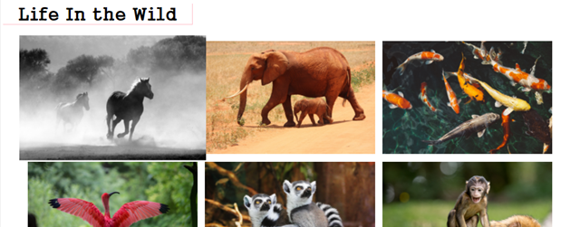
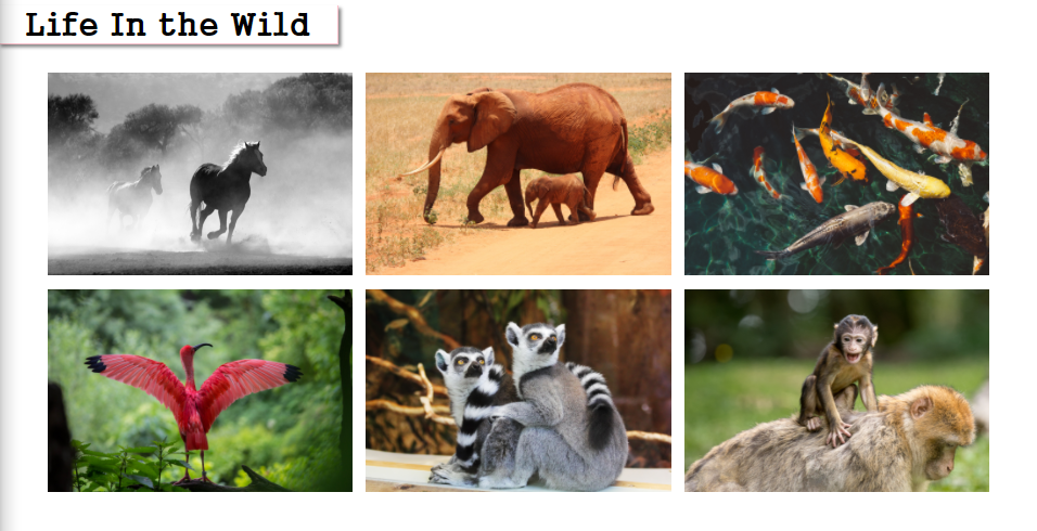
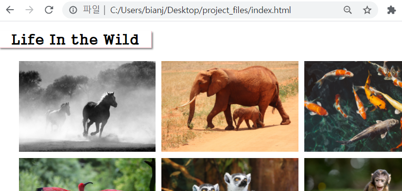
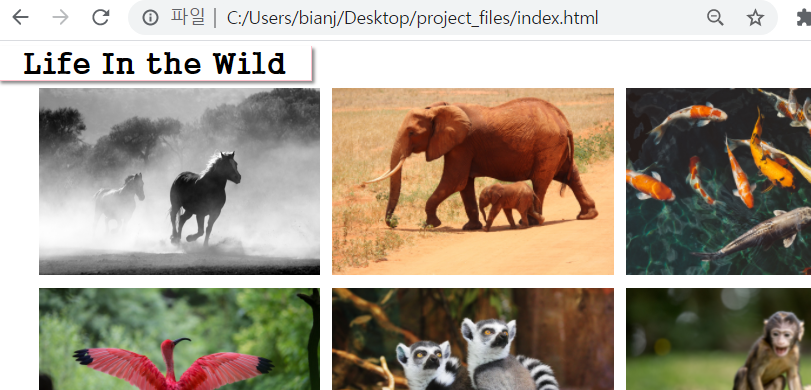
Images are now moving on hover.
img{
	width: 450px;
	height: 300px;
	margin: 10px;
	transition: all 4s;
}
it takes four seconds for the image to scale.
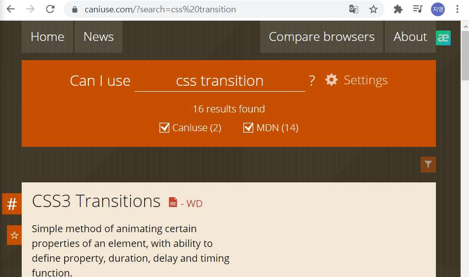
지원브라우저(CSS Browser Support Reference)
https://www.w3schools.com/cssref/css3_browsersupport.asp
a box ShadowStats, that means kind of making this look 3D and having
h1 {
	font-family: cursive;
	font-size: 3em;
	border-bottom: 2px solid pink;
	border-right: 2px solid pink;
	width: 500px;
	text-align: center;
	box-shadow: 4px 4px 5px #888888;
}
/*style.css*/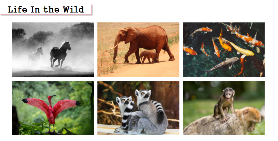
-moz-box-shadow:4px 4px 5px #888888;In h1 css property, this makes sure that it works on the Mozilla browser.
mozila
-moz-box-shadow:4px 4px 5px #888888;
explorer
-ms-box-shadow:4px 4px 5px #888888;
safari chrome
-webkit-box-shadow:4px 4px 5px #888888;
opera browser
-o-box-shadow:4px 4px 5px #888888;
Go back to the index page,
css h1에서 추가 margin: 0px;
margin 이 변했음.
body{
	margin:0px;
}/*style.css*/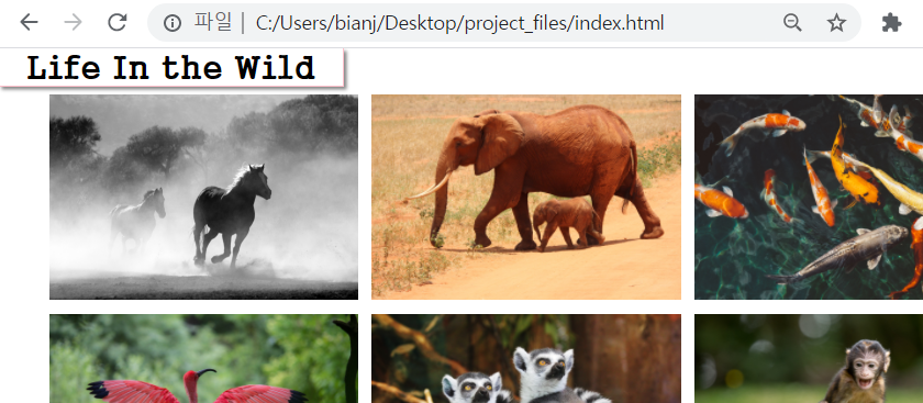
h1 {
	font-family: cursive;
	font-size: 3em;
	border-bottom: 2px solid pink;
	border-right: 2px solid pink;
	width: 500px;
	text-align: center;
	-moz-box-shadow:4px 4px 5px #888888;
	-ms-box-shadow:4px 4px 5px #888888;
	-webkit-box-shadow:4px 4px 5px #888888;
	-o-box-shadow:4px 4px 5px #888888;
	box-shadow: 4px 4px 5px #888888;
	margin-top: 10px;
}
margin-top:10px;