
스타일드 컴포넌트(Styled Components)
자바스크립트 파일 안에서 스타일을 작성할 수 있게 해주는 CSS-in-JS 라이브러리이다. 컴포넌트 단위로 스타일을 작성할 수 있어서 관리가 훨씬 편해진다.
스타일드 컴포넌트 설치
스타일드 컴포넌트는 추가 라이브러리임으로 아래 명령어를 통해 설치하고 import 해줘야 한다.
npm install styled-components // 설치
import styled from 'styled-component' // import
스타일드 컴포넌트에서 Emmet을 사용하려면 확장 프로그램을 설치하면 된다.
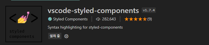
Emmet은 CS의 작성시간을 단축시켜주는 에디터 확장기능이다. 자동완성 기능이 포함되어있다.
기본적인 사용법
import React from 'react';
import styled from 'styled-components';

const Circle = styled.div`
  width: 5rem;
  height: 5rem;
  background: black;
  border-radius: 50%;
`;

function App() {
  return <Circle />;
}

export default App;
템플릿 리터럴을 사용한다.
div태그 스타일링하고 Circle에 저장하고 컴포넌트 처럼 사용했다. 기본적인 패턴이다 스타일링 할 태그를 바꾸고 싶으면 style. 뒤 태그를 변경해주면 된다.
props도 넘길 수 있다.
import React from 'react';
import styled from 'styled-components';

const Circle = styled.div`
  width: 5rem;
  height: 5rem;
  background: ${props => props.color || `black`};
  border-radius: 50%;
`;

function App() {
  return <Circle color='blue'/>;
}

export default App;
color props를 받아 조건부로 사용했다. props가 있다면 받아온 컬러를 배경으로 아니면 검은색을 배경으로 나오게한다.
import React from 'react';
import styled, { css } from 'styled-components';

const Circle = styled.div`
  width: 5rem;
  height: 5rem;
  background: ${props => props.color || 'black'};
  border-radius: 50%;
  ${props =>
    props.huge &&
    css`
      width: 10rem;
      height: 10rem;
    `}
`;

function App() {
  return <Circle color="red" huge />;
}

export default App;
huge키워드가 있으면 조건부로 새로운 css를 추가한다. 이땐 css로 import해와야한다. 여러줄의 코드를 조건부로 설정할 때 사용한다. 해당 기능을 이용해서...
import styled,  {css} from 'styled-components';

const whiteText = css`
    color: #fff;
    font-size: 14px;
`;

const MyBoldTextComponent = styled.Text`
    ${whiteText}
    font-weight: 600
`;

const MyLightTextComponent = styled.Text`
    ${whiteText}
    font-weight: 200
`;
...공통부분을 저장해서 사용할 수 있다.
상속도 가능하다.
const Box = styled.div`
  width: 100px;
  height: 100px;
  background-color: ${(props) => props.bgColor};
`;

const Circle = styled(Box)`
  border-radius: 50%;
`;
Box 스타일에 radius를 추가하는 circle을 만들었다.
애니메이션 & 가상선택자
import styled,{keyframes} from "styled-components";
const animation = keyframes`
	// 일반 css처럼 쓰면 됨
`;
const Box = styled.div`
  width: 100px;
  height: 100px;
  background-color: red;
  animation: ${animation} 5s linear infinite;
`;
keyframes을 import하고 css를 작성해 변수에 저장한 뒤 스타일드 컴포넌트에 넣으면 된다.
import styled from "styled-components";
const Child = styled.div`
  width:50px;
  height:50px;
  background:#fff;
`;
const Parent = styled.div`
  width:300px;
  height:300px;
  background:#eee;

  &:hover ${Child}{
  background:#000;
  } // parent에 hover했을 때 자식요소에 작용
`;
&는 Sass의 부모 선택 참조자인데, 위 예제의 경우 Parent를 참조한다.(this처럼 생각하면 편하다.) 그리고 그 하위의 Child 스타일 컴포넌트를 다시 참조한 예제이다.
import styled from 'styled-components';

const Title = styled.div`
  color: darkolivegreen;

  h1 {
    font-size: 30px;
    margin: 0 0 10px 0;
  }
`;

const Notice = styled.div`
  padding: 20px;
  border: 2px solid #aaa;

  ${Title}:hover {
    color: crimson;
  }
`;

const Button = styled.button`
  display: block;
  padding: 6px 10px;
  color: #fff;
  font-size: 18px;
  border-radius: 3px;
  background-color: crimson;
  border: 0;

	&:hover {
    background-color: teal;
  }
`;
다른 컴포넌트뿐만 아니라 태그도 하위에 작성할 수 있다.(Title 안에 h1)
Button 컴포넌트 안의 &는 Button을 참조하는 것.
테마 적용하기
ThemeProvider를 이용해서 테마를 적용할 수 있다.
/* index.js */

import React from 'react';
import ReactDOM from 'react-dom';
import { ThemeProvider } from 'styled-components';
import App from './App';

const darkTheme = {
  textColor: 'whitesmoke',
  backgroundColor: '#111'
};

const lightTheme = {
  textColor: '#111',
  backgroundColor: 'whitesmoke'
};

ReactDOM.render(
  <React.StrictMode>
    <ThemeProvider Theme={darkTheme}>
      <App />
    </ThemeProvider>
  </React.StrictMode>,
  document.getElementById('root')
);
ThemeProvider가 App을 감싸고 있어서 dartTheme, lightTheme에 접근할 수 있다.
const Title = styled.div`
  color: ${(props) => props.theme.textColor};
`;

const Notice = styled.div`
  background-color: ${(props) => props.theme.backgroundColor};
`;
컴포넌트 단위에서 따로 props를 받는게 아니라 styled 자체가 받아온다고 생각하면 된다.
공통 CSS 적용하기
css 초기화 또는 통일화를 위해 reset.css나 normalize.css를 스타일드 컴포넌트에서도 제공한다.
/* GlobalStyle.js */

import { createGlobalStyle } from 'styled-components';
import Normalize from 'styled-normalize';

const GlobalStyle = createGlobalStyle`
  ${Normalize}; // Normalize를 넣고

  * {
    margin: 0;
    padding: 0;
  }

  body {
    background-color: #f0f0f0;
  }
`;

export default GlobalStyle;
전역으로 사용될 스타일 export 한뒤 상위 컴포넌트에 위치시킨다.
/* index.js */
import GlobalStyle from './GlobalStyle';

...
ReactDOM.render(
  <React.StrictMode>
    <GlobalStyle />
    <ThemeProvider theme={pastelTheme}>
      <App />
    </ThemeProvider>
  </React.StrictMode>,
  document.getElementById('root')
);
...
생각해보기
css파일을 따로 분리하지 않아도 되는 것이 큰 장점으로 느껴진다. 아토믹 디자인 패턴과도 궁합이 좋아보인다. 컴포넌트를 원자단위로 나누면서 거기서 스타일링을 해도되고 원자들을 모아놓은 곳에서 스타일링을 해도되고 고민해서 최대한 보기 좋고 깔끔하게 코드를 짜도록 해봐야겠다.
참조
