Flutter ch 1.Column
이제 모든 준비가 끝났으므로 하나씩 공부를 해 보려고 한다ㅎㅎ 얼마나 많은 시간이 걸릴지 내가 주어진 시간에 얼마나 이해를 빨리 할지는 아무도 모르지만 일단 되는대로 노력 해 보기로 ㅠㅠ!
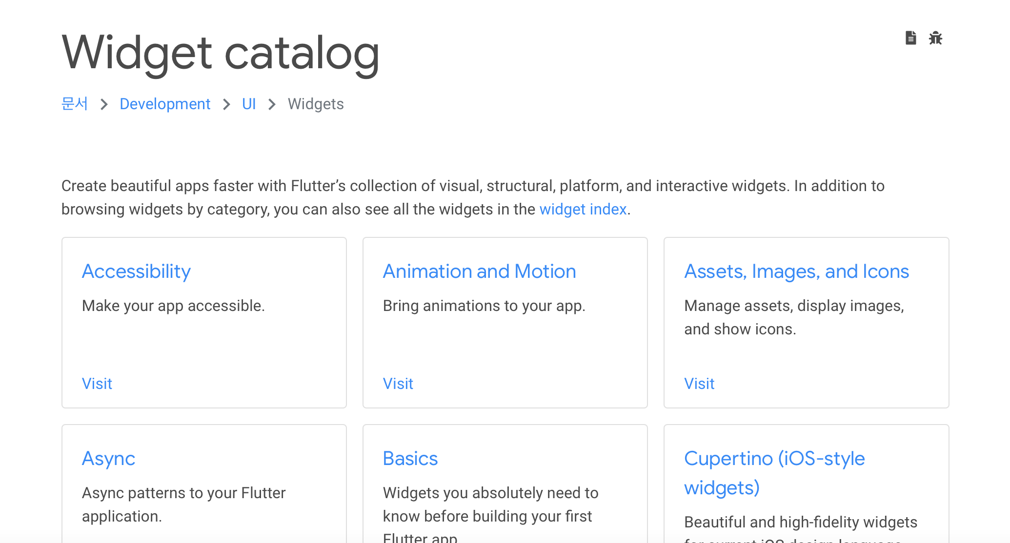
역시 리액트와 비슷하게 사이트에 어떤 위젯이나 어떤방법으로 사용하면 좋을지에 대한 가이드들이 많이 나와있다.
이 많은 위젯들을 다 익힐려면 물론 시간이 걸리겠지만 하나하나 뽀게는게 내 목표ㅎ_ㅎ
컬럼에 들어가기 전에 정말 기초적으로 flutter에 대한 강의는
https://www.youtube.com/watch?v=G859WRJypuk&list=PL93mKxaRDidGqIewEULPeKMJRcWD9KRrn
이 동영상을 보면서 익혔다!
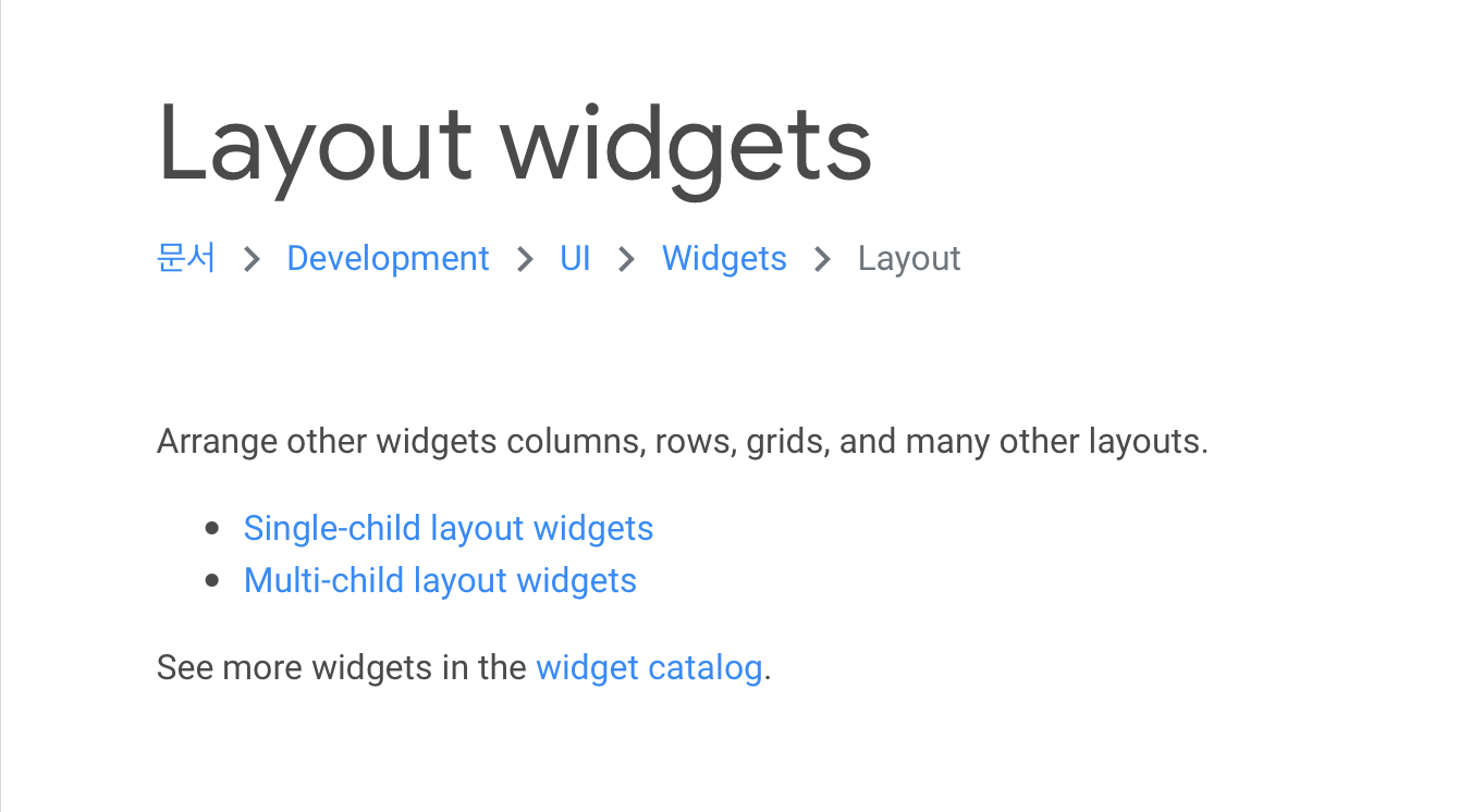
이렇게 layout에 들어가면 어떤 종류의 layout을 사용할수 있는지 그리고 간단한 4분짜리 동영상들이 있었다.
1. Container
body: Container(
   color: Colors.orange,
), 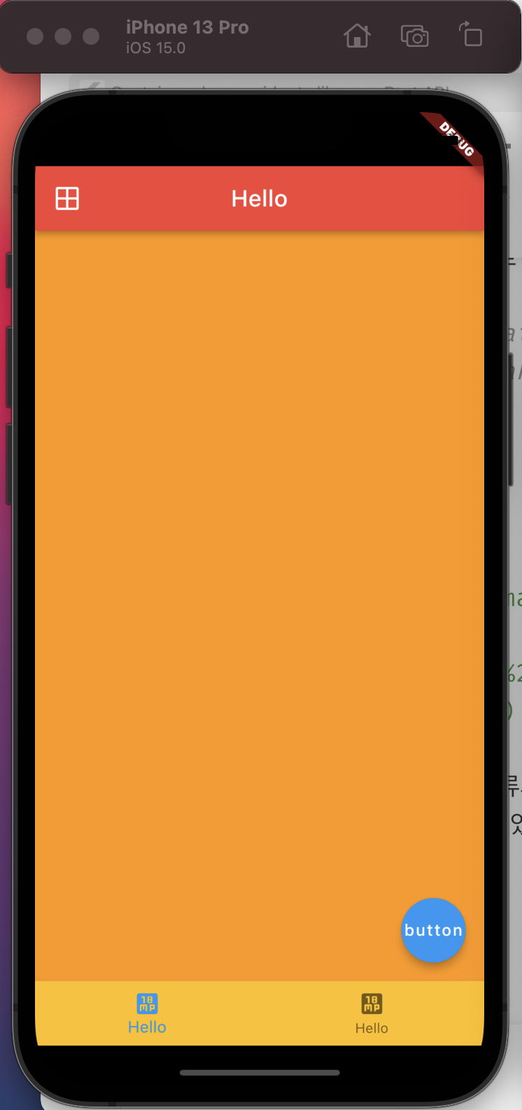
사진에서 보면 알다시피 컨테이너는 오렌지 색깔로 나타나 있는 저 부분을 뜻한다.
body: Column(
   children: [
     Container(
       color: Colors.orange,
       height: 50,
     ),
     Container(
       color: Colors.green,
       height: 50,
     ),
   ],
),
이렇게 자식요소를 넣게 되면
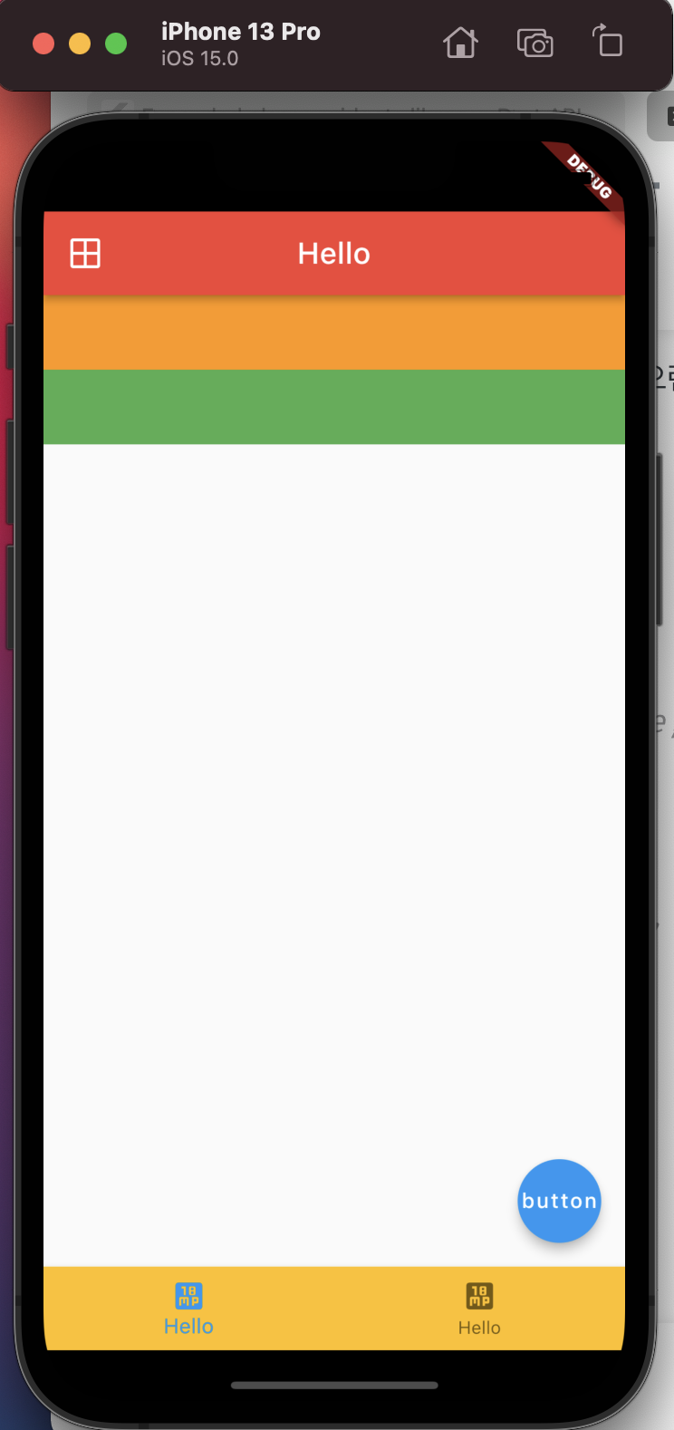
이런식으로 나타낼수 있다.
body: Column(
   children: [
       Expanded(
         //남는공간 체우기
         child: Container(
           color: Colors.orange,
           height: 50,
         ),
       ),
       Container(
           color: Colors.green,
           height: 50,
       ),
   ],
), 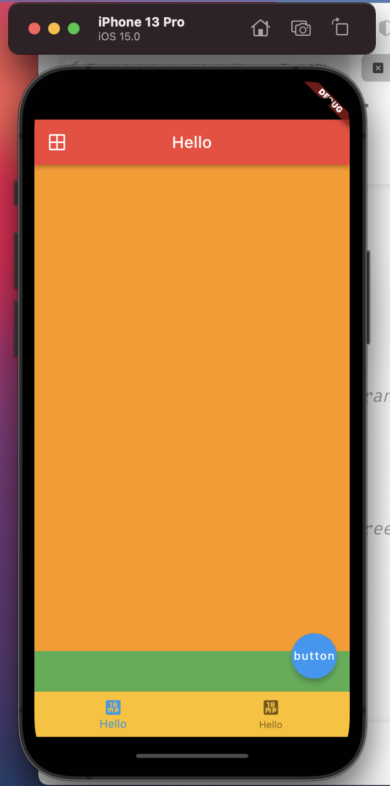
또한 밑의 초록 상자를 기준으로 남는 부분을 오렌지 색으로 꽉 체우는 것도 가능하다!
샘플만들어 보기
어느정도 이해가 된다면 flutter 사이트에 나와있는 예제들을 만들어보기로 하자!
나는 사진부분을 제외한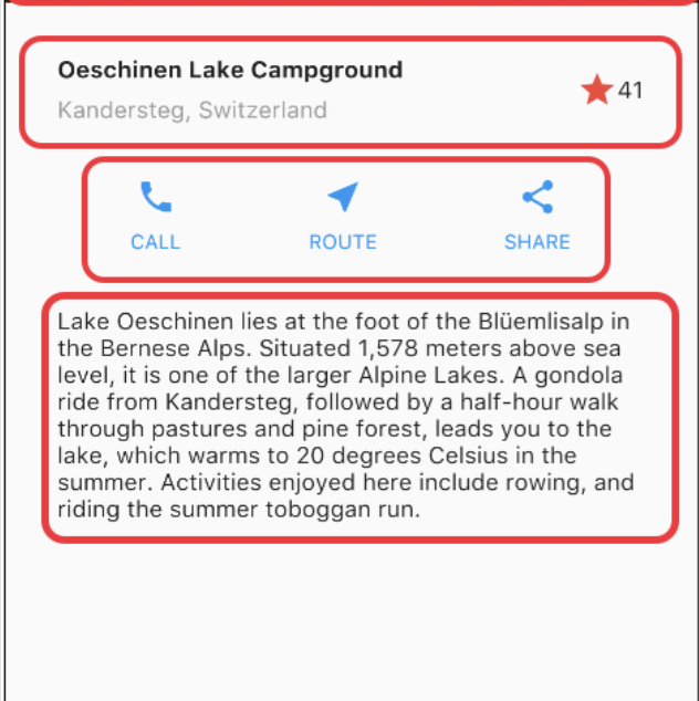
요 부분을 만들어 보기로ㅎㅎ
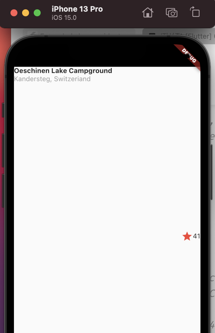
body: Container(
                 child: Row(
                   children:[
                     Expanded(
                      child:Column(
                        crossAxisAlignment: CrossAxisAlignment.start,
                        // mainAxisSize: MainAxisSize.min,
                        children:  [
                            Text('Oeschinen Lake Campground',
                              style: TextStyle(
                                  fontWeight: FontWeight.bold,
                              ),
                            ),
                          Text('Kandersteg, Switzeriand',
                            style: TextStyle(
                                color: Colors.grey
                            ),),
                        ],
                      )
                     ),
                     Icon(Icons.star,
                     color:Colors.red
                     ),
                     Text('41')
                   ],
                 ),
                 ),
처음 이렇게 만들었을때 아이콘이 자꾸 중앙에 위치해 있었다.
해결법을 찾기 위해서 하나하나 사이즈를 보다가
mainAxisSize: MainAxisSize.min
이걸 써서 해결할수 있었다! 세로 사이즈를 최소로 하기
Widget buttonSection = Container(
    child: Row(
      mainAxisAlignment:MainAxisAlignment.spaceEvenly,
      children: [
        Column(
          children: const [
            Icon(Icons.call,
              color: Colors.blue,
            ),
            Text('CALL',
                style: TextStyle(
                  color: Colors.blue,
                  fontWeight: FontWeight.bold
                )
            )
          ],
        ),
        Column(
          children: const [
            Icon(Icons.near_me,
              color: Colors.blue,
            ),
            Text('ROUTE',
                style: TextStyle(
                    color: Colors.blue,
                    fontWeight: FontWeight.bold
                )
            )
          ],
        ),
        Column(
          children: const [
            Icon(Icons.share,
              color: Colors.blue,
            ),
            Text('SHARE',
                style: TextStyle(
                    color: Colors.blue,
                    fontWeight: FontWeight.bold
                )
            )
          ],
        )
      ],
    )
);
아이콘파트는 이렇게 하나하나 컬럼을 쓰면서 하긴했는데 공식사이트에 보니까 좀 더 간편한 방법이 있었다!
보면서 하기 보다는 스스로 먼저 해보고 공식사이트를 보고 더 쉬운 방법을 찾아가는게 공부하는데 더 도움이 되는거 같다ㅎㅎ
class MyApp extends StatelessWidget {
  const MyApp({Key? key}) : super(key: key);

  @override
  Widget build(BuildContext context) {
    // ···
  }

  Column _buildButtonColumn(Color color, IconData icon, String label) {
    return Column(
      mainAxisSize: MainAxisSize.min,
      mainAxisAlignment: MainAxisAlignment.center,
      children: [
        Icon(icon, color: color),
        Container(
          margin: const EdgeInsets.only(top: 8),
          child: Text(
            label,
            style: TextStyle(
              fontSize: 12,
              fontWeight: FontWeight.w400,
              color: color,
            ),
          ),
        ),
      ],
    );
  }
}

Color color = Theme.of(context).primaryColor;

Widget buttonSection = Row(
  mainAxisAlignment: MainAxisAlignment.spaceEvenly,
  children: [
    _buildButtonColumn(color, Icons.call, 'CALL'),
    _buildButtonColumn(color, Icons.near_me, 'ROUTE'),
    _buildButtonColumn(color, Icons.share, 'SHARE'),
  ],
);
이렇게 하면 훨씬 깔끔하게 코드작성이 가능한거 같다 ㅎㅎ
패딩값이나 스타일 수정이 필요하지만 레이아웃 작성을 이렇게 완료했다!
꾸준히 하다보면 저도 잘 하는 날이 오겠죠?ㅠㅠ