1. 인증 후 메인 화면
- Stack Navigator 안에 Tab Navigator 가 포함되도록 작성
import React, { useContext } from 'react';
import { createStackNavigator } from '@react-navigation/stack';
import { Channel, ChannelCreation } from '../screens';
import { ThemeContext } from 'styled-components/native';
import Home from './Home';
export type MainStackParamList = {
Channel: undefined;
ChannelCreation: undefined;
Home: undefined;
};
const Stack = createStackNavigator<MainStackParamList>();
const Main = () => {
const theme = useContext(ThemeContext);
return (
<Stack.Navigator
screenOptions={{
headerTitleAlign: 'center',
headerTintColor: theme.text,
headerBackTitleVisible: false,
cardStyle: { backgroundColor: theme.background },
}}
>
<Stack.Screen name="Home" component={Home} />
<Stack.Screen name="Channel" component={Channel} />
<Stack.Screen name="ChannelCreation" component={ChannelCreation} />
</Stack.Navigator>
);
};
export default Main;
import React from 'react';
import { createBottomTabNavigator } from '@react-navigation/bottom-tabs';
import { ChannelList, Profile } from '../screens';
export type MainTabParamList = {
List: undefined;
Profile: { user: object };
};
const Tab = createBottomTabNavigator<MainTabParamList>();
const Home = () => {
return (
<Tab.Navigator screenOptions={{ headerShown: false }}>
<Tab.Screen name="List" component={ChannelList} />
<Tab.Screen name="Profile" component={Profile} />
</Tab.Navigator>
);
};
export default Home;
2. 탭 버튼과 헤더 타이틀
- expo 의 materialIcons 활용
- screen의 focused props활용
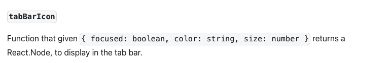
- tabBarIcon 의 활용법 주의 : React.Node를 리턴해야 한다.
- getFocusedRouteNameFromRoute : 현재 선택한 화면의 Name
import { getFocusedRouteNameFromRoute } from '@react-navigation/native';
const TabIcon = ({ name, focused }: { name; focused: boolean }) => {
const theme: themeType = useContext(ThemeContext);
return (
<MaterialIcons
name={name}
size={26}
color={focused ? theme.tabBtnActive : theme.tabBtnInActive}
/>
);
};
const Home = ({ navigation, route }) => {
useEffect(() => {
const screenName = getFocusedRouteNameFromRoute(route) || 'List';
navigation.setOptions({
headerTitle: screenName,
});
});
return (
<Tab.Navigator screenOptions={{ headerShown: false }}>
<Tab.Screen
name="List"
component={ChannelList}
options={{
tabBarIcon: ({ focused }) =>
TabIcon({
name: focused ? 'chat-bubble' : 'chat-bubble-outline',
focused,
}),
}}
/>
<Tab.Screen
name="Profile"
component={Profile}
options={{
tabBarIcon: ({ focused }) =>
TabIcon({
name: focused ? 'person' : 'person-outline',
focused,
}),
}}
/>
</Tab.Navigator>
);
};
export default Home;
3. 프로필 화면
- 현재 로그인한 유저의 로그인 정보를 가져오는 함수를 작성하여 로그인 정보를 불러온뒤 랜더링 한다.
- 불러온 정보 중 일부는 수정이 불가능하게끔 TextInput 컴포넌트의 editable 속성을 사용한다. 이에 어울리게끔 CSS도 수정한다.
export const getCurrentUser = () => {
const { uid, displayName, email, photoURL } = Auth.currentUser;
return { uid, name: displayName, email, photo: photoURL };
};
export default function Profile({ navigation }: Props) {
const { setUser } = useContext(UserContext);
const theme = useContext(ThemeContext);
const user = getCurrentUser();
const [photo, setPhoto] = useState(user.photo);
const { spinner } = useContext(ProgressContext);
const _handlePhotoChange = async (url: string) => {
try {
spinner.start();
const photoURL = await updateUserInfo(url);
setPhoto(photoURL);
} catch (e) {
Alert.alert('Photo upload Error');
} finally {
spinner.stop();
}
};
return (
<Container>
<Image url={photo} onChanePhoto={_handlePhotoChange} showButton />
<Input label="Name" value={user.name} disabled />
<Input label="Email" value={user.email} disabled />
<Button
title="Logout"
onPress={async () => {
try {
spinner.start();
await signout();
} catch (e) {
} finally {
setUser({ uid: null });
spinner.stop();
}
}}
containerStyle={{ backgroundColor: theme.btnSignout }}
/>
</Container>
);
}
const StyledInput = styled.TextInput.attrs<styledPropsType>(({ theme }) => ({
placeholderTextColor: theme.inputPlaceholder,
}))<styledPropsType>`
width: 100%;
background-color: ${({ theme, editable }) =>
editable ? theme.inputBackground : theme.inputDisabled}; // ⭐️⭐️⭐️⭐️⭐️
color: ${({ theme }) => theme.text};
padding: 20px 10px;
font-size: 16px;
border: 1px solid
${({ theme, isFocused }) => (isFocused ? theme.text : theme.inputBorder)};
border-radius: 4px;
`;
const Input = forwardRef<TextInput, props>(
(
{
label,
value,
onChangeText,
onSubmitEditing,
onBlur,
placeholder,
returnKeyType,
maxLength,
isPassword,
disabled,
},
ref,
) => {
const [isFocused, SetIsFocused] = useState(false);
return (
<Container>
<Label isFocused={isFocused}>{label}</Label>
<StyledInput
ref={ref}
value={value}
onChangeText={onChangeText}
onSubmitEditing={onSubmitEditing}
onBlur={() => {
SetIsFocused(false);
onBlur;
}}
placeholder={placeholder}
returnKeyType={returnKeyType}
maxLength={maxLength}
autoCapitalize="none"
autoCorrect={false}
isFocused={isFocused}
onFocus={() => SetIsFocused(true)}
secureTextEntry={isPassword}
editable={!disabled}
/>
</Container>
);
},
);
export default Input;
- 유저 정보중 프로필 이미지만 수정하도록 한다.
- 이미지 업로드 버튼 클릭
- Image 컴포넌트의 _handlePhotoBtnPress 함수 동작
ImagePicker 동작, 이미지 업로드 url 반환
- _handlePhotoBtnPress 함수 내의 onChangePhoto 함수 동작
- Profile 컴포넌트의 onChangePhoto props로 _handlePhotoChange 함수 전달
- _handlePhotoChange 함수 내에 유저 정보 업데이트 함수 작동
- 유저 정보 업데이트 함수는 updateUserInfo(firebase.tsx)에 작성
- updateUserInfo 에서 firebase storage에 사진 정보를 저장하고 저장한 사진 url 주소를 반환하여 유저정보 업데이트
const _handlePhotoChange = async (url: string) => {
try {
spinner.start();
const photoURL = await updateUserInfo(url);
setPhoto(photoURL);
} catch (e) {
Alert.alert('Photo upload Error');
} finally {
spinner.stop();
}
};
return (
<Container>
<Image url={photo} onChanePhoto={_handlePhotoChange} showButton />
<Input label="Name" value={user.name} disabled />
<Input label="Email" value={user.email} disabled />
export const updateUserInfo = async (photo: string) => {
const photoURL = await uploadImage(photo);
await updateProfile(Auth.currentUser, { photoURL });
return photoURL;
};
import React, { useState } from 'react';
import styled from 'styled-components/native';
import { themeType } from '../theme';
import { MaterialIcons } from '@expo/vector-icons';
import * as ImagePicker from 'expo-image-picker';
const Container = styled.View`
margin-bottom: 30px;
`;
interface styledPropsType {
theme: themeType;
}
const ProfileImage = styled.Image<styledPropsType>`
background-color: ${({ theme }) => theme.imgBackground};
width: 100px;
height: 100px;
border-radius: 50px;
`;
const ButtonConatiner = styled.TouchableOpacity<styledPropsType>`
background-color: ${({ theme }) => theme.imgBtnBackground};
position: absolute;
bottom: 0;
right: 0;
width: 30px;
height: 30px;
border-radius: 15px;
justify-content: center;
align-items: center;
`;
const ButtonIcon = styled(MaterialIcons).attrs<styledPropsType>(
({ theme }) => ({
name: 'photo-camera',
size: 22,
color: theme.imgBtnIcon,
}),
)``;
const PhotoButton = ({ onPress }: { onPress: () => void }) => {
return (
<ButtonConatiner onPress={onPress}>
<ButtonIcon></ButtonIcon>
</ButtonConatiner>
);
};
interface PropsType {
url?: string;
showButton?: boolean;
onChanePhoto: (text: string) => void;
}
const Image = ({ url, showButton = false, onChanePhoto }: PropsType) => {
const _handlePhotoBtnPress = async () => {
let result = await ImagePicker.launchImageLibraryAsync({
mediaTypes: ImagePicker.MediaTypeOptions.Images,
allowsEditing: true,
aspect: [4, 3],
quality: 1,
});
console.log(result);
if (!result.cancelled) {
onChanePhoto(result['uri']);
}
};
return (
<Container>
<ProfileImage source={{ uri: url }} resizeMode="contain" />
{showButton && <PhotoButton onPress={_handlePhotoBtnPress} />}
</Container>
);
};
export default Image;
