Pie Chart
이번에는 데이터 시각화 중 가장 많이 사용하는 pie chart에 대하여 정리하였다.
info.
원을 부채꼴로 분할하여 표현하는 통계차트로
전체를 백분위로 나타낼 때 유용하다.
단점
- bar plot등에 비해 구체적인 양의 비교 어려움
- 유용성 떨어짐
-> 단독 말고 다른 plot과 같이 쓰자
종류
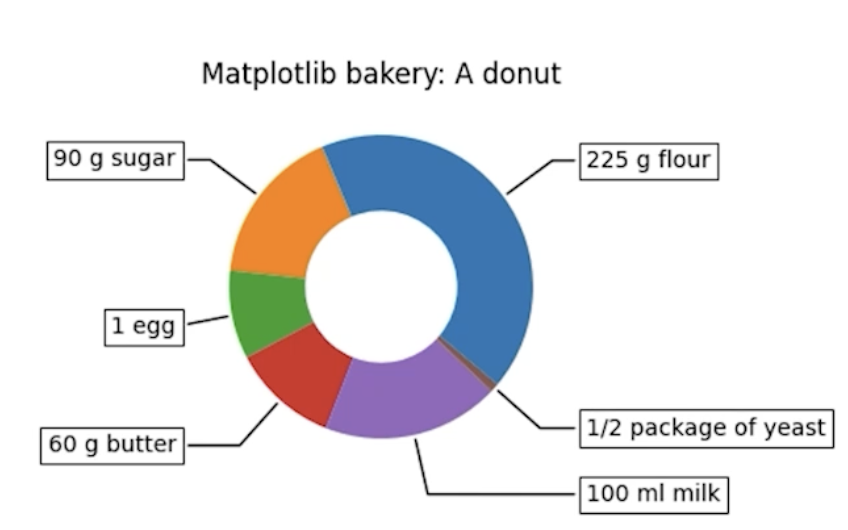
Donut Chart
- 중간이 비어있는 Pie chart
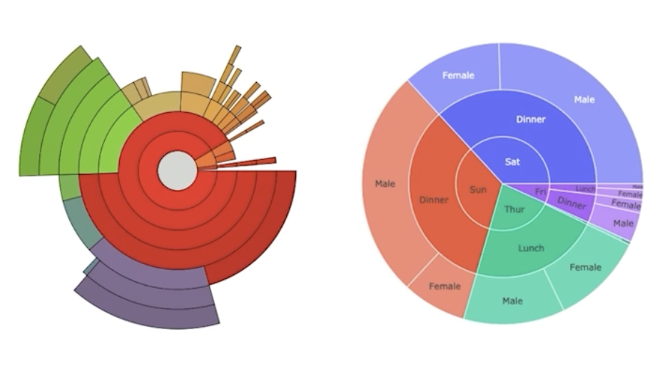
Sunburst Chart
- Sunburst(햇살)을 닮은 차트
- 계층적 데이터를 시각화하는데 사용
- 크게 추천하지는 않으며 Treemap 추천한다.
코드
Pie Chart
기본적인 코드는 아래와 같다.
fig, ax = plt.subplots(1, 1, figsize=(7, 7))
ax.pie(data,labels=['A','B','C'])
plt.show()- startangle : 시작 각도 설정
fig, ax = plt.subplots(1, 1, figsize=(7, 7))
ax.pie(data,labels=['A','B','C','D'],startanle=90)
plt.show()
- explode : 원하는 부분 강조하기 위해 한 부분만 떨어져 나오게 하는 설정
fig, ax = plt.subplots(1, 1, figsize=(7, 7))
explode = [0, 0, 0.2, 0] # 얼마나 튀어나갈 것인가

ax.pie(data, labels=labels, explode=explode, startangle=90,textprops={'color':'w'})
plt.show()
- shadow : 그림자 설정
fig, ax = plt.subplots(1, 1, figsize=(7, 7))
explode = [0, 0, 0.2, 0] # 얼마나 튀어나갈 것인가

ax.pie(data, labels=labels, explode=explode, startangle=90,textprops={'color':'w'},
shadow=True)
plt.show()- autopot : 전체 비율을 %로 나타내준다.
fig, ax = plt.subplots(1, 1, figsize=(7, 7))
explode = [0, 0, 0.2, 0]

ax.pie(data, labels=labels, explode=explode, startangle=90,
      shadow=True, autopct='%1.1f%%',textprops={'color':'w'})
plt.show()
- labeldistance & rotatelabels
label과 plot의 거리를 조절해주고 label의 각도 조절을 해준다.
fig, ax = plt.subplots(1, 1, figsize=(7, 7))
explode = [0, 0, 0.2, 0]

ax.pie(data, labels=labels, explode=explode, startangle=90,
      shadow=True, autopct='%1.1f%%',textprops={'color':'w'},
      labeldistance=1.5, rotatelabels=90)
plt.show()- counterclock : 시계순서로 그리는 설정
파라미터를
counterclock=True
로 설정하면 된다. - radius : pie char의 크기 설정
radius = 1 또는 0.8 등등 숫자
로 설정하면 된다.
Donut Chart
fig, ax = plt.subplots(1, 1, figsize=(7, 7))


ax.pie(data, labels=labels, startangle=90,
      shadow=True, autopct='%1.1f%%')

# 좌표 0, 0, r=0.7, facecolor='white'
centre_circle = plt.Circle((0,0),0.70,fc='white')
ax.add_artist(centre_circle)

plt.show()
-> 중간에 흰원이 추가된 chart가 나온다.
- pctdistance : 퍼센트 텍스트 거리 조절
fig, ax = plt.subplots(1, 1, figsize=(7, 7))


ax.pie(data, labels=labels, startangle=90,
      shadow=True, autopct='%1.1f%%')

# 좌표 0, 0, r=0.7, facecolor='white'
centre_circle = plt.Circle((0,0),0.70,fc='white')
ax.add_artist(centre_circle)

plt.show()
위의 그래프에서 pctdistance를 0.85로 지정하였는데
이는 0.7과 1 사이이기 때문에 그래프 가운데에 그려진다.


나는야 호기심 많은 느림보🤖