✨transition
- 요소의 속성 변화를 부드럽게 애니메이션화하는 데 사용된다.
- 변화가 발생하는 속성과 시간, 타이밍 함수, 지연 시간 등을 설정할 수 있다.
transition-property
- 애니메이션을 적용할 속성을 지정한다. 여러 속성을 동시에 애니메이션화할 수 있다.
transition-duration
- 애니메이션의 지속 시간을 지정한다. 단위는 초 또는 밀리초다.
transition-timing-function
- 애니메이션의 속도 변화 패턴을 지정한다. ease, linear, ease-in, ease-out, ease-in-out 등의 값을 가질 수 있다.
https://easings.net/
transition-delay
- 애니메이션 시작 전의 지연 시간을 지정한다. 단위는 초 또는 밀리초다.
.box {
  transition-property: width;
  transition-duration: 0.5s;
  transition-timing-function: ease-in-out;
  transition-delay: 0.2s;
}
✨transform
- 요소의 변형(트랜스폼)을 수행하는 데 사용된다.
- 요소를 이동, 회전, 크기 조정 등 다양한 방법으로 변형시킬 수 있다.
transform-origin
- 변형의 기준점을 설정한다. 변형의 중심 축을 변경할 수 있다.
translate()
- 요소를 이동시킨다. translateX(), translateY(), translateZ() 등의 함수로 각각의 축을 따로 이동할 수 있다.
rotate()
- 요소를 회전시킨다. 각도를 지정하여 회전할 수 있다.
scale()
- 요소의 크기를 조정한다. scaleX(), scaleY(), scaleZ() 등의 함수로 각 축을 따로 조정할 수 있다.
.box {
transform: translateX(100px) rotate(45deg) scale(1.2);
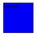
}[예시]
.box {
  border-style: solid;
  border-width: 1px;
  display: block;
  width: 100px;
  height: 100px;
  background-color: #0000ff;
  transition: width 2s, height 2s, background-color 2s, rotate 2s;
}

.box:hover {
  background-color: #ffcccc;
  width: 200px;
  height: 200px;
  rotate: 180deg;
}
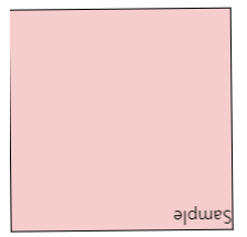
👍🏻마우스를 올렸을 때 180도 회전하면서 배경과 크기가 달라진다.
앞서 transition을 2s로 설정해놔 2초동안 transform이 달라진다.

정신차려 이 각박한 세상속에서