심화과제1
잘못된 시각화 모음
잘못된 시각화가 모아져 있는 사이트: viz.wtf
- Visualizations that make no sense. For a discussion of what is wrong with a particular visualization.
시각화의 방법 변경 (방법론, 배치, 색상 등)
- 설명이 부족한 시각화의 경우, 내용 추가.
- 의미 전달을 위해 다른 데이터를 수집할 수 있는 경우, 수집 방법과 데이터 스토리텔링 방법.
- 의미 있게 개선하기 위한 방법을 고민해보자!
추가된 설득에 초점을 둔다.
1. 선택한 잘못된 시각화
링크: 잘못된 시각화 링크

2. 현재 시각화의 문제점 및 개선 방향
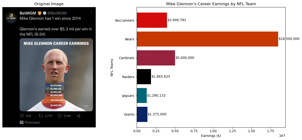 **문제점 1:**
목의 길이를 늘려서 수익을 표현하고 단순히 수익을 나열하기 때문에 해석을 위한 시간적 효율성이 떨어진다.
**문제점 1:**
목의 길이를 늘려서 수익을 표현하고 단순히 수익을 나열하기 때문에 해석을 위한 시간적 효율성이 떨어진다.
개선 방향 1:
일반적인 막대그래프를 사용하여 각 수익의 차이를 더 명확하게 전달하고자 했다.
문제점 2:
팀을 나타내는 색상과의 연관성이 부족하다.
개선 방향 2:
팀의 공식 색상을 사용하여 각 수익을 시각화했다.
3. 개선된 시각화 제안
설명:
SSH 환경에 Jupyter Notebook을 설치하여 그래프와 이미지를 실시간으로 확인했다.
코드 설명:
import matplotlib.pyplot as plt
import matplotlib.image as mpimg

image_path = '/home/user/Desktop/BOHYUN/naver/week3/image/as_1.jpg'

img = mpimg.imread(image_path)

fig, (ax1, ax2) = plt.subplots(1, 2, figsize=(14, 6))

ax1.imshow(img)
ax1.axis('off')  # 축 숨기기
ax1.set_title("Original Image")

teams = ["Giants", "Jaguars", "Raiders", "Cardinals", "Bears", "Buccaneers"]
earnings = [1375000, 1280132, 1865625, 5000000, 18500000, 3946782]
colors = ["#0b2265", "#006778", "#000000", "#97233F", "#C83803", "#D50A0A"]

ax2.barh(teams, earnings, color=colors)

ax2.set_title("Mike Glennon's Career Earnings by NFL Team")
ax2.set_xlabel("Earnings ($)")
ax2.set_ylabel("NFL Teams")

for i, v in enumerate(earnings):
    ax2.text(v + 50000, i, f"${v:,}", color='black', va='center')

plt.tight_layout()
plt.show()-
이미지 로드 및 표시:
mpimg.imread(image_path)로 지정된 경로에서 이미지를 로드한다.ax1.imshow(img)로 이미지를 첫 번째 플롯(ax1)에 표시한다.ax1.axis('off')로 이미지 주변의 축을 숨겨 이미지만 표시되도록 한다.ax1.set_title("Original Image")로 이미지 위에 제목을 추가하여 이미지를 설명한다.
-
막대그래프 생성:
teams리스트와earnings리스트를 사용하여 각 팀과 그 팀에서 Mike Glennon이 벌어들인 수익을 저장한다.ax2.barh(teams, earnings, color=colors)로 수평 막대그래프를 생성한다. 각 막대의 색상은colors리스트에서 지정한 팀별 색상을 사용한다.ax2.set_title,ax2.set_xlabel,ax2.set_ylabel을 사용하여 그래프에 제목과 축 라벨을 추가하여 데이터를 명확하게 설명한다.ax2.text(v + 50000, i, f"${v:,}", color='black', va='center')로 각 막대 끝에 수익 금액을 표시하여, 수익의 크기를 시각적으로 쉽게 이해할 수 있도록 한다.
-
레이아웃 조정 및 표시:
plt.tight_layout()는 두 개의 플롯이 겹치지 않고 깔끔하게 배치되도록 레이아웃을 조정한다.

심화과제 2
import pandas as pd
import os

# CSV 파일이 저장된 경로
directory_path = '/home/user/Desktop/BOHYUN/naver/week3/csv/'

# 파일 목록을 읽어들이고 CSV 파일을 모두 불러옴
csv_files = ['2020.csv', '2021.csv', '2022.csv', '2023.csv']

# 데이터프레임을 저장할 리스트
dataframes = []

for file in csv_files:
    file_path = os.path.join(directory_path, file)

    # CSV 파일을 읽어서 데이터프레임으로 변환 (인코딩 지정)
    try:
        df = pd.read_csv(file_path, encoding='utf-8')
    except UnicodeDecodeError:
        # 만약 utf-8 인코딩이 실패하면, 다른 인코딩으로 시도
        df = pd.read_csv(file_path, encoding='euc-kr')

    # 전처리 과정
    df = df.dropna()  # 결측치가 있는 행 제거

    # 리스트에 데이터프레임 추가
    dataframes.append(df)

    # 각 파일의 데이터셋 개수 출력
    print(f"{file} contains {len(df)} rows.")

# 모든 데이터를 하나의 데이터프레임으로 합치기
combined_df = pd.concat(dataframes, ignore_index=True)
print(f"Combined dataset contains {len(combined_df)} rows.")2020.csv contains 157 rows.
2021.csv contains 159 rows.
2022.csv contains 158 rows.
2023.csv contains 157 rows.
Combined dataset contains 631 rows.import torch
import torch.nn as nn
import math
import matplotlib.pyplot as plt
import seaborn as sns
class MultiHeadSelfAttention(nn.Module):
def __init__(self, num_heads, hidden_size):
super().__init__()
self.num_heads = num_heads
self.attn_head_size = int(hidden_size / num_heads)
self.head_size = self.num_heads * self.attn_head_size
self.Q = nn.Linear(hidden_size, self.head_size)
self.K = nn.Linear(hidden_size, self.head_size)
self.V = nn.Linear(hidden_size, self.head_size)
self.dense = nn.Linear(self.head_size, hidden_size)
def tp_attn(self, x):
x_shape = x.size()[:-1] + (self.num_heads, self.attn_head_size)
x = x.view(*x_shape)
return x.permute(0, 2, 1, 3)
def forward(self, hidden_states):
Q, K, V = self.Q(hidden_states), self.K(hidden_states), self.V(hidden_states)
Q_layer, K_layer, V_layer = self.tp_attn(Q), self.tp_attn(K), self.tp_attn(V)
attn = torch.matmul(Q_layer, K_layer.transpose(-1, -2)) / math.sqrt(self.attn_head_size)
attn_weights = nn.Softmax(dim=-1)(attn)
output = torch.matmul(attn_weights, V_layer)
output = output.permute(0, 2, 1, 3).contiguous()
output_shape = output.size()[:-2] + (self.head_size,)
output = output.view(*output_shape)
Z = self.dense(output)
return Z, attn_weights
# MultiHeadSelfAttention 모델 인스턴스 생성
self_attn = MultiHeadSelfAttention(num_heads=2, hidden_size=4)
# 랜덤 데이터 생성
rand_data = torch.rand((1, 3, 4))
# 모델을 통해 데이터 통과
mh_selfattn_data, attn_weights = self_attn(rand_data)
# Attention 가중치 시각화
attn_weights = attn_weights.squeeze().detach().numpy()
plt.figure(figsize=(10, 5))
for i in range(attn_weights.shape[0]):
plt.subplot(1, attn_weights.shape[0], i + 1)
sns.heatmap(attn_weights[i], annot=True, cmap='Blues', cbar=True)
plt.title(f'Head {i + 1}')
plt.xlabel('Key positions')
plt.ylabel('Query positions')
plt.tight_layout()
plt.show()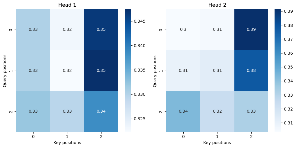

Fall in love with Computer Vision