Avoiding Over-Complication in Describe the Image Responses – PTE Academic Guide
The Describe Image task in the PTE Academic Speaking section is one of the most challenging components for many candidates. With a visual image and only 25 seconds to prepare, it’s easy to fall into the trap of over-complicating the response — using unnecessary jargon, complicated sentence structures, or trying to describe every single detail.
But simplicity, clarity, and fluency are the keys to scoring well. In this blog, we’ll explore why over-complicating hurts your score and how to deliver high-quality responses that are simple, structured, and effective.
Understanding the Task
In the Describe Image task, candidates are shown an image — such as a bar graph, pie chart, line graph, map, table, or picture — and are expected to describe it in detail within 40 seconds after a 25-second preparation time.
The goal is not just to describe what you see but to demonstrate your spoken fluency, pronunciation, and the ability to summarize visual data effectively.
Why Over-Complicating is a Problem
Over-complication leads to several problems:
1. Loss of Fluency: Long, complex sentences increase the risk of hesitations, fillers (“uh…”, “um…”), and grammatical mistakes.
2. Reduced Coherence: Trying to say too much leads to disorganized responses, which reduces overall clarity.
3. Incomplete Responses: You may run out of time before concluding or stating the main message.
4. Pronunciation Issues: Advanced vocabulary can be hard to pronounce clearly, especially under pressure.
5. Increased Anxiety: Overthinking your sentence structure can increase stress and reduce spontaneity.
What Does the Scoring Algorithm Look For?
PTE’s AI-based scoring engine evaluates responses based on:
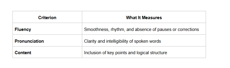
Fluency and pronunciation contribute to over 50% of the total score in speaking, which makes clarity more valuable than vocabulary depth in this context.
Best Practices to Avoid Over-Complication
1. Use a Simple and Consistent Template
Using a pre-learned structure helps avoid mental overload. Here's a basic template:
The image is a [type of image] that shows [general description]. It presents data about [main topic] across [categories/time periods]. The highest value is seen in [X], while the lowest is in [Y]. Overall, the image shows that [summary/conclusion]."
✅ This structure ensures you cover introduction, details, and summary — the key components evaluated by the scoring engine.
2. Focus on the Main Trends or Features
Don’t try to mention every single data point. Focus on:
The highest and lowest values
Trends (e.g., increasing, decreasing)
Significant differences
General overview
❌ “The chart shows values of 10%, 20%, 30%, 40%, and 50% respectively for five countries…”
✅ “The chart shows a clear upward trend in values across the five countries, with the highest recorded in Country E.”
3. Avoid Advanced Vocabulary You’re Not Confident Using
While it’s tempting to use words like “anomalies,” “fluctuations,” or “exponential growth,” these can backfire if mispronounced or used incorrectly.
Stick to clear, academic language you can say confidently:
- Use “increase” instead of “escalation”
- Use “decline” instead of “depreciation”
- Use “remains the same” instead of “plateaued at a consistent magnitude”
4. Use Transition Words to Connect Ideas
Transitions make your response smoother and more coherent. Examples include:
Firstly
-In addition
-However
-As a result
-Overall
These help you organize your thoughts without complicating the structure.
5. Practice with a Timer
Since you only have 40 seconds to speak, timing is crucial. Over-complicated sentences often cause you to speak too slowly or miss the conclusion. Aim for:
-1–2 lines for introduction
-2–3 key observations
-1-line summary/conclusion
💡 Record yourself and aim to finish your response between 35–40 seconds with natural pacing.
Sample Response – Good vs. Over-Complicated
🟠 Over-Complicated:
“The image demonstrates a sequential bar chart delineating a plethora of comparative metrics that signify differential patterns in consumer preferences, potentially indicating macroeconomic tendencies and behavioral economics.”
Issues: Hard to follow, unnatural, too vague, high chance of pronunciation or fluency errors.
🟢 Simple & Effective:
“The bar chart shows consumer preferences across five products. Product A has the highest preference, while Product E has the lowest. Overall, most consumers seem to favor the first two options.”
Benefits: Easy to follow, structured, clearly communicates the message.
Final Tips
-Keep your response structured and concise
-Speak with confidence and clarity
-Focus on what matters – not every detail
-Don’t sacrifice fluency for fancy words
-Practice with real PTE-style images and mock tests
You can try a full-length PTE mock test that includes “Describe Image” tasks to simulate test-day pressure and get used to the timing and format.
Conclusion
Over-complication is one of the biggest barriers to achieving a high score in the “Describe Image” task of PTE Academic. Remember, the goal is not to impress with vocabulary, but to communicate clearly and fluently. By following a structured approach and avoiding unnecessary complexity, you can significantly boost your speaking score.
Also Read: