Build Native Mobile Apps with Flutter
Lesson 1-13: Quiz < Code Your Own Category Widget >
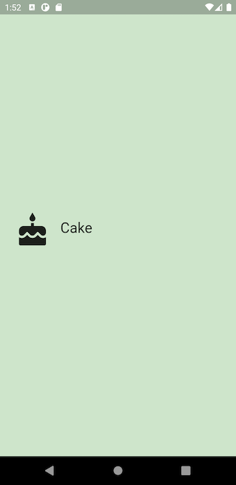
In this exercise, you'll finish the implementation of the Category widget.
So that you don't have to guess the sizes, use these:
- Widget height: 100.0
- Icon size: 60.0
- Icon-with-colored-background width: 70.0
- Text size: 24.0
Goals
- Using the existing Flutter widgets, build a custom Category widget.
- Customize the widget to your liking.
Steps
- Fill out the TODOs in category.dart and main.dart using the specs below.
- Customize your Category widget if desired. Some ideas are listed below.
Specs
- The icon, color, and text should be passed into the Category widget upon instantiation. They should be required.
- Height of the Category widget is 100.0. Its padding is 8.0.
- The widget's border radius is half of the Category height (in this case, 50.0). You can define both the height and the border radius as constants.
- Icon size is 60.0. The padding around the icon is 16.0.
- Text size is 24.0.
- The InkWell will not animate if the onTap function is null. Use a print statement for now, as a placeholder. i.e. onTap: () { print('I was tapped!'); }.
- The InkWell's splash and highlight colors should be the color we pass in.
Code
Result
⬇️ after tap

👩🏻💻 iOS Developer