디프만 1차 mvp 작업을 어느정도 마쳤다. 따라서 프론트엔드에서도 리팩토링 작업을 하고 다음 테스크로 넘어가기로 했다.
프론트의 가장 큰 과제는 프라임 리액트 걷어내기...!!!
짧은 시간 안에 완성도 있는 작업물을 만들고 빠른 개발 속도를 위해서 프라임 리액트를 이용해 공통 컴포넌트를 만들었지만 디자인에 한계가 생기고 커스텀이 점점 어려운 컴포넌트들이 생기기 시작했다. . (특히 포털로 생성되는 컴포넌트들의 스타일들은 글로벌 스타일로 제어를 해야하는 경우들이 다반사였다 . . . )
따라서 프라임 리액트가 필수적으로 필요한 컴포넌트들을 제외하고는 프라임 리액트를 걷어내고 똑스만의 컴포넌트를 만들기로 했다.
나는 버튼 컴포넌트와 Select 컴포넌트를 맡았는데, 버튼 컴포넌트에서 프라임 리액트를 걷어내는 과정에서 타입 정의를 하며 공부했던 것들을 정리해보겠다.
TypeScript
타입스크립트를 사용하는 이유는 프로그래밍에 안정성을 더할 수 있기 때문이다. 자바스크립트 같은 경우 런타임이 바이트 코드를 평가하기 때문에 에러를 런타임에서야 발견할 수 있다. 그러나 타입스크립트 같은 경우 컴파일 타임에 타입을 확인하고 대부분의 에러를 컴파일 타임에 검출한다.
그러나 타입을 느슨하게 가져가다보면 결국에 에러가 런타임에서 발견되는 경우가 종종 발생한다. 따라서 타입을 알고 정확하게 사용하는 것이 중요하다.
기존 코드
import { Button as BaseButton } from 'primereact/button';

type BaseButtonProps = ComponentProps<typeof BaseButton>;

type ButtonType = 'primary' | 'general' | 'ghost';
type ButtonStatus = 'normal' | 'hover' | 'disabled';

interface Props extends Omit<BaseButtonProps, 'type'> {
  type?: ButtonType;
  width?: number;
  htmlType?: BaseButtonProps['type'];
  size?: ButtonSize;
  buttonStyle?: React.CSSProperties;
}

export function Button({ type = 'primary', width, size = 'medium', disabled, htmlType, buttonStyle, ...rest }: Props) {
  return (
    <StyledBaseButton
      // TODO: inline style로 적용한 부분 제외하기
      style={{
        background: BUTTON_COLOR[disabled ? 'disabled' : 'normal'][type],
        borderRadius: '32px',
        width: width ?? '100%',
        height: BUTTON_HEIGHT[size],
        border: type !== 'ghost' ? 'none' : '1px solid #A5A5A5',
        color: BUTTOON_TEXT_COLOR[type],
        fontWeight: '700',
        fontSize: '16px',
        ...buttonStyle,
      }}
      buttontype={type}
      type={htmlType}
      disabled={disabled}
      loadingIcon={<ProgressSpinner strokeWidth="6px" style={{ width: '26px', height: '26px', margin: 0 }} />}
      {...rest}
    />
  );
}


const StyledBaseButton = styled(BaseButton)<{ buttontype: ButtonType }>`
  display: flex;
  justify-content: center;
  align-items: center;
  gap: 14px;
ComponentProps
React의 특정 컴포넌트에서 쓰이는 props의 타입들을 별도의 타입으로 선언해서 사용하고 싶을 때 React.ComponentProps를 사용한다.
따라서 리액트 컴포넌트에서 prop의 타입을 얻기 위해서는 React.ComponentProps(typeof Component) 와 같이 작성하면 된다.
위의 코드에서는 Prime React의 BaseButton 컴포넌트의 prop 타입을 얻기 위해 type BaseButtonProps = ComponentProps<typeof BaseButton>; 와 같이 작성하였다.
Omit<Type, Keys>
Omit<Type, Keys>는 Type으로부터 Key 프로퍼티를 제거한다는 뜻이다.
interface Todo {
  title: string;
  description: string;
  completed: boolean;
  createdAt: number;
}

type TodoPreview = Omit<Todo, "description">;

const todo: TodoPreview = {
  title: "Clean room",
  completed: false,
  createdAt: 1615544252770,
};

todo;
즉 위의 코드같은 경우 TodoPreview는 Todo 타입에서 description 프로퍼티를 제외하고 사용하겠다는 뜻이다.
아래는 Prime React의 Button Props의 Hierarchy이다.
Omit<React.DetailedHTMLProps<React.ButtonHTMLAttributes<HTMLButtonElement>, HTMLButtonElement>, "disabled" | "ref">Prime React가 상속하고 있는 HTMLButtonElement같은 경우 type property를 가지고 있다.
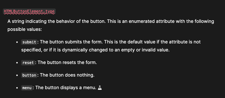
HTMLButtonElement의 type은 위와 같이 버튼의 동작을 보여주는 역할을 하지만 우리의 공통컴포넌트 같은 경우 똑스의 디자인 시스템에서 정의한 button의 type을 Button props의 type에서 사용하고 싶었기 때문에
interface Props extends Omit<BaseButtonProps, 'type'> 로 Omit을 사용하여 기존 버튼의 type 프로퍼티를 제거하고 상속했다. 그리고 type ButtonType = 'primary' | 'general' | 'ghost'; 로 새롭게 버튼 타입을 정의하여 버튼의 타입을 지정해주고 스타일을 입혔다.
Partial
interface Props extends Partial<React.InputHTMLAttributes<HTMLInputElement>> {
  name?: string;
  width?: number;
  height?: number;
  label?: string;
  errorMessage?: string;
  errorMessageVariant?: Typography;
  suffix?: React.ReactNode;
}
Partial은 여기서 사용하지는 않지만 input에서 사용된 유틸리티 타입이다.
Partial<Type>같은 경우 타입 T의 모든 프로퍼티를 optional의 형태로 바꾸어준다.
즉 type Partial<T> = { [P in keyof T]?: T[P]; }; 이런 모양으로 바꾸어주는 것인데 P in keyof T는 타입 T의 프로퍼티 키값에 해당하는 P를 전부 옵셔널 형태로 감싸 리턴하게 되는 것이다.
따라서 위에서 우리가 만든 input의 props 같은 경우 HTMLInputElement에 해당하는 프로퍼티 값을 할당을 할 수도, 할당을 하지 않을 수도 있게 된 것이다.
✨ 바뀐 코드
type ButtonStatus = 'normal' | 'hover' | 'disabled';

type ButtonHTMLType = 'button' | 'reset' | 'submit' | undefined;


interface Props extends Omit<React.ButtonHTMLAttributes<HTMLButtonElement>, 'type'> {
  type?: ButtonType;
  width?: number;
  size?: ButtonSize;
  buttonStyle?: React.CSSProperties;
  disabled?: boolean;
  htmlType?: ButtonHTMLType;
}


export function Button({ type = 'primary', width, size = 'medium', disabled, buttonStyle, htmlType, ...rest }: Props) {
  return (
    <StyledButton
      style={{
        ...buttonStyle,
      }}
      width={width}
      size={size}
      buttontype={type}
      disabled={disabled}
      type={htmlType}
      {...rest}
    />
  );
}

const StyledButton = styled('button')<{
  buttontype: ButtonType;
  disabled?: boolean;
  width?: number;
  size: ButtonSize;
}>`
차란...!!! ✨ 인라인 스타일과 Prime React를 걷어내고 <button>태그를 이용해서 버튼 컴포넌트를 완성해봤다. 처음부터 타입에 대해 찾아보고 Prime React를 걷어 냈으면 빠르게 고칠 수 있었을 것 같은데 마음이 급해 이것저것 타입을 붙여보다가 이렇게는 안되겠다고 생각하여 제대로 타입에 대해 공부해보았다.
interface Props extends Omit<React.ButtonHTMLAttributes<HTMLButtonElement>, 'type'> 와 같이 타입을 지정해주어 button의 type을 커스텀해서 사용하고자 했다. Prime React의 BaseButton같은 경우 disabled까지 Omit해서 사용했지만 기존과 button의 disabled 프로퍼티와 같이 boolean값으로 처리 되어 이대로 두어도 될 것 같아 똑스의 자체 버튼 컴포넌트에서는 따로 Omit처리를 하지 않았다. . .
더 고민해서 보다 좋은 타입스크립트를 사용할 수 있도록 해야지 . .
참고자료
https://ui.toast.com/posts/ko_20210505
https://www.typescriptlang.org/docs/handbook/utility-types.html#excludetype-excludedunion
https://primefaces.github.io/primereact/api/9.0.0-rc.1/interfaces/button.ButtonProps.html
https://developer.mozilla.org/en-US/docs/Web/API/HTMLButtonElement