똑스를 만들기 시작할 때부터 프론트 개발자들은 디자이너 분들과 논의하여 디자인 시스템을 먼저 구축하고 가져가는 것을 목표로 했다.
감사하게도 디자이너 분들이 흔쾌히 좋다고 해주셔서 멋진 파운데이션과 컴포넌트들을 만들어주고 계신다.
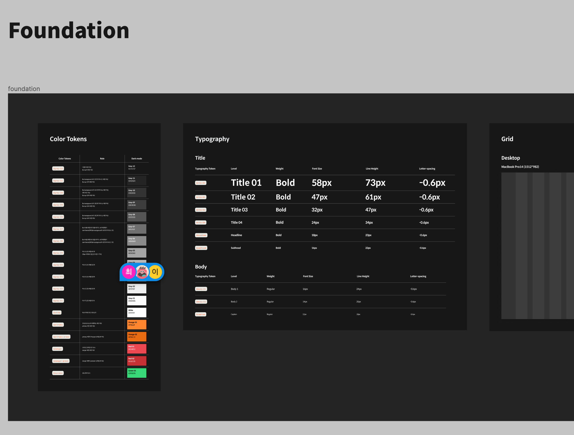
디자인 시스템이란?
디자인 시스템은 디자인 원칙과 중요한 UX 전략에 의해 결합된 UI 구성 요소의 모음이다. 디자인 시스템을 구축하게 된다면 프론트 개발자들은 이러한 구성 요소를 다양한 조합으로 재사용해서 컴포넌트나 디자인 설계에 시간을 낭비하지 않고 제품을 빌드하거나 업데이트할 수 있게 된다.
[출처]
똑스 디자인 시스템 적용기
처음에는 사실 디자인 시스템의 역할에 크게 동감하지 못했다. (아마 내가 제대로 활용하지 못해서이겠지요.. )

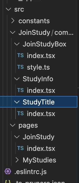
//JoinStudyBox/index.tsx
import { JoinButton } from 'components/JoinStudy/JoinButton';
import { JoinInput } from 'components/JoinStudy/JoinInput';
import { StudyInfo } from 'components/JoinStudy/StudyInfo';
import { StudyTitle } from 'components/JoinStudy/StudyTitle';
import { Tag } from '@depromeet/toks-components';
import { Txt } from '@depromeet/toks-components';

import {
  DateText,
  DateWrapper,
  DescriptionBox,
  DescriptionContainer,
  JoinMessage,
  TagContainer,
  Wrapper,
} from './style';

export function JoinStudyBox() {
  // mock data
  const ourStudyDescription = '아키텍쳐 크리너스로 소프트웨어 구조와 설계의 원칙 제대로 이해하기 ';
  const personnelDescription = '5-7명을 계획하고 있어요.';
  const startDate = '2022. 10. 13';
  const doneDate = '2022. 12. 03';
  const stacks = ['Java', 'Javascript', 'React'];
  return (
    <Wrapper>
      <StudyTitle />
      {stacks?.map(stack => (
        <TagContainer>
          <Tag>
            <Txt>{stack}</Txt>
          </Tag>
        </TagContainer>
      ))}
      <form>
        <DescriptionContainer>
          <StudyInfo
            leftAddon={<DescriptionBox />}
            title={<span>우리 스터디는</span>}
            description={
              <Txt size={16} weight={500}>
                {ourStudyDescription}
              </Txt>
            }
          />
          <StudyInfo
            leftAddon={<DescriptionBox />}
            title={<span>스터디 기간은</span>}
            description={
              <>
                <DateWrapper>
                  <Txt size={14} weight={500}>
                    시작일
                  </Txt>
                  <DateText>
                    {' '}
                    <Txt size={20} weight={700}>
                      {startDate}
                    </Txt>
                  </DateText>
                </DateWrapper>
                <DateWrapper>
                  <Txt size={14} weight={500}>
                    종료일
                  </Txt>
                  <DateText>
                    <Txt size={20} weight={700}>
                      {doneDate}
                    </Txt>
                  </DateText>
                </DateWrapper>
              </>
            }
          />
          <StudyInfo
            leftAddon={<DescriptionBox />}
            title={<span>스터디 인원은</span>}
            description={
              <Txt size={16} weight={500}>
                {personnelDescription}
              </Txt>
            }
          />
          <StudyInfo leftAddon={<DescriptionBox />} title={<span>스터디 기간은</span>} description={<JoinInput />} />
        </DescriptionContainer>
      </form>
      <JoinMessage>
        <Txt size={20} weight={700}>
          똑스와 8주간 함께해볼까요?
        </Txt>
      </JoinMessage>
      <JoinButton />
    </Wrapper>
  );
}
//JoinStudyBox/style.ts
import { theme } from '@depromeet/theme';
import styled from '@emotion/styled';
export const Wrapper = styled.div`
width: 656px;
height: 762px;
padding: 36px;
background-color: ${theme.colors.gray100};
margin: 0 auto;
border: 1.4px solid ${theme.colors.gray080};
border-radius: 16px;
`;
export const DescriptionContainer = styled.div`
margin-top: 47px;
`;
export const JoinMessage = styled.span`
text-align: center;
padding: 80px 0 24px 0;
justify-content: center;
display: flex;
`;
export const DescriptionBox = styled.div`
width: 26px;
height: 26px;
border-radius: 6px;
background-color: ${theme.colors.gray080};
`;
export const TagContainer = styled.span`
&:first-of-type {
margin-left: 0;
}
margin-left: 8px;
`;
export const DateWrapper = styled.div`
display: flex;
&:first-of-type {
margin-left: 0px;
}
margin-right: 39px;
align-items: center;
`;
export const DateText = styled.p`
color: ${theme.colors.white};
margin: 0;
margin-left: 11px;
`;위 화면을 구성하는 컴포넌트와 스타일 코드이다.
import된 컴포넌트 중에서 toks-components에서 가져온 것들은 디자인 시스템을 적용한 공통 컴포넌트 들이고 ./style에서 가져온 컴포넌트들은 모두 스타일 컴포넌트들이다.
JoinStudyBox/index.tsx를 보면 Container나 DateWrapper와 같은 스타일링만을 위해 사용된 컴포넌트들이 많이 보인다.
코드리뷰에서 이렇게 불필요한 요소들이 추가된다면 가독성을 해치기 쉬워지기 때문에 스타일링을 위해 컴포넌트 상단을 감싸 스타일링을 하는 것이 아니라 해당 컴포넌트에 css를 바로 주어서 스타일링을 바로 하는 것이 어떻겠냐는 조언을 주셨다.
1st 수정
//JoinStudyBox/index.tsx

import { Button, Image, Tag, Text } from '@depromeet/toks-components';

import { StudyInfo } from 'components/JoinStudy/StudyInfo';
import { StudyTitle } from 'components/JoinStudy/StudyTitle';

import { ButtonContainer, DescriptionContainer, Wrapper, dateStyle, descriptionStyle, tagMargin } from './style';

export function JoinStudyBox() {
  // mock data
  const ourStudyDescription =
    '설명은 100자 제한입니다 설명은 100자 제한입니다 설명은 100자 제한입니다 설명은 100자 제한입니다 설명은 100자 제한입니다 설명은 100자 제한입니다 설명은 100자 제한입니다 설명은 100자 제한입니다 설명은 100자 제한입니다 설명은 100자 제한';
  const personnelDescription = '5-7명을 계획하고 있어요.';
  const startDate = '2022. 10. 13';
  const doneDate = '2022. 12. 03';
  const stacks = ['Java', 'Javascript', 'React'];
  return (
    <Wrapper>
      <StudyTitle />
      {stacks?.map(stack => (
        <Tag css={tagMargin}>{stack}</Tag>
      ))}
      <form>
        <DescriptionContainer>
          <StudyInfo
            leftAddon={
              <Image
                width={16}
                height={22}
                src="https://toks-web-assets.s3.amazonaws.com/studyinfo-icon.svg"
                alt="StudyInfo 아이콘"
              />
            }
            title={'우리 스터디는'}
            description={
              <Text css={descriptionStyle} size={16} weight={400}>
                {ourStudyDescription}
              </Text>
            }
          />
          <StudyInfo
            leftAddon={
              <Image
                width={16}
                height={22}
                src="https://toks-web-assets.s3.amazonaws.com/studyinfo-icon.svg"
                alt="StudyInfo 아이콘"
              />
            }
            title={'스터디 기간은'}
            description={
              <>
                <Text size={14} weight={400} css={dateStyle}>
                  시작일
                </Text>
                <Text size={16} weight={400}>
                  {startDate}
                </Text>
                <Text size={14} weight={400} css={dateStyle}>
                  종료일
                </Text>
                <Text size={16} weight={400}>
                  {doneDate}
                </Text>
              </>
            }
          />
          <StudyInfo
            leftAddon={
              <Image
                width={16}
                height={22}
                src="https://toks-web-assets.s3.amazonaws.com/studyinfo-icon.svg"
                alt="StudyInfo 아이콘"
              />
            }
            title={'스터디 인원은'}
            description={
              <Text size={16} weight={400} css={descriptionStyle}>
                {personnelDescription}
              </Text>
            }
          />
        </DescriptionContainer>
      </form>
      <ButtonContainer>
        <Button>참여하기</Button>
      </ButtonContainer>
    </Wrapper>
  );
}
//JoinStudyBox/study.ts
mport { theme } from '@depromeet/theme';
import { css } from '@emotion/react';
import styled from '@emotion/styled';
export const Wrapper = styled.div`
width: 600px;
padding: 28px;
background-color: ${theme.colors.gray110};
margin: 0 auto;
border: 1.4px solid ${theme.colors.gray100};
border-radius: 16px;
`;
export const DescriptionContainer = styled.div`
margin-top: 62px;
`;
export const tagMargin = css`
:first-of-type {
margin-left: 0;
}
margin-left: 8px;
`;
// button 수정되면 수정하기
export const ButtonContainer = styled.div`
width: 100%;
height: 54px;
margin-top: 62px;
`;
export const descriptionStyle = css`
line-height: 24px;
`;
export const dateStyle = css`
line-height: 16px;
margin-right: 12px;
:first-of-type {
margin-left: 0;
}
margin-left: 36px;
`;emotion css를 사용하여 상단을 스타일 컴포넌트로 감싸는 방식 대신 컴포넌트에 바로 css를 적용해주는 방식으로 대체했다. 구조적으로 훨씬 가독성이 좋아지긴 했지만 여전히 디자인 시스템을 제대로 활용하고 있지 못한 느낌이 들었다.
디자이너 분들은 디자인 시스템을 정의할 때 typo variant title01, body01과 같이 다 정의하여 이를 활용하여 페이지 디자인을 하고 계셨는데 나는 Text컴포넌트에 font-size와 weight를 하나하나 다 넘겨주는 방식으로 구현하고 있었기 때문이다. 디자인 시스템을 정의하여 이를 효율적으로 재사용하는 것이 아니라 단순히 스타일 컴포넌트를 css를 직접 주는 방식으로만 교체한 느낌이었다. (실제로 스타일링을 위한 코드의 양도 비슷하다. )
뿐만 아니라 다른 사람이 내 코드를 보았을 때 마진과 패딩을 어디서 주었는지 확인하기가 어렵다는 점도 걸렸다. 팀원이 내 컴포넌트 구조를 보고 채림님 이 부분 마진은 어디서 주셨어요!? 라고 물어보면 나는 잠시만요!! 하고 스타일 코드를 뒤져서 아 ButtonContainer요! 라고 대답해야만 했다. 굉장히 비효율적인 구조이다. 누가 내 코드를 한 번에 알아보지 못하고 나한테 물어보면 내가 또 스타일 코드를 찾아보고 대답해야한다니.. 또 한번의 수정이 필요할 수 밖에 없었다!!!!
2nd 수정
import { css } from '@emotion/react';
export const typography = {
title01: css`
font-size: 58px;
font-weight: 700;
line-height: 73px;
letter-spacing: -0.6px;
`,
title02: css`
font-size: 47px;
font-weight: 700;
line-height: 61px;
letter-spacing: -0.6px;
`,
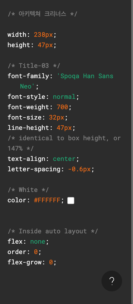
title03: css`
font-size: 32px;
font-weight: 700;
line-height: 47px;
letter-spacing: -0.6px;
`,
title04: css`
font-size: 24px;
font-weight: 700;
line-height: 34px;
letter-spacing: -0.6px;
`,
headline: css`
font-size: 18px;
font-weight: 700;
line-height: 23px;
letter-spacing: -0.6px;
`,
subhead: css`
font-size: 16px;
font-weight: 700;
line-height: 22px;
letter-spacing: -0.6px;
`,
body01: css`
font-size: 16px;
font-weight: 400;
line-height: 24px;
letter-spacing: -0.6px;
`,
body02: css`
font-size: 14px;
font-weight: 400;
line-height: 20px;
letter-spacing: -0.6px;
`,
body03: css`
font-size: 12px;
font-weight: 400;
line-height: 18px;
letter-spacing: -0.6px;
`,
} as const;
export type Typography = keyof typeof typography;//Text 컴포넌트
import { theme } from '@depromeet/theme';
import styled from '@emotion/styled';
import { HTMLAttributes, ReactNode } from 'react';
import { Typography, typography as typographyObject } from './token';
type FontWeight = 100 | 200 | 300 | 400 | 500 | 600 | 700 | 800 | 900 | 'normal' | 'bold' | 'bolder' | 'lighter';
interface TextProps extends HTMLAttributes<HTMLSpanElement> {
// as?: 'span' | 'strong' | 'p' | 'h1' | 'h2' | 'h3' | 'h4' | 'h5' | 'h6'; // TODO: as 통해서 시멘틱 태그 사용 가능하게
size?: number;
weight?: FontWeight;
color?: string; // TODO: color token type 추가
variant?: Typography;
children: ReactNode;
}
// TODO: 폰트 토큰 정해지면 수정하기
export function Text({
size = 16,
weight = 'normal',
color = theme.colors.white,
children,
variant = 'body02',
...rest
}: TextProps) {
return (
<StyledText size={size} weight={weight} color={color} variant={variant} {...rest}>
{children}
</StyledText>
);
}프론트 팀원분이 감사하게 typo variant를 정의해주시고 이를 Text에 props로 넘겨 적용할 수 있도록 만들어주셨다.
//JoinStudyBox/index.tsx

import { Button, Image, Tag, Text } from '@depromeet/toks-components';
import { Flex, Spacing, width100 } from '@toss/emotion-utils';

import { StudyInfo } from 'JoinStudy/components/StudyInfo';
import { StudyTitle } from 'JoinStudy/components/StudyTitle';

import { Wrapper } from './style';

export function JoinStudyBox() {
  // mock data
  const ourStudyDescription =
    '설명은 100자 제한입니다 설명은 100자 제한입니다 설명은 100자 제한입니다 설명은 100자 제한입니다 설명은 100자 제한입니다 설명은 100자 제한입니다 설명은 100자 제한입니다 설명은 100자 제한입니다 설명은 100자 제한입니다 설명은 100자 제한';
  const personnelDescription = '5-7명을 계획하고 있어요.';
  const startDate = '2022. 10. 13';
  const doneDate = '2022. 12. 03';
  const tags = ['Java', 'Javascript', 'React'];
  return (
    <Wrapper>
      <div>
        <StudyTitle />
        {/* tag margin 위아래 10 고려하여 18->8 */}
        <Spacing size={8} />
        <Tag.Row>
          {tags?.map(tag => (
            <Tag key={tag}>{tag}</Tag>
          ))}
        </Tag.Row>
      </div>
      <Flex direction="column" css={{ gap: '32px' }}>
        <StudyInfo
          leftAddon={
            <Image
              width={16}
              height={22}
              src="https://toks-web-assets.s3.amazonaws.com/studyinfo-icon.svg"
              alt="StudyInfo 아이콘"
            />
          }
          title={'우리 스터디는'}
          description={<Text variant="body01">{ourStudyDescription}</Text>}
        />
        <StudyInfo
          leftAddon={
            <Image
              width={16}
              height={22}
              src="https://toks-web-assets.s3.amazonaws.com/studyinfo-icon.svg"
              alt="StudyInfo 아이콘"
            />
          }
          title={'스터디 기간은'}
          description={
            <>
              <Text variant="body02">시작일</Text>
              <Text variant="body01" css={{ marginLeft: '12px' }}>
                {startDate}
              </Text>
              <Text variant="body02" css={{ marginLeft: '36px' }}>
                종료일
              </Text>
              <Text variant="body01" css={{ marginLeft: '12px' }}>
                {doneDate}
              </Text>
            </>
          }
        />
        <StudyInfo
          leftAddon={
            <Image
              width={16}
              height={22}
              src="https://toks-web-assets.s3.amazonaws.com/studyinfo-icon.svg"
              alt="StudyInfo 아이콘"
            />
          }
          title={'스터디 인원은'}
          description={<Text variant="body01">{personnelDescription}</Text>}
        />
      </Flex>
      <Button css={width100}>참여하기</Button>
    </Wrapper>
  );
}
//JoinStudyBox/style.ts
import { theme } from '@depromeet/theme';
import styled from '@emotion/styled';
export const Wrapper = styled.div`
position: relative;
display: flex;
gap: 62px;
flex-direction: column;
width: 600px;
padding: 28px;
background-color: ${theme.colors.gray110};
margin: 0 auto;
border: 1px solid ${theme.colors.gray100};
border-radius: 16px;
`;위는 두 번째로 수정된 코드이다.
Text에 하나하나 size와 weight를 넘기지 않고 variant만 넘기게 되니 훨씬 코드가 깔끔해진 것을 확인할 수 있다. 또한 스타일 코드를 줄이고 코드의 가독성을 위해 토스의 emotion-utils 라이브러리를 사용했다. 스타일 컴포넌트를 이용해 위 아래로 margin을 주던 방식에서 Space를 선언적으로 주는 <Spacing/> 컴포넌트를 이용하여 다른 사람들이 내 코드를 더 직관적으로 알아볼 수 있도록 수정했다.
이렇게 디자인 시스템을 활용하니 이 페이지를 만들기 위해 Wrapper 스타일 컴포넌트를 제외하고 모든 스타일 코드를 삭제할 수 있었다.(style.ts 파일 자체가 하나로 줄어드는 마법이....) 코드를 리팩토링하는 과정을 통해 제대로 디자인 시스템을 활용한다면 프론트 개발자가 스타일 코드를 작성하기 위해 사용하는 시간을 최소화할 수 있다는 점을 뼈저리게 느꼈다.
마치며
이번 디자인 시스템 적용기를 거치며 디자인 시스템의 필요성을 제대로 배울 수 있었다. 그리고 이왕 디자인 시스템을 사용할 것이라면 제대로 사용해야 한다는 것도 느꼈다. 디자인 시스템을 잘 적용하기만 하면 프론트 개발자가 디자인에 신경써야 하는 일들이 매우 줄어들고 커스텀 스타일링을 최소화할 수 있게 된다. 앞으로 공통 컴포넌트와 페이지를 만들 때에도 이 점에 유의하면서 구현을 할 수 있도록 할 것이다.