css에서 제대로 알지 못하고 지나쳤던 2차원 정렬인 grid,
중앙 정렬에 대해 공부해 보았다.
grid
1차원 정렬 방식이였던 flex와 달리 grid는 2차원 정렬 방식을 할 수 있게 해준다.
html은 다음과 같이 구성하였다.
하나의 container가 10개의 item box를 감싸고 있는 방식이다.
<div class="container">
  <div class="item box1">1</div>
  <div class="item box2">2</div>
  <div class="item box3">3</div>
  <div class="item box4">4</div>
  <div class="item box5">5</div>
  <div class="item box6">6</div>
  <div class="item box7">7</div>
  <div class="item box8">8</div>
  <div class="item box9">9</div>
  <div class="item box10">10</div>
</div>
display
컨테이너 박스가 그리드를 사용할 수 있게 해준다.
.container {
  display: grid;
}
template
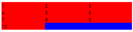
셀의 column(행)과 row(열)의 갯수와 크기를 지정해준다.
- grid-template-colums 행(가로)의 갯수와 크기를 지정한다.
- grid-template-rows 열(세로)의 갯수와 크기를 지정한다.
.container {
  background-color: blue;
  display: grid;
  grid-template-columns: 1fr 1fr 1fr;
  /*
  grid-template-columns: 100px 200px 300px;
  */
}

.item {
  background-color: red;
}
repeat
grid-template-colums, rows의 갯수를 반복하여 지정할 수 있다.
.container {
  background-color: blue;
  display: grid;
  grid-template-columns: repeat(3, 1fr);
  /*
  grid-template-columns: repeat(3, 100px);
  */
}

.item {
  background-color: red;
}
minmax
해당 컨테이너의 셀의 최소, 최대값을 지정해 줄 수 있다.
- 최소값 보다 작아지면 셀이 컨테이너를 벗어난다.
- 최댓값 보다 커지면 셀이 더이상 커지지 않는다.
.container {
  background-color: blue;
  display: grid;
  grid-template-columns: repeat(3, minmax(100px, 300px));
  /*
  grid-template-columns: repeat(3, 1fr);
  */
}

.item {
  background-color: red;
}
auto
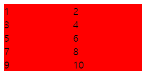
현재 컨테이너 크기에 맞게 아이템을 배치해준다.
- auto-fill 셀이 부족할 경우 컨테이너를 비워둔다.
- auto-fit 셀이 부족할 경우 셀을 늘려서 컨테이너를 채운다.
.container {
  background-color: blue;
  display: grid;
  grid-template-columns: repeat(auto-fill, minmax(100px, 1fr));
  /*
  grid-template-columns: repeat(auto-fit, minmax(100px, 1fr));
  */
}

.item {
  background-color: red;
}
gap
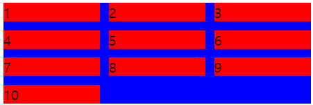
셀 간의 간격을 지정해준다.
- column-gap 열(좌우)의 간격을 지정해준다.
- row-gap 행(상하)의 간격을 지정해준다.
- gap 행, 열 모두의 간격을 지정해준다.
.container {
  background-color: blue;
  display: grid;
  grid-template-columns: repeat(auto-fill, minmax(100px, 1fr));
  gap: 10px;
}

.item {
  background-color: red;
}
start, end
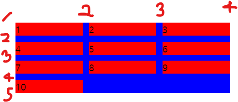
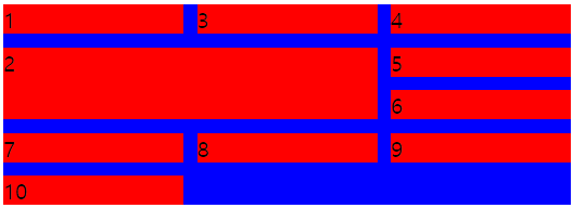
해당 item의 셀의 공간 차지를 지정한다.
이 때, 다음과 같이 라인의 순서를 이용해 지정한다.
- grid-column-start ~번의 열 라인부터 차지함.
- grid-column-end ~번의 열 라인까지 차지함.
- grid-column
- grid-row
.container {
  background-color: blue;
  display: grid;
  grid-template-columns: repeat(auto-fill, minmax(100px, 1fr));
  gap: 10px;
}

.item {
  background-color: red;
}

.box2 {
  grid-column-start: 1;
  grid-column-end: 3;
  grid-row-start: 2;
  grid-row-end: 4;
  /*
  grid-column: 1 / 3;
  grid-row: 2 / 4
  */
}
span
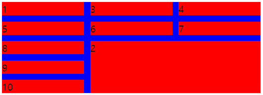
gird-column, grid-row의 셀의 시작 위치와 셀 차지 갓수를 지정한다.
.container {
  background-color: blue;
  display: grid;
  grid-template-columns: repeat(auto-fill, minmax(100px, 1fr));
  gap: 10px;
}

.item {
  background-color: red;
}

.box2 {
  grid-column: 2 / span 2;
  grid-row: 3 / span 3;
}
정렬
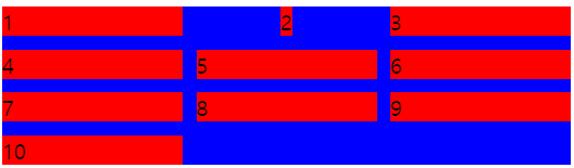
해당 item 셀의 자신의 위치를 정렬시킨다.
.container {
  background-color: blue;
  display: grid;
  grid-template-columns: repeat(auto-fill, minmax(100px, 1fr));
  gap: 10px;
}

.item {
  background-color: red;
}

.box2 {
  justify-self: center;
  align-self: center;
}
order
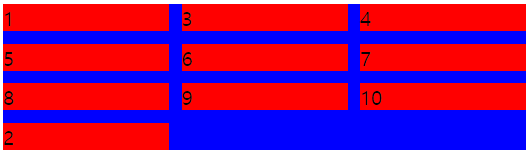
해당 item의 순서를 지정한다.
default값은 0이다.
.container {
  background-color: blue;
  display: grid;
  grid-template-columns: repeat(auto-fill, minmax(100px, 1fr));
  gap: 10px;
}

.item {
  background-color: red;
}

.box2 {
  order: 1;
}
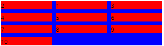
.container {
  background-color: blue;
  display: grid;
  grid-template-columns: repeat(auto-fill, minmax(100px, 1fr));
  gap: 10px;
}

.item {
  background-color: red;
}

.box2 {
  order: -1;
}
중앙 정렬
중앙 정렬을 하고 자연스럽게 반응형으로 반응한다.
주로 navbar의 너비를 정의할 때 사용한다.
전체화면 크기에서 1000px을 좌/우로 나눠서 500px씩 좌/우 너비를 줌.
만약 1000px 에서 더 숫자가 작아지면 좌/우 너비는 더 좁아진다.
padding: 0 calc((100vw-1000px) / 2);모달을 만들 때 다음과 같이 사용했다.
.modal {
  position: fixed;
  z-index: 1;
  top: 0;
  left: 0;
  right: 0;
  bottom: 0;
  background-color: black;
  padding: 0 calc((100vw - 600px) / 2);
}
position을 absolute로 두었을 때, 너비-높이 중앙 정렬을 할 때 사용한다.
위, 왼쪽에서 50%위치에 두고 요소의 크기의 반 만큼 조정해준다.
.center {
  position: absolute;
  top: 50%;
  left: 50%;
  transform: translate(-50%, -50%);
}