CSS
CSS 선택자
선택자는 스타일을 적용할 엘리먼트를 선택하는 역할을 한다.
- 기본 선택자
- 관계 선택자
기본 선택자
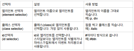
엘리먼트 선택자 예제
엘리먼트 선택자를 활용해 간단한 스타일을 적용해라.
<!DOCTYPE html>
<html lang="en">
<head>
    <meta charset="UTF-8">
    <meta name="viewport" content="width=device-width, initial-scale=1.0">
    <title>Document</title>
</head>
<body>

    <h1>엘리먼트 선택자</h1>

    <!-- style엘리먼트: html 문서 안에서 간단한 스타일을 적용할 때 사용 -->
    <style>
        /* 엘리먼트 선택자: 이름으로 스타일을 적용할 엘리먼트를 선택한다 */
        li {
            /* 이탤릭체(기울임체) 적용 */
            /* 스타일 속성: 값 */
            font-style: italic;
        }
    </style>

    <ul>
        <li>foo</li>
        <li>bar</li>
        <li>baz</li>
    </ul>

</body>
</html>
클래스 선택자 예제
클래스 선택자를 활용해 간단한 스타일을 적용하라.
<!DOCTYPE html>
<html lang="en">
<head>
    <meta charset="UTF-8">
    <meta name="viewport" content="width=device-width, initial-scale=1.0">
    <title>Document</title>
</head>
<body>

    <h1>클래스 선택자</h1>

    <style>
        /*
        클래스 선택자
        사용방법: .클래스
        클래스 이름은 원하는 대로 지을 수 있다
        (프론트엔드 프레임워크인 '테일윈드css'를 기반)
        */
        .font-semibold {
            /* 글자를 약간 두껍게 처리하는 속성 */
            font-weight: 600;
        }

        .italic {
            /* 이탤릭체 */
            font-style: italic;
        }
    </style>

    <ul>
        <!-- 띄어쓰기로 여러개의 클래스를 적용할 수 있다 -->
        <li class="italic font-semibold">foo</li>
        <!-- 하나의 클래스를 공유할 수 있다 -->
        <li class="italic">bar</li>
        <li>baz</li>
    </ul>

</body>
</html>
아이디 선택자
아이디 선택자를 활용해 간단한 스타일을 적용하라.
<!DOCTYPE html>
<html lang="en">
<head>
    <meta charset="UTF-8">
    <meta name="viewport" content="width=device-width, initial-scale=1.0">
    <title>Document</title>
</head>
<body>

    <h2>id 선택자</h2>

    <style>
        /*
        아이디 선택자
        사용방법: #아이디
        */
        #message {
            color: red;
        }
        </style>

    <p id="message">Hello CSS!</p>

</body>
</html>
관계 선택자
엘리먼트 사이의 관계를 활용해 엘리먼트를 선택한다.
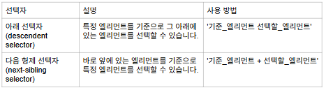
아래 선택자
자식 선택자를 활용해 간단한 스타일을 적용하라.
<!DOCTYPE html>
<html lang="en">
<head>
    <meta charset="UTF-8">
    <meta name="viewport" content="width=device-width, initial-scale=1.0">
    <title>Document</title>
</head>
<body>

    <h1>아래 선택자</h1>

    <style>
        /*
        관계 선택자(아래 선택자)
        사용 방법: 기준_엘리먼트 선택할 엘리먼트
        사용 목적: 스타일을 적용할 범위를 좁히고 싶을 때
         */
        .b li {
            /* 텍스트 중간에 선 긋기 */
            text-decoration-line: line-through;
        }
    </style>

    <h3>list A</h3>
    <ul>
        <li>foo</li>
        <li>bar</li>
        <li>baz</li>
    </ul>

    <h3>list B</h3>
    <ul class="b">
        <li>foo</li>
        <li>bar</li>
        <li>baz</li>
    </ul>

</body>
</html>
형제 선택자
형제 선택자를 활용해 간단한 스타일을 적용하라.
<!DOCTYPE html>
<html lang="en">
<head>
    <meta charset="UTF-8">
    <meta name="viewport" content="width=device-width, initial-scale=1.0">
    <title>Document</title>
</head>
<body>

    <h1>형제 선택자</h1>

    <style>
        /*
        바로 앞에 있는 엘리먼트를 기준으로 엘리먼트를 선택할 수 있다.
        사용 방법: 기준_앨리먼트 + 선택할 엘리먼트
         */
        .x + li {
            /* 이탤릭체 */
            font-style: italic;
        }
    </style>

    <ul>
        <li>foo</li>
        <li class="x">bar</li>
        <li>baz</li>
    </ul>

</body>
</html>
가상 클래스(Pseudo class)
가상 클래스를 활용해 특정한 상태에 있는 엘리먼트를 선택할 수 있다.
다음은 가상 클래스를 사용하는 방법이다.
선택자: 가상 클래스
가상 클래스 종류
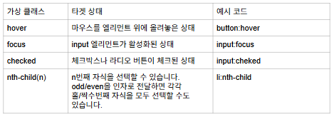
hover 예제
hovor 효과를 활용하라.
<!DOCTYPE html>
<html lang="en">
<head>
    <meta charset="UTF-8">
    <meta name="viewport" content="width=device-width, initial-scale=1.0">
    <title>Document</title>
</head>
<body>

    <h1>호버(hover)</h1>

    <style>
        /*
        선택자: 가상클래스
        hover: 마우스를 엘리먼트 위에 올려놓은 상태
        */
        li:hover {
            /* 밑줄긋기 */
            text-decoration-line: underline;
        }
    </style>

    <ul>
        <li>foo</li>
        <li>bar</li>
        <li>baz</li>
    </ul>

</body>
</html>
focus 예제
focus 효과를 활용하라.
<!DOCTYPE html>
<html lang="en">
<head>
    <meta charset="UTF-8">
    <meta name="viewport" content="width=device-width, initial-scale=1.0">
    <title>Document</title>
</head>
<body>

    <h1>focus</h1>

    <style>
        input:focus {
            /* 엘리먼트 밖에 회색선 */
            outline: 2px solid #ddd;
        }
    </style>

    <label for="username">아이디</label>
    <input type="text" id="username">

</body>
</html>
checked 예제
checked를 활용하라.
<!DOCTYPE html>
<html lang="en">
<head>
    <meta charset="UTF-8">
    <meta name="viewport" content="width=device-width, initial-scale=1.0">
    <title>Document</title>
</head>
<body>

    <h1>checked</h1>

    <style>
        /*
        checked: 체크박스/라디오가 체크되었을 때
        체크된 체크박스 바로 아래에 있는 라벨에게 스ㅏ일이 적용된다.
         */
        input:checked + label {
            /* 텍스트 중간에 선 긋기 */
            text-decoration-line: line-through;
        }
    </style>

    <h3>할 일 목록</h3>
    <input type="checkbox" name="" id="eat">
    <label for="eat">밥 먹기</label>

</body>
</html>
nth-child
간단한 테이블을 생성하고 nth-child 효과를 활용해 짝수번째 행에만 배경색을 적용하라.
<!DOCTYPE html>
<html lang="en">
<head>
    <meta charset="UTF-8">
    <meta name="viewport" content="width=device-width, initial-scale=1.0">
    <title>Document</title>
</head>
<body>

    <h1>nth-child</h1>

    <style>
        /*
        nth-child(n): n번째 자식을 선택할 수 있다.
        even, odd를 인자로 가질 수 있다.
        even: 짝수번째 자식 선택
        odd: 홀수번째 자식 선택
        */
        tr:nth-child(even) {
            /* 배경색을 회색으로 만든다 */
            background-color: #ddd;
        }
    </style>

    <table border="1">
        <tbody>
            <tr>
                <th>id</th>
                <th>name</th>
                <th>age</th>
            </tr>
            <tr>
                <td>1</td>
                <td>John Doe</td>
                <td>30</td>
            </tr>
            <tr>
                <td>2</td>
                <td>Jane Doe</td>
                <td>25</td>
            </tr>
            <tr>
                <td>3</td>
                <td>Mary Doe</td>
                <td>40</td>
            </tr>
        </tbody>
    </table>

</body>
</html>
CSS 규칙
길이 단위
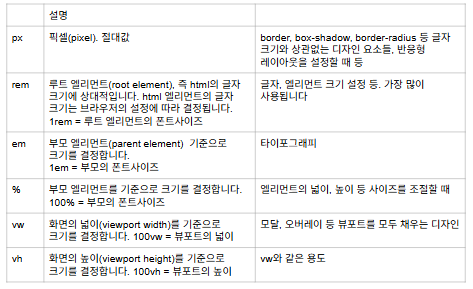
단위별로 글자 크기 지정 예제
앞에서 배운 단위들을 폰트 사이즈에 적용하라.
<!DOCTYPE html>
<html lang="en">
<head>
    <meta charset="UTF-8">
    <meta name="viewport" content="width=device-width, initial-scale=1.0">
    <title>Document</title>
</head>
<body>

    <h1>CSS 길이 단위</h1>

    <style>
        /* 루트 엘리먼트 */
        /* 루트 엘리먼트의 글자크기는 브라우저의 설정값에 따라 결정된다 */
        html {
            /* 글자 크기 */
            /* 테스트를 위해 16px로 고정 */
            /* px(pixel): 절대값 */
            font-size: 16px;
        }

        ul {
            font-size: 16px;
        }

        .px {
            font-size: 16px;
        }

        /* 루트 엘리먼트를 기준으로 폰트사이즈가 결정된다 */
        /* 1rem = 루트 엘리먼트의 폰트 사이즈 */
        .rem {
            font-size: 1rem;
        }

        /* 부모 엘리먼트를 기준으로 폰트사이즈가 결정된다 */
        .em {
            font-size: 1em;
        }

        /* 부모 엘리먼트를 기준으로 폰트사이즈가 결정된다 */
        /* 100% = 부모 엘리먼트의 폰트 사이즈 */
        .percent {
            font-size: 100%;
        }

        /* 화면의 넓이(viewport width)를 기준으로 폰트 사이즈가 결정된다 */
        /* vw = 화면의 넓이 */
        .vw {
            font-size: 10vw;
        }

        /* 화면의 높이(viewport height)를 기준으로 폰트 사이즈가 결정된다 */
        /* 100vh = 화면의 높이 */
        .vh {
            font-size: 10vh;
        }
    </style>

    <ul>
        <li class="px">font-size: 16px</li>
        <li class="rem">font-size: 1rem</li>
        <li class="em">font-size: 1em</li>
        <li class="percent">font-size: 100%</li>
        <li class="vw">font-size: 10vw</li>
        <li class="vh">font-size: vh</li>
    </ul>

</body>
</html>
색상 표기법(Color notation)
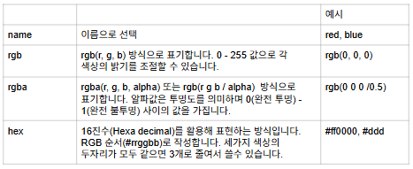
색상 표기법
각 표기 방법별로 빨간 색을 표현하라.
<!DOCTYPE html>
<html lang="en">
<head>
    <meta charset="UTF-8">
    <meta name="viewport" content="width=device-width, initial-scale=1.0">
    <title>Document</title>
</head>
<body>

    <h1>색상 표기법</h1>

    <style>
        .name {
            /* color: 글자 색상 */
            /* 이름으로 색상을 선택한다 */
            color: red;
        }

        .rgb {
            /* rgb (R, G, B) */
            /*
            RGB: 빛의 삼원색
            각 자리는 0-255 사이의 값을 가진다
            숫자가 커질수록 더 밝아진다
             */
            color: rgb(255 0 0);
        }

        .rgba {
            /*
            rgb(R, G, B, 알파) 또는 rgb(R G B / 알파)
             */
            color: rgba(255 0 0 / 1);
        }

        .hex {
            /*
            16진수로 색상을 표기한다 (0~f)
            16진수 = 0 1 2 3 4 5 6 7 8 9 a b c d e f
            #rrggbb
            숫자가 커지면 더 밝아진다
            */
            color: #f00;
        }

        .hex-3 {
            /* 16진수 표기법에서 각 두자리가 모두 같으면 3자리로
            줄여쓸 수 있다*/
            color: #f00;
        }
    </style>

    <ul>
        <li class="name">list item</li>
        <li class="rgb">list item</li>
        <li class="rgba">list item</li>
        <li class="hex">list item</li>
        <li class="hex-3">list item</li>
    </ul>

</body>
</html>
상속(inheritance)
엘리먼트의 속성 값이 아래에 있는 엘리먼트들에게 상속되는 것을 의미한다.
주로 타이포그래피 속성이 자동으로 상속된다.
만약 상속을 원하지 않는 경우 덮어쓰면 된다.
ex) 문서에 폰트를 적용하는 경우
상속/상속 거부하기 예제
상속을 받는 경우와 덮어쓰는 경우를 비교하는 코드를 작성하라.
<!DOCTYPE html>
<html lang="en">
<head>
    <meta charset="UTF-8">
    <meta name="viewport" content="width=device-width, initial-scale=1.0">
    <title>Document</title>
</head>
<body>

    <h1>상속</h1>

    <style>
        ul {
            font-style: italic;
        }

        .a li {
            /*
            타이포그래픽 속성은 기본적으로 상속된다.
            타이포그래픽 속성: font-style 등 텍스트 관련 속성들
            엘리먼트의 font-style의 기본값은 ingerit(상속받기) 이다
            */
            font-style: inherit;
        }

        .b li {
            /* font-style을 덮어쓴다(상속 거부) */
            font-style: normal;
        }
    </style>

    <h3>상속</h3>
    <ul class="a">
        <li>foo</li>
        <li>bar</li>
        <li>baz</li>
    </ul>

    <h3>덮어쓰기</h3>
    <ul class="b">
        <li>foo</li>
        <li>bar</li>
        <li>baz</li>
    </ul>

</body>
</html>
상속 활용 예제
문서 전체의 같은 폰트를 적용하라.
<!DOCTYPE html>
<html lang="en">
<head>
    <meta charset="UTF-8">
    <meta name="viewport" content="width=device-width, initial-scale=1.0">
    <title>Document</title>
</head>
<body>

    <h1>폰트 상속받기</h1>

    <style>
        /* 문서 전체에 적용하고 싶은 폰트 스타일을 body에 적용한다 */
        body {
            font-style: italic;
        }
    </style>

    <ul>
        <li>foo</li>
        <li>bar</li>
        <li>baz</li>
    </ul>

</body>
</html>
Typography 속성
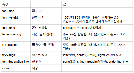
font-style 예제 (1)
여러 텍스트를 각각 다른 폰트 크기로 출력하라.
<!DOCTYPE html>
<html lang="en">
<head>
    <meta charset="UTF-8">
    <meta name="viewport" content="width=device-width, initial-scale=1.0">
    <title>Document</title>
</head>
<body>

    <h1>폰트 사이즈</h1>
    <!--
    폰트 사이즈에서 rem을 쓰는 이유:
    브라우저의 설정값으로부터 폰트 크기를 결정하기 위해서
    -->

    <style>
        .text-xs {
            font-size: 0.75rem;
        }

        .text-base {
            font-size: 1rem;
        }

        .text-2xl {
            font-size: 1.5rem;
        }
    </style>

    <p class="text-xs">font size: 0.75rem</p>

    <p class="text-base">font size: 1rem</p>

    <p class="text-2xl">font size: 1.5rem</p>

</body>
</html>
font-weight 예제
글자 크기를 각각 다르게 한 텍스트들을 출력하라.
<!DOCTYPE html>
<html lang="en">
<head>
    <meta charset="UTF-8">
    <meta name="viewport" content="width=device-width, initial-scale=1.0">
    <title>Document</title>
</head>
<body>

    <h1>font weight(글자 굵기)</h1>
    <!--
    100에서 900 사이에서 100씩 증가하는 값을 가진다
    100(가장 얇음) ~ 900(가장 두꺼움)
    -->
    <style>
        .font-thin {
            font-weight: 100;
        }

        .font-normal {
            font-weight: 400;
        }

        .font-bold {
            font-weight: 700;;
        }
    </style>

    <p class="font-thin">font weight: 100</p>
    <p class="font-normal">font weight: 400</p>
    <p class="font-bold">font weight: 700</p>

</body>
</html>
font-style 예제 (2)
폰트 스타일을 활용하라.
<!DOCTYPE html>
<html lang="en">
<head>
    <meta charset="UTF-8">
    <meta name="viewport" content="width=device-width, initial-scale=1.0">
    <title>Document</title>
</head>
<body>

    <h1>폰트 스타일</h1>

    <style>
        .not-italic {
            font-style: normal;
        }

        .italic {
            font-style: italic;
        }
    </style>

    <p class="not-italic">font-style: normal</p>

    <p class="italic">font-style: italic</p>

</body>
</html>
letter-spacing
letter-spacing을 활용해 자간 간격을 활용하라.
<!DOCTYPE html>
<html lang="en">
<head>
    <meta charset="UTF-8">
    <meta name="viewport" content="width=device-width, initial-scale=1.0">
    <title>Document</title>
</head>
<body>

    <h1>letter-spacing(글자 간격)</h1>
    <!--
    타이포그래피 속성에서 em 단위를 쓰는 경우
    엘리먼트의 폰트 사이즈에 상대적이다.
    -->

    <style>
        .tracking-tightest {
            letter-spacing: -0.05em;
        }

        .tracking-normal {
            letter-spacing: 0em;
        }

        .tracking-widest {
            letter-spacing: 0.1rem;
        }
    </style>

    <p class="tracking-tightest">letter spacing: -0.05em</p>

    <p class="tracking-normal">letter spacing: 0em</p>

    <p class="tracking-widest">letter spacing: 0.1rem</p>

</body>
</html>
line-height
line-height를 활용해 줄 높이를 조절하라.
<!DOCTYPE html>
<html lang="en">
<head>
    <meta charset="UTF-8">
    <meta name="viewport" content="width=device-width, initial-scale=1.0">
    <title>Document</title>
</head>
<body>

    <h1>line height(줄 간격)</h1>

    <style>
        .leading-tight {
            /* em: 엘리먼트의 폰트 사이즈에 상대적 */
            line-height: 1.25em;
        }

        .leading-normal {
            line-height: 1.5em;
        }

        .leading-relaxed {
            line-height: 1.625em;
        }
    </style>

    <h3>line height: 1.25em</h3>
    <p class="leading-tight">
        Lorem ipsum dolor, sit amet consectetur
        adipisicing elit. Vel nihil natus deserunt
        nisi? Vel, atque totam odio mollitia in ipsum
         eveniet ut illo, facilis laboriosam alias tempora
         debitis perferendis harum.
    </p>

    <h3>line height: 1.5em</h3>
    <p class="leading-normal">
        Lorem ipsum dolor sit amet consectetur adipisicing
        elit. Voluptate molestias fugit consectetur
        perspiciatis ipsum, inventore fuga adipisci sunt
        tempora dicta animi et minima exercitationem mollitia
        totam debitis omnis neque cumque?
    </p>

    <h3>line height: 1.625em</h3>
    <p class="leading-relaxed">
        Lorem ipsum dolor sit amet, consectetur adipisicing
        elit. Voluptas, consequatur quisquam reprehenderit
        quia quasi obcaecati quo dolor rerum omnis magnam
        molestias illum accusantium modi est architecto
        officia corrupti? Veniam, laborum.
    </p>
</body>
</html>
text-align
text-align을 활용해라.
<!DOCTYPE html>
<html lang="en">
<head>
    <meta charset="UTF-8">
    <meta name="viewport" content="width=device-width, initial-scale=1.0">
    <title>Document</title>
</head>
<body>

    <h1>text-align(텍스트 정렬)</h1>

    <style>
        .text-left {
            /* 왼쪽 정렬 */
            text-align: left;
        }

        .text-center {
            /* 가운데 정렬 */
            text-align: center;
        }

        .text-right {
            /* 오른쪽 정렬 */
            text-align: right;
        }
    </style>

    <h3>text align: left</h3>
    <p class="text-left">
        Lorem ipsum dolor sit amet consectetur adipisicing elit.
    </p>

    <h3>text align: center</h3>
    <p class="text-center">
        Lorem, ipsum dolor sit amet consectetur adipisicing elit.
    </p>

    <h3>text align: right</h3>
    <p class="text-right">
        Lorem ipsum dolor sit amet consectetur adipisicing elit.
    </p>

</body>
</html>
text-decoration
text decoration을 활용하라.
<!DOCTYPE html>
<html lang="en">
<head>
    <meta charset="UTF-8">
    <meta name="viewport" content="width=device-width, initial-scale=1.0">
    <title>Document</title>
</head>
<body>

    <h1>text decoration line(선 긋기)</h1>

    <style>
        .no-underline {
            text-decoration-line: none;
        }

        .underline {
            text-decoration-line: underline;
        }

        .line-though {
            text-decoration-line: line-through;
        }
    </style>

    <p class="no-underline">text-decoration-line: none</p>
    <p class="underline">text-decoration-line: underline</p>
    <p class="line-though">text-decoration-line: line-through</p>

</body>
</html>
color
color를 활용하라.
<!DOCTYPE html>
<html lang="en">
<head>
    <meta charset="UTF-8">
    <meta name="viewport" content="width=device-width, initial-scale=1.0">
    <title>Document</title>
</head>
<body>

    <h1>color(텍스트 색상)</h1>

    <style>
        .text-red {
            color: red;
        }

        .text-blue {
            color: blue;
        }

        .text-green {
            color: green;
        }
    </style>

    <p class="text-red">red text</p>
    <p class="text-blue">blue text</p>
    <p class="text-green">green text</p>

</body>
</html>
퀴즈
다음 그림을 만들어라.
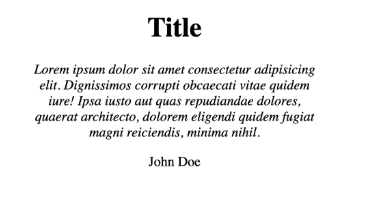
<!DOCTYPE html>
<html lang="en">
<head>
    <meta charset="UTF-8">
    <meta name="viewport" content="width=device-width, initial-scale=1.0">
    <title>Document</title>
</head>
<body>

    <style>
        .text-center {
            text-align: center;
        }

        .italic {
            font-style: italic;
        }
    </style>

    <h1 class="text-center">Title</h1>

    <p class="text-center italic">
        Lorem ipsum dolor sit amet consectetur <br>
        adipisicing elit. Officiis consequatur <br>
        vel provident minus qui a, maiores recusandae <br>
        magni ex necessitatibus earum quam dolorem <br>
        eius at sint. Incidunt ut ducimus et! <br>
    </p>

    <p class="text-center">John Doe</p>

</body>
</html>
Display
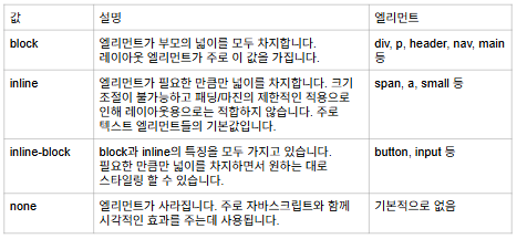
엘리먼트를 진열(display)하는 방법을 결정한다.
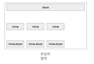
display 종류
block 예제
block 속성을 갖는 엘리먼트를 생성하라.
<!DOCTYPE html>
<html lang="en">
<head>
    <meta charset="UTF-8">
    <meta name="viewport" content="width=device-width, initial-scale=1.0">
    <title>Document</title>
</head>
<body>

    <h1>display: block</h1>

    <style>
        .item {
            /* 엘리먼트의 경계선 */
            border: 1px solid;
        }

        .block {
            /* 부모 엘리먼트의 넓이를 모두 차지한다 */
            /* div의 기본값은 block 이다 */
            display: block;
        }
    </style>

    <div class="item block">item</div>
    <div class="item block">item</div>
    <div class="item block">item</div>

</body>
</html>
inline 예제
inline 속성을 갖는 엘리먼트를 생성하라.
<!DOCTYPE html>
<html lang="en">
<head>
    <meta charset="UTF-8">
    <meta name="viewport" content="width=device-width, initial-scale=1.0">
    <title>Document</title>
</head>
<body>

    <h1>display: inline</h1>

    <style>
        .item {
            /* 경계선 */
            border: 1px solid;
        }

        .inline {
            /*
            엘리먼트가 필요한 만큼만 공간을 차지한다
            크기조절이 불가능하고 패딩/마진의 제한적인 적용으로
            인해서 레이아웃용으로는 사용되지 않는다.
            텍스트 엘리먼트(span, a, small 등)의 기본값이다.
            => 텍스트용 속성값
            참고로 p 엘리먼트는 block이다
            */
            display: inline;
        }
    </style>

    <div class="item inline">item</div>
    <div class="item inline">item</div>
    <div class="item inline">item</div>

</body>
</html>
inline-block
inline-block 속성을 갖는 엘리먼트를 생성하라.
<!DOCTYPE html>
<html lang="en">
<head>
    <meta charset="UTF-8">
    <meta name="viewport" content="width=device-width, initial-scale=1.0">
    <title>Document</title>
</head>
<body>

    <h1>display: inline-block</h1>

    <style>
        .item {
            border: 1px solid;
            /* 패딩 적용 */
            padding: 20px
        }

        .inline-block {
            /*
            inline, block의 특징을 모두 가진 속성값이다.
            필요한 만큼만 넓이를 가지면서 다양한 스타일을 적용할 수 있다.
            */
            display: inline-block;
        }
    </style>

    <div class="item inline-block">item</div>
    <div class="item inline-block">item</div>
    <div class="item inline-block">item</div>

</body>
</html>
none 예제
none 속성을 갖는 엘리먼트를 생성하라.
<!DOCTYPE html>
<html lang="en">
<head>
    <meta charset="UTF-8">
    <meta name="viewport" content="width=device-width, initial-scale=1.0">
    <title>Document</title>
</head>
<body>

    <h1>display: none</h1>

    <style>
        .item {
            border: 1px solid;
        }

        .hidden {
            /* 엘리먼트가 없어진다 */
            display: none;
        }
    </style>

    <div class="item">item 1</div>
    <div class="item hidden">item 2</div>

</body>
</html>
마무리
오늘도 css를 배웠다. 여러가지 text들을 변형시키는 것에 대해 중점적으로 배웠는데 확실히 눈에 보이니 이해가 더 잘 되는 거 같다.
