개요
웹 애플리케이션에서 데이터 로딩은 불가피한 요소이다. 이러한 상황에서 스켈레톤 UI는 사용자 경험을 크게 개선할 수 있는 중요한 디자인 패턴이다.
현재의 문제점
현재 애플리케이션은 모든 페이지에서 동일한 로딩 컴포넌트를 사용하고 있다. 이는 다음과 같은 한계를 가지고 있다.
- 사용자가 로드될 콘텐츠의 구조를 예측할 수 없음
- 페이지별 특성을 반영하지 못하는 획일적인 로딩 표시
- 콘텐츠 로드 완료 시 갑작스러운 레이아웃 변화
스켈레톤 UI를 통한 개선
스켈레톤 UI는 실제 콘텐츠가 표시될 영역의 구조를 미리 보여주는 방식이다. 이는 마치 건물의 뼈대를 먼저 세우는 것과 같은 원리로, 다음과 같은 이점을 제공한다.
- 페이지의 최종 레이아웃을 미리 파악 가능
- 더 자연스러운 로딩 경험 제공
- 사용자의 체감 로딩 시간 감소
어떤 기준으로 컴포넌트를 수정할까?
위에서 언급한대로 스켈레톤 UI는 뼈대를 보여주는 UI이다.
따라서 뼈대가 되는 컴포넌트들을 외부 컴포넌트로 따로 제작하고 Props를 활용하여 스켈레톤 UI인지 실제로 컨텐츠를 보여주는 UI인지 구분하려고 한다.
뼈대 컴포넌트 분리하기
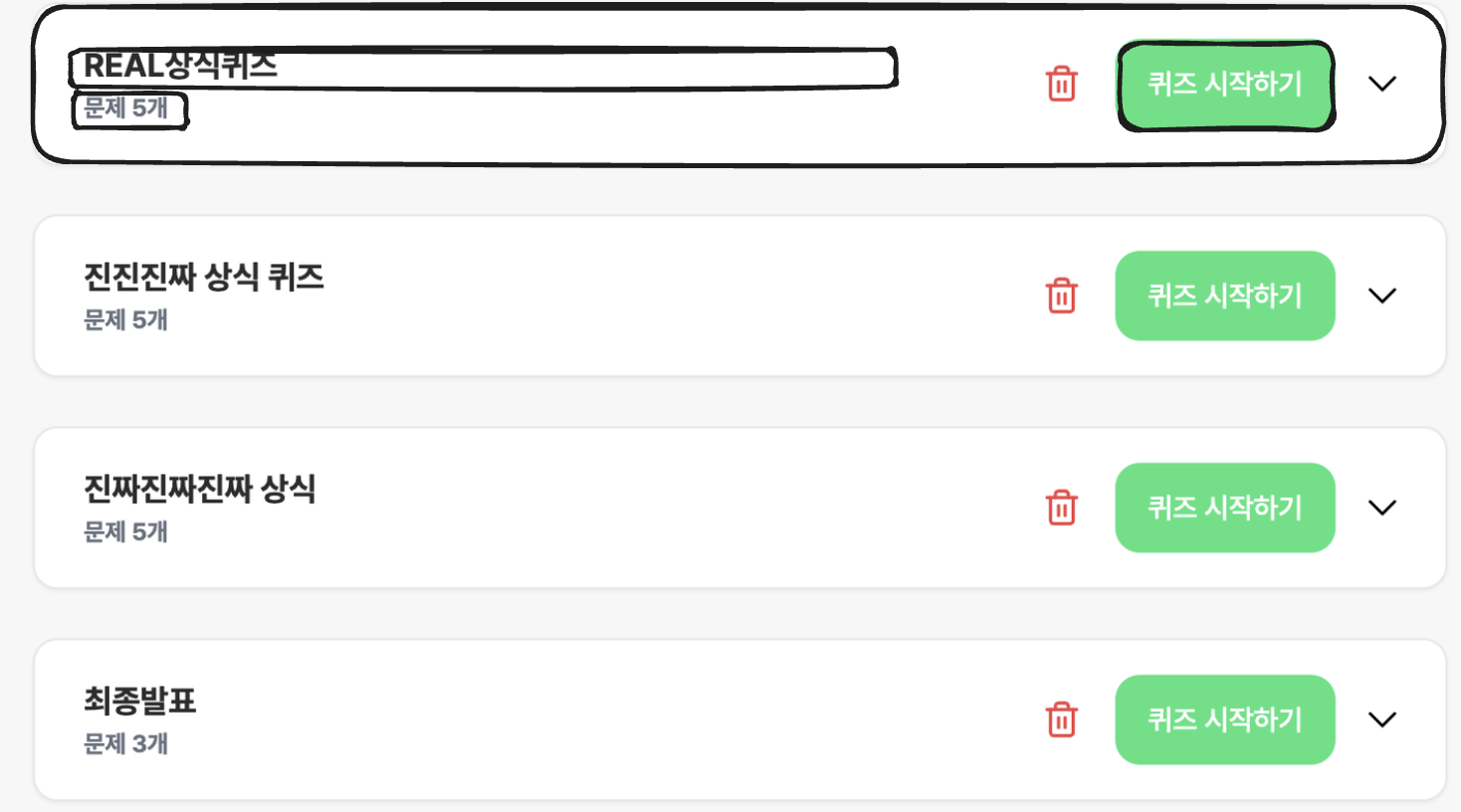
위 화면의 스켈레톤을 제작한다면 그림처럼 뼈대를 잡을 수 있을 것이다.
가장 큰 뼈대는 ClassItem 이라는 컴포넌트로 이미 분리되어 있다. 그렇다면 ClassItem 컴포넌트의 Props를 추가하여 스켈레톤일 때와 아닐 때의 UI를 바꿔주면 될 것 같다.
문제점
위의 방식대로 구현을 하던 중 문제점을 발견했다.
우선 ClassItem의 기존 Props는 아래와 같다.
interface ClassItemProps {
  quizList: Quiz;
  index: number;
}
변경된 Props는 아래와 같다.
interface ClassItemProps {
  varient: 'skeleton' | 'content';
  quizList?: Quiz;
  index?: number;
}
문제점은 바로 quizList? 에서 나타난다.
optional props이기 때문에 quizList의 타입은 Quiz | undefined로 잡히게 되어 quizList를 활용하는 부분에서 타입에러가 발생한다.
해결책
위 문제의 해결책으로 Union 타입과 타입 단언을 사용했다.
이게 최선의 해결책인지는 모르겠으나 위와 같은 방식을 활용하기 위한 임시 해결책이다.
방법은 아래와 같다.
interface SkeletonProps {
  varient: 'skeleton';
}
interface ContentProps {
  varient: 'content';
  quizList: Quiz;
  index: number;
}

type ClassItemProps = SkeletonProps | ContentProps;

export default function ClassItem(props: ClassItemProps) {

	...

  if (props.varient === 'skeleton') {
	   ...
  }

  const { quizList, index } = props as ContentProps;
스켈레톤 Props와 컨텐츠 Props를 분리하여 Union 타입으로 지정 후 조건문을 통해 해당 되는 props에 접근한다.
결과
props를 통해 스켈레톤 UI를 제작한 방식의 장점을 꼽아보자면,
- 컴포넌트 재활용성이 올라갔다.
varientprops를 추가하여 스켈레톤일 때와 아닐 때 다른 UI를 리턴해주는 방식으로ClassItem컴포넌트를 재활용할 수 있었다.
- SkeletonUI의 코드가 간단하다.
단순히export default function SkeletonQuizList() { return ( <div className="w-full min-h-[calc(100vh-80px)] px-8 flex flex-col gap-6 mt-6 mx-auto"> <ClassItem varient="skeleton" /> </div> ); }varientprops만을 추가한 컴포넌트를 사용하기 때문에 간단한 구조를 가진다.
반면 위 방식의 단점을 꼽아보면,
ClassItem의 복잡도가 올라갔다.- 기존 오롯이
ClassItem에만 쓰이는 비지니스 로직과 UI 코드가 존재했다면,varientprops를 추가해줌으로써varient를 판단하는 로직과 스켈레톤 UI 코드가 혼재하면서 코드가 복잡해졌다.
- 기존 오롯이
- 다소 난해한 Props 타입
- 이전에는 Props를 Union 타입으로 활용해본적이 없어서 난해하게 느껴질지 모르겠으나, Props를 Union타입으로 선언하면서 불필요한 타입단언이 생겼다.
위의 장단점을 저울질 해보았을 때 개인적인 생각으로는 단점이 더 크다고 생각한다.
가장 큰 단점은 ClassItem 컴포넌트의 복잡도가 올라간 것이다.
사실 스켈레톤 컴포넌트는 단순한 UI만 제공하면 되기 때문에 현재 ClassItem에 존재하는 코드를 스켈레톤 컴포넌트에 넣는다고해서 코드의 복잡도가 크지는 않다.
하지만 ClassItem 컴포넌트는 실제 컨텐츠와 관련된 비지니스 로직과 UI들이 존재하기 때문에 스켈레톤과 관련된 코드들이 존재하면 다소 혼란스러울 수 있다.
결론
위에서 언급한 Props를 활용한 방식은 장점보다 단점이 크다고 생각한다.
그래서 스켈레톤 컴포넌트에 스켈레톤 UI를 직접 작성하는 방법으로 코드를 짰다.
기본적인 레이아웃만을 보여주기 때문에 직접 코드를 작성해도 매우 길이가 매우 짧고 간결했다.
위의 UI는 간단한 구조이기 때문에 직접 스켈레톤 UI를 작성하는 방식이 더 알맞다고 생각한다.
그렇다면 좀 더 복잡한 구조에서 스켈레톤 UI를 작성해보자.
복잡한 UI의 스켈레톤
결론부터 말하면 복잡한 UI의 스켈레톤은 더더욱 Props 방식을 지양해야된다는 것을 느꼈다.
기본적으로 UI가 복잡한 만큼 컴포넌트 내부의 비지니스 로직과 Props도 많아서 여기에 Varient Props를 추가하여 스켈레톤 UI를 추가하면 더욱 복잡해졌다.
그렇다면 좀 더 슬기롭게 스켈레톤 UI를 작성하는 방법은 무엇일까 생각해보다가 MUI의 스켈레톤 컴포넌트를 참고했다.
MUI의 스켈레톤
MUI는 <Skeleton /> 이라는 컴포넌트가 존재한다.
해당 컴포넌트의 props로 모양, 크기, 애니메이션 등을 지정하여 사용한다.
즉, 회색 컴포넌트가 미리 생성되어 있고 props로 회색 컴포넌트를 조정한다고 생각하면된다.
<Skeleton variant="circular" width={40} height={40} />  // 원형
<Skeleton variant="rectangular" width={210} height={60} />  // 사각형
<Skeleton variant="rounded" width={210} height={60} />  // 둥근 모서리
MUI의 스켈레톤 컴포넌트를 참고해서 기존의 복잡한 스켈레톤 UI를 수정해보았다.
결과는 아래와 같다.
- 위에서 언급한 복잡한 컴포넌트 스켈레톤
- 컴포넌트 구조가 매우 복잡하여 읽기가 힘들다.
export default function SkeletonQuizWait() {
  return (
    <div className="flex justify-center gap-4 pt-8">
      <div className="flex flex-col gap-6 justify-center items-center">
        <div className="w-full bg-white rounded-xl shadow-md p-6">
          <div className="relative flex items-center justify-between mb-4 gap-2">
            <div className="flex items-center gap-2">
              <div className="h-10 w-32 bg-gray-100 rounded-xl animate-pulse" />
              <div className="h-10 w-32 bg-gray-200 rounded-xl animate-pulse" />
            </div>
            <div className="absolute top-1/2 left-1/2 transform -translate-x-1/2 -translate-y-1/2 w-64 h-6 bg-gray-100 rounded-md animate-pulse" />
            <div className="flex items-center gap-6">
              <div className="h-10 w-24 bg-gray-100 rounded-2xl animate-pulse" />
              <div className="h-10 w-32 bg-gray-100 rounded-md animate-pulse" />
            </div>
          </div>

          <div className="w-full bg-gray-50 rounded-xl shadow-md">
            <div className="grid grid-cols-8 gap-16 p-8">
              {Array.from({ length: 32 }).map((_, index) => (
                <div key={index} className="flex flex-col items-center animate-pulse">
                  <div className="w-20 h-20 bg-gray-200 rounded-full" />
                  <div className="w-16 h-4 bg-gray-200 rounded-md mt-2" />
                </div>
              ))}
            </div>
          </div>
        </div>

        <div className="relative flex justify-end min-w-full">
          <div className="h-10 w-32 bg-gray-200 rounded-xl animate-pulse" />
        </div>
      </div>
    </div>
  );
}
<Skeleton />컴포넌트를 적용한 모습- 스켈레톤 컴포넌트에는 기본 배경 색과 애니메이션 코드만 작성되어있다.
- 여전히 복잡하나 약간은 정돈된 느낌이 든다.
    <div className="flex justify-center gap-4 pt-8">
      <div className="flex flex-col gap-6 justify-center items-center">
        <div className="w-full bg-white rounded-xl shadow-md p-6">
          <div className="relative flex items-center justify-between mb-4 gap-2">
            <div className="flex items-center gap-2">
              <Skeleton className="h-10 w-32 rounded-xl" />
              <Skeleton className="h-10 w-32 rounded-xl" />
            </div>
            <div className="absolute top-1/2 left-1/2 transform -translate-x-1/2 -translate-y-1/2 w-64 h-6 bg-gray-100 rounded-md animate-pulse" />
            <div className="flex items-center gap-6">
              <Skeleton className="h-10 w-24 rounded-2xl" />
              <Skeleton className="h-10 w-32 rounded-md" />
            </div>
          </div>

          <div className="w-full bg-gray-50 rounded-xl shadow-md">
            <div className="grid grid-cols-8 gap-16 p-8">
              {Array.from({ length: 32 }).map((_, index) => (
                <div key={index} className="flex flex-col items-center animate-pulse">
                  <Skeleton className="w-20 h-20 rounded-full" />
                  <Skeleton className="w-16 h-4 bg-gray-200 rounded-md mt-2" />
                </div>
              ))}
            </div>
          </div>
        </div>

        <div className="relative flex justify-end min-w-full">
          <Skeleton className="h-10 w-32 rounded-xl" />
        </div>
      </div>
</div>- 레이아웃을 커스텀 컴포넌트로 분리하고 스켈레톤을 적용한 모습
- 컴포넌트명 덕분에 읽기는 훨씬 수월하다.
<QuizWaitLayout>
	<QuizWaitHeader>
		<div className="w-full bg-white rounded-xl shadow-md p-6">
          <div className="relative flex items-center justify-between mb-4 gap-2">
            <div className="flex items-center gap-2">
              <Skeleton className="h-10 w-32 rounded-xl" />
              <Skeleton className="h-10 w-32 rounded-xl" />
            </div>
            <div className="absolute top-1/2 left-1/2 transform -translate-x-1/2 -translate-y-1/2 w-64 h-6 bg-gray-100 rounded-md animate-pulse" />
            <div className="flex items-center gap-6">
              <Skeleton className="h-10 w-24 rounded-2xl" />
              <Skeleton className="h-10 w-32 rounded-md" />
            </div>
          </div>
	</QuizWaitHeader>
	<QuizWaitBoard>
		 <div className="grid grid-cols-8 gap-16 p-8">
	        {Array.from({ length: 32 }).map((_, index) => (
	          <div key={index} className="flex flex-col items-center animate-pulse">
	            <Skeleton className="w-20 h-20 rounded-full" />
	            <Skeleton className="w-16 h-4 bg-gray-200 rounded-md mt-2" />
	          </div>
	        ))}
	      </div>
      </div>
	</QuizWaitBoard>
	<div className="relative flex justify-end min-w-full">
    <Skeleton className="h-10 w-32 rounded-xl" />
  </div>
</QuizWaitLayout>- 최종 컴포넌트 코드
- 초기 컴포넌트 로직 작성 시 레이아웃 컴포넌트들을 잘 분리하고,
- 내부 요소에 대한 스타일들을 클래스로 분리하여 작성하면 아래와 같은 모습이다.
<QuizWaitLayout>
	<QuizWaitHeader>
		<div className="w-full bg-white rounded-xl shadow-md p-6">
          <div className="relative flex items-center justify-between mb-4 gap-2">
            <div className="flex items-center gap-2">
              <Skeleton className="wait-header-button" />
              <Skeleton className="wait-header-pincode" />
            </div>
            <div className="absolute top-1/2 left-1/2 transform -translate-x-1/2 -translate-y-1/2 w-64 h-6 bg-gray-100 rounded-md animate-pulse" />
            <div className="flex items-center gap-6">
              <Skeleton className="wait-header-participants" />
              <Skeleton className="wait-header-number" />
            </div>
          </div>
	</QuizWaitHeader>
	<QuizWaitBoard>
		 <div className="grid grid-cols-8 gap-16 p-8">
	        {Array.from({ length: 32 }).map((_, index) => (
	          <div key={index} className="flex flex-col items-center animate-pulse">
	            <Skeleton className="wait-board-character" />
	            <Skeleton className="wait-board-nickname" />
	          </div>
	        ))}
	      </div>
      </div>
	</QuizWaitBoard>
	<div className="relative flex justify-end min-w-full">
    <Skeleton className="wait-footer-button" />
  </div>
</QuizWaitLayout>
최종 결론
스켈레톤 UI를 잘 작성하기 위해서 필요한 것은 다음과 같다는 결론을 내렸다.
- 분리된 레이아웃 컴포넌트
- 내부 요소에 대한 스타일 클래스화
- 커스텀 스켈레톤 컴포넌트 활용
초기에 스켈레톤을 고려하지 않고 코드를 작성하다보니 프로젝트가 마무리되고 이를 수정하려니 시간과 노력이 많이 들었다.
이번 경험을 통해서 스켈레톤 뿐 아니라 재사용성이 높은 컴포넌트 제작에 필요한 기본적인 요소들을 습득할 수 있었다고 생각한다.