CSS 복습
justify- content ⇒ 콘텐츠를 정의한다
- flex- start
- flex- end
- center
- space-between
- space-around
- space-evenly
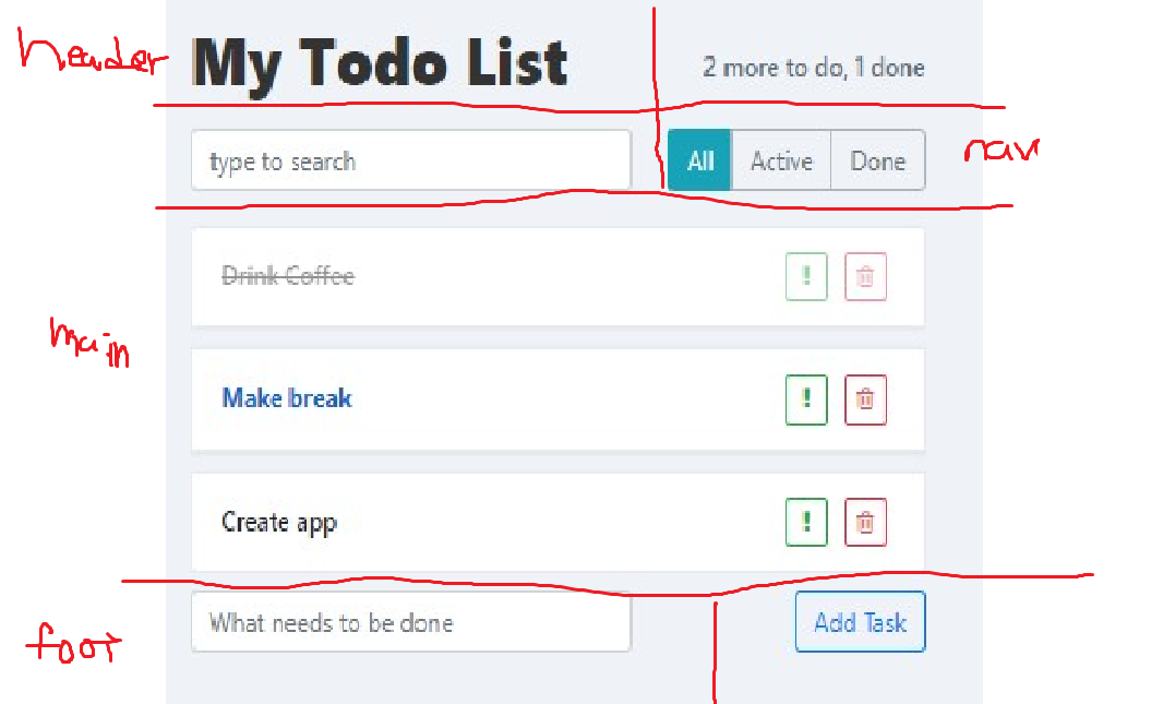
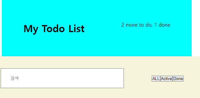
<header class="mainHome">

    <div class="title">
 <h1>My Todo List</h1>
    <p class="check">2 more to do, 1 done</p>
    <!-- // 숫자가 들어간 곳은 변동이 될수 있어야함 // -->

    </div>

    <input type="text" name="search" class="search" id="search" placeholder="검색">
    <nav>
        <ul id="topMenu">
            <li><button type="button">ALL</button></li>
            <li><button type="button">Active</button></li>
            <li><button type="button">Done</button></li>
</header>
* {margin: 0;
padding: 0;}
body {
display: flex;
justify-content: center;
align-items: center;
width: auto;
height: 100%;
li {
list-style: none;
}
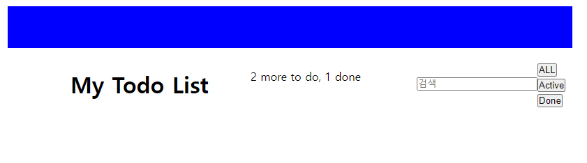
.mainHome {
display: flex;
align-items: flex-start;
margin: 3rem;
padding: 10px;
height: 40px;
background-color: blue;
align-self: baseline;
}
.title {
display: flex;
align-items: flex-start;
margin: 40px;
padding: 100px;
}mainHome 이라는 클래스 안에
title
check
search
topMenu
4개의 요소가 있는데 이것을 2개씩 병렬로 하고 싶음
우선 전체적으로 display : flex 해서 수직정렬을 하였는지
나머지 두개가 내려가는 방법을 모르겠어서 서칭하고 여쭤보아서 해결방법
‼️‼️‼️‼️‼️‼️‼️‼️‼️‼️‼️‼️‼️‼️‼️
방법1- flex- wrap 을 쓴다면
Q. flex - wrap 이란?
아이템들이 컨테이너 안에서 한줄로 배치 될지, 여러줄로 나누어질지를 결정
사용을 하려면 1 + 2 요소가 전체 공간을 다 차지 하여야지
3,4 가 그다음줄로 내려감
화면의 크기에 따른 반응형 웹이나 앱에서 많이 사용함
방법2- 요소 4개를 2개씩 나누어서 전체적으로 flex를 주고 column으로 배열하는 방법
🍏🍏🍏>>적용
효율적인 방법2로 ㄱ
방법 2
요소 분리하기
전체 class
.mainHome {
display : flex;
flex-direction :column;}
두줄로 정렬됨
nav 요소가 마진이랑 패딩이 아무것도 없어서 값을 줌
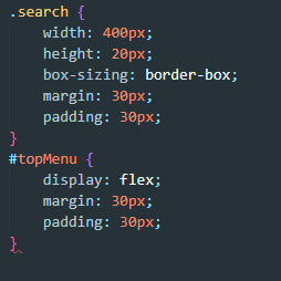
serarch는 검색창
topMenu는 카테고리
탑메뉴 같은 경우는 3개의 버튼이 수직정렬해야 되서 flex를 줌
이제는 리스트와 투두 추가를 밑에 배열하려고 함
chan