flex를 조금 더 만져보면서 이해해야 도움이 될 것 같아서
이렇게 저렇게 만져보고자 했고 그 속에서 다양한 단위들도 사용해 보았다.
body{
  margin: 0;
}
#container{
  display:flex;
  flex-direction: column;
  background-color: darkgrey;
  height: 100vh;
  width: 100vw;
}
#top{
  background-color: darkgreen;
  gap:20px;
  padding: 10px;
  flex-basis: 10%;
  align-items: flex-end;
  display: flex;
}
#top div{
  background-color: darkgoldenrod;
  text-align: center;
}
#top div:last-child{
  flex-basis: 70%;
  padding: 0.6rem;
}
#top div:first-child{
  flex-basis: 30%;
  background-color: darkseagreen;
  padding:0.6rem;
}
#mid{
  display: flex;
  flex-grow: 1;
  justify-content: center;
  align-items: center;
  gap:10px;
}
#bro{
  display: flex;
  background-color: darkslategrey;
  padding: 164px 140px;
  gap: 10px;
}
#content{
  display:flex;
  padding:40px;
  background-color: lightgreen;
}
#bottom{
  display: flex;
  justify-content:center;
  align-items: center;
  background-color: darkolivegreen;
  flex-basis: 10%;
}<body>
<div id="container">
<div id="top">
<div>아빠 치코리타</div>
<div>큰아빠 치코리타</div>
</div>
<div id="mid"><img src="./person.jpg" width="686px" height="427px">
<div id="bro">
<div id="content">
중간 치코리타(형)
</div>
<div id="content">
중간 치코리타(동생)
</div>
</div>
</div>
<div id="bottom">
<p>애기 치코리타</p>
</div>
</div>
</body>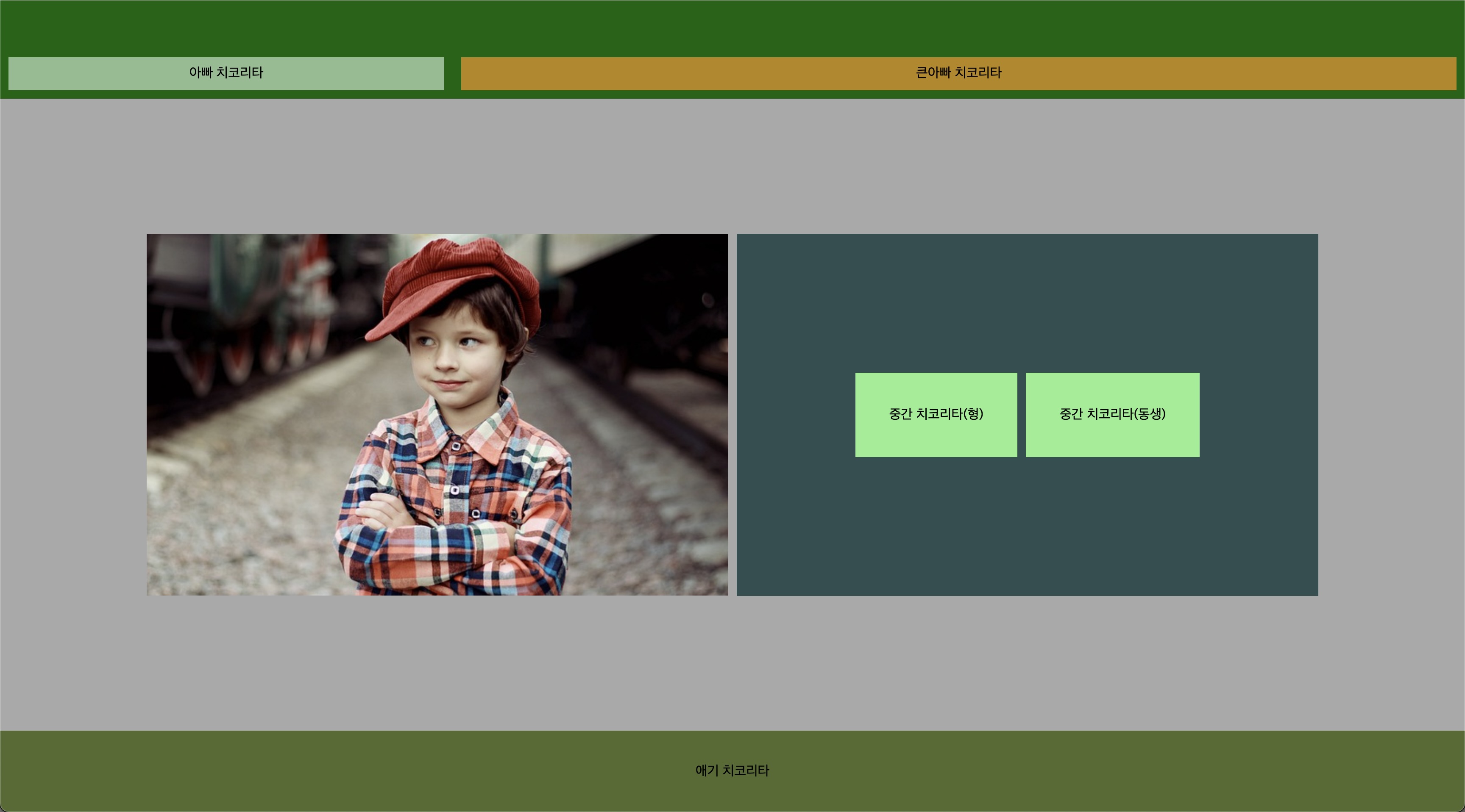
- 좋은 방법이 아닐 순 있으나, 기능들을 사용해보는 것에 크게 의의를 뒀다.
- 상 중 하로 구역을 나눠서 사용해 보고 싶었으며, 구역을 나눠보고, 정렬을 해보는 것에 초점을 뒀다.
- 각 구역에 대해서 display:flex는 기본 옵션으로 뒀다. 그 후 container를 100vh, 100vw를 써서 꽉 채워보았다.
- container의 기준 축을 column으로 두었다.
- padding, flex-basis, gap을 통해 요소들간의 간격과 크기(비율)들을 요리조리 조절해봤다.
- justify-content와 align-items를 통해 정렬을 해보고 싶은대로 해봤다.
해당 작업을 해보면서 해결하지 못한 점
개발자 도구를 통해서 mid부분에 있는 사진과 bro태그의 크기를 완벽하게 맞추고 싶었는데,
소수점 두번째자리에서 맞춰지지 않았다. 각각 태그를 나눠서 해야하는건지.. 다음 번에 시도하게 된다면 사이즈를 정확히 맞춰보는 작업을 해보고 싶다.
추가적으로 사실 이렇게 저렇게 삽질해보면서 하려던 방향대로 맞춰진거지 어디에 어떤기능을 정확히 넣어야 겠다!! 하고 적용시킨게 아니다. 조금 체계적으로 좋은 코드를 짜보고 싶다.
꾸준히 진득하게 앞으로