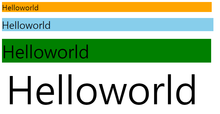
반응형 웹
동작환경에 따라서 모양을 다르게 바꾸어 가독성과 사용성의 편의를 추구하는 웹
<!DOCTYPE html>
<html>
<head>
<meta name="viewport" content="width=device-width, initial-scale=1.0">
<style type="text/css">
@import url(http://fonts.googleapis.com/earlyaccess/nanumgothic.css);

.font{ font-family: 'Nanum-Gothic'; }
@media (max-width:375px) {
	.apple{ background-color: white; }
	.font { font-size: 22px; }
}
@media (min-width:376px) {
	.apple{ background-color: green; }
	.font { font-size: 20px; }
}
@media (min-width:768px) {
	.apple{ background-color: skyblue; }
	.font { font-size: 16px; }
}
@media (min-width:992px) {
	.apple{ background-color: orange; }
	.font { font-size: 14px; }
}
</style>
</head>
<body>
	<div class="apple font">Helloworld</div>
</body>
</html>
(max-width:375px) : 0~375, 구형 스마트폰
(min-width:376px) : 376~, 신형 스마트폰
(min-width:768px) : 768~, 태블릿
(min-width:992px) : 992~, 컴퓨터 모니터
<!DOCTYPE html>
<html>
<head>
<!-- 아예 고정되도록 하게 설정 할 수 있음. 확대/축소 안되도록 -->
<meta name="viewport" content="width=device-width,initial-scale=1.0,minimum-scale=1.0,maximum-scale=1.0,user-scalable=no">
<style type="text/css">
@import url(http://fonts.googleapis.com/earlyaccess/nanumgothic.css);
.font { font-family: 'Nanum-Gothic'; text-align: center; }
/*
<meta name="viewport" content="width=device-width, initial-scale=1.0">
미리 큰글꼴 / 중간글꼴 / 작은글꼴 정해놓고 환경에 따라 크기를 다르게하여 적용
*/
.font_sm { font-family: 'Nanum-Gothic'; text-align: center; }
.font_md { font-family: 'Nanum-Gothic'; text-align: center; }
.font_lg { font-family: 'Nanum-Gothic'; text-align: center; }
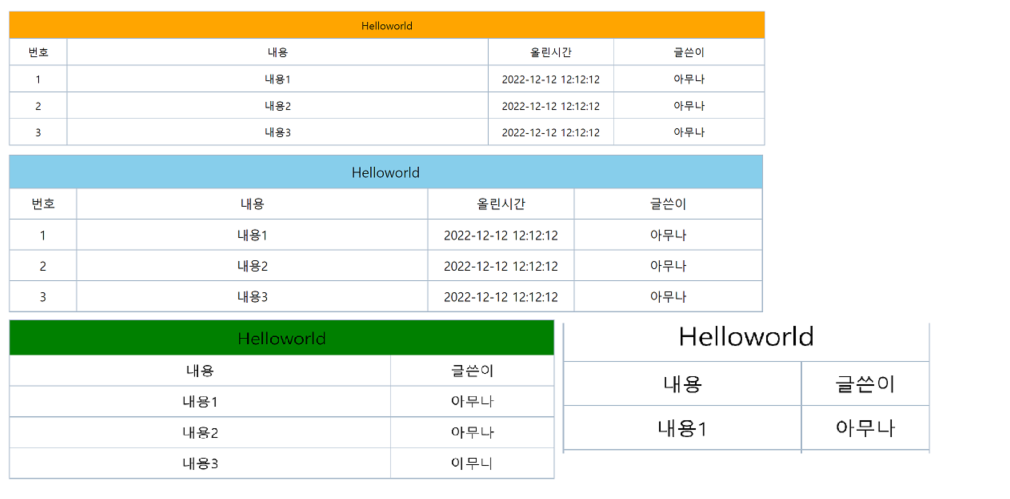
@media (max-width:375px) {
.apple{ background-color: white; }
.font { font-size: 22px; }
.font_sm { font-size: 16px; }
.td_no { display: none; }
.td_time { display: none; }
.td_author { width: 35%; }
}
@media (min-width:376px) {
.apple{ background-color: green; }
.font { font-size: 20px; }
.font_sm { font-size: 16px; }
.td_no { display: none; }
.td_time { display: none; }
.td_author { width: 30%; }
}
@media (min-width:768px) {
.apple{ background-color: skyblue; }
.font { font-size: 16px; }
.font_sm { font-size: 14px; }
.td_no { display: table-cell; }
.td_time { display: table-cell; }
.td_author { width: 25%; }
}
@media (min-width:992px) {
.apple{ background-color: orange; }
.font { font-size: 14px; }
.font_sm { font-size: 14px; }
.td_no { display: table-cell; }
.td_time { display: table-cell; }
.td_author { width: 20%; }
}
.apple {
padding : 8px;
border: 1px solid #aabbcc;
margin-bottom: -1px;
}
table {
width: 100%;
border-width: 0px;
border-collapse: collapse;
text-align: center;
}
table td {
border: 1px solid #aabbcc;
padding: 8px;
}
.td_no { width : 60px; }
.td_time { width : 150px; }
</style>
</head>
<body>
<div class="apple font">Helloworld</div>
<table>
<tr>
<td class="td_no font_sm">번호</td>
<td class="td_content font_sm">내용</td>
<td class="td_time font_sm">올린시간</td>
<td class="td_author font_sm">글쓴이</td>
</tr>
<tr>
<td class="td_no font_sm">1</td>
<td class="td_content font_sm">내용1</td>
<td class="td_time font_sm">2022-12-12 12:12:12</td>
<td class="td_author font_sm">아무나</td>
</tr>
<tr>
<td class="td_no font_sm">2</td>
<td class="td_content font_sm">내용2</td>
<td class="td_time font_sm">2022-12-12 12:12:12</td>
<td class="td_author font_sm">아무나</td>
</tr>
<tr>
<td class="td_no font_sm">3</td>
<td class="td_content font_sm">내용3</td>
<td class="td_time font_sm">2022-12-12 12:12:12</td>
<td class="td_author font_sm">아무나</td>
</tr>
</table>
</body>
</html>display: none; : 테이블의 tr 또는 td를 숨김처리한다.
