그리드 레이아웃은 웹사이트 디자인의 주요한 요소이고, CSS 그리드 모듈은 그것을 구현해주는강력하고 쉬운 툴로 사용된다.
CSS 그리드의 두가지 주요 요소는 cyt(부모 요소)와 items(자식 요소)이다.
cyt는 감싸주는 그리드이고 item들은 그리드 내부의 요소들이다.
부모 요소 내부에 6개의 자식 요소들이 있는 마크업
<!DOCTYPE html>
<html>
	<head>
    <link rel="stylesheet" href="./grid.css"/>
    </head>
    <body>
    <div class="cyt">
    	<div class="a">1</div>
        <div class="a">2</div>
        <div class="a">3</div>
        <div class="a">4</div>
        <div class="a">5</div>
        <div class="a">6</div>
     </div>
     </body>
  </html>
부모 div를 cyt로 바꾸려면, display를 cyt로 설정한다.!
.cyt{
display: grid;
width: 200px;
height: 300px;
font-weight: bold;
}

.a{
background-color: red;
text-align: center;
line-height: 90px;
}

.g{
background-color: red;
text-align: center;
line-height: 90px;
}

.c{
background-color: red;
text-align: center;
line-height: 90px;
}

.d{
background-color: red;
text-align: center;
line-height: 90px;
}
아직 그리드가 설정 할지 지정되지 않았기 때문에 단순히 6개의 class가 지정된 div들이 쌓여있는 모습으로 보여질 것이다.
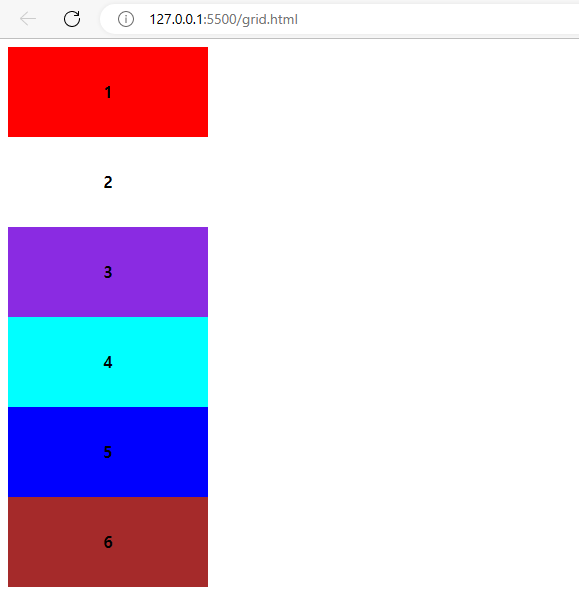
서버로 열엇을 떄 보여지는 모습이다.
Column과 row
두개로 나누기 위해서, column과 row를 정의하고
grid-template-row와 grid-template-column 프로퍼티를 사용한다.
grid-template-columns에 2개의 값, grid-template-rows에 2개의 값을 정의해 주면 2개의 columns과 rows 표현이 가능해진다.
값들은 column의 너비(100px)와 , row의 높이(100px)을 적용한다.
.cyt {
display: grid;
grid-template-columns: 100px 100px;
grid-template-rows: 100px 100px;
border: 1px solid black;
width: 200px;
height: 300px;
font-weghit: bold;
}
2x2를 사용하여 정의하여 나타낸다.
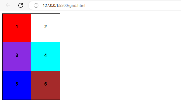
깔금하게 정리한 grid가 완성된다.

개발자 가치를 높이는 나의 성장에 대해서 작성하고 있습니다.