display: flex; 사용 방법을 참고용으로 정리
1. 시작하기 전 셋팅 내용
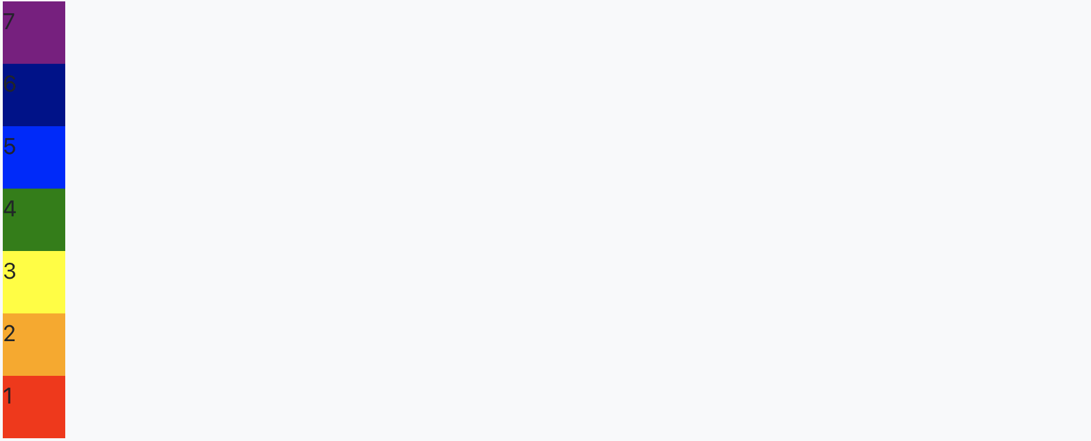
<div id="div1">
  <div style="background-color: red; height: 50px; width: 50px;">1</div>
  <div style="background-color: orange; height: 50px; width: 50px;">2</div>
  <div style="background-color: yellow; height: 50px; width: 50px;">3</div>
  <div style="background-color: green; height: 50px; width: 50px;">4</div>
  <div style="background-color: blue; height: 50px; width: 50px;">5</div>
  <div style="background-color: darkblue; height: 50px; width: 50px;">6</div>
  <div style="background-color: purple; height: 50px; width: 50px;">7</div>
</div>
2. css 파일에서 display를 flex로 설정
#div1 {
display: flex;
}

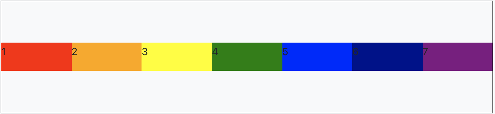
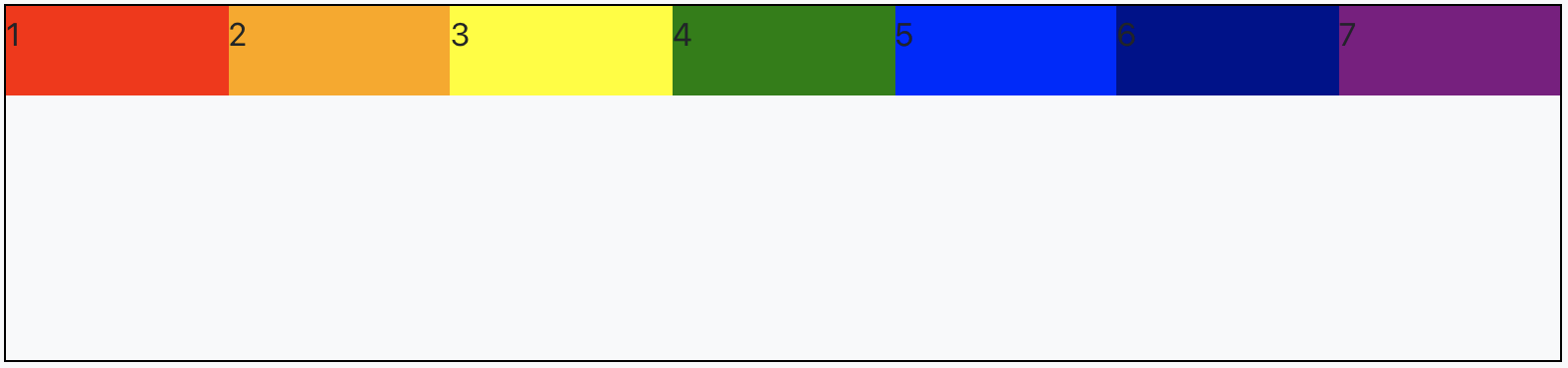
flex로 설정하게 되면 flex-direction 값이 기본값인 row로 지정 되기 때문에 가로로 정렬
3. 가로,세로 정렬 or 순서 위치 정렬 (flex-direction)
flex-direction 을 사용해서 가로(row), 세로(column) 또는 순서와 위치(-reverse)를 설정 할 수 있음
설정을 하지 않으면 기본값은 row이기 때문에 가로로 정렬
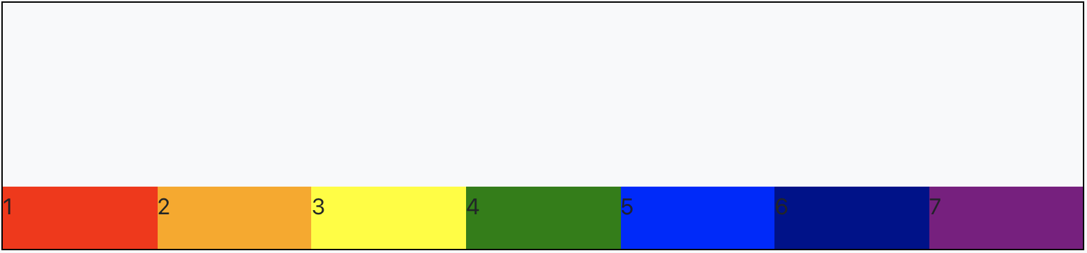
row-reverse로 설정하면 가로축으로 정렬이 되지만 우측부터 순서대로 정렬됨
#div1 {
display: flex;
flex-direction: row-reverse;
}
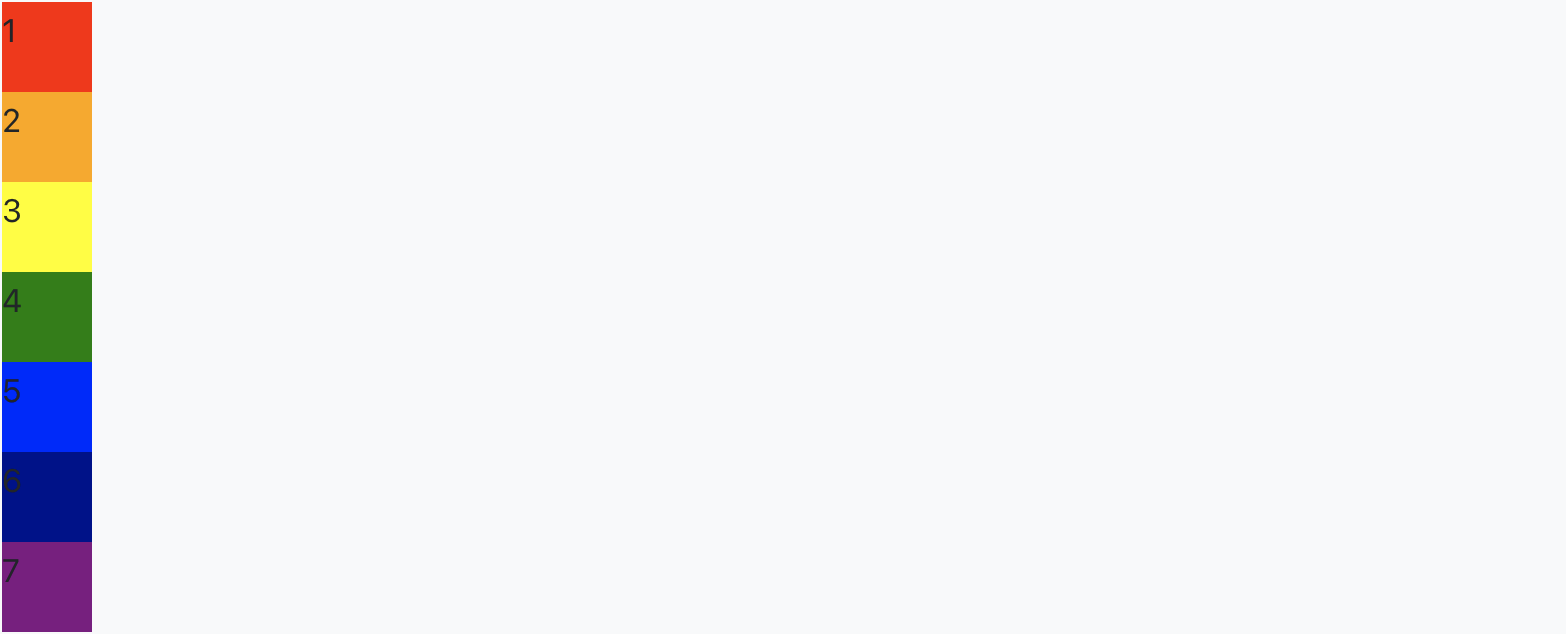
column으로 설정하면 세로축으로 정렬
#div1 {
display: flex;
flex-direction: column;
}
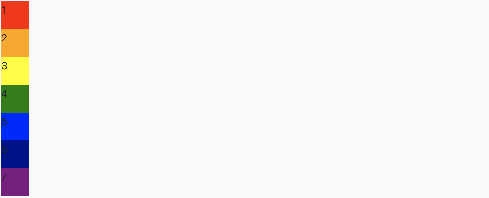
column-reverse로 설정하면 세로축으로 정렬되지만 하단부터 순서대로 정렬
#div1 {
display: flex;
flex-direction: column-reverse;
}

4. 컨텐츠 공간이 부족할 때 줄바꿈 (flex-wrap)
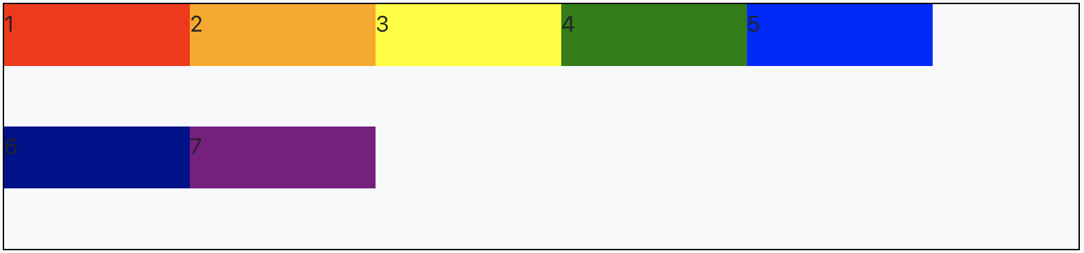
flex-wrap 를 사용해서 컨텐츠 공간이 부족하면, 줄바꿈을 하거나 페이지에 넘치게 둘 수 있음
flex-wrap: nowrap; //페이지 크기가 부족해도 다음줄로 줄바꿈 하지 않음
flex-wrap: wrap; //페이지 크기가 부족하면 다음줄로 줄바꿈#div1 { display: flex; flex-direction: row; flex-wrap: nowrap; }
#div1 {
display: flex;
flex-direction: row;
flex-wrap: wrap;
}

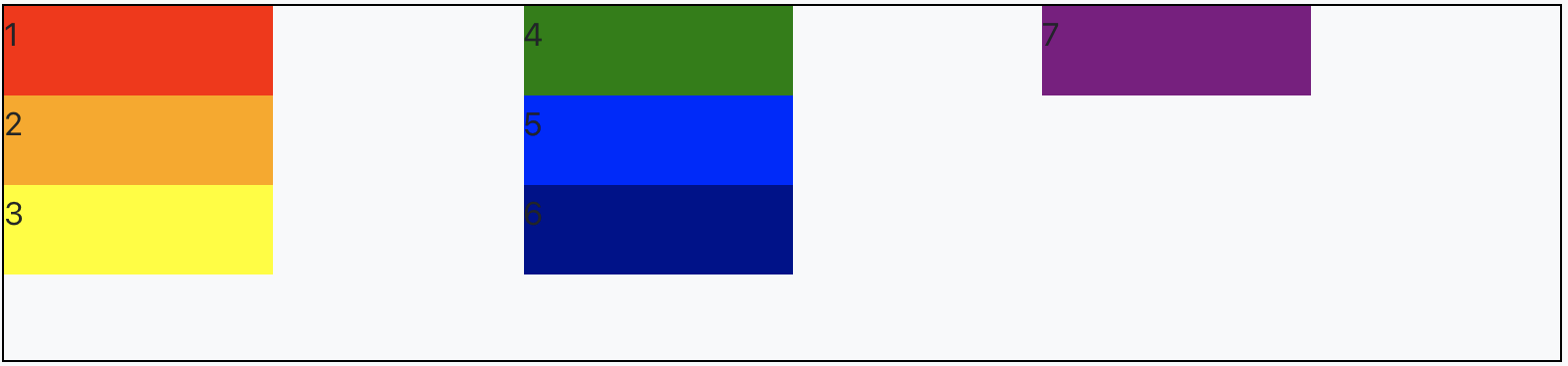
flex-direction과 flex-wrap는 "flex-flow"로 한번에 사용가능
#div1 {
display: flex;
flex-flow: row wrap;
}
#div1 {
display: flex;
flex-flow: column wrap;
}
5. 주축 컨텐츠 정렬 (justify-content)
justify-content 를 사용해서 메인 축(가로로 정렬했을 때는 가로가 메인, 세로로 정렬했을 때는 세로가 메인)의 컨텐츠를 정렬
justify-content: flex-start; //주축 시작점 정렬
justify-content: flex-end; //주축 끝점 정렬
justify-content: center; //주축 가운데 정렬
justify-content: space-around; //일정한 간격으로 width 크기에 정렬
justify-content: space-between; //시작 끝 부분 공간없이 일정한 간격으로 width 크기에 정렬#div1 { display: flex; flex-direction: row; justify-content: center; }
#div1 {
display: flex;
flex-direction: row;
justify-content: space-between;
}


6. 교차 축 컨텐츠 정렬 (align-content)
align-content 를 사용해서 교차축(가로로 정렬했을 때는 세로가 교차축, 세로로 정렬했을 때는 가로가 교차축)의 컨텐츠를 정렬
align-content: flex-start; //교차축 시작점 정렬
align-content: flex-end; //교차축 끝점 정렬
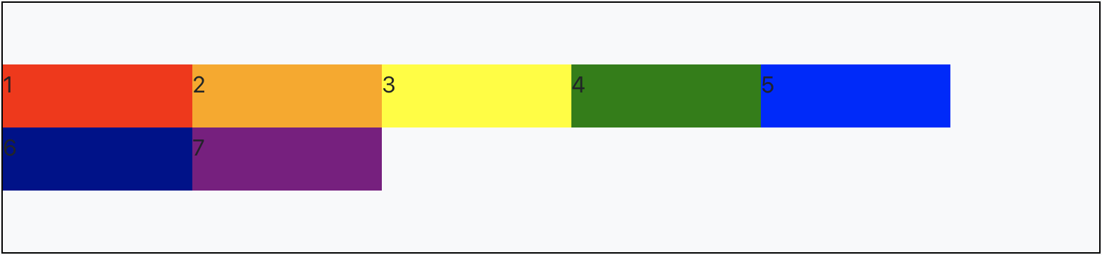
align-content: center; //교차축 가운데 정렬
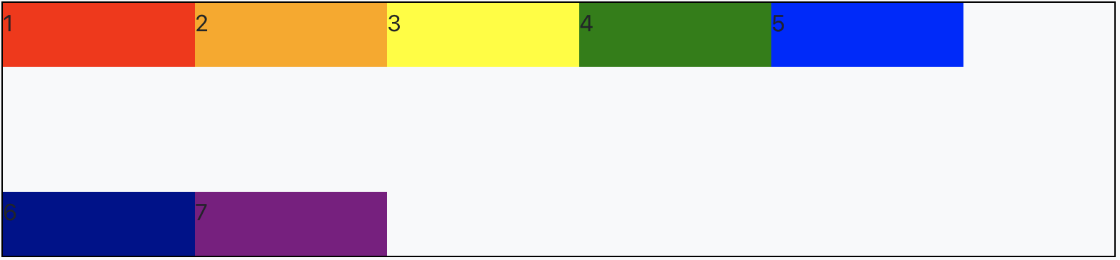
align-content: space-around; //일정한 간격으로 height 크기에 정렬
align-content: space-between; //시작 끝 부분 공간없이 일정한 간격으로 height 크기에 정렬#div1 { display: flex; flex-flow: row wrap; align-content: space-between; }
#div1 {
display: flex;
flex-flow: row wrap;
align-content: center;
}
7. 교차축 아이템 정렬(align-items)
align-content는 컨텐츠끼리의 정렬을 하는거라면, align-items는 컨텐츠 자체를 정렬
aling-items: flex-start; // 교차 축의 시작점으로 정렬
aling-items: flex-end; // 교차 축의 끝점으로 정렬
aling-items: center; // 교차 축의 가운데로 정렬#div1 { display: flex; flex-flow: row nowrap; align-items: flex-end; }
#div1 {
display: flex;
flex-flow: row nowrap;
align-items: center;
}