Grid란?
비교적 최신에 나온 CSS속성이다.
flex와는 다르게 한번에 여러 정렬을 할수있다.
Grid의 장점
grid의 장점은 위의 사진처럼 정렬할때 장점을 크게 느낄수있다.
flex로 정렬하기 위해서는 두번째 줄을 flex정렬을 위해 부모tag로 감싸야 하지만
grid는 바로 정렬이 가능하다.
grid 사용법
grid사용법은 간단하다.
grid-template-columns : 해당 컨텐츠를 좌우로 몇개를 나눌지 정하는 코드
grid-template-columns : 1fr 1fr;1fr은 grid속성이 알아서 컨텐츠를 똑같이 나눠주는 단위이다.
만약.container{ width: 400px; height: 600px; display: grid; grid-template-columns: 1fr 1fr; }해당 컨텐츠의 width값이 400px인데 1fr 1fr을 사용했다면 각각 200px로 나눈다.
.container{
            width: 400px;
            height: 600px;
            display: grid;
            grid-template-columns:  200px 1fr 1fr;
        }
그리고 200px 1fr 1fr로 적는다면 해당 컨텐츠 width값에서 200px을 뺀 나머지를 1fr 1fr로 나눈다.
즉, 1fr은 100px이 된다.
grid-template-rows : 해당 컨텐츠를 위아래로 몇개를 나눌지 정하는 코드
 .container{
            width: 400px;
            height: 600px;
            display: grid;
            grid-template-rows:  1fr 1fr;
        }
해당 컨텐츠의 height값이 600px인데 1fr 1fr을 사용했다면 각각 300px로 나눈다.
.container{
            width: 400px;
            height: 600px;
            display: grid;
            grid-template-rows:  200px 1fr 1fr;
        }
그리고 200px 1fr 1fr로 적는다면 해당 컨텐츠 height값에서 200px을 뺀 나머지를 1fr 1fr로 나눈다. 즉, 1fr은 200px이 된다.
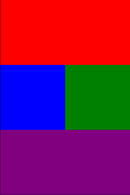
grid-template-areas : grid-template-rows와grid-template-columns에서 나눈 영역에 값을 준다.
 .container{
            width: 400px;
            height: 600px;
            display: grid;
            grid-template-columns:  1fr 1fr;
            grid-template-rows: 1fr 1fr 1fr;
            grid-template-areas:
            "top top"
            "left right"
            "bottom bottom";
        }
이렇게 코드를 짜면 1줄은 top이 차지하고
2줄은 왼쪽은 left 오른쪽은 right가 차지하고
3줄은 bottom이 차지하게 된다.
하지만 주의 할 점이 있다. 컨텐츠를 나눌때 ㄱ자나 ㄴ자로 나눌순없다.
예를 들어
 .container{
            width: 400px;
            height: 600px;
            display: grid;
            grid-template-columns:  1fr 1fr;
            grid-template-rows: 1fr 1fr 1fr;
            grid-template-areas:
            "top top"
            "top right"
            "bottom bottom";
        }
이렇게 코드를 짜게 되면 grid가 틀어져서 아예 안나온다.
grid-area : grid-template-areas에서 나눈 값을 각 태그에 주는 속성
.top{
            background: red;
            grid-area: top;
        }
        .left{
            background: blue;
            grid-area: left;
        }
        .right{
            background: green;
            grid-area: right;
        }
        .bottom{
            background: purple;
            grid-area: bottom;
        }
이렇게 각 class에 나눈 값을 할당할수있다.

열심히하자