Grid
grid-auto-rows
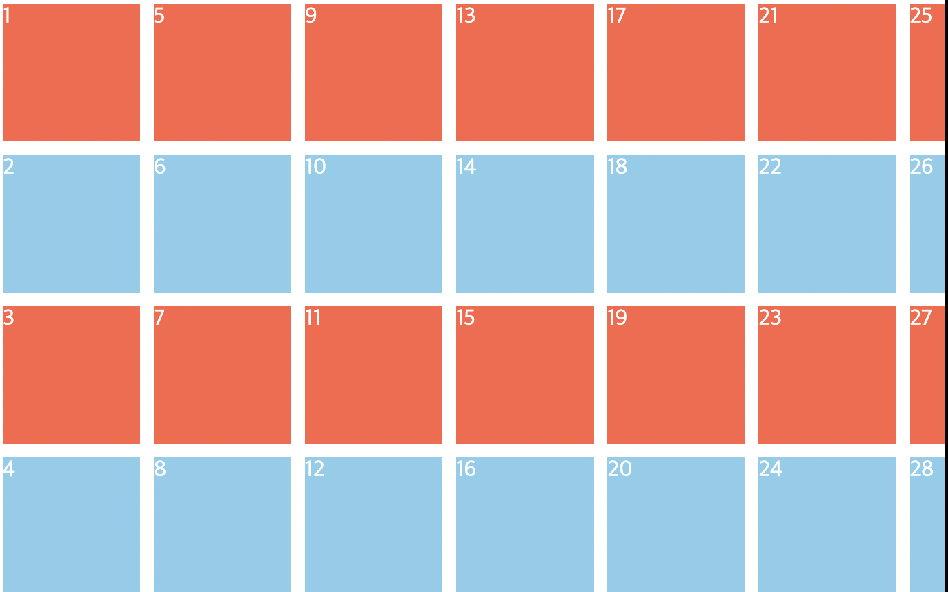
아주 많은 element를 가지고 있을 때 row의 높이 보장해주고 싶을 때 사용
default 값 row : 넘치는 elemen있을때 row를 생성.grid { color: white; display: grid; gap: 10px; grid-template-columns: repeat(4, 100px); grid-auto-rows: 300px; }
grid-auto-flow : column or row
정의한 row보다 더 많은 element 있을 때 어디에 생성할 것인지 결정한다
순서 바뀜에 주의 !
.grid {
  color: white;
  display: grid;
  gap: 10px;
  grid-template-columns: repeat(4, 100px);
  grid-template-rows: repeat(4, 100px);
**  grid-auto-flow: column;** // column 을 더 생성한다
}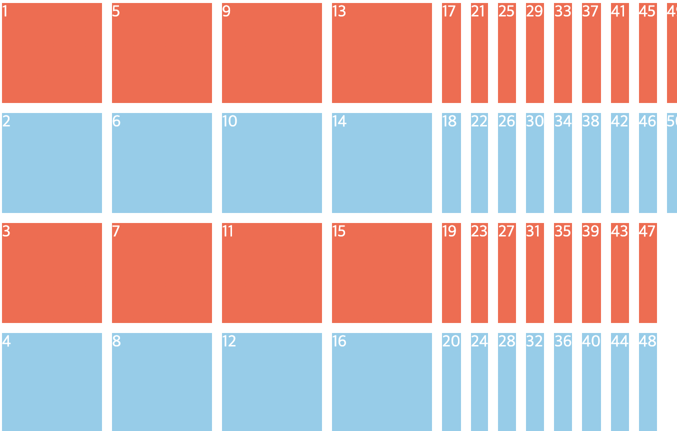
gird-auto-flow with grid-auto-columns or rows
- 넘치는 element 크기 보장해 주고 싶을 때 grid-auto-columns or rows 속성 쓴다
- 스크롤이 생긴다
.grid {
  color: white;
  display: grid;
  gap: 10px;
  grid-template-columns: repeat(4, 100px);
  grid-template-rows: repeat(4, 100px);
  grid-auto-flow: column;
  grid-auto-columns: 100px;
}

.item:nth-child(odd) {
  background-color: tomato;
}

.item:nth-child(even) {
  background-color: skyblue;
}

Divde & Conquer