
지금까지 배웠던 약간의 html, css, javascript 지식으로 작은 프로젝트를 하나씩 만들면 공부에 보다 도움이 될 것 같아 그 시작을 아날로그 시계로 정했다.
1. body 구성하기
우리가 흔히 볼 수 있는 벽시계를 만들려 한다. 시계판과 시침, 분침, 초침이 시각을 가리킨다는 특징이 있다.
먼저 시계판 위에 시계침들이 들어가므로 body를 다음과 같이 구성했다.
<div class="clock">
    <div class="hand hour"></div>
    <div class="hand minute"></div>
    <div class="hand second"></div>
    <div class="dot"></div>
</div>
<div class="digital"></div>
hand는 시계침들의 공통적인 속성을 담을 클래스고, hour/minute/second는 각각을 구분하는 데 사용한다.
dot은 시계에서 모든 침을 고정시키는 핀 같은 역할을 한다.
digital은 아날로그 시계 밑에 함께 현재 시각을 디지털로 표시하는 역할을 한다.
2. body 스타일 적용
이제 클래스 선택자를 사용해서 스타일을 적용해 준다.
<style>
    body {
      background: ivory;
    }

    .clock {
      background: white;
      display: flex;
      position: relative;
      width: 500px;
      height: 500px;
      border: 5px solid black;
      border-radius: 50%;
      box-shadow: 0px 2px 5px 5px;
    }

    .hand {
      background: black;
      position: absolute;
      width: 10px;
      height: 100px;
      border-radius: 5px;
      top: 50%;
      left: 50%;
      transform-origin: top;
    }

    .hour {
      height: 150px;
    }

    .minute {
      height: 200px;
    }

    .second {
      width: 5px;
      height: 200px;
      background: red;
    }

    .digital {
      display: flex;
      width: 510px;
      height: 100px;
      align-items: center;
      justify-content: center;
      color: black;
      font-size: x-large;
      font-family: 'Gill Sans', 'Gill Sans MT', Calibri, 'Trebuchet MS', sans-serif;
    }

    .dot {
      background: black;
      position: absolute;
      width: 20px;
      height: 20px;
      left: 245px;
      top: 245px;
      border-radius: 50%;
    }
  </style>
clock 클래스를 가진 부모 태그를 기준으로 시계침을 움직이기 위해 부모 태그는 position: relative를 주고 그 자식들은 position: absolute를 주었다.
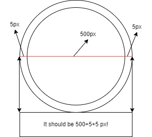
digital 클래스 스타일에서 width: 510px은 clock 클래스에서 양쪽 border 5px씩을 더한 값이다. 처음에 width: 500px를 했는데 글자가 중앙에 맞지 않는 느낌이었다. 알고 보니 border 값을 더하지 않았기 때문이었다.
3. script 작성
JavaScript의 Date 객체를 이용해 현재 시각을 알아오게 하는 것이 첫 번째 목표이다. 그 다음으로 웹페이지가 실행되고 나서 1초마다 시계 바늘이 움직이도록 해야 한다.
시침, 분침, 초침이 각각 따로 움직이게 하려면 각 요소들을 객체로 다뤄야 하기에 document.querySelector를 사용했다.
 <script>
    function clock() {
      const currentTime = new Date();

      const currentYear = currentTime.getFullYear();
      const currentMonth = currentTime.getMonth();
      const currentDay = currentTime.getDate();
      const currentHour = currentTime.getHours();
      const currentMin = currentTime.getMinutes();
      const currentSec = currentTime.getSeconds();

      const hourHand = document.querySelector('.hour');
      const minHand = document.querySelector('.minute');
      const secHand = document.querySelector('.second');
      const digital = document.querySelector('.digital');

      hourHand.style.transform = `rotate(${180 + currentHour * 30 + (30 * currentMin) / 60}deg)`;
      minHand.style.transform = `rotate(${180 + currentMin * 6 + (6 * currentSec) / 60}deg)`;
      secHand.style.transform = `rotate(${180 + currentSec * 6}deg)`;
      digital.innerHTML = `${currentYear}-${currentMonth + 1}-${currentDay} ${currentHour}:${currentMin < 10 ? "0" + currentMin : currentMin}:${currentSec < 10 ? "0" + currentSec : currentSec}`;
    }

    function handleLoad() {
      // 시계를 표시하는 함수를 1초마다 새로고침
      setInterval(clock, 1000);
    }

    function initial() {
      window.addEventListener("load", handleLoad);
    }

    initial();
</script>.style.transform으로 접근한 뒤 rotate함수를 사용해 시계침들을 움직인다. 좀 더 사실적인 표현을 위해 1초마다 분침과 시침이 얼마나 회전하는지 계산했다.
디지털 시계에서 10초 미만, 즉 한 자리 수에 대해서는 앞에 0을 붙여서 두 자리 수로 표현하게 했다.
점차적으로 기능을 보완할 예정인데,
다음에는 시계판 위에 1부터 12까지 숫자를 표현할 것이다. TODO!
지금까지 완성된 모습은 아래에서 확인 가능하다!! ↓
(0.5배로 보면 전체 모습이 보인다)