react에서 css파일을 생성하지 않고 간편하게 스타일링 하는 방법이있다. 그것은 바로 styled-component를 이용한것인데 사용법은 간단하다.
설치
npm add styled components / yarn add styled components설치후에 import를해준다
import styled from "styled-components";준비는 끝났다 바로 스타일링을 하면된다.
더이상 class를 정의할필요가 없다. 바로 component에 스타일을 줄수있다.
예로,
lass App extends React.Component {

  render() {
    return (
      <section>
        <Container>
  	  <Button>Hello</Button>
          <Button danger>Hello</Button>
        </Container>
      </section>
    );
  }
}

const Container = styled.div`
  height: 400px;
  width: 400px;
  background-color: pink;
`;

const Button = styled.button`
  border-radius: 50px;
  padding: 5px;
  min-width: 120px;
  color: #fff;
  font-weight: 600;
  -webkit-appearance: none;
  cursor: pointer;
  &:active,
  &:focus {
    outline: none;
  }
  background-color: ${(props) => (props.danger ? "#e74c3c" : "#2ecc71")};
`;

export default App;
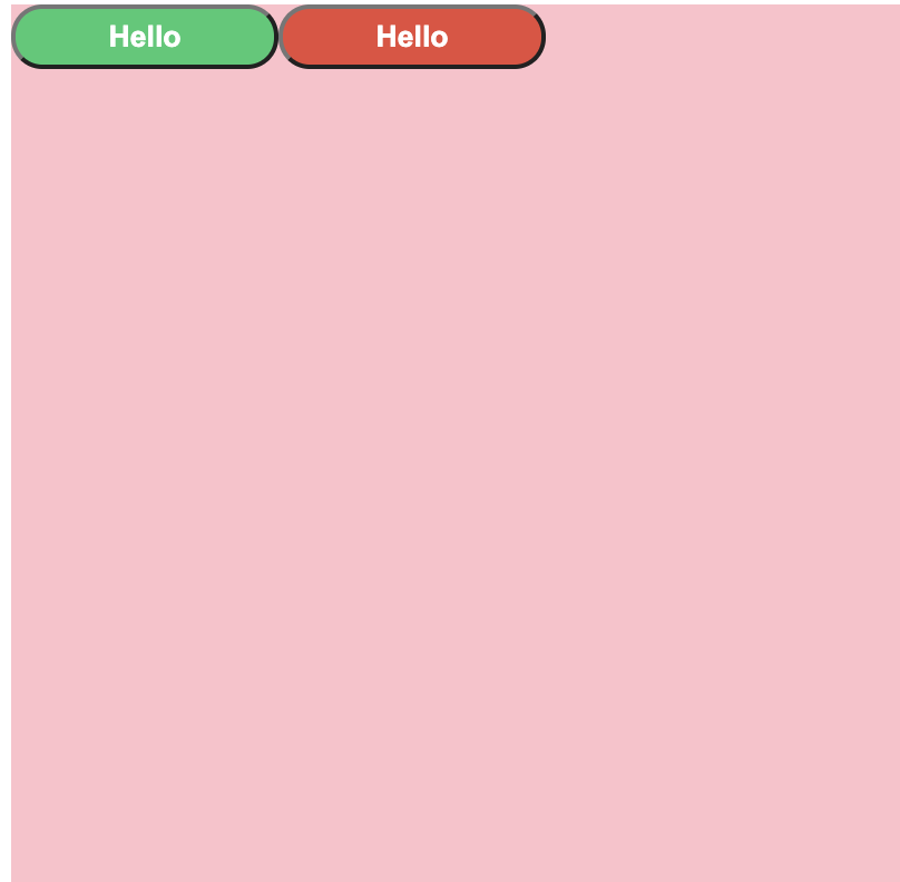
아래와 같은 결과를 얻을수있다. `(백틱)이 표시되지않아 한글로 남긴다.
방법은 간단하다. 그냥 Component에
const Container = styled.div`(백틱)css스타일링.....하고 마무리 백틱
그냥 컴포넌트 변수를 만들고 styled.(html태그)후 백틱 css 백틱을 하면 적용이된다.
background-color: ${(props) => (props.danger ? "#e74c3c" : "#2ecc71")};처럼 props를 받아서 스타일도 추가할수있다.
injectGlobal
만약 body를 수정할경우에는 아래와 같이 injectGlobal를 추가하고, 수정하면 끝이다.
import styled, { createGlobalStyle } from "styled-components";

createGlobalStyle`
  body{
    padding:0;
    margin:0;
  }
`;
스타일 extend
<Anchor href="http://google.com">Go to google</Anchor>
const Anchor = styled(Button.withComponent("a"))`
  text-decoration: none;
`;
방법은 styled(Button[extend할 component].withComponent("a"))백틱
[추가할 css]백틱 만하면 끝이다. react가 알아서 Anchor 컴포넌트안에 href를 알고 a태그의 href로 작동하면서 props를 주지도 않아두된다.
애니메이션 keyframes
사실 막상 써보고 배워보니.. 그렇게 편하지는 않은것 같다. 그냥 상황이나 선호도에 다른것같다. 아무튼 애니메이션을 사용할려면 또 import를 해주어야하는데..
import styled, { css, keyframes, createGlobalStyle } from "styled-components";

const rotation = keyframes`
  from{
    transform:rotate(0deg);
  }
  to{
    transform:rotate(360deg);
  }`;
setAttribute
css가 중복되면 복사하고 붙여놓는일은 상당히 번거롭고 귀찮은일이다. 그래서 styled-component는 이일을 아주 쉽게 처리해줄수있는데, 방법은 간단하다.
const awesomeCard = css`
  box-shadow: 0 4px 6px rgba(50, 50, 93, 0.11), 0 1px 3px rgba(0, 0, 0, 0.08);
  background-color: #fff;
  border-radius: 10px;
  padding: 20px;
`;

const Input = styled.input.attrs({
  required: true,
})`
  border-radius: 5px;
  border: none;
  ${awesomeCard}
`;
awesomeCard 컴포넌트에서 css를 주게되면 css 템플릿 박스를 만들수있게된다. 그래서 이것은 주고자하는 컴포넌트에서 .attrs({ required: true })로 설정후에, 추가하고자 하는 css와 ${awesomeCard}를 할당해주면된다.
theme
theme을 또 설정해줄수있는데 이것도 다시 import해주어야한다.. 만약에 styled-component로 스타일링을 할거면, 처음부터 다 import하는것은 권장한다.
import styled, {
  css,
  keyframes,
  createGlobalStyle,
  ThemeProvider,
} from "styled-components";
그리고 theme.js 라는 파일만든후에 그안에 이렇게 일단 예로 이렇게 작성해봤다. 그리고 import했다.
const theme = {
  mainColor: "#3498db",
  dangerColor: "#e74c3c",
  successColor: "#2eccc71",
};

export default theme;


//App.js에서
import theme from "./theme.js";
그리고 이런식으로 넣어주기만 하면끝이다.
<ThemeProvider theme={theme}>
	<Container>
		<Form></Form>
	</Container>
</ThemeProvider>


const Card = styled.div`
  background-color: red;
`;

const Button = styled.button`
  border-radius: 30px;
  padding: 25px 15px;
  background-color: ${(props) => props.theme.mainColor};
`;

const Form = () => (
  <Card>
    <Button></Button>
  </Card>
);
ThemeProvider라는 component를 만든후에 theme={theme}라는 props를 보낸다. 그러면, 원하는 컴포넌트에서 받은 props를 이용하여 스타일링이 가능하다. ${(props) => props.theme.mainColor};