본 포스팅은 💻 유데미 Advanced CSS and Sass강좌 를 공부하면서 정리한 내용입니다.
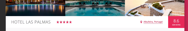
Gallery HTML 작성
<main class="hotel-view">
  <div class="gallery">
    <figure class="gallery__item">
      <img
        src="img/hotel-1.jpg"
        alt="Photo of hotel 1"
        class="gallery__photo"
      />
    </figure>
    <figure class="gallery__item">
      <img
        src="img/hotel-2.jpg"
        alt="Photo of hotel 2"
        class="gallery__photo"
      />
    </figure>
    <figure class="gallery__item">
      <img
        src="img/hotel-3.jpg"
        alt="Photo of hotel 3"
        class="gallery__photo"
      />
    </figure>
  </div>
</main>
Gallery 구조는 다음과 같다.
hotel-view(main)
- gallery(div)
- gallery__item(figure)
- gallery__photo(img)
- gallery__item(figure)
- gallery__photo(img)
- gallery__item(figure)
- gallery__photo(img)
- gallery__item(figure)
Gallery 디자인
////////////////////////////////////////////////
// GALLERY
.gallery {
  // gallery를 flex 적용해줘서 figure 3개가 한줄로 정렬되도록 해줌
  display: flex;

  &__photo {
    // img 기본은 inline인데 block으로 바꿔줬다. 이렇게 안해주면 이미지 밑에 여분의 공간이 생기게 되는데
    // 그러한 이유는 img를 텍스트와 같이 취급하기 때문이다. 브라우저는 요소 내의 텍스트를 렌더링할 때
    // 디센더가 적용되는데 그러한게 img에도 적용된다는 뜻이다.
    // https://poiemaweb.com/css3-removing-white-space-image-element 참고
    display: block;
    width: 100%;
  }
}
Overview HTML 작성
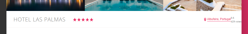
<div class="overview">
  <h1 class="overview__heading">Hotel Las Palmas</h1>
  <div class="overview__stars">
    <svg class="overview__icon-star">
      <use xlink:href="img/sprite.svg#icon-star"></use>
    </svg>
    <svg class="overview__icon-star">
      <use xlink:href="img/sprite.svg#icon-star"></use>
    </svg>
    <svg class="overview__icon-star">
      <use xlink:href="img/sprite.svg#icon-star"></use>
    </svg>
    <svg class="overview__icon-star">
      <use xlink:href="img/sprite.svg#icon-star"></use>
    </svg>
    <svg class="overview__icon-star">
      <use xlink:href="img/sprite.svg#icon-star"></use>
    </svg>
  </div>
  <div class="overview__location">
    <svg class="overview__icon-location">
      <use xlink:href="img/sprite.svg#icon-location-pin"></use>
    </svg>
    <button class="btn-inline">Albufeira, Portugal</button>
  </div>
  <div class="overview__rating">
    <div class="overview__rating-average">8.6</div>
    <div class="overview__rating-count">429 votes</div>
  </div>
</div>
overview 클래스 구조 정리
- overview__heading (h1)
- overview__stars (div)
- overview__icon-start (svg) X 5개
- overview__location (div)
- overview__icon-location (svg)
- button
- overview__rating(div)
- overview__rating-average(div)
- overview__rating-count(div)
Overview 디자인
1단계. 초기세팅
//////////////////////////////////////////
// HOTEL OVERVIEW
.overview {
  // 한줄 배치를 위해 flex 적용
  display: flex;

  &__heading {
  }

  &__stars {
  }

  &__icon-star,
  &__icon-location {
    // 아이콘 크기와 색상 지정
    width: 1.75rem;
    height: 1.75rem;
    fill: $color-primary;
  }

  &__location {
  }

  &__rating {
  }

  &__rating-average {
  }

  &__rating-count {
  }
}
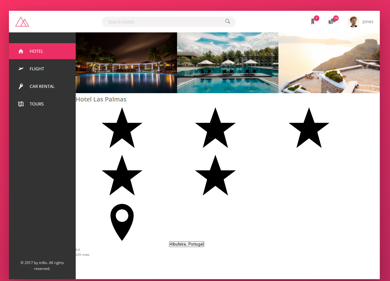
그나마 좀 낫다. 이제 세부적인 내용을 지정해보도록 하겠다.
2단계. 세부 배치
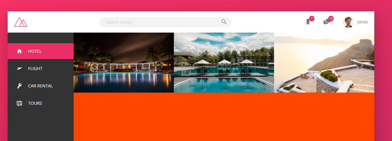
필자는 아래처럼 디자인하고 싶다. 이렇게 하려면 main-axis 배치는 어떻게 하는게 좋을까? 🤔
stars의 flex를 1로 하면 어떨까? flex: 1은 flex: 1 1 0과 같다고 첫번째 시간에 설명했었다. 증가-감소-기본너비 순서이다. 결국에는 공간을 차지 할 수 있는 만큼 start가 차지하게 되는것이다.
  &__stars {
    flex: 1;
    background-color: orangered;
  }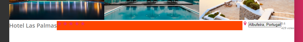
근데 이건 별로 좋은 방법이 아니다. 예를 들어, hover같은 속성을 주고 싶은데 이때는 stars 요소 부분만 마우스를 올려놨을때 적용되는거지 지금처럼 하면 stars 요소가 없는부분에도 마우스를 올려놨을때 적용되기 때문이다.
이때 사용할만한 좋은 트릭은 바로 margin을 이용하는것입니다. 👏
  &__stars {
    // flex: 1;
    margin-right: auto;
    background-color: orangered;
  }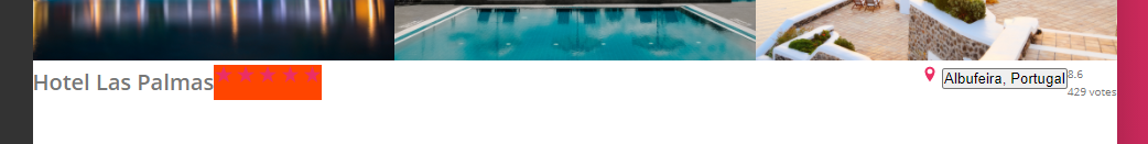
아까랑은 다르게 해당 아이콘 부분만을 공간으로 차지 하고 나머지는 전부 마진인것을 볼 수 있습니다.
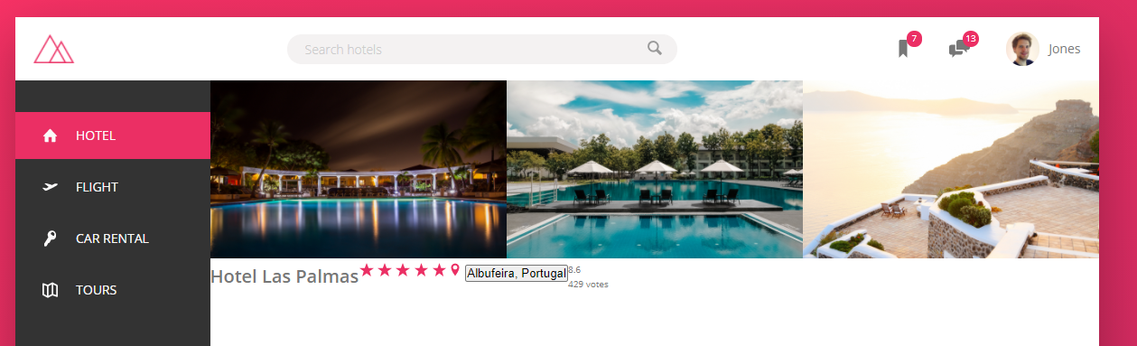
3단계. 세부 디자인
1. overview와 heading
.overview {
  display: flex;
  align-items: center; // 교차축 정렬
  border-bottom: 1px solid $color-grey-light-2;

  &__heading {
    font-size: 2.25rem;
    font-weight: 300;
    text-transform: uppercase;
    letter-spacing: 1px;
    padding: 1.5rem 3rem;
  }

  (...)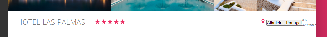
2. location과 btn-inline
btn-inline은 나중에도 쓸 것이기 때문에 overview안에 속해있는 것이 아니라 별도로 분리시켜준다.
.overview {
  (...)
  &__location {
    font-size: 1.2rem;
    display: flex;
    align-items: center;
  }
}
////////////////////////////////////
// BUTTON INLINE
.btn-inline {
  border: none;
  color: $color-primary;
  font-size: inherit;
  border-bottom: 1px solid currentColor;
  padding-bottom: 2px;
  display: inline-block;
  background-color: transparent;
  cursor: pointer;
  transition: all 0.2s;

  &:hover {
    color: $color-grey-dark-1;
  }

  &:focus {
    outline: none;
  }
}
3. rating
이제 마지막으로 가장 오른쪽 부분을 디자인하겠다.
  &__rating {
    background-color: $color-primary;
    color: #fff;
    margin-left: 3rem;
  }

  &__rating-average {
    font-size: 2.25rem;
    font-weight: 300;
  }

  &__rating-count {
    font-size: 0.8rem;
    text-transform: uppercase;
  }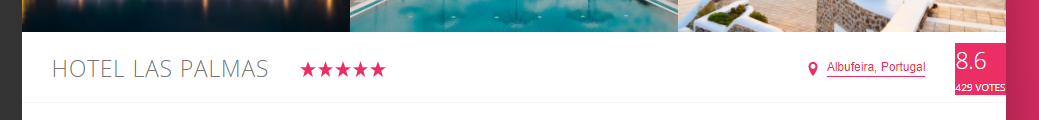
음... align-self를 stretch 시켜줘야겠네? 그리고 flex layout을 적용해줘서 주축, 교차축 중앙정렬을 수행해주자.
  &__rating {
    background-color: $color-primary;
    color: #fff;
    margin-left: 3rem;
    padding: 0 2.25rem;

    align-self: stretch;

    display: flex;
    flex-direction: column;
    align-items: center;
    justify-content: center;
  }
배움을 좋아합니다. 새로운 것을 좋아합니다.