본 포스팅은 💻 유데미 Advanced CSS and Sass강좌 를 공부하면서 정리한 내용입니다.
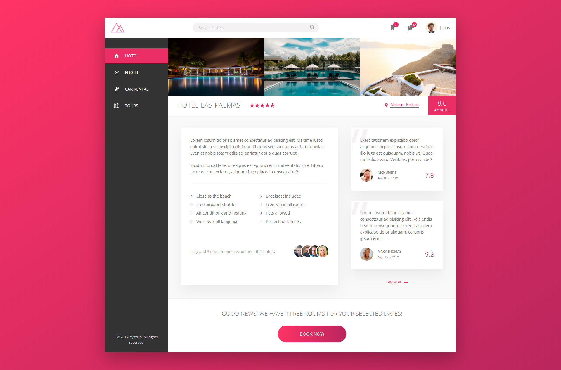
프로젝트 최종 목표화면
프로젝트 구성 및 실행
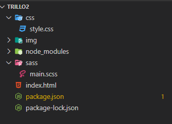
초기 프로젝트 세팅
초기 프로젝트 구조는 다음과 같다. $ npm init을 통해 package.json을 생성해준다. 그런 다음 img 폴더, sass폴더와 main.scss 파일, 그리고 index.html 만 만들어주면 된다.
index.html은 아래 코드를 복붙하자.
<!DOCTYPE html>
<html lang="en">
<head>
<meta charset="UTF-8">
<meta name="viewport" content="width=device-width, initial-scale=1.0">
<link href="https://fonts.googleapis.com/css?family=Open+Sans:300,400,600"
rel="stylesheet">
<link rel="stylesheet" href="css/style.css">
<link rel="shortcut icon" type="image/png" href="img/favicon.png">
<title>trillo — Your all-in-one booking app</title>
</head>
<body>
</body>
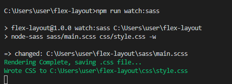
</html>node-sass 라이브러리 설치
이 프로젝트에서는 CSS보다 Sass를 사용할 예정이기 때문에 Sass를 CSS로 변환해주기 위해 node_sass 라이브러리가 필요하다. npm을 통해 설치를 해준다.
$ npm install node-sass그 다음 package.json에 scripts에 아래와 같이 작성해주자. $ npm run watch:sass를 실행하면 sass/main.scss 파일을 css/style.css로 자동으로 변환해준다는 의미이다.
  // package.json
  "scripts": {
    "watch:sass": "node-sass sass/main.scss css/style.css -w"
  }
설정을 마치면 $ npm run watch:sass를 실행해보자. main.scss를 ctrl+s를 통해 저장해보면 자동으로 css폴더에 style.css가 생길 것이다.
main.scss 변경
main.scss에다가 아래와 같이 초기 코드를 작성해보자.
* {
margin: 0;
padding: 0;
}
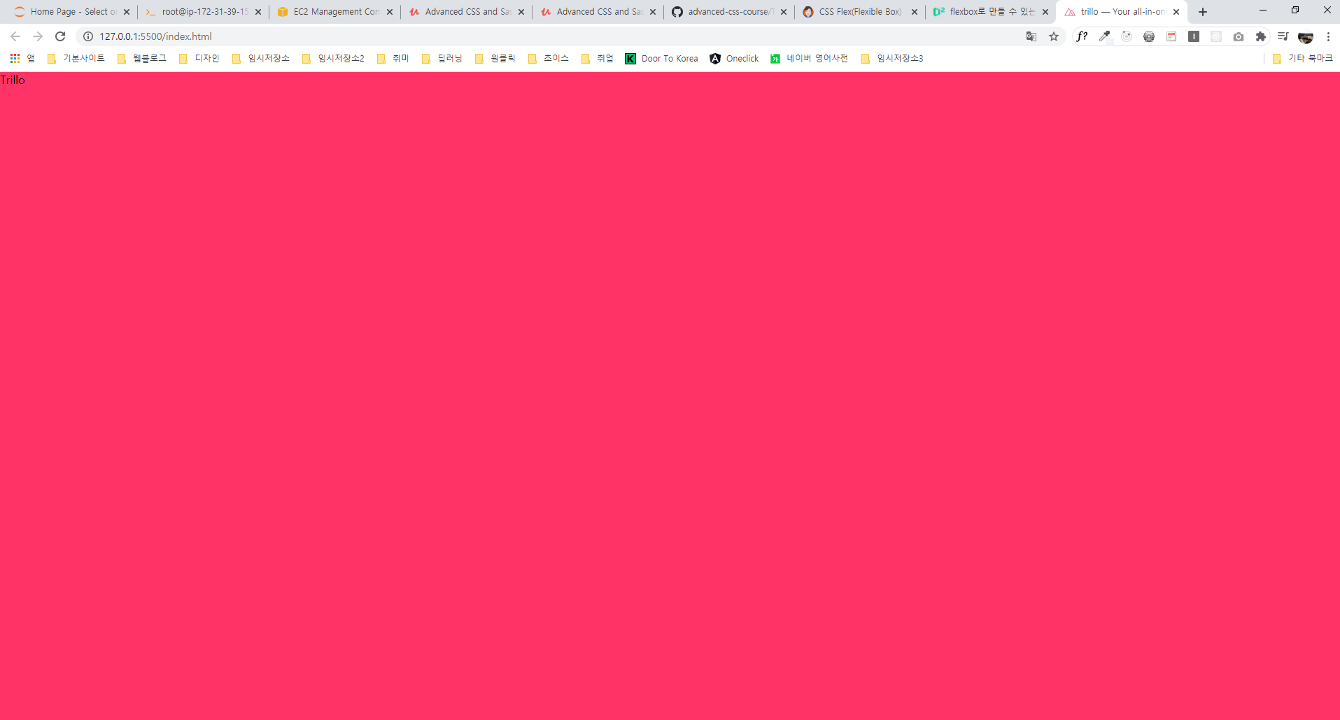
body {
background-color: #ff3366;
}Live Server
VS Code에는 Live Server라는 도구가 있는데 로컬 서버없이도 static 파일을 통해 로컬 서버를 생성해줘서 실시간으로 코드를 수정하면 업데이트된 내용을 웹 브라우저를 통해 볼 수 있게 해준다.
설치가 되었다면 index.html에서 마우스 오른쪽 버튼 클릭 후 Open with Live Server 클릭.
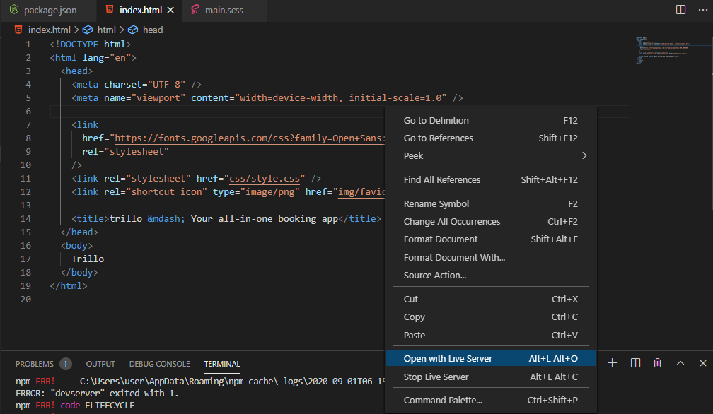
그럼 자동으로 사이트 하나가 뜨게 되는데 우리가 지금까지 작성한 index.html과 main.scss가 적용된 것을 알 수 있을 것이다.
Sass 초기 세팅하기
파일 분할하기
sass 폴더에 _base.scss, _components.scss, _layout.scss 파일을 추가로 만든다. 각 기능은 다음과 같다.
- _base.scss : 전역변수, 전체 요소 디자인, html, body 디자인을 설정한다.
- _components.scss : 각 요소마다 디자인 설정을 한다.
- _layout.scss : 레이아웃 구조를 설정한다.
main.scss에서 import
이렇게 만든 후 main.scss에서 import해야 최종적으로 적용된다.
@import "base";
@import "layout";
@import "components";
_base.scss 파일 작성
_base.scss에다가는 전역 색상값(주로 이렇게 정해줘서 사이트를 통일감 있게 설정하는 편이 좋은 습관이다), 글로벌 디자인 등을 설정해주면 된다.
// 칼라값 전역변수 설정
$color-primary: #eb2f64;
$color-primary-light: #ff3366;
$color-primary-dark: #ba265d;

$color-grey-light-1: #faf9f9;
$color-grey-light-2: #f4f2f2;
$olor-grey-light-3: #f0eeee;
$color-grey-light-4: #ccc;

$color-grey-dark-1: #333;
$color-grey-dark-2: #777;
$color-grey-dark-3: #999;

// 모든 요소에 대해 maring 0, padding 0 설정
* {
  margin: 0;
  padding: 0;
}

// box-sizing은 상속이 안되므로 이런식으로 모든 요소에 대해 상속되도록 설정해주었다.
*,
*::before,
*::after {
  box-sizing: inherit;
}

html {
  box-sizing: border-box; // border까지를 width, height 범위로 본다.
  font-size: 62.5%; // 1rem = 10px, 10px/16px = 62.5%
}

body {
  // body에는 처음에 font 관련 설정과 color 관련 설정을 진행해준다.
  font-family: "Open Sans", sans-serif;
  font-weight: 400;
  line-height: 1.6;
  color: $color-grey-dark-2;

  background-image: linear-gradient(
    to right bottom,
    $color-primary-light,
    $color-primary-dark
  );
  background-size: cover;
  background-repeat: no-repeat;

  min-height: 100vh;
}
✅ 여기서 매우 중요한 내용은 html에서
font-size를62.5%로 설정했다는 것이다. 브라우저 폰트 크기가 기본값이 16px인데 62.5%니까 10px로 설정했다는 말이 된다. 따라서 1rem은 10px이고, 10px로 한 이유는 계산하기 편하기 때문이다. (rem 단위를 모르면 CSS 시리즈 참고)
전체 레이아웃 설정
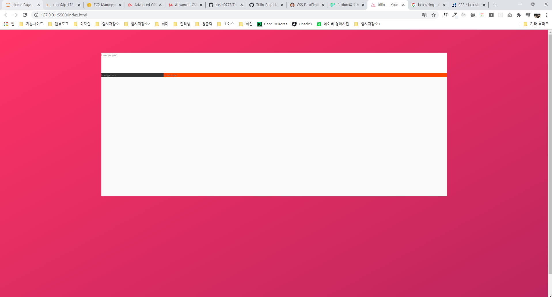
index.html
index.html에 body 부분을 container > header, content 로 나누고, content는 또 nav(왼쪽 사이드 바), main(호텔 뷰)으로 구분해주었다.
<body>
  <div class="container">
    <header class="header">Header part</header>
    <div class="content">
      <nav class="sidebar">Navigation</nav>
      <main class="hotel-view">Hotel view</main>
    </div>
  </div>
</body>
_layout.scss
index.html에서 나눠준 부분에 맞게 기본적인 범위(크기)를 지정해주었다. 여기서 content는 flex를 써준것을 알 수 있다.
.container {
  max-width: 120rem; // 최대 너비 1200px(이 범위를 넘어가면 여백)
  min-height: 50rem; // 최소 높이 500px(이 범위가 안되면 스크롤)
  margin: 8rem auto; // 가운데 정렬
  background-color: $color-grey-light-1;
  box-shadow: 0 2rem 6rem rgba(0, 0, 0, 0.3);
}

.header {
  height: 7rem;
  background-color: #fff;
  border-bottom: $color-grey-light-2;
}

.content {
  display: flex;
}

.sidebar {
  flex: 0 0 18%; // grow-shrink-basis 순서
  background-color: $color-grey-dark-1;
}

.hotel-view {
  flex: 1; // flex: 1 1 0 이랑 같은 의미. 쉽게말해 나머지 전부를 차지한다고 보면 됨.
  background-color: #fff;
  background-color: orangered;
}