
Overview
요즘이라고 하기에는 좀 지난거 같지만, 요즘에는 이미 잘 만들어진 공통 컴포넌트를 제공하는 라이브러리가 많이 존재합니다. 제가 찾아보니까 현 시점 3대장은 다음과 같습니다.
- MUI(Material-UI) 라는 오픈 소스 React component library 가 존재합니다.
- Ant Design 도 있을 수 있죠. 마찬가지로 많은 UI 컴포넌트 요소들을 제공합니다.
- React Bootstrap 은 이번에 처음 들었는데 꽤 유명하네요?
참고 : https://npmtrends.com/@mui/material-vs-antd-vs-react-bootstrap
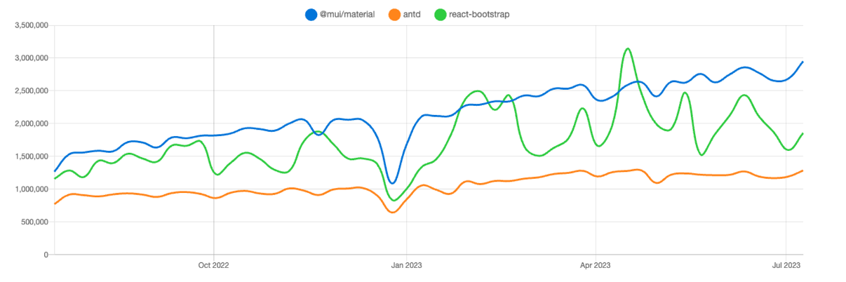
NPM trends로 비교해보면 MUI가 지속적으로 증가하고 있고, React Bootstrap은 주춤거리고 있네요. Ant Design은 MUI 만큼은 아니지만 단단한 구독자 층이 있나봅니다.
그리고 위 3개랑 좀 성격이 다르긴 하지만, Tailwind CSS 기반의 daisyUI 가 있습니다. Tailwind CSS 확장판이라고 보면 될 거 같습니다. Tailwind CSS를 이미 사용하고 있다면 daisyUI를 쉽게 추가해서 사용해볼 수 있다는 장점이 있습니다.
MUI와 같은 라이브러리는 좋을까?
MUI(Material-UI)에 대한 소개
그 중에서 저는 가장 유명한 MUI 에 대해 간단하게 소개해볼까 합니다.
MUI(Material-UI)는 구글의 디자인 철학인 Material Design을 구현한 자바스크립트 라이브러리입니다. 특히 버전 5가 릴리즈 되면서 많은 변화가 있었다고 합니다. 기존 Material-UI를 MUI라는 명칭으로 변경된것도 이때부터라고 하네요.
또한, 5 버전 부터 emotion을 접목시켜 보다 더 styled component에 가까워졌습니다. 이에 따라 엄청난 속도로 다운로드 수가 증가하고 있는 것으로 보입니다.
MUI 의 단점
하지만 말이죠... 저는 MUI나 Ant Design 을 제대로 사용해본 적은 없지만 뭔가 이런것들을 보면 쉽사리 도입하기가 꺼려집니다. (저만 그런가요...?? 🤔)
물론, 빠르게 잘 만들어진 컴포넌트를 가져다가 사용할 수는 있겠죠. 하지만 뭔가 무거워질 거 같고, 결국에는 종속적이게 될 거 같고, 커스텀하기 어려울 거 같습니다. 쉽게 사용하려고 하다가 어느 순간 더 어려워질 수 있다는 거죠.
여러 글들을 보니 역시 이런 문제를 단점으로 뽑고 있는거 같습니다.
해당 글에서 MUI, React Bootstrap이 가진 문제점으로 지적하는 것은 나만의 스타일을 추가하는 것이 어려울 수 있으며, 이는 결국 우리가 필요한 것보다 더 많은 시간을 소모하게 될 수 있다고 지적하고 있습니다.
Radix-ui 란
그러던 와중에 shadcn/ui를 알게 되었습니다. 근데 이 녀석은 근본적으로 Radix-ui를 기반으로 하고 있습니다. 따라서 먼저 Radix-ui에 대해 알아보도록 하겠습니다.
Introduction
공식 문서 : https://www.radix-ui.com/docs/primitives/overview/introduction
⭐️ 고품질의 액세스 가능한 디자인 시스템 및 웹 앱을 구축하기 위한 오픈 소스 UI 컴포넌트 라이브러리입니다.
Radix Primitives는 접근성, 사용자 정의, 개발자 경험에 초점을 맞춘 하위 수준의 UI 컴포넌트 라이브러리입니다. 이러한 컴포넌트를 설계 시스템의 기본 계층으로 사용하거나 점진적으로 채택할 수 있습니다.
Vision
우리들 대부분은 accordion, checkbox, combobox, dialog, dropdown, select, slider, and tooltip 와 같은 일반적인 UI 패턴에 대해 유사한 정의를 공유하고 있습니다. 이러한 UI 패턴은 WAI-ARIA(Accessible Rich Internet Application)에 의해 문서화되어 있으며 일반적으로 커뮤니티에 의해 이해됩니다.
그러나 웹 플랫폼이 우리에게 제공하는 구현은 부적절합니다. 그들은 존재하지 않거나 기능이 부족하거나 충분히 사용자 정의를 할 수 없습니다. (아무래도 웹 플랫폼이 기본적으로 제공하는 checkbox, select를 보더라도 좀 많이 부족해보입니다. 또한, dialog, slider 같은건 직접 만들어야합니다. )
따라서 개발자는 사용자 지정 컴포넌트를 구축해야 합니다. 이는 매우 어려운 작업입니다. 결과적으로, 웹의 대부분의 컴포넌트는 inaccessible 하며, 성능이 떨어지며, 중요한 특징이 빠져있습니다.
우리의 목표는 커뮤니티가 accessible design systems을 구축하는 데 사용할 수 있도록 충분한 지원을 하는 오픈 소스 컴포넌트 라이브러리를 만드는 것입니다.
✍️ 위의 말을 정리해보면 웹 플랫폼이 기본적으로 제공하는 요소는 기능이 부족하거나 없기 때문에 직접 만들어야 하는데, 이는 어려운 작업이며 그런한 작업을 대신 지원해주겠다고 합니다. 특히, 웹 접근성에 있어서도 접근 가능한 디자인 시스템을 구축하는데 도와준다고 하네요.
주요 특징
-
Accessible : 컴포넌트는 가능한 경우 WAI-ARIA 설계 패턴을 준수합니다. aria 및 role 속성, 포커스 관리 및 키보드 탐색을 포함하여 접근성과 관련된 많은 어려운 구현 세부 사항을 처리합니다. 접근성 문서에서 더 많은 것을 볼 수 있습니다.
-
Unstyled : Components은 스타일이 없는 상태로 제공되므로 스타일링을 완벽하게 제어할 수 있습니다. 구성 요소는 바닐라 CSS, CSS 프리프로세서, CSS-in-JS 라이브러리와 함께 스타일링 할 수 있다. 스타일링 가이드에서 자세히 알아보십시오.
-
Opened : Radix Primitives는 사용자의 요구에 맞게 사용자 정의되도록 설계되었습니다. 개방형 구성요소 아키텍처는 각 구성요소 부분에 대한 세부적인 액세스를 제공하므로, 각 구성요소 부분을 래핑하고 event listeners, props, or refs를 추가할 수 있습니다.
-
Uncontrolled : 해당되는 경우 구성 요소는 기본적으로 uncontrolled이지만 대신 controlled할 수도 있습니다. 모든 동작은 내부적으로 처리되므로 로컬 상태를 생성할 필요 없이 최대한 원활하게 시작 및 실행할 수 있습니다.
-
Developer experience : 우리의 주요 목표 중 하나는 최고의 개발자 경험을 제공하는 것이다. Radix Primitives는 완전한 형식의 API를 제공합니다. 모든 구성 요소는 유사한 API를 공유하여 일관되고 예측 가능한 환경을 만듭니다. 또한 asChild prop을 구현하여 사용자가 렌더링된 요소를 완전히 제어할 수 있도록 했습니다.
-
Incremental adoption : 각 primitive은 개별적으로 설치할 수 있으므로 점진적으로 적용할 수 있습니다. 원시 요소는 또한 점진적 채택을 더욱 용이하게 하기 위해 독립적으로 버전화됩니다.
npm install @radix-ui/react-dialog
npm install @radix-ui/react-dropdown-menu
npm install @radix-ui/react-tooltip
Getting started
Radix Primitives 중에서 저는 Dialog 를 사용해보도록 하겠습니다. 먼저 개별 설치부터 해줍니다.
pnpm add @radix-ui/react-dialog그리고 나서 예시 소스코드를 가져다가 사용해보겠습니다. 잘 보면 형식 자체가 익숙하죠? Compound component pattern 를 사용하고 있습니다. 이렇게 하면 배치를 조작하기 편하다는 장점이 있습니다. 유연성이 높아지는 것이죠.
import React from 'react';
import * as Dialog from '@radix-ui/react-dialog';
import { Cross2Icon } from '@radix-ui/react-icons';
import './styles.css';

const DialogDemo = () => (
  <Dialog.Root>
    <Dialog.Trigger asChild>
      <button className="Button violet">Edit profile</button>
    </Dialog.Trigger>
    <Dialog.Portal>
      <Dialog.Overlay className="DialogOverlay" />
      <Dialog.Content className="DialogContent">
        <Dialog.Title className="DialogTitle">Edit profile</Dialog.Title>
        <Dialog.Description className="DialogDescription">
          Make changes to your profile here. Click save when you're done.
        </Dialog.Description>
        <fieldset className="Fieldset">
          <label className="Label" htmlFor="name">
            Name
          </label>
          <input className="Input" id="name" defaultValue="Pedro Duarte" />
        </fieldset>
        <fieldset className="Fieldset">
          <label className="Label" htmlFor="username">
            Username
          </label>
          <input className="Input" id="username" defaultValue="@peduarte" />
        </fieldset>
        <div style={{ display: 'flex', marginTop: 25, justifyContent: 'flex-end' }}>
          <Dialog.Close asChild>
            <button className="Button green">Save changes</button>
          </Dialog.Close>
        </div>
        <Dialog.Close asChild>
          <button className="IconButton" aria-label="Close">
            <Cross2Icon />
          </button>
        </Dialog.Close>
      </Dialog.Content>
    </Dialog.Portal>
  </Dialog.Root>
);

export default DialogDemo;
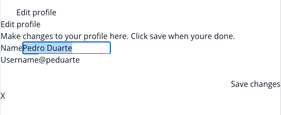
여기까지 하고 확인해보면 Dialog 형태라고 볼 수 없습니다. 하지만, 열고 닫히는 동작이라던가 HTML 구조 자체는 Dialog 형태입니다.
그리고 HTML을 보면 한가지 특이점이 있습니다. 바로 role이랑 aria-label같은 웹 접근성을 위한 속성이 기본적으로 제공이 되어있다는 것이죠. 이러한 속성에 대해서는 다른 블로그를 참고 바랍니다.
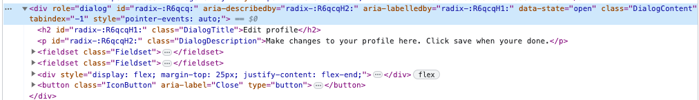
아무튼 여기에다가 스타일을 지정해주면 Dialog 형태를 만들 수 있게 됩니다. ClassName도 이미 지정이 되어있어서 그에 맞게 스타일을 잘 지정해주면 되겠습니다.
.DialogOverlay {
  background-color: var(--black-a9);
  position: fixed;
  inset: 0;
  animation: overlayShow 150ms cubic-bezier(0.16, 1, 0.3, 1);
}

.DialogContent {
  background-color: white;
  border-radius: 6px;
  box-shadow: hsl(206 22% 7% / 35%) 0px 10px 38px -10px, hsl(206 22% 7% / 20%) 0px 10px 20px -15px;
  position: fixed;
  top: 50%;
  left: 50%;
  transform: translate(-50%, -50%);
  width: 90vw;
  max-width: 450px;
  max-height: 85vh;
  padding: 25px;
  animation: contentShow 150ms cubic-bezier(0.16, 1, 0.3, 1);
}
.DialogContent:focus {
  outline: none;
}

...
공식문서 예제를 따라한다면 아래와 같은 전형적인 Dialog 형태를 만들어볼 수 있습니다.

MUI과 Radix-ui 차이점 (Headless UI)
위에서 알 수 있다 싶이, 가장 큰 차이점은 Radix-ui가 훨씬 커스텀 하기 쉽다는 것입니다. 기본 동작은 내부적으로 처리하고 있고, 스타일은 개별 지정을 할 수 있으며, Compound component pattern으로 유연성을 가지고 있습니다. 또한, 개별 설치가 가능하며 기본 HTML 구조에 접근성까지 잘 적용이 되어있습니다.
참고 : https://www.howdy-mj.me/design/headless-components
아, 찾다보니까 Radix-ui와 같은 형태를 Headless UI 라고 부른다고 하네요. Radix UI뿐만 아니라 Headless UI, Reach UI 등이 있습니다. (그렇군요...하하)
shadcn/ui 란
공식 문서 : https://ui.shadcn.com/
메인 소개) Build your component library. Beautifully designed components that you can copy and paste into your apps. Accessible. Customizable. Open Source.
솔직히 처음 메인 페이지를 봤을때 뜬금없이 대시보드가 있길래 이거 뭐하는 사이트야? 라고 생각했는데… 대시보드 말고 다른것도 확인해보면 와… 이거 되게 요즘 스타일이다 라고 느끼게 됩니다. 깔끔하고 세련되어 보이면서 다양한 컴포넌트를 확인해볼 수 있습니다.
Introduction
Radix UI 및 Tailwind CSS를 사용하여 구축된 재사용 가능한 컴포넌트.
컴포넌트 라이브러리가 아닙니다. 앱에 복사하여 붙여넣을 수 있는 재사용 가능한 컴포넌트 모음입니다.
Q. 구성 요소 라이브러리가 아닌 것은 무엇을 의미합니까?
A. 제 말은 당신이 그것을 종속성으로 설치하지 않는다는 것입니다. npm을 통해 배포하거나 사용할 수 없습니다.
필요한 구성 요소를 선택합니다. 코드를 복사하여 프로젝트에 붙여넣고 필요에 따라 사용자 지정합니다. 코드는 네 것입니다. 이를 참조로 사용하여 자체 구성 요소 라이브러리를 작성합니다.
쉽게 말해, Radix UI 및 Tailwind CSS를 사용하여 한번 더 재가공해서 제공하고 있다는 것입니다. 그리고 당신은 이걸 그냥 복붙해서 사용하면 됩니다 라고 말하는 것이고요.
Radix UI에 스타일을 적용한 버전이 바로 shadcn/ui 입니다. CSS가 조금 자신이 없는 분, 빠르게 가져다가 쓰길 원하시는 분들에게 추천드립니다.
실습) Next.js + TailwindCSS + shadcn/ui
마지막으로 간단한 실습을 통해 shadcn/ui를 사용해보고 마무리 하겠습니다.
기본적으로 Next.js와 TailwindCSS 환경이라고 가정해보겠습니다. shadcn-ui init 명령을 실행하여 프로젝트를 설정합니다:
npx shadcn-ui@latest init그러면 components.json을 설정하기 위한 여러가지 선택사항이 나옵니다. 기본 사항을 선택해주겠습니다.
Would you like to use TypeScript (recommended)? no / yes
Which style would you like to use? › Default
Which color would you like to use as base color? › Slate
Where is your global CSS file? › › app/globals.css
Do you want to use CSS variables for colors? › no / yes
Where is your tailwind.config.js located? › tailwind.config.js
Configure the import alias for components: › @/components
Configure the import alias for utils: › @/lib/utils
Are you using React Server Components? › no / yes
그러면 보통 형식은 다음과 같습니다. components/ui 안에 shadcn/ui 기본 공유 컴포넌트가 들어갈 예정입니다.
.
├── app
│   ├── layout.tsx
│   └── page.tsx
├── components
│   ├── ui
│   │   ├── alert-dialog.tsx
│   │   ├── button.tsx
│   │   ├── dropdown-menu.tsx
│   │   └── ...
│   ├── main-nav.tsx
│   ├── page-header.tsx
│   └── ...
├── lib
│   └── utils.ts
├── styles
│   └── globals.css
├── next.config.js
├── package.json
├── postcss.config.js
├── tailwind.config.js
└── tsconfig.json
lib에는 utils.ts 라는 파일이 생성되며 다음과 같은 코드가 작성되어있습니다. 많이 보던 함수네요.
import { clsx, ClassValue } from "clsx";
import { twMerge } from "tailwind-merge";

export function cn(...classes: ClassValue[]) {
  return twMerge(clsx(classes));
}
그 외에 tailwind.config.js와 styles/globals.css에 변화가 생긴 것을 알 수 있습니다. 기본적인 color 값이 지정이 되어있습니다. 만약 기본 색상이 마음에 안든다면 여기서 커스텀 할 수 있겠네요.
/* styles/globals.css */

@layer base {
 :root {
   --background: 0 0% 100%;
   --foreground: 222.2 47.4% 11.2%;

   --muted: 210 40% 96.1%;
   --muted-foreground: 215.4 16.3% 46.9%;

   --popover: 0 0% 100%;
   --popover-foreground: 222.2 47.4% 11.2%;

   ...
 }

 .dark {
   --background: 224 71% 4%;
   --foreground: 213 31% 91%;

   --muted: 223 47% 11%;
   --muted-foreground: 215.4 16.3% 56.9%;

   --popover: 224 71% 4%;
   --popover-foreground: 215 20.2% 65.1%;

   ...
 }
}

@layer base {
 body {
   @apply bg-background text-foreground;
 }
}
그리고 tailwind.config.js에서도 globals.css에 정의된 color 값을 가져와서 사용하는 것을 알 수 있습니다.
// tailwind.config.js

/** @type {import('tailwindcss').Config} */
module.exports = {
 darkMode: ["class"],
 content: [
   './pages/**/*.{ts,tsx}',
   './components/**/*.{ts,tsx}',
   './app/**/*.{ts,tsx}',
   './src/**/*.{ts,tsx}',
	],
 theme: {
   extend: {
     colors: {
       border: "hsl(var(--border))",
       input: "hsl(var(--input))",
       ring: "hsl(var(--ring))",
       background: "hsl(var(--background))",
       foreground: "hsl(var(--foreground))",
       primary: {
         DEFAULT: "hsl(var(--primary))",
         foreground: "hsl(var(--primary-foreground))",
       },
       secondary: {
         DEFAULT: "hsl(var(--secondary))",
         foreground: "hsl(var(--secondary-foreground))",
       },
       ...
     },
     borderRadius: {
       lg: "var(--radius)",
       md: "calc(var(--radius) - 2px)",
       sm: "calc(var(--radius) - 4px)",
     },
     keyframes: {
       "accordion-down": {
         from: { height: 0 },
         to: { height: "var(--radix-accordion-content-height)" },
       },
       "accordion-up": {
         from: { height: "var(--radix-accordion-content-height)" },
         to: { height: 0 },
       },
     },
     animation: {
       "accordion-down": "accordion-down 0.2s ease-out",
       "accordion-up": "accordion-up 0.2s ease-out",
     },
   },
 },
 plugins: [require("tailwindcss-animate")],
}
이렇게 하면 기본 세팅은 마무리 됩니다. 이제 Dialog를 가져다가 사용해보겠습니다. 직접 코드를 복붙할 수도 있지만, CLI를 통해 가져올 수도 있습니다.
❯  npx shadcn-ui@latest add dialog

✔ Ready to install components and dependencies. Proceed? … yes
✔ Done.
그러면 이러한 형태의 Dialog 파일이 components/ui 폴더 안에 생성되는 것을 알 수 있습니다. 내부적으로 @radix-ui/react-dialog 를 사용하고 있는 것을 알 수 있고, tailwindCSS 가 기본으로 지정되어 있기 때문에 스타일을 정의할 필요도 없습니다. 물론 얼마든지 코드 상에 커스텀이 가능하고요.
"use client"

import * as React from "react"
import * as DialogPrimitive from "@radix-ui/react-dialog"
import { X } from "lucide-react"

import { cn } from "@/lib/utils"

const Dialog = DialogPrimitive.Root

const DialogTrigger = DialogPrimitive.Trigger

const DialogPortal = ({
 className,
 ...props
}: DialogPrimitive.DialogPortalProps) => (
 <DialogPrimitive.Portal className={cn(className)} {...props} />
)
DialogPortal.displayName = DialogPrimitive.Portal.displayName

const DialogOverlay = React.forwardRef<
 React.ElementRef<typeof DialogPrimitive.Overlay>,
 React.ComponentPropsWithoutRef<typeof DialogPrimitive.Overlay>
>(({ className, ...props }, ref) => (
 <DialogPrimitive.Overlay
   ref={ref}
   className={cn(
     "fixed inset-0 z-50 bg-background/80 backdrop-blur-sm data-[state=open]:animate-in data-[state=closed]:animate-out data-[state=closed]:fade-out-0 data-[state=open]:fade-in-0",
     className
   )}
   {...props}
 />
))
DialogOverlay.displayName = DialogPrimitive.Overlay.displayName

const DialogContent = React.forwardRef<
 React.ElementRef<typeof DialogPrimitive.Content>,
 React.ComponentPropsWithoutRef<typeof DialogPrimitive.Content>
>(({ className, children, ...props }, ref) => (
 <DialogPortal>
   <DialogOverlay />
   <DialogPrimitive.Content
     ref={ref}
     className={cn(
       "fixed left-[50%] top-[50%] z-50 grid w-full max-w-lg translate-x-[-50%] translate-y-[-50%] gap-4 border bg-background p-6 shadow-lg duration-200 data-[state=open]:animate-in data-[state=closed]:animate-out data-[state=closed]:fade-out-0 data-[state=open]:fade-in-0 data-[state=closed]:zoom-out-95 data-[state=open]:zoom-in-95 data-[state=closed]:slide-out-to-left-1/2 data-[state=closed]:slide-out-to-top-[48%] data-[state=open]:slide-in-from-left-1/2 data-[state=open]:slide-in-from-top-[48%] sm:rounded-lg md:w-full",
       className
     )}
     {...props}
   >
     {children}
     <DialogPrimitive.Close className="absolute right-4 top-4 rounded-sm opacity-70 ring-offset-background transition-opacity hover:opacity-100 focus:outline-none focus:ring-2 focus:ring-ring focus:ring-offset-2 disabled:pointer-events-none data-[state=open]:bg-accent data-[state=open]:text-muted-foreground">
       <X className="h-4 w-4" />
       <span className="sr-only">Close</span>
     </DialogPrimitive.Close>
   </DialogPrimitive.Content>
 </DialogPortal>
))
DialogContent.displayName = DialogPrimitive.Content.displayName

const DialogHeader = ({
 className,
 ...props
}: React.HTMLAttributes<HTMLDivElement>) => (
 <div
   className={cn(
     "flex flex-col space-y-1.5 text-center sm:text-left",
     className
   )}
   {...props}
 />
)
DialogHeader.displayName = "DialogHeader"

const DialogFooter = ({
 className,
 ...props
}: React.HTMLAttributes<HTMLDivElement>) => (
 <div
   className={cn(
     "flex flex-col-reverse sm:flex-row sm:justify-end sm:space-x-2",
     className
   )}
   {...props}
 />
)
DialogFooter.displayName = "DialogFooter"

const DialogTitle = React.forwardRef<
 React.ElementRef<typeof DialogPrimitive.Title>,
 React.ComponentPropsWithoutRef<typeof DialogPrimitive.Title>
>(({ className, ...props }, ref) => (
 <DialogPrimitive.Title
   ref={ref}
   className={cn(
     "text-lg font-semibold leading-none tracking-tight",
     className
   )}
   {...props}
 />
))
DialogTitle.displayName = DialogPrimitive.Title.displayName

const DialogDescription = React.forwardRef<
 React.ElementRef<typeof DialogPrimitive.Description>,
 React.ComponentPropsWithoutRef<typeof DialogPrimitive.Description>
>(({ className, ...props }, ref) => (
 <DialogPrimitive.Description
   ref={ref}
   className={cn("text-sm text-muted-foreground", className)}
   {...props}
 />
))
DialogDescription.displayName = DialogPrimitive.Description.displayName

export {
 Dialog,
 DialogTrigger,
 DialogContent,
 DialogHeader,
 DialogFooter,
 DialogTitle,
 DialogDescription,
}
그리고 나서 예시 코드를 가져와서 사용해보겠습니다. 여기서 주의할 점은 "@/components/ui/dialog"를 import 해야 한다는 겁니다. 실수로 "@radix-ui/react-dialog"를 import 한 다음에 이게 왜 스타일이 적용이 안되어있지? 라는 고민을 한 적이 있기 때문에... 말씀드립니다.
import {
  DialogHeader,
  Dialog,
  DialogContent,
  DialogTrigger,
  DialogTitle,
  DialogDescription,
} from "@/components/ui/dialog";

<Dialog>
  <DialogTrigger>Open</DialogTrigger>
  <DialogContent>
    <DialogHeader>
      <DialogTitle>Are you sure absolutely sure?</DialogTitle>
      <DialogDescription>
        This action cannot be undone. This will permanently delete your account
        and remove your data from our servers.
      </DialogDescription>
    </DialogHeader>
  </DialogContent>
</Dialog>
결과 화면 입니다. 정말 쉽게 Dialog를 구현했습니다.

마치면서
이번 시간에는 공유 UI 컴포넌트를 가져다가 사용하는 여러가지 방법에 대해 알아봤고, 그 중에서 Radix-ui와 이를 기반으로 TailwindCSS 스타일을 접목시킨 shadcn/ui를 사용해봤습니다. MUI나 Antd 는 사용하기 꺼려졌는데 shadcn/ui는 코드를 복붙해서 사용하는 형태이다보니 커스텀하기도 쉽고 사용하기도 쉽고 가볍다고 생각합니다. 간만에 좋은 걸 알게 되어서 좋습니다. 자주 사용하게 될 거 같네요.
참고 자료
- https://blog.bitsrc.io/enhance-your-dx-with-radix-a-customizable-and-a11y-friendly-react-component-library-91ddfcfef1c9
- https://www.radix-ui.com/docs/primitives/overview/introduction
- https://velog.io/@a_in/WAI-ARIA-role-aria-label
- https://im-developer.tistory.com/238
- https://www.howdy-mj.me/design/headless-components
- https://ui.shadcn.com/


혹시 shadcn/ui 사용하시면서 커스텀 폰트는 어떻게 하셨나요?