👉 without Styled Components
알아보기 전에
Styled Components없이 css를 만들어 보자
function App() {
  return (
    <div style={{ display: "flex" }}>
      <div style={{ backgroundColor: "teal", width: 100, height: 100 }}></div>
      <div style={{ backgroundColor: "tomato", width: 100, height: 100 }}></div>
    </div>
  );
}
이 방식은 먼저 div를 생성한 다음
스타일을 적용시켰다
그리고 각각 div 를 들여다봐야지만,
어떤 역할과 css가 적용되었는지 알 수 있다
👉 Styled Components 기본세팅
먼저 라이브러리를 설치해준다
npm i styled-components
다음, import를 해서 사용할 준비를 한다
import styled from "Styled-components"
Styled Components를 사용하면,
모든 스타일은 컴포넌트를 사용하기 이전에 미리 컴포넌트에 포함이 된다.
🎈 사용방법
const 작명 = styled.태그 ` css `위 방식을 토대로
이전에 작성한 기본 css 를 대체해보자
// <div style={{ display: "flex" }}>
const Father = styled.div`
  display: flex;
`;


// <div style={{ backgroundColor: "teal", width: 100, height: 100 }}></div>
const BoxOne = styled.div`
  background-color: teal;
  width: 100px;
  height: 100px;
`;


const BoxTwo = styled.div`
  background-color: tomato;
  width: 100px;
  height: 100px;
`;

const Text = styled.div`
  color: white;
`;


function App() {
  return (
    <Father>
      <BoxOne>
        <Text> Hello</Text>
      </BoxOne>
      <BoxTwo />
    </Father>
  );
}
이 방식의 장점
- 코드부분이 아주 깔끔해지는 점
- 자바스크립트 방식이 아닌, css 방식을 그대로 사용하는 점
- 재사용이 가능하다는 점 이다
🎈 props 재사용
현재 박스 1과 2 는 색상만 다르다
하지만 동일 코드를 색상 때문에 2번 적고 있다
이런 경우에는, props 를 사용해서 컴포넌트 확장이 가능하다
스타일컴포넌트 선언 부분이 아닌,
사용 부분에서 변수를 전달해주는 방식이다
먼저 선언 부분에서 변경하고 싶은 데이터를 변수로 선언해주고
호출 부분에서 변수를 props로 전달해주면 된다
const Box = styled.div`
  background-color: ${(props) => props.bgColor};
  width: 100px;
  height: 100px;
`;

function App() {
  return (
    <Father>
      <Box bgColor="teal" />
      <Box bgColor="tomato" />
    </Father>
  );
}
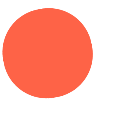
🎈 컴포넌트 재사용
만약 Box 와 동일한 스타일을 가진 원을 만들고 싶으면 어떻게 할까?
하나 그대로 만들면 간단하지만,
코드가 중복되고 있다
const Box = styled.div`
  background-color: ${(props) => props.bgColor};
  width: 100px;
  height: 100px;
`;

const Circle = styled.div`
  background-color: ${(props) => props.bgColor};
  width: 100px;
  height: 100px;
  border-radius: 50px;
`;
이 때 사용가능 한 방식이
스타일 컴포넌트 자체를 불러오는 형식이다
위에서 div 를 불러 오는 대신,
만들어 놓은 스타일 컴포넌트 자체를 불러오고, css를 추가하는 방식을 사용하면 된다
const Circle = styled(Box)`
  border-radius: 50px;
`;

<Circle bgColor="tomato" />
📌 완성본
import styled from "styled-components";

const Father = styled.div`
  display: flex;
`;

const Box = styled.div`
  background-color: ${(props) => props.bgColor};
  width: 100px;
  height: 100px;
`;

const Circle = styled(Box)`
  border-radius: 50px;
`;

// const BoxTwo = styled.div`
//   background-color: tomato;
//   width: 100px;
//   height: 100px;
// `;

const Text = styled.div`
  color: white;
`;

export default function StyleComponents() {
  return (
    <Father>
      <Box bgColor="teal" />
      <Box bgColor="tomato" />
      {/* <BoxTwo /> */}
      <Circle bgColor="yellow">
        <Text>Hello</Text>
      </Circle>
    </Father>
  );
}
👉 as로 태그 변경
const Btn = styled.button`
  color: white;
  background-color: tomato;
  border: 0;
  border-radius: 15px;
`;

  return (
    <Father>
      <Btn>Login </Btn>
      <Btn>Logout </Btn>
    </Father>
  );
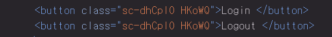
스타일을 입힌 버튼 컴포넌트를 미리 만들어 놓았다
그런데 갑자기
스타일은 동일하게 유지하면서,
다른 태그, (div, Link 등등) 이 사용하고 싶으면 어떻게 할까??
이 때 사용하는게 as props이다
as를 통해서 태그를 입력해주면 해당 태그로 변경이 된다
a링크를 as로 보내주고 결과를 보자
  return (
    <Father>
      <Btn>Login </Btn>
      <Btn as="a" href="/">Logout </Btn>
    </Father>
  );
button태그를 사용하는 스타일컴포넌트를 사용하지만,
as를 통해서 a태그로 간편하게 변경해줄 수 있다.
a태그니까 이동경로도 바로 써주면된다
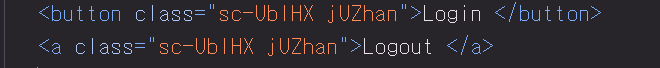
👉 속성값 설정 - attrs
const Input = styled.input`
  background-color: tomato;
`;

function App() {
  return (
    <Father as="header">
      <Input required/>
      <Input required/>
      <Input required/>
      <Input required/>
    </Father>
  );
}
모든 input에 required 라는 속성을 추가하고 싶다
각각의 input에 넣어주면 간단하지만, 이건 개발자 스럽지 못하다
attrs 를 활용하면,
태그로 전달될 속성을 가진 오브젝트를 생성할 수 있다
const Input = styled.input.attrs({ required: true, minLength: 10 })`
  background-color: tomato;
`;

function App() {
  return (
    <Father as="header">
      <Input />
      <Input />
      <Input />
      <Input />
    </Father>
  );
}
이렇게 객체를 설정해주면 위에서 설정한 required가 전부 동일하게 들어간다
, 를 통해서 여러가지 속성을 추가할수도 있다
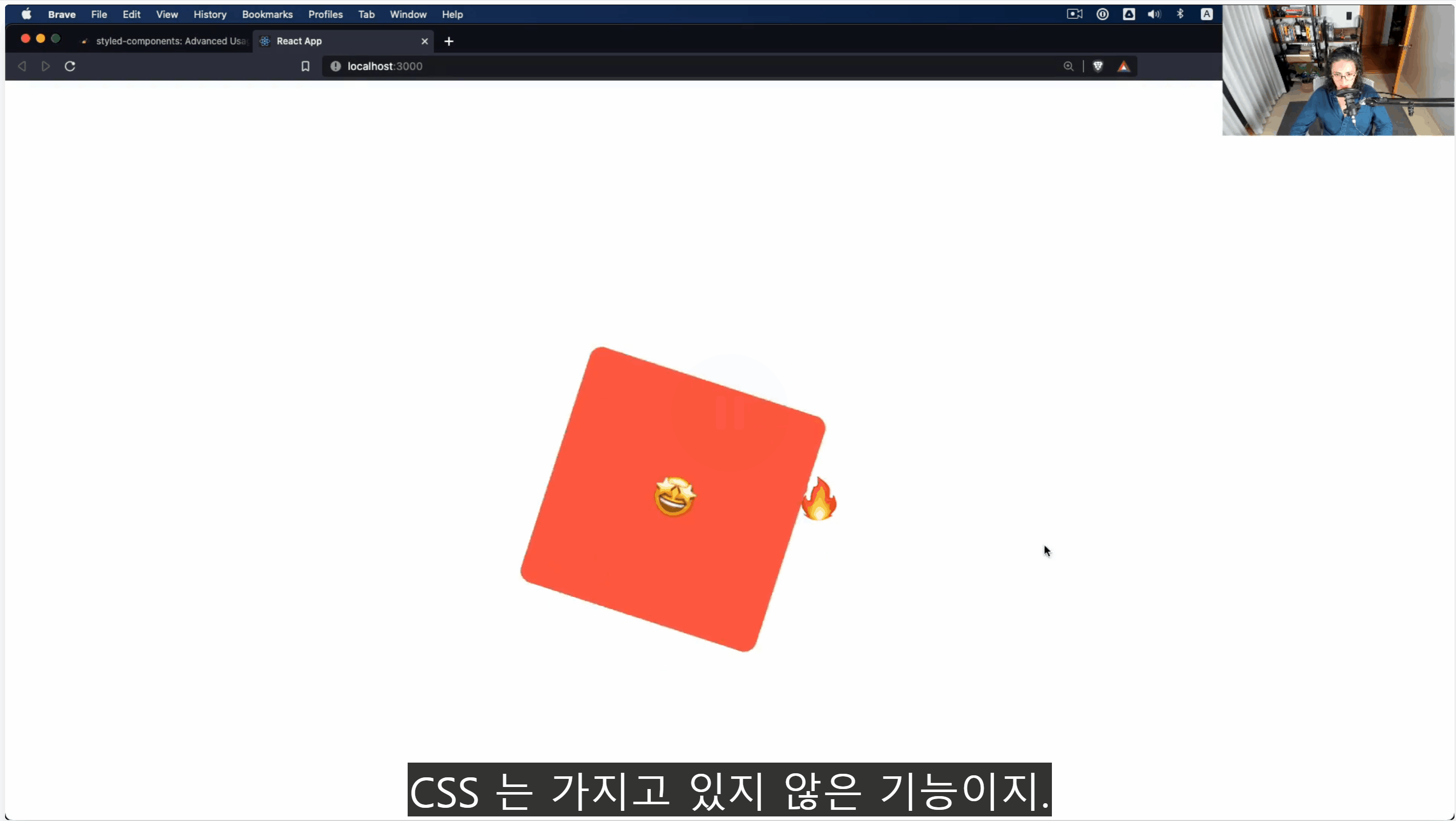
👉 애니메이션
스타일컴포넌트에서 애니메이션을 사용하러면
먼저 keyframes 를 import 해와야한다
import { keyframes } from "styled-components"다음, 밖에서 animation 컴포넌트를 만들어준다
const animation = keyframes`
	// css 작성
`
안에다가 기본 css 애니메이션을 주면 된다
const animation = keyframes`
    from {
        transform: rotate(0);
    }
    to {
        transform: rotate(360);
    }
`
그리고 사용하고 싶은 스타일컴포넌트에
스타일로 넣어주면 된다
const Box = styled.div`
  width: 200px;
  height: 200px;
  background-color: tomato;
  animation: ${rotationAnimation} 1s linear infinite;
`;
📌 완성본
import styled, { keyframes } from "styled-components";

const rotationAnimation = keyframes`
    0% {
        transform: rotate(0deg);
        border-radius: 0px;
    }
    50% {
        transform: rotate(360deg);
        border-radius: 100px;
    }
    100% {
        transform: rotate(0deg);
        border-radius: 0px;
    }
`;

const Box = styled.div`
  width: 200px;
  height: 200px;
  background-color: tomato;
  animation: ${rotationAnimation} 1s linear infinite;
`;

export default function AnimationBox() {
  return (
    <div>
      <Box />
    </div>
  );
}
🎈 selector
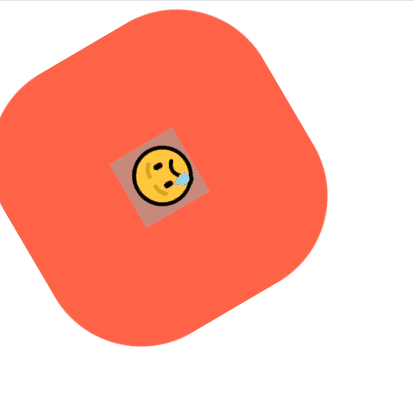
      <Box>
        <span>😢</span>
      </Box>
스타일컴포넌트 안에 그냥 태그가 들어있다
그냥 태그를 스타일컴포넌트에서
selector 문법으로 선택해서
스타일 지정이 가능하다
즉, 모든 컴포넌트를 스타일컴포넌트로 만들 필요가 없는 셈이다
const Box = styled.div`
  ...
  justify-content: center;
  align-items: center;
  span {
    font-size: 36px;
  }
`;
📍 & - pseudo selector
&:active {
  opacity: 0%;
}
selector 에서
span:hover 같은 것을 더 쉽게 적용시켜주는 문법이다
span:hover = &:hover
const Box = styled.div`
  ...
  align-items: center;
  span {
    font-size: 36px;
    &:hover {
      font-size: 50px;
    }
    &:active {
      opacity: 0%;
    }
  }
`;
📌 완성본
import styled, { keyframes } from "styled-components";

const rotationAnimation = keyframes`
    0% {
        transform: rotate(0deg);
        border-radius: 0px;
    }
    50% {
        transform: rotate(360deg);
        border-radius: 100px;
    }
    100% {
        transform: rotate(0deg);
        border-radius: 0px;
    }
`;

const Box = styled.div`
  width: 200px;
  height: 200px;
  background-color: tomato;
  animation: ${rotationAnimation} 1s linear infinite;
  display: flex;
  justify-content: center;
  align-items: center;
  span {
    font-size: 36px;
    &:hover {
      font-size: 50px;
    }
    &:active {
      opacity: 0%;
    }
  }
`;

export default function AnimationBox() {
  return (
    <div>
      <Box>
        <span>😢</span>
      </Box>
    </div>
  );
}
👉 태그네임 의존 해결
현재 span태그로 코딩해놓았다
그럼 리턴 부분에서 span 을 p태그로 변경한다면
위에서 select해놓은 게 변경되어 아무런 css도 적용되지 않는다
즉, select 부분을 다시 p로 변경해주어 맞춰줘야지 적용이 된다
이런 경우,
하나의 컴포넌트를 만들어서 넣어버리면 된다
그리고 스타일컴포넌트에서는
span 자리에
${새로만든컴포넌트명} 을 넣어서 select 해주면 된다
그러면, 해당 태그가 span 이건 p이건 정상작동된다
const Emoji = styled.span`
	font-size : 36px
`

const Box = styled.div`
  ...
  align-items: center;

  ${Emoji} {
    &:hover {
      font-size: 50px;
    }
    &:active {
      opacity: 0%;
    }
  }
`;

export default function AnimationBox() {
  return (
    <div>
      <Box>
        <Emoji>😢</Emoji>   📌 적용
      </Box>

        <Emoji>🔥</Emoji>   📌 미적용
    </div>
  );
}
Emoji 컴포넌트의 hover 스타일은
반드시 box 스타일컴포넌트 내에서만 적용이 된다
select로 찍어놓았기 때문이다
따라서 위 코드의 두번째 이모지는
36px을 가지지만, hover는 적용되지 않는다
👉 themes - 다크모드
다크모드에서 필요한 것은 두가지 이다
- theme
- local East Management
이 중, 첫번째인 theme을 자세히 알아보자
theme?
- 모든 색상들을 가지고 있는 하나의 객체
theme provider
가장 먼저 theme provider 를 index파일에서 import해준다
그리고 App 컴포넌트를 감싸준다
그리고 색상을 props 로 내려준다
//index.js  or main.js(in vite)

import { ThemeProvider } from "styled-components";

const darkTheme = {
  textColor: "whitesmoke",
  backgroundColor: "#111"
};

const lightTheme = {
  textColor: "#111",
  backgroundColor: "whitesmoke",
};


createRoot(document.getElementById("root")!).render(
  <StrictMode>
    <ThemeProvider theme={darkTheme}>
      <App />
    </ThemeProvider>
  </StrictMode>
);
현재 ThemeProvider 에 색상을 넣어줬기 때문에
App 에 있는 모든 컴포넌트들이 해당 색상에 접근 할 수 있다
즉, 위에서 지정한 theme 객체의
textColor 값과
backgroundColor 값에 접근이 가능해진것이다
(이건 작명이라 아무거나 가능)
// App.js

const Title = styled.h1`
	color : ${props => props.theme.textColor}
`

const Wrapper = styled.div`
	background-color : ${props => props.theme.backgroundColor}
`
이제 모드 변경을 해주고 싶으면
<ThemeProvider theme={darkTheme}> 이 부분의 props를
위에서 선언한 lightTheme으로 바꿔주면 된다
여기서 조심해야할 점이
반드시 두 테마의 프로퍼티 작명이 동일해야한다는 점이다