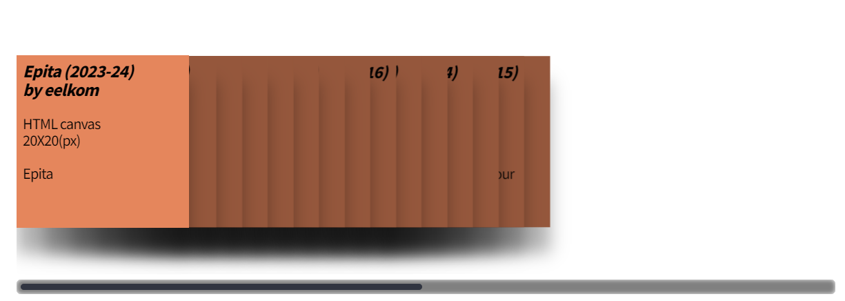
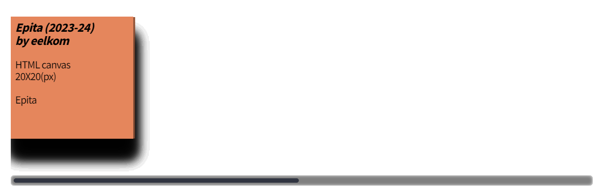
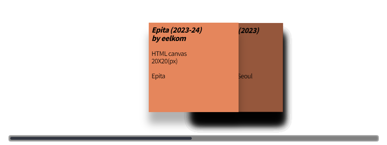
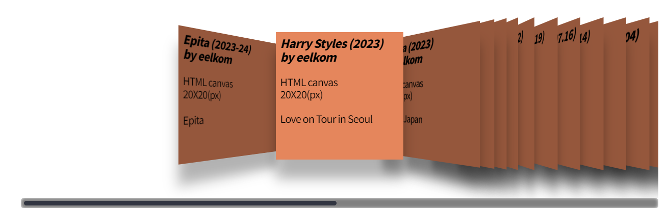
coverFlow 탐구하기
Cover Flow 탐구하기
function initCoverFlow
// Coverflow setting value
let spacing = 30; // Spacing between captions
let width = 950; // Width of coverflow container
let index = 0; // To show from captions[0]

const captions = []; // Array for captions
const windowWidth = window.innerWidth;
let captionSize = 0;

if (windowWidth < 1024) {
		captionSize = 200;
} else {
	captionSize = 230;
}
- 커버플로우의 기본 세팅값을 변수로 설정
- Caption을 담아줄 배열 선언
- 윈도우 창의 넓이 비교 후 화면 크기에 알맞은 캡션의 크기를 설정
// coverflow-container style 속성 적용
c.style.position = "relative";
c.style.overflowX = "auto";
c.style.width = width + "px";
c.style.height = (captionSize + 120) + "px";
setTransform3D(c, 0, 600, 0);
- caption 담을 부모 컨테이너(coverflow-container)의 속성을 relative로 설정
- c(coverflow-container)의 overflowX 속성을 auto로 설정
- c(coverflow-container)의 width, height 설정
- c(coverflow-container)에 perspective 속성 적용(원근감 효과)
function setTransform3D(elem, degree, perspective, z) {
	elem.style.perspective = perspective + "px";
}
setTransform3D 함수를 호출해 perspective 속성 적용
- overflowX는 CSS 속성 중 하나로, 요소의 내용이 가로(width)로 넘칠 때 어떻게 처리할지를 결정
<overflowX의 사용 값>- visible (기본값): 넘치는 내용이 잘리지 않고 그대로 표시됩니다.
- hidden: 넘치는 내용이 잘리며 보이지 않게 됩니다(스크롤바가 생성되지 않음).
- scroll: 넘치는 내용이 없더라도 항상 스크롤바를 표시합니다.
- auto: 넘치는 내용이 있을 때만 스크롤바를 표시합니다. 없으면 스크롤바가 나타나지 않습니다.
Array.from(c.children).forEach((node) => {
	captions.push(node); // node(==content 요소) push
});
- c(coverflow-container)의 자식요소를 captions 배열에 push
for (let i = 0; i < captions.length; i++) {
	captions[i].style.position = "absolute"; // 요소를 가장 가까운 포지셔닝된 조상 요소를 기준으로 위치시킵니다.
	captions[i].style.width = captionSize + "px";
	captions[i].style.height = captionSize + "px";
	captions[i].style.bottom = "60px"; // 요소의 bottom 시작 위치 설정(position과 함께 사용)
	captions[i].style.boxShadow = "0px 30px 20px rgba(0, 0, 0, 0.3)";
	captions[i].style.transition = "transform 0.9s ease, margin-left 0.6s linear, filter 0.4s linear";
}
- captions 배열을 순회하며 captions[0] 부터 captions[captions.length - 1] 까지 요소에 style 적용.
<transition 효과>
- transform: 요소의 변형(이동, 회전, 크기 조정 등)에 대한 전환 효과를 설정합니다.
- margin-left: 요소의 왼쪽 여백에 대한 전환 효과를 설정합니다.
- filter: 요소에 적용되는 필터(예: 그레이스케일, 투명도 조정 등)에 대한 전환 효과를 설정합니다.
ease: 처음에는 천천히 시작하고 중간에 가속된 후 끝에서 다시 느려집니다. 부드럽고 자연스러운 움직임을 만듭니다.
linear: 속도가 일정하게 진행
const placeholding = document.createElement("div");
placeholding.style.width = (width * 2) + "px";
placeholding.style.height = "1px"; // 실제 컨텐츠를 갖지 않기에 최소한의 높이로 설정
c.appendChild(placeholding);
- placeholding은 가상의 요소로, 이미지 커버플로우(carousel)의 너비를 조절하기 위해 사용
- c(coverflow-container)가 스크롤 가능해지도록 공간을 확보하기 위해 사용 > 커버플로우의 스크롤 기능 확보
스크롤을 활성화하려면 컨테이너의 너비보다 더 큰 콘텐츠가 있어야 함.
그러나 커버플로우의 콘텐츠들은 대부분 절대 위치(position: absolute)로 배치되기 때문에, 스크롤이 자동으로 생성되지 않습니다.- Placeholder로 가로 스크롤 확보
이 문제를 해결하기 위해 placeholding이라는 가상의 div를 추가하여, 컨테이너의 너비보다 더 넓은 공간을 만들어줍니다.- width * 2: 커버플로우에 필요한 스크롤 범위를 확보하기 위해, 가상의 div를 컨테이너의 2배 크기로 만듭니다.
height = 1px: 이 div는 단순히 스크롤 공간을 확보하기 위한 요소이므로, 눈에 보이지 않도록 최소한의 높이만 부여합니다.- appendChild()로 컨테이너에 추가
이 가상의 요소를 컨테이너 c에 추가하면, 컨테이너는 이 요소의 크기만큼 스크롤 범위를 가지게 됩니다.
결과적으로, 커버플로우의 콘텐츠가 스크롤 가능한 형태가 됩니다.
c.addEventListener('scroll', () => {
	coverflowScroll(captionSize, spacing, c, captions, width);
}, { passive: true });

for (let i = 0; i < captions.length; i++) {
	captions[i].addEventListener('click', () => {
    	displayIndex(captionSize, spacing, c.scrollLeft, captions, i, parseInt(c.style.width));
    });
}
// 초기 화면 display
displayIndex(captionSize, spacing, c.scrollLeft, captions, index, parseInt(c.style.width));
function coverflowScroll
function coverflowScroll(captionSize, spacing, c, captions, width) {
	let sLeft = c.scrollLeft;
    let p = 1.0 * sLeft / width;
    let index = Math.min(Math.floor(p * captions.length), captions.length - 1);
    displayIndex(captionSize, spacing, sLeft, captions, index, width);
    }
- c.scrollLeft는 스크롤의 왼쪽 끝으로부터 스크롤된 픽셀 수를 나타냅니다.
- 스크롤이 오른쪽으로 이동하면 c.scrollLeft의 값은 점점 증가하게 됩니다. (t실수형 반환임을 명확히 하기 위해 1.0 곱)
- sLeft값은 0 ~ c.style.width - 1... 범위 까지 (현재 950px)
- p값은 0 ~ 0.99... 범위 까지
- index 값의 경우 (p captions.length) 식을 활용해 스크롤 된 비율 만큼의 index 값을 추출
( ex. p = 0.55, captions.length = 10 => Math.floor( p captions.length = 5.5 ) => index = 5 )- Math.min 함수를 통해 최대 index 값이 captions.length - 1이 되도록 함 (배열의 인덱스 범위를 벗어나지 않도록 보장)
- displayIndex 호출
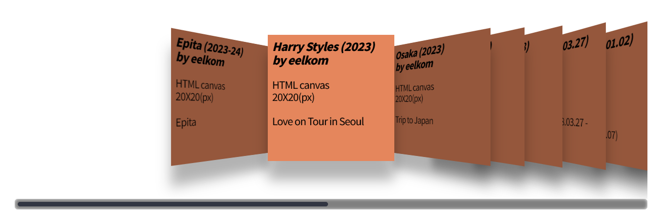
function displayIndex
function setTransform3D(elem, degree, perspective, z) {
	degree = Math.max(Math.min(degree, 90), -90);
	z -= 5;
	elem.style.perspective = perspective + "px";
	elem.style.transform = "rotateY(" + degree + "deg) translate3D(0, 0, " + z + "px)";
}
function displayIndex(captionSize, spacing, sLeft, captions, index, width) {
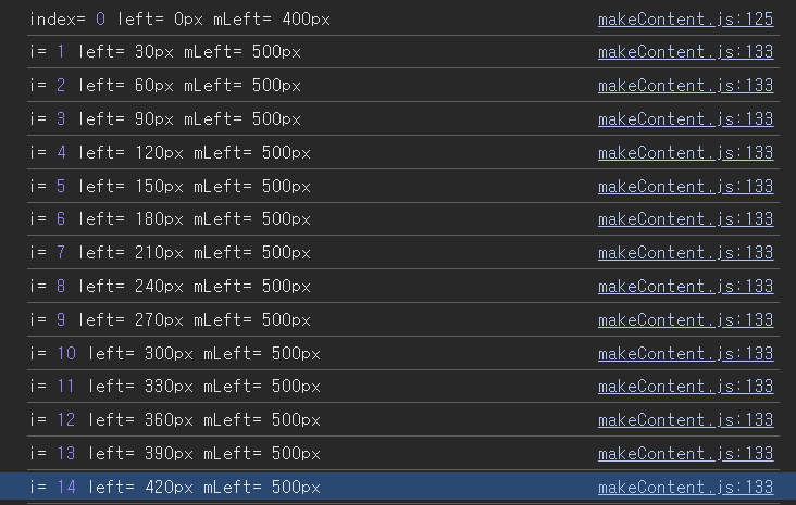
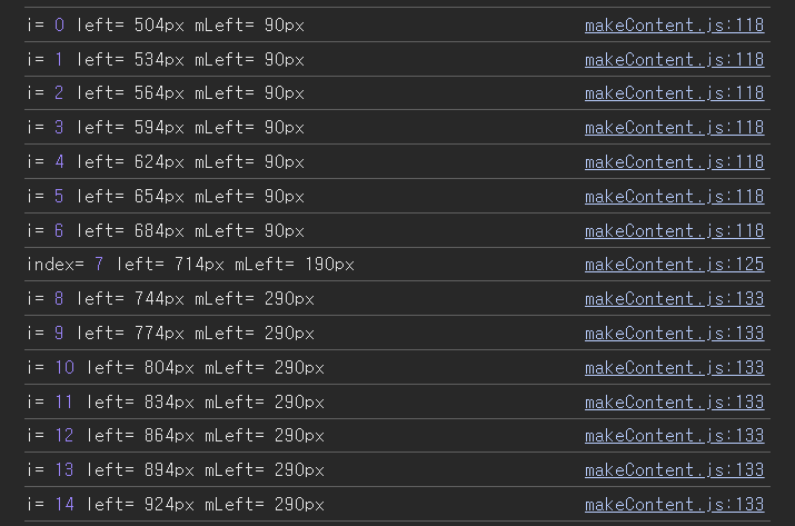
let mLeft = ((width - captionSize) * 0.5) - (spacing * index);
for (let i = 0; i < index; i++) {
captions[i].style.left = (sLeft + i * spacing) + "px";
captions[i].style.marginLeft = (mLeft - captionSize * 0.5) + "px";
captions[i].style["-webkit-filter"] = "brightness(0.65)";
captions[i].style.zIndex = i + 1;
setTransform3D(captions[i], ((index - i) * 10 + 45), 300, (-(index - i) * 30 - 18));
}
captions[index].style.left = (sLeft + index * spacing) + "px";
captions[index].style["-webkit-filter"] = "none";
captions[index].style.marginLeft = mLeft + "px";
captions[index].style.zIndex = captions.length;
setTransform3D(captions[index], 0, 0, 5);
for (let i = index + 1; i < captions.length; i++) {
captions[i].style.left = (sLeft + i * spacing) + "px";
captions[i].style.marginLeft = (mLeft + captionSize * 0.5) + "px";
captions[i].style["-webkit-filter"] = "brightness(0.65)";
captions[i].style.zIndex = captions.length - i;
setTransform3D(captions[i], ((index - i) * 10 - 45), 300, ((index - i) * 30 - 18));
}
}
- mLeft 값 계산
- 해당 index 전 captions[i] style 속성 적용
- captions[i].style.left = (sLeft + i * spacing) + "px";
- 여기서의 sLeft 값은 c.scrollLeft를 인자로 받아온 값
- 각 캡션 요소를 X축에서 배치하기 위해, left 값을 설정합니다.
이 코드에서는 position: absolute로 설정된 캡션들이, 왼쪽에서부터 일정 간격(spacing)으로 떨어지도록 배치됩니다.
left가 증가할수록 캡션이 오른쪽으로 이동합니다.- marginLeft = captions[i]의 왼쪽 마진을 설정
- zIndex 설정을 통해 이미지 우선 표기 설정
element.style.left
이 코드는 요소의 왼쪽 경계를 부모 컨테이너의 왼쪽 경계로부터 50픽셀 떨어진 곳에 배치합니다.
값은 픽셀(px), 퍼센트(%) 또는 calc() 등의 CSS 단위로 사용할 수 있습니다.
let mLeft = (width - captionSize) x 0.5 - spacing x (index) - captionSize x 0.5;
(width - captionSize) x 0.5 = 고정값
captionSize x 0.5 = 고정값
spacing x (index) = index가 증가 할수록 값이 커짐
-> i 값이 증가 할수록 mLeft 값이 감소함
index = 0, width = 1000, captionSize = 200으로 가정
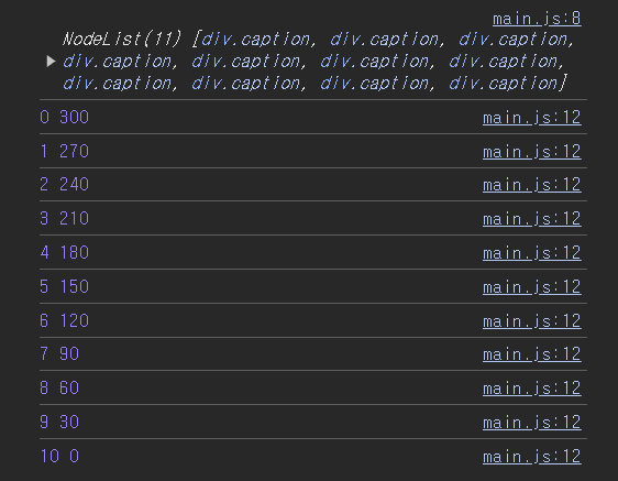
(() => {
    let width = 1000;
    let spacing = 30;
    let captionSize = 200;
    let captions = document.querySelectorAll('.caption');
    console.log(captions);
    for(let i = 0; i < captions.length; i++) {
        let mLeft = (width - captionSize) * 0.5 - spacing * (i) - captionSize * 0.5;
        console.log(i, mLeft);
        captions[i].style.marginLeft = mLeft+ "px";
    }
})();
위 코드의 console.log(i, mLeft) 출력에 따른 index 변화에 따른 mLeft 값의 변화이다.
본 코드에서의 index값 변화에 따른 left, mLeft 값이다
index 값이 커질수록 mLeft 값이 감소한다.
function setTransform3D
function setTransform3D(elem, degree, perspective, z) {
	degree = Math.max(Math.min(degree, 90), -90);
	elem.style.perspective = perspective + "px";
	elem.style.transform = "rotateY(" + degree + "deg) translate3D(0, 0, " + (z - 5) + "px)";
}
- degree 범위 설정: -90 <= degree <= 90
- perspective: 원근감 적용
- rotateY: y 축으로 회전
- translate3D 속성 설정
(Transformation) 속성
- transform: translate3D(x, y, z);
translate3D()는 3차원 공간에서 요소를 이동시키는 CSS 변환
x: 요소를 좌우(X축)로 이동 (양수는 오른쪽, 음수는 왼쪽)
y: 요소를 상하(Y축)로 이동 (양수는 아래쪽, 음수는 위쪽)
z: 화면 깊이(Z축)로 이동 (양수는 사용자에게 더 가까이, 음수는 더 멀리)
rotateY:
양수 값: 오른쪽 방향으로 회전 (시계 방향).
음수 값: 왼쪽 방향으로 회전 (반시계 방향).
- index 전 요소 까지의 setTransform3D 호출
(index = 5, captions.length = 10으로 가정)setTransform3D(captions[i], ((index - i) * 10 + 45), 300, (-(index - i) * 30 - 20));- degree 변수로 받게 되는 (index - i) 10 + 45) 식의 경우
(5-0) 10 + 45 = 50 + 45
(5-1) 10 + 45 = 40 + 45
(5-2) 10 + 45 = 30 + 45
(5-3) 10 + 45 = 20 + 45
(5-4) 10 + 45 = 10 + 45
-> Y축 기준 오른쪽 방향으로 회전
-> index에서 caption이 멀어질 수록 회전 각 증가
- z 변수로 받게 되는 (-(index - i) 30 - 20) 식의 경우
(-(5 - 0) 30 - 20) = -150 - 20
(-(5 - 1) 30 - 20) = -120 - 20
(-(5 - 2) 30 - 20) = -90 - 20
(-(5 - 3) 30 - 20) = -60 - 20
(-(5 - 4) 30 - 20) = -30 - 20
-> index에서 caption이 멀어질 수록 깊이감 증가
-> captions[i] 에서 i 값이 마이너스 값일 수록 화면 깊이감 증가
- index 요소의 setTransform3D 호출
(index = 5, captions.length = 10으로 가정)setTransform3D(captions[index], 0, 0, 5);-> degree 변수로 받게 되는 값 = 0 (Y축 회전 x)
-> Z-index = 0
- index 후 요소부터 setTransform3D 호출
(index = 5, captions.length = 10으로 가정)setTransform3D(captions[i], ((index - i) * 10 - 45), 300, ((index - i) * 30 - 20));degree 변수로 받게 되는 (index - i) 10 - 45) 식의 경우
(5-6) 10 + 45 = -10 - 45
(5-7) 10 + 45 = -20 - 45
(5-8) 10 + 45 = -30 - 45
(5-9) * 10 + 45 = -40 - 45
-> Y축 기준 왼쪽 방향으로 회전
-> captions[i] 에서 i 값이 클수록 회전 각 증가
- z 변수로 받게 되는 ((index - i) 30 - 20) 식의 경우
((5 - 6) 30 - 20) = -30 - 20
((5 - 7) 30 - 20) = -60 - 20
((5 - 8) 30 - 20) = -90 - 20
((5 - 9) * 30 - 20) = -120 - 20
-> index에서 caption이 멀어질 수록 깊이감 증가
-> captions[i] 에서 i 값이 마이너스 값일 수록 화면 깊이감 증가
오류()
c.children.forEach((node) => {
	captions.push(node); // // node(==content 요소) push
});
c.children은 HTMLCollection을 반환.
이는 배열이 아니라서 forEach 메서드를 바로 사용할 수 없음.
forEach는 배열의 메서드이기 때문에, HTMLCollection이나 NodeList와 같은 배열 유사 객체에서는 동작하지 않음.
해결 방법:
Array.from() 또는 스프레드 연산자(...)를 사용하여 c.children을 배열로 변환한 후, forEach를 사용.
c.childNodes.forEach((node) => {
	if (node.tagName) { // tagName 속성을 사용하여 c.childNodes 내 HTML tag만 추출
		captions.push(node); // // node(==content 요소) push
	}
});
if (node.tagName) 조건문을 거치지 않으면 마자막 요소에 텍스트가 포함되어서 오류 발생 (이유는 아직 모름)
애니메이션 탐구
left 속성
displayIndex함수 내
captions[i].style.left = (sLeft + i * spacing) + "px";captions[i]의 style.position 속성은 "absolute"
항상 같은 위치를 유지함
스크롤이 된 만큼(sLeft의 값이 바뀌어도 i * spacing의 값은 항상 같기에) 이동해서 항상 같은 위치에 위치한 것 처럼 보여줌
i x spacing -> caption 사이에 공간을 주기 위함
captions[i].style.left속성을 실행하지 않을 경우 모든 요소들이 곂쳐 보인다
marginLeft 속성
let mLeft = ((width - captionSize) * 0.5) - (spacing * index);

for (let i = 0; i < index; i++) {
	captions[i].style.marginLeft = (mLeft - captionSize * 0.5) + "px";
}

captions[index].style.marginLeft = mLeft + "px";

for (let i = index + 1; i < captions.length; i++) {
	captions[i].style.marginLeft = (mLeft + captionSize * 0.5) + "px";
}
mLeft 식을 살펴보자
width: 1000, captionSize: 200, index = 0 으로 가정
mLeft = ((width - captionSize) x 0.5) - (spacing x index);
= (1000 - 200) x 0.5 - (30 x 0)
= 400
- mLeft는 caption을 컨테이너 중앙에 배치하기 위한 변수이다.
- 현재 mLeft = 400, caption의 size = 200. 즉, captions[0]의 정 가운데가 컨테이너 중앙에 정렬된다.
left 속성과 marginLeft 속성의 관계
- i = 0, mLeft = 400, left = 0
- i = 1, mLeft = 370, left = 30
- i = 2, mLeft = 340, left = 60
- i = 3, mLeft = 310, left = 90
...
spacing 값이 더해지더라도 caption을 가운데에 위치시키기 위해 mLeft 값을 계산할 때 -(spacing x index) 식을 더해준다.
setTransform3D 함수 내
function setTransform3D(elem, degree, perspective, z) {
	degree = Math.max(Math.min(degree, 90), -90);
	elem.style.perspective = perspective + "px";
	elem.style.transform = "rotateY(" + degree + "deg) translate3D(0, 0, " + (z - 5) + "px)";
}
translate3D(x, y, z)
translate3D 속성을 사용해 z값에 깊이감을 적용
z: 화면 깊이(Z축)로 이동 (양수는 사용자에게 더 가까이, 음수는 더 멀리)
- before
- after
z 변수로 받게 되는 (-(index - i) 30 - 20) 식의 경우
(-(5 - 0) 30 - 20) = -150 - 20
(-(5 - 1) 30 - 20) = -120 - 20
(-(5 - 2) 30 - 20) = -90 - 20
(-(5 - 3) 30 - 20) = -60 - 20
(-(5 - 4) 30 - 20) = -30 - 20
-> index에서 caption이 멀어질 수록 깊이감 증가
-> captions[i] 에서 i 값이 마이너스 값일 수록 화면 깊이감 증가