리액트에서 버튼 컴포넌트를 만들어보자.
그냥 버튼은
<button>buttonTEST</button>이런 식으로 작성하면 되지만,
리액트의 장점을 최대한 살릴려면 이렇게 컴포넌트를 따로 빼서 작성하면 좋다.
그래서 처음에
function Button(props){
return <button>{props.title}</button>
}
이런식으로 작성하고 말았다.
이 Button을 부르는 index.js에서
import Button from './Button.js';이런식으로 import만 해주면 되는줄 알았는데.
오류가 떴다.
알고보니 새로 만든 Button.js에서
export default Button;와 같이 export를 추가해야 하는 것이었다.
이제 다양한 props를 주면서 버튼 컴포넌트를 더 다채롭게 만들어 봐야겠다.
버튼의 크기를 조정하는 데는 두 가지 방법이 있는 듯 하다.
1. width, height
일반적인 방법이고, width는 %까지 지정할 수 있다.
2. padding
처음 react를 쓸 때 찾은 게 padding이었다. padding은 자식 컴포넌트와의 거리로,
버튼 가장자리로부터 버튼 안의 텍스트와의 거리이다.
이 거리를 조정하면 버튼의 크기도 조정할 수 있다.
padding="20px 50px"이렇게 쓰면 세로 padding이 20px, 가로 padding이 50px 로 되는 듯 하다.
3. 두 가지 다 쓰면?
가장 궁금한 게 둘 다 쓰면인데,
실험을 통해 얻은 결론으로는 도형이 망가지지 않는 한 둘 다 최대한 만족시키려는 것 같다.
예를 들면 height가 10px인데 padding의 세로가 30px 이라면 30 기준으로 맞춰진다.
그만큼의 padding을 줘야 하기 때문에 height=10 은 무시되는 것 같다.
반대로 height는 100, padding은 10이라면 이 때는 충분히 버튼이 이미 크기때문에 padding이 10이든 20이든 무시된다.
둘의 정확한 우선순위는 모르겠으나,
width="300px"
height="50px"
padding="20px 50px"
보다
width="300px"
height="50px"
//padding="20px 50px"
와 같이 했을 때 텍스트가 좀 더 밑으로 내려가는 것을 보아하니
어느 한쪽만 무시되는 것은 아니고 둘다 적용은 되는 듯 하다.
내가 내린 결론은 버튼의 크기는 width와 height로 맞추고, 필요한 경우 padding을 쓰자 라는 것이다.
(참고)
(Button.js)
import styled, { css } from "styled-components";


function Button(props){
  return <StyledButton
  padding={props.padding}
  width={props.width}
  height={props.height}
  background={props.background}
  margin={props.margin}
  marginTop={props.marginTop}
  marginLeft={props.marginLeft}
  marginRight={props.marginRight}
  marginBottom={props.marginBottom}
  textSize={props.textSize}
  textColor={props.textColor}
  fontWeight={props.fontWeight}
  border={props.border}
  radius={props.radius}

  >{props.title}</StyledButton>
}

const StyledButton = styled.button`
padding: ${props => props.padding};
width: ${props => props.width};
height: ${props => props.height};
background : ${props => props.background};
margin : ${props => props.margin};
margin-top : ${props => props.marginTop};
margin-left : ${props => props.marginLeft};
margin-right : ${props => props.marginRight};
margin-bottom : ${props => props.marginBottom};
font-size: ${props => props.textSize};
color : ${props => props.textColor};
font-weight: ${props => props.fontWeight};
border: ${props => props.border};
border-radius: ${props => props.radius};

cursor: pointer;
font-family: "Noto Sans KR", sans-serif;
align-items: center;


`;


export default Button;
(App.js)
import logo from './logo.svg';
import './App.css';
import Button from './Button.js'
function App() {
return (
<div className="App">
Hello React!
<div></div>
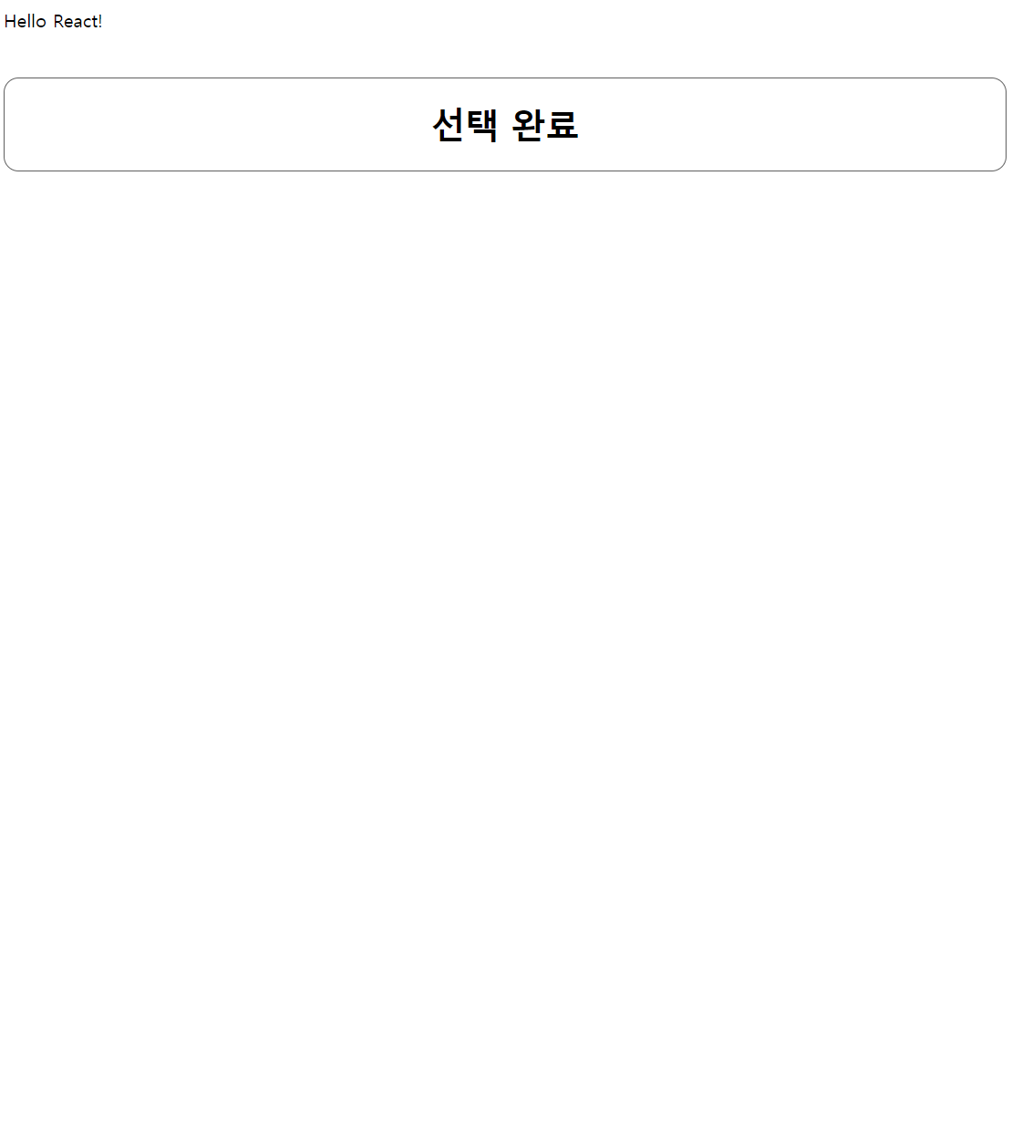
<Button title='선택 완료' padding='20px' width='100%' background='#FFFFFF' marginTop = '40px'
textSize='30px' textColor = '#000000' fontWeight = 'bold'
border = '1px solid #5F5F5F' radius = '13px'
></Button>
</div>
);
}
export default App;
(완성사진)
- 빌드 명령 : npm start
- VS Code 에서 터미널에서 명령어를 통해 styled components를 깔아야만 하고, 추가로 Extensions으로 styled components 깔아주면 좋다.
