리액트에서 스타일링을 하는 데에는 크게 세가지 방법이 있다. 아래는 그 중 하나인 인라인 방식이다.
function App() {
  return (
    <div>
      <div style={{ width: 100, height: 100, backgroundColor: "red" }}></div>
    </div>
  );
}
보다시피 구구절절 거추장스럽다.
이보다 한 단계 나은 module.css 방법도 있는데, 파일을 옮겨가며 className 붙여넣기 해줘야 하고, 특정 조건에 따른 스타일을 구현해주기 위해선 className을 덕지덕지 붙여야 한다는 단점이 있다.
그래서 앞서 말한 세 가지 방법 중 단점이 없는 건 아니지만 그래도 제일 나은 styled-components를 사용해본다.
설치
npm i styled-components
or
yarn add styled-components
사용법
const 컴포넌트명 = styled.태그명 ` 속성: 값; `
import styled from "styled-components";

const Box = styled.div`
  width: 100px;
  height: 100px;
  background-color: red;
`;

function App() {
  return (
    <div>
      <Box />
    </div>
  );
}
props 전달
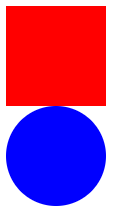
색깔만 다르고 나머지는 똑같은 Box 두 개를 만들고 싶다면 해당 색을 props로 전달하면 된다.
const Box = styled.div`
  width: 100px;
  height: 100px;
  background-color: ${(props) => props.color};
`;

function App() {
  return (
    <div>
      <Box color="red" />
      <Box color="blue" />
    </div>
  );
}
확장
Box와 동일한 width, height, background-color를 갖지만 border-radius만 다른 Circle 컴포넌트를 만들었다.
const Box = styled.div`
  width: 100px;
  height: 100px;
  background-color: ${(props) => props.color};
`;

const Circle = styled.div`
  width: 100px;
  height: 100px;
  background-color: ${(props) => props.color};
  border-radius: 50%;
`;

function App() {
  return (
    <div>
      <Box color="red" />
      <Circle color="blue" />
    </div>
  );
}
두 컴포넌트에 동일한 속성이 세 개나 있는데 반복 작성하는 건 비효율적이지 않은가.
const Circle = styled(Box)` `
이렇게 하면 Circle은 Box를 확장하여 Box의 스타일 속성을 모두 갖고 거기에 추가로 본인만의 스타일을 가질 수도 있다.
const Box = styled.div`
  width: 100px;
  height: 100px;
  background-color: ${(props) => props.color};
`;

const Circle = styled(Box)`
  border-radius: 50%;
`;

function App() {
  return (
    <div>
      <Box color="red" />
      <Circle color="blue" />
    </div>
  );
}
태그 바꿔치기
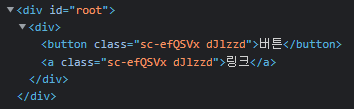
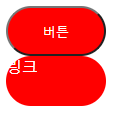
페이지에 똑같이 생긴 버튼 두 개 있는데, 하나는 페이지 내에서 기능을 하는 button 태그이고 하나는 페이지를 이동하는 a 태그라고 해보자. 이럴 때 styled-components를 사용한다면
const Button = styled.button` `
const Link = styled.a` `
이렇게 똑같은 스타일 속성을 갖는 요소를 태그명만 바꿔서 두 개 만들어 줄 필요가 없다.
const Button = styled.button`
  display: block;
  width: 100px;
  height: 50px;
  color: white;
  background-color: red;
  border-radius: 25x;
`;

function App() {
  return (
    <div>
      <Button>버튼</Button>
      <Button as="a">링크</Button>
    </div>
  );
}as="a"만 넣어주면 button 태그가 아니라 a 태그가 된다.
태그의 속성 설정
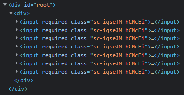
회원가입 form을 만들었는데 필수로 작성해야 하는 input이 많다고 해보자. 그렇다면 아래와 같이 input 태그마다 required를 적어줘야 할까? styled-components를 사용한다면 그럴 필요가 없다.
const Input = styled.input`
  display: block;
  color: white;
  background-color: pink;
  margin-bottom: 10px;
`;

function App() {
  return (
    <div>
      <Input required />
      <Input required />
      <Input required />
      <Input required />
      <Input required />
      <Input required />
      <Input required />
    </div>
  );
}
태그명 뒤에 .attrs() 붙여주고 ()안에 부여하고 싶은 속성을 객체 형식으로 작성하면 된다.
const Input = styled.input.attrs({ required: true })`
  display: block;
  color: white;
  background-color: pink;
  margin-bottom: 10px;
`;

function App() {
  return (
    <div>
      <Input />
      <Input />
      <Input />
      <Input />
      <Input />
      <Input />
      <Input />
    </div>
  );
}
각 input 태그마다 required가 들어간 것을 확인할 수 있다.
애니메이션
애니메이션을 적용하려면 keyframes를 import 해야한다. 이후 사용법은 기본적인 CSS와 다를 바 없다.
import styled, { keyframes } from "styled-components";

const rotate = keyframes`
from{
  transform:rotate(0deg);
}
to{
  transform: rotate(360deg);
}
`;

const Rotator = styled.div`
  width: 100px;
  height: 100px;
  background-color: pink;
  animation: ${rotate} 1s linear infinite;
`;

function App() {
  return (
    <div>
      <Rotator />
    </div>
  );
}
상위선택자 (&), 중첩
styled-components에서는 SASS처럼 상위선택자 & 를 지원하고 중첩이 가능하다.
const Box = styled.div`
  display: flex;
  justify-content: center;
  align-items: center;
  width: 100px;
  height: 100px;
  background-color: pink;
  span {
    color: white;
    &:hover {
      font-size: 48px;
    }
  }
`;

function App() {
  return (
    <div>
      <Box>
        <span>상자</span>
      </Box>
    </div>
  );
}
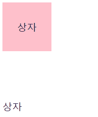
자식 styled-component 중첩
styled-component 안에서 다른 styled-component를 선택자로 사용할 수 있다.
const Text = styled.span`
  font-size: 20px;
`;

const Box = styled.div`
  display: flex;
  justify-content: center;
  align-items: center;
  width: 100px;
  height: 100px;
  background-color: pink;
  ${Text}:hover {
    font-size: 48px;
  }
`;

function App() {
  return (
    <div>
      <Box>
        <Text>상자</Text>
      </Box>
      <Text>상자</Text>
    </div>
  );
}
"상자"라는 글자 모두 Text의 스타일이 적용되지만 Box 안에 있는 Text만 hover 했을 때 지정한 스타일이 적용된다.
ThemeProvider
styled-components가 제공하는 themeProvider를 사용해서 색상을 객체 형식으로 모아둔 theme을 props로 하위 컴포넌트들에게 넘겨줄 수 있다.
색상을 일일이 바꿔줄 필요없이 themeProvider에서 넘겨주는 theme만 바꿔주면 되므로 라이트 테마, 다크 테마를 구현할 때 유용하게 사용할 수 있다.
index.js
import React from "react";
import ReactDOM from "react-dom";
import { ThemeProvider } from "styled-components";
import App from "./App";

const darkTheme = {
  textColor: "white",
  backgroundColor: "black",
};

const lightTheme = {
  textColor: "black",
  backgroundColor: "whitesmoke",
};

ReactDOM.render(
  <React.StrictMode>
    <ThemeProvider theme={lightTheme}>
      <App />
    </ThemeProvider>
  </React.StrictMode>,
  document.getElementById("root")
);
App.js
const Container = styled.div`
  background-color: ${(props) => props.theme.backgroundColor};
`;

const Text = styled.span`
  color: ${(props) => props.theme.textColor};
`;

function App() {
  return (
    <Container>
      <Text>테마가 무엇이오?</Text>
    </Container>
  );
}
<ThemeProvider theme={lightTheme}>일 때

<ThemeProvider theme={darkTheme}>일 때