
일단 간단하게 HTML코드를 이와 같이 작성한다.
      <div class="container">
        <div class="flip-btn">
          <div class="front">front</div>
          <div class="back">back</div>
        </div>
      </div>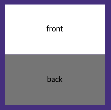
.flip-btn {
  width: 200px;
  height: 30px;
  color: black;
  text-align: center;
  line-height: 30px;
}height와 line-height의 값이 같으면 수직 방향에서 중앙에 위치하게 된다.
공식처럼 외우면 된다고 한다.
단, 텍스트가 한 줄 일때만 가능하며 두 줄이면 X
.container {
  position: absolute;
  left: 50%;
  top: 100%;
  transform: translate(-50%, 50%);
  perspective: 1000px;
}

.flip-btn {
  width: 200px;
  height: 100px;
  color: black;
  text-align: center;
  line-height: 100px;
  transform-style: preserve-3d;
}
transform-style: preserve-3d를 통해 3D 공간에 주고 최상위 요소에 perspective: 1000px(perspective의 값이 작으면 작을수록 더 원근감을 가까이에 본다 생각하고 크면 클 수록 멀리 본다)을 주어 원근감을 준다.
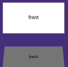
.back {
  background-color: grey;
  height: 100px;
  transform: rotateX(50deg);
}
이후 X축을 기준으로 transform: rotateX(50deg)을 주게 되면 위와 같이 보여지게 된다.
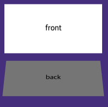
여기서 transform: rotateX(90deg) 90도를 주게 되면 아래와 같이 직각이 된다.
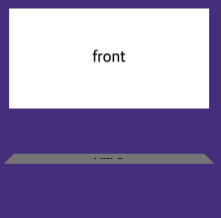
그리고 translateZ(40px)을 주는데 양수를 주면 올라가고 👇
음수translateZ(-40px)를 주게 되면 내려간다. 👇
.container {
position: absolute;
left: 50%;
top: 100%;
transform: translate(-50%, 50%);
perspective: 1000px;
}
.flip-btn {
width: 200px;
height: 100px;
color: black;
text-align: center;
line-height: 100px;
transform-style: preserve-3d;
transition: 0.5s;
/* transition 0.5초 동안 애니메이션 발생 */
}
.flip-btn:hover {
transform: rotateX(-90deg);
}
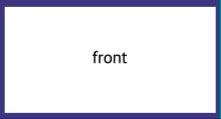
.front {
background-color: white;
height: 100px;
color: black;
transform: translateZ(50px);
}
.back {
background-color: grey;
height: 100px;
transform: rotateX(90deg) translateZ(150px);
}
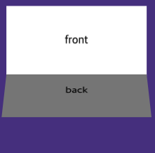
적절한 위치에 translateZ, X값을 주고 hover를 주어 효과를 주게 되면 아래와 같은 효과가 나오게 된다.
수코딩 영상링크
수코딩님 감사합니다.

Loding...