flex란
flex는 정렬이나 공간을 구분해서 레이아웃을 만들 수 있는 '레이아웃 배치 전용' 기능으로 사용되는 요소이다.
flex의 특징
- flex는 flex와 inline-flex가 있음.
- flex는 block처럼 여역을 다 차지하고, inline-flex는 자식들의 넓이만큼만 자기자신의 넓이를 잡는다.inline-block과 비슷함.
1. display의 속성으로 display:flex; 이렇게 작성한다.
.container{
    display:flex;
    }
2. flex는 block의 성질을 가지고 있으며, 부모 요소인 container와 자식 요소인 item이 있다. 주로 부모인 containr를 이용해 자식인 item들을 정렬시키고 배치시킨다.
💡 block의 성질을 가지고 있지만 block과는 다르게 가로 방향으로 배치가 되고, 자신의 width만 큼만 자리를 차지함. height는 컨테이너 높이만큼 늘어남.
💡 flex에는 메인축(main axis)와 수직(교차)축(cross axis)가 있다. flex는 이 axis를 기준으로 정렬 된다.
3. flex-direction
아이템들의 방향을 결정해줌
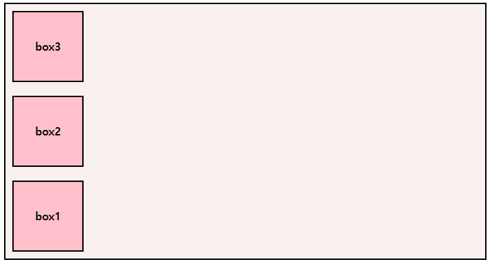
3-1. row
row는 기본값이기 때문에 flex-direction:row;로 안 적어도 알아서 row로 정렬됨.
.container{
    display:flex;
    flex-direction: row;
    }
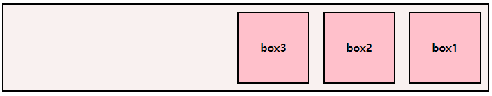
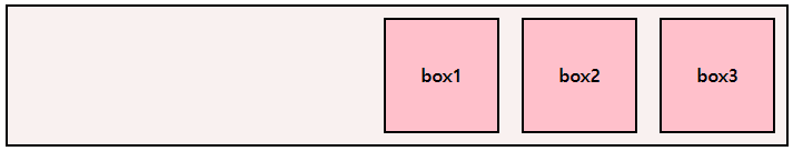
3-2. row-reverse
.container{
    display:flex;
    flex-direction: row-reverse;
    }
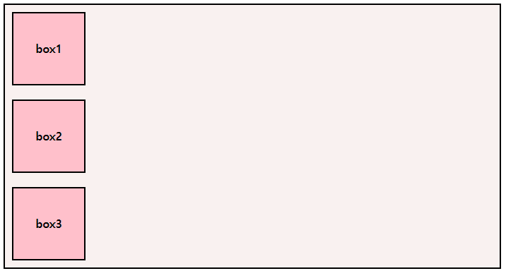
3-3. column
.container{
    display:flex;
    flex-direction: column;
    }
3-4. column-reverse
.container{
    display:flex;
    flex-direction: column-reverse;
    }
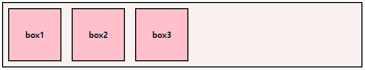
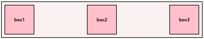
4.justify-content
main축을 기준으로 아이템을 정렬해줌, 아이템들 사이 간격도 조절해줌
💁 종류는 이렇게 있음!
 .container {
        display: flex;
        /* justify-content: flex-start; */
        /* justify-content: flex-end; */
        /* justify-content: center; */
        /* justify-content: space-between; */
        /* justify-content: space-around; */
        /* justify-content: space-evenly; */
        }
4-1. flex-start

4-2. flex-end
4-3. center
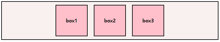
4-4. space-between
4-5. space-around
4-6. space-evenly
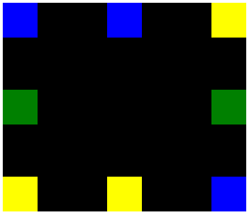
justify-content를 이용한 실습!!
 <style>
        div {
            width: 50px;
            height: 50px
        }

        .blue {
            background: blue
        }

        .green {
            background: green
        }

        .yellow {
            background: yellow
        }


        article {
            display: flex;
            justify-content: space-between;
            background: black;
            width: 350px;
            height: 300px;
        }

        .left_side {
            display: flex;
            flex-direction: column;
            justify-content: space-between;
        }

        .center {
            display: flex;
            flex-direction: column;
            justify-content: space-between;
        }

        .right_side {
            display: flex;
            justify-content: space-between;
            flex-direction: column-reverse;

        }

        .right_side,
        .center,
        .left_side {
            height: 300px;
        }
</style><body>
<article>
<div class="left_side">
<div class="blue"></div>
<div class="green"></div>
<div class="yellow"></div>
</div>
<div class="center">
<div class="blue"></div>
<div class="yellow"></div>
</div>
<div class="right_side">
<div class="blue"></div>
<div class="green"></div>
<div class="yellow"></div>
</div>
</article>
</body>💁 이런 결과가 나옴!
5. align-items, align-content
align-items는 cross axis(교차축)을 기준으로 정렬
align-content는 아이템들이 여러줄 일 때 사용 가능하다.
💁 align-items의 종류.container { display: flex; /* align-items: stretch; (기본값) */ /* align-items: center; */ /* align-items: flex-start; */ /* align-items: flex-end; */ }
<style>
        .container {
            width: 400px;
            height: 400px;
            background: blue;
            display: flex;
            justify-content: flex-end;
            align-items: center;
        }

        .container div {
            display: flex;
            width: 100px;
            height: 100px;
            background: green;
        }
    </style>

    <body>
    <div class="container">
        <div></div>
    </div>
</body>
💁align-item를 사용해 만든 모양

float을 사용하다 flex를 사용하니 한번에 정렬되는 것이 정말 편하다!! 맘같아선 flex만 알고 싶지만 앞의 float에서 얘기했던 크로스브라우징에 관한 문제로 flex만을 사용할 수는 없는 법!😂 편하다고 flex만 사용하지말고 종종 float을 이용한 레이아웃 만들기도 꾸준히 연습해야 될 것 같다..flex를 알고 나니 왠지 flex만을 이용할 것 같아서... 편함에 너무 익숙해지지 말자!! float과 flex를 자유자재로 쓸 수 있는 레이아웃 능력자가 되고싶다!!!