📝 폰트 패밀리
기본 폰트 설정
body {
  font-family: 'gulim', 'gothic';
}
폰트를 설정할 때 주의사항:
- 영문명 사용: 한글 폰트명보다는 영문명을 사용하는 것이 안전합니다
- 따옴표 사용: 폰트명에 공백이 있을 수 있으므로 항상 따옴표로 감싸주세요
- 폴백 폰트: 콤마로 구분하여 여러 폰트를 지정하면, 왼쪽부터 순서대로 적용을 시도합니다
- 설치된 폰트만: 사용자 컴퓨터에 설치된 폰트만 적용 가능합니다
커스텀 폰트 사용하기 (@font-face)
사용자 컴퓨터에 없는 폰트를 사용하려면 @font-face를 활용하세요:
@font-face {
  font-family: '이쁜폰트';
  src: url(nanumsquare.ttf);
}

/* 사용 예시 */
.custom-text {
  font-family: '이쁜폰트';
}
웹폰트 최적화: WOFF 파일 사용
TTF 파일은 용량이 크기 때문에 웹에 최적화된 WOFF 파일 사용을 권장합니다:
- 용량: WOFF는 TTF의 1/3 수준
- 한글폰트: 수천 자가 포함되어 있어 특히 용량이 큼
- 호환성: TTF와 거의 동일 (IE8 이하는 둘 다 미지원)
나눔스퀘어 WOFF 버전: GitHub - moonspam/NanumSquare
크로스 브라우저 호환성을 위한 설정
구버전 IE까지 지원하려면 다음과 같이 여러 포맷을 함께 제공하세요:
@font-face {
  font-family: 'NanumSquare';
  font-weight: 400;
  src: url(NanumSquareR.eot);
  src: url(NanumSquareR.eot?#iefix) format('embedded-opentype'),
      url(NanumSquareR.woff) format('woff'),
      url(NanumSquareR.ttf) format('truetype');
}
Google Fonts 활용하기
폰트 파일을 직접 관리하지 않고 Google Fonts를 사용하는 방법:
HTML에서 사용:
<link href="https://fonts.googleapis.com/css2?family=Noto+Sans+KR&display=swap" rel="stylesheet">CSS에서 사용:
@import url('https://fonts.googleapis.com/css2?family=Noto+Sans+KR&display=swap');장점:
- 폰트 파일 관리 불필요
- 구글 서버에서 호스팅되어 트래픽 절약
- 브라우저 캐싱으로 속도 향상
폰트 안티앨리어싱 개선
Windows에서 폰트가 각지게 보이는 문제를 해결하려면:
.smooth-font {
  transform: rotate(0.04deg);
}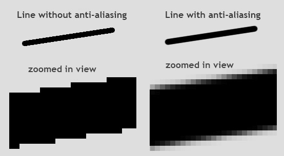
맥 OS쓰시면 알아서 해주지만,
매우 미세한 회전을 적용하면 Windows에서도 부드러운 폰트 렌더링 효과를 얻을 수 있습니다.
🎯 Flexbox 레이아웃 완벽 가이드
Flexbox 기본 사용법
<div class="flex-container">
  <div class="box"></div>
  <div class="box"></div>
  <div class="box"></div>
</div>
css
.flex-container {
  display: flex;
}

.box {
  width: 100px;
  height: 100px;
  background: grey;
  margin: 5px;
}
부모 요소에 display: flex만 추가하면 자식 요소들이 자동으로 가로 정렬됩니다.
⚠️ 호환성 주의: IE 11 이상에서만 사용 가능합니다.
Flexbox 핵심 속성들
.flex-container {
  display: flex;
  justify-content: center;  /* 주축(가로) 정렬 */
  align-items: center;      /* 교차축(세로) 정렬 */
  flex-direction: column;   /* 정렬 방향 변경 */
  flex-wrap: wrap;          /* 줄바꿈 허용 */
}

.box {
  flex-grow: 2;  /* 남은 공간을 차지하는 비율 */
}
실전 팁: 좌우 정렬 동시에 하기
첫 번째 요소는 왼쪽, 마지막 요소는 오른쪽에 배치하고 싶을 때:
<div class="flex-container">
  <div class="box"></div>
  <div class="box" style="flex-grow: 1"></div>
  <div class="box"></div>
</div>
가운데 요소에 flex-grow: 1을 주면 남은 공간을 모두 차지하여 자연스럽게 양쪽 정렬이 됩니다.
align-content 속성
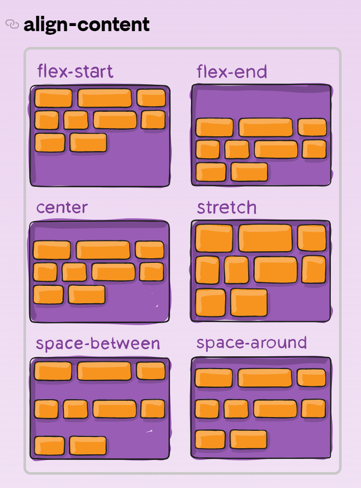
여러 줄로 배치된 요소들의 수직 정렬을 조절할 때 사용합니다:
.flex-container {
  display: flex;
  flex-wrap: wrap;
  align-content: space-between;  /* 여러 줄일 때 줄 간격 조절 */
}align-content는 flex-wrap: wrap과 함께 사용하며, 여러 줄로 배치된 요소들의 전체적인 정렬을 제어합니다.
💡 React에서 활용하기
React 컴포넌트에서 이러한 스타일을 적용하는 방법:
CSS Modules:
css
/* styles.module.css */
.flexContainer {
  display: flex;
  justify-content: center;
  align-items: center;
}
Styled Components:
const FlexContainer = styled.div`
  display: flex;
  justify-content: center;
  align-items: center;
`;
Inline Styles:
<div style={{
  display: 'flex',
  justifyContent: 'center',
  alignItems: 'center'
}}>
  {children}
</div>
App, Web Developer