이제 아주 조금만 더 자세히 틀을 만들어 보자.
https://sveltematerialui.com/ 요 화면 틀과 동일하게 하려고 한다.
뭐 결국은 material ui 에서 제공하는 컴포넌트들 중 적절한 것을 찾아서 써야 하는데, 저 사이트를 보다 보니까 헤더는 TopAppBar, 메인은 Drawers 컴포넌트를 사용하는 것 같더라.
TopAppBarDrawers
TopAppBar
헤더를 TopAppBar 의 static 모드로 설정하자. 뭐 저 사이트에서 제공하는 코드를 가져와 조금만 수정한 수준이다.
-
Header.svelete<TopAppBar variant="static"> <Row> <Section> <IconButton class="material-icons blog-header-menu" on:click={ onClick }>menu</IconButton> <Title>DJ's Blog Header</Title> </Section> <Section align="end" toolbar> <IconButton href="https://github.com/crazydj2/blog-frontend" target="_blank"><Github /></IconButton> </Section> </Row> </TopAppBar> <script> import TopAppBar, { Row, Section, Title } from '@smui/top-app-bar'; import IconButton from '@smui/icon-button'; import Github from "svelte-material-icons/Github.svelte"; const onClick = () => { alert('click......'); }; </script> <style> :global(.blog-header-menu) { display: none; } @media (max-width: 480px) { :global(.blog-header-menu) { display: flex; } } </style>
width 에 따라 display 를 조정한건 모바일을 고려해서 생각한 거긴 한데... 여긴 나중에 좀 더 손보기로 하자.
참고리 style 을 :global 로 설정한 이유는 빌드 에러가 나오기 때문이다.
ex)
<Row class="ttt"></Row>

<style>
	.ttt {}
</style>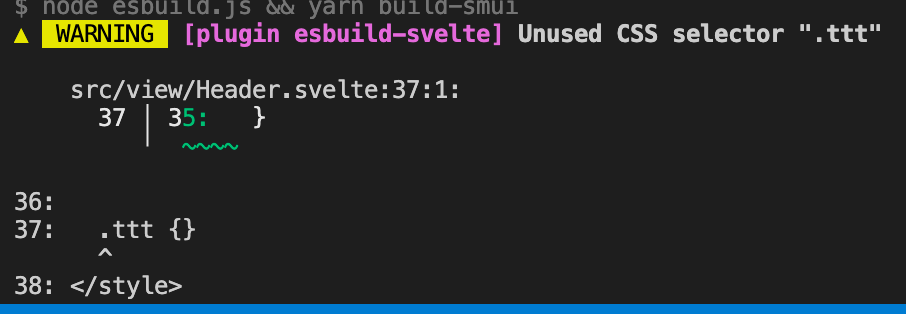
사용자 정의 컴포넌트가 아닌, 실제 html 태그 - div 나 span 같은 거 - 를 쓰면 에러 없이 잘 빌드 된다.
흠... 아직은 svelte 가 부족한 것일 수도 있고... 아님 svelte 철학상 그런 것일수도 있고...
지금은 그냥 저렇다는 사실만 기억하고 넘어가자.
Drawers
Drawers 를 사용해서 메인 틀을 만들어 보자.
마침 modal 버전이 내가 생각한 거랑 똑같다. (사실 modal 버전을 보고 틀을 생각했다는게 맞는 말일거다.)
TopAppBar 와 마찬가지로 코드 긁어와 내 버전에 맞게 수정했다.
-
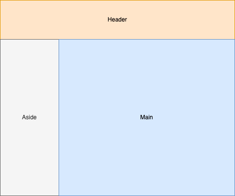
Main.svelte<div class="blog-drawer-container"> <Aside bind:open={open}></Aside> <AppContent class="app-content"> <main class="main-content"> <Router {routes} /> </main> </AppContent> </div> <script> import Router from 'svelte-spa-router'; import routes from '../routes/routes'; import { AppContent } from '@smui/drawer'; import Aside from './main/Aside.svelte'; let open = false; </script> <style> /* These classes are only needed because the drawer is in a container on the page. */ .blog-drawer-container { position: relative; display: flex; height: 100%; overflow: hidden; z-index: 0; } :global(.app-content) { flex: auto; overflow: auto; position: relative; flex-grow: 1; } .main-content { overflow: auto; padding: 16px; height: 100%; box-sizing: border-box; } </style> -
Aside.svelte<!-- Don't include fixed={false} if this is a page wide drawer. It adds a style for absolute positioning. --> <Drawer variant="static" fixed={false} bind:open> <Header> <Title>Super Mail</Title> <Subtitle>It's the best fake mail app drawer.</Subtitle> </Header> <Content> <List> <Item href="javascript:void(0)" on:click={() => setActive('keyboard_arrow_right')} activated={active === 'keyboard_arrow_right'} > <Graphic class="material-icons" aria-hidden="true">keyboard_arrow_right</Graphic> <Text>keyboard_arrow_right</Text> </Item> <Separator /> <Item href="javascript:void(0)" on:click={() => setActive('keyboard_arrow_down')} activated={active === 'keyboard_arrow_down'} > <Graphic class="material-icons" aria-hidden="true">keyboard_arrow_down</Graphic> <Text>keyboard_arrow_down</Text> </Item> <Separator /> </List> </Content> </Drawer> <!-- Don't include fixed={false} if this is a page wide drawer. It adds a style for absolute positioning. --> <Scrim fixed={false} /> <script> import Drawer, { Content, Header, Title, Subtitle, Scrim } from '@smui/drawer'; import List, { Item, Text, Graphic, Separator } from '@smui/list'; export let open; let active = 'keyboard_arrow_right'; const setActive = value => { active = value; open = false; }; </script>
코드상 알아둘만한 점은 bind:value={value} 문법으로 부모 & 자식 컴포넌트 간 데이터 바인딩을 구현한다는 점 정도?
나머지 컴포넌트에 대한 세세한 스펙이라던가 하는 점은... 하면서 그때 그때 알아가자.
아직 부족한 점은 많지만 일단 틀은 만들어졌으니... 전체 틀은 여기까지 하고 이젠 Admin 화면을 만들자.
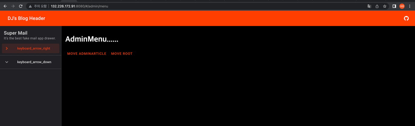
일단 여기까지 구현한 화면은 아래와 같다.