
-Preview-
| Timer / ImageTransition | ProgressBar |
|---|---|
 |  |
-오늘의 학습-
Timer
Timer의 정의에 대해 학습하기Timer.publish를 사용하여 이미지 자동 변환 만들기
ProgressBar
ProgressBar를 커스터마이징 하여 만들기ProgressBar를 호출하고 상태 설정하기
-Timer-
Timer란?
Timer는 사용자가 지정한 일정한 시간을 간격으로 코드를 실행할 수 있게 해주는 객체이다.
Swift에서는Timer Class를 사용하여 타이머를 생성하고, 특정 시간 간격마다 반복적으로 작업을 수행하거나 일정 시간이 지난 후 한 번만 작업을 수행할 수 있도록 설정할 수 있다.Timer 기본 값
class Timer : NSObjectSwiftUI에서는
Timer를 직접 사용할 수도 있지만,Combine프레임워크를 활용하여Timer의 퍼블리셔를 생성하고 이를onReceive와 함께 사용하는 것이 일반적이다.Publisher(퍼블리셔) 메소드
static func publish(
    every interval: TimeInterval,
    tolerance: TimeInterval? = nil,
    on runLoop: RunLoop,
    in mode: RunLoop.Mode,
    options: RunLoop.SchedulerOptions? = nil
) -> Timer.TimerPublisher
퍼블리셔 활용
import SwiftUI
import Combine
// every - 시간 간격 설정(초)
// on - 어디서 진행할 이벤트인지(기본값 main)
// in - 런루프 모드 설정(기본값 common)
// autoconnect - 퍼블리셔가 자동으로 연결되고 이벤트를 방출하도록 설정
private let timer = Timer.publish(every: 1, on: .main, in: .common).autoconnect()
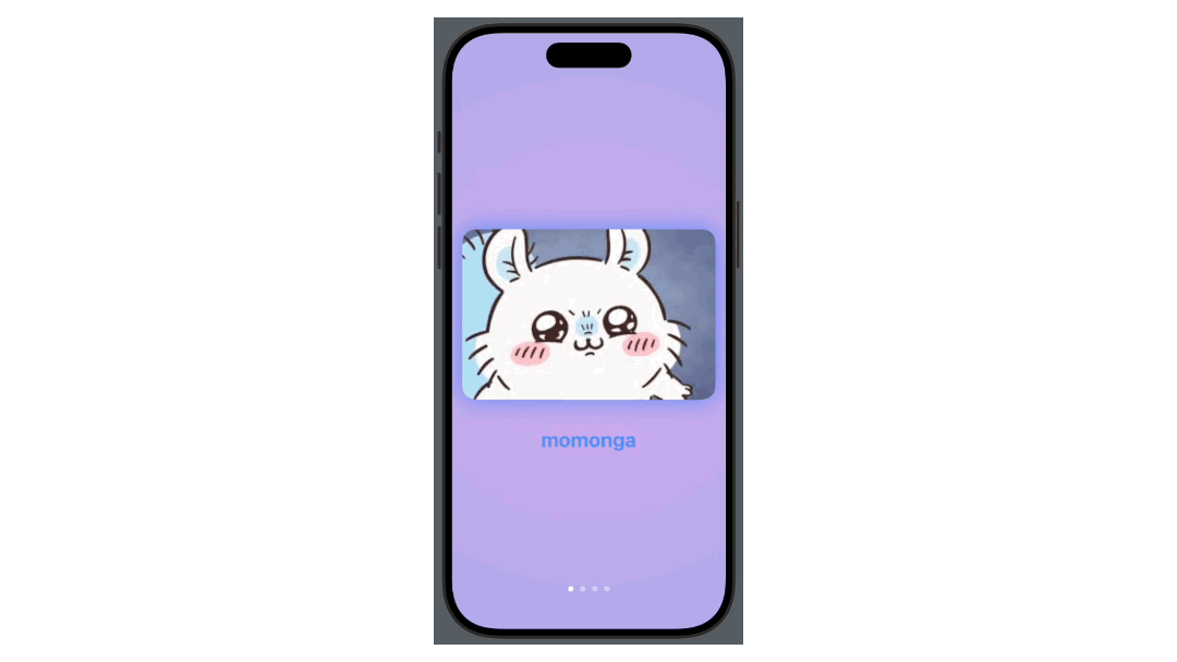
이미지 자동 변환 뷰 만들기
타이머를 활용하여 일정시간마다 자동으로 이미지가 변하는 뷰를 만드려고 한다.
이를 위해 이미지 4장을 준비하고,Assets에 저장한다. 이미지 변환 뷰의 조건은 아래와 같다.
- 3초 주기로 이미지가 슬라이드 형식으로 넘어간다.
- 이미지에 따라 그림자의 색이 바뀌는 함수를 작성한다.
Timer와onReceive를 활용하여 autoTransition을 구현한다.
1. 초기 설정
먼저, 타이머의 기본값을 세팅하고 이미지를 배열로 저장한다.
// 3초마다 이벤트를 발생시키고 방출한다
private let timer = Timer.publish(every: 3, on: .main, in: .common).autoconnect()
// 이미지의 인덱스 값을 불러올 변수
@State private var index: Int = 0
// 현재 뷰에 보여질 이미지 값
@State private var selectedImage: String = "momonga"
// 전체 이미지 값을 저장해둔 배열
private let imageArray: [String] = ["momonga", "chiikawa", "hachiware", "usagi"]
2. 탭뷰 구현하기
이미지를 슬라이드 형식으로 넘기기 위해 TabView와 .transition 중 어떤 방식을 사용할지 고민했는데, transition은 뷰의 표시와 비표시를 구현하는데 더욱 적합한 코드이기 때문에 이번엔 TabView를 사용하기로 하였다.
그리고 TabView의 내부는 ForEach를 사용하여 이미지 뷰가 나타나도록 한다.
// 탭뷰에서 변화를 감지할 바인딩 값으로 selectedImage 사용
TabView(selection: $selectedImage) {
	// ForEach문으로 이미지 배열을 넣어 이미지 뷰를 화면에 구현
	ForEach(imageArray, id: \.self) { index in
		VStack {
			Image(index)
				.resizable()
				.scaledToFill()
				.frame(width: UIScreen.main.bounds.width - 30, height: 250)
				.clipShape(RoundedRectangle(cornerRadius: 20))
				.shadow(radius: 20)
				.padding(.bottom, 30)
3. onReceive 사용하기
TabView에 onReceive를 사용하여 지정한 시간 주기에 맞추어 TabView의 값이 바뀌도록 설정한다.
TabView(selection: $selectedImage) { ... }
	// 탭뷰의 스타일을 페이지로 지정 -> 슬라이드 형식
	.tabViewStyle(.page)
    // onReceive의 퍼블리셔를 타이머로 설정한다
	.onReceive(self.timer) { _ in
		withAnimation {
        	// % 연산자를 통해 index값을 0~배열 최댓값이 되도록 설정한다
            // 이벤트가 발생(지정한 시간 간격)할 때마다 index의 값이 변하고 이미지 배열의 인덱스 값으로 활용한다
			self.index = (index + 1) % imageArray.count
			selectedImage = imageArray[index]
		}
	}
4. 그림자 색을 바꾸기 위한 함수 구현
이미지가 변할 때 그림자의 색도 같이 변하게 해주는 함수를 구현한다.
// 변환 값을 Color로 하여 함수를 직접 사용하도록 구현
func shadowColorChange(_ type: String) -> Color {
    if type == "momonga" {
        return Color.blue.opacity(0.6)
    } else if type == "chiikawa" {
        return Color.mint.opacity(0.5)
    } else if type == "hachiware" {
        return Color.gray.opacity(0.6)
    } else if type == "usagi" {
        return Color.yellow.opacity(0.6)
    } else {
        return Color.clear
    }
}
그리고 위에서 작성한 함수를 실제 코드에 적용시킨다.
Image(index).shadow(color: shadowColorChange(self.selectedImage), radius: 20)5. 전체 코드
import SwiftUI

struct ImageTransitionView: View {

    private let timer = Timer.publish(every: 3, on: .main, in: .common).autoconnect()
    @State private var index: Int = 0
    @State private var selectedImage: String = "momonga"
    private let imageArray: [String] = ["momonga", "chiikawa", "hachiware", "usagi"]

    var body: some View {
        ZStack {
            RadialGradient(colors: [.purple, .indigo], center: .center, startRadius: 5, endRadius: 500)
                .opacity(0.5)
                .ignoresSafeArea()

            TabView(selection: $selectedImage) {
                ForEach(imageArray, id: \.self) { index in
                    VStack {
                        Image(index)
                            .resizable()
                            .scaledToFill()
                            .frame(width: UIScreen.main.bounds.width - 30, height: 250)
                            .clipShape(RoundedRectangle(cornerRadius: 20))
                            .shadow(color: shadowColorChange(self.selectedImage), radius: 20)
                            .padding(.bottom, 30)

                        Text(index)
                            .font(.system(size: 30))
                            .fontWeight(.bold)
                            .foregroundStyle(shadowColorChange(self.selectedImage))
                    }
                }
            }
            .tabViewStyle(.page)
            .onReceive(self.timer) { _ in
                withAnimation {
                    self.index = (index + 1) % imageArray.count
                    selectedImage = imageArray[index]
                }
            }
        }
    }
}

func shadowColorChange(_ type: String) -> Color {
    if type == "momonga" {
        return Color.blue.opacity(0.6)
    } else if type == "chiikawa" {
        return Color.mint.opacity(0.5)
    } else if type == "hachiware" {
        return Color.gray.opacity(0.6)
    } else if type == "usagi" {
        return Color.yellow.opacity(0.6)
    } else {
        return Color.clear
    }
}
6. 결과

-ProgressBar-
ProgressBar란?
ProgressBar란 진행표시줄로, 어떠한 상태에 대해 얼마나 진행되었는지 직관적으로 표시해줄 수 있는 이미지 뷰이다.
흔히Loading을 표현할 때 자주 쓰이는데, 이를 커스텀하여 만들어보기로 하였다.
- ProgressBar - 기본 프로그레스 바
- DashProgressBar - 대쉬 형식의 프로그레스 바
- BrogressBox - 박스 형식의 프로그레스 바
ProgressBar 구현하기
기본 형태의 프로그레스 바를 구현하는 것은 크게 어렵지 않다.
먼저 초기설정으로 Binding할 프로그레스 값을 지정하고, 프로그레스 바의 길이, 높이 등을 설정하는 변수를 선언한다.
import SwiftUI

struct ProgressBar: View {

    @Binding var progress: CGFloat
    var width: CGFloat // 프로그레스 바의 길이
    var height: CGFloat // 프로그레스 바의 높이
    var CRadius: CGFloat // 프로그레스 바의 코너 값
다음으로 ZStack을 활용하여 프로그레스 바와 프로그레스 바의 프레임을 구현한다.
ZStack(alignment: .leading) {
	// 프로그레스 바의 프레임 구현
	RoundedRectangle(cornerRadius: CRadius)
    	// 프로그레스 바보다 커야하기 때문에 +10 만큼의 값을 준다
		.frame(width: width + 10, height: height + 10)
		.foregroundStyle(.yellow.opacity(0.5))

    // 프로그레스 바 구현
	RoundedRectangle(cornerRadius: CRadius)
    	// 프로그레스 바의 길이는 현재 프로그레스의 값에 상대적이어야 하므로 progress * width를 한다
		.frame(width: progress * width, height: height)
		.foregroundStyle(.orange.opacity(0.5))
		.offset(x: 5)
        }
    }
}
이제 위의 바인딩 값과 프로그레스 바의 변수 값을 모두 입력하여 선언하면 프로그레스 바를 생성할 수 있다.
@State var progress: CGFloat = 0.5
ProgressBar(progress: $progress, width: 300, height: 25, CRadius: 20)
DashProgressBar 구현하기
대쉬 형태의 프로그레스 바를 구현은 기본 프로그레스 바에서 몇가지 형식만 바꿔주면 구현할 수 있다.
먼저 일반 프로그레스 바와 같이 초기설정을 해준다.
import SwiftUI

struct DashLineProgress: View {

    @Binding var progress: CGFloat
    var totalWidth: CGFloat // 프로그레스 바의 프레임의 길이
    var dashWidth: CGFloat // 프로그레스 바의 대쉬 길이
    var dashSpacing: CGFloat // 프로그레스 바의 대쉬 간격
다음으로 ZStack을 활용하여 프로그레스 바와 프레임을 구현해주는데, 이 때 프로그레스 바를 대쉬로 구현할 수 있도록 HStack을 함께 사용한다. 또, ForEach를 사용하여 대쉬가 현재 프로그레스 값에 맞추어 생성될 수 있도록 한다.
ZStack(alignment: .leading) {
	// 프로그레스 바의 프레임 구현
	Rectangle()
		.stroke(lineWidth: 2)
        // 프로그레스 바의 길이보다 길어야 하기에 totalWidth에 +4를 해준다
		.frame(width: totalWidth + 4, height: 20)

    // 대쉬 프로그레스 바 구현
	HStack(spacing: dashSpacing) {
    	// 0 ~ 현재 프로그레스 값만큼 내부 코드(대쉬)가 생성되도록 설정
        // Int((progress * totalWidth) / (dashWidth + dashSpacing)) = 대쉬의 수
		ForEach(0 ..< Int((progress * totalWidth) / (dashWidth + dashSpacing)), id: \.self) { item in
			Rectangle()
				.frame(width: dashWidth, height: 15)
			}
		}
		.offset(x: 3)
	}
}
.foregroundStyle(Color.green)
이후 대쉬 프로그레스 바 선언을 통해 뷰에 대쉬 형태의 프로그레스 바를 불러올 수 있다.
@State var progress: CGFloat = 0.5
DashLineProgress(progress: $progress, totalWidth: 300, dashWidth: 8, dashSpacing: 2)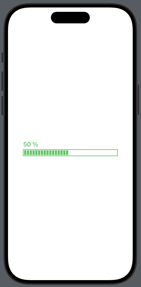
BrogressBox 구현하기
마지막으로 BrogressBox를 구현하기 위해서는 기본 프로그레스 바에서 디자인 적인 요소를 추가하면 만들 수 있다.
먼저 프로그레스 바의 초기 설정을 해준다.
import SwiftUI

struct BrogressBox: View {

    @Binding var progress: CGFloat
    var width: CGFloat
    var height: CGFloat
    var CRadius: CGFloat
그 뒤에는 기본 프로그레스 바 스타일에서 색을 Gradient로 지정하고, 현재 progress 값을 보여주는 Text 구성요소를 추가하며 꾸미면 BrogressBox를 구현할 수 있다.
	VStack(alignment: .leading, spacing: 7) {
		HStack {
			Text("\(Int(progress * 100)) % To Complete")
				.bold()
				.font(.callout)
				.foregroundStyle(LinearGradient(gradient: Gradient(colors: [.blue, .cyan]), startPoint: .leading, endPoint: .trailing))

                Spacer()

		Group {
			Image(systemName: "clock")
			Text("12Min")
		}
		.font(.caption)
		.foregroundStyle(Color.gray.opacity(0.7))
	}
	.frame(width: width)

	ZStack(alignment: .leading) {
		RoundedRectangle(cornerRadius: CRadius)
			.frame(width: width, height: height)
			.foregroundStyle(Color.blue.opacity(0.3))

		RoundedRectangle(cornerRadius: CRadius)
			.frame(width: progress * width, height: height)
			.foregroundStyle(LinearGradient(gradient: Gradient(colors: [.blue, .cyan]), startPoint: .leading, endPoint: .trailing))
		}
	}
	.padding(20)
	.background(.white, in: .rect(cornerRadius: 16))
	.shadow(color: .black.opacity(0.1), radius: 20, x: 0, y: 0)
}BrogressBox를 아래와 같이 불러올 수 있다.
@State var progress: CGFloat = 0.5
BrogressBox(progress: $progress, width: 300, height: 12, CRadius: 10)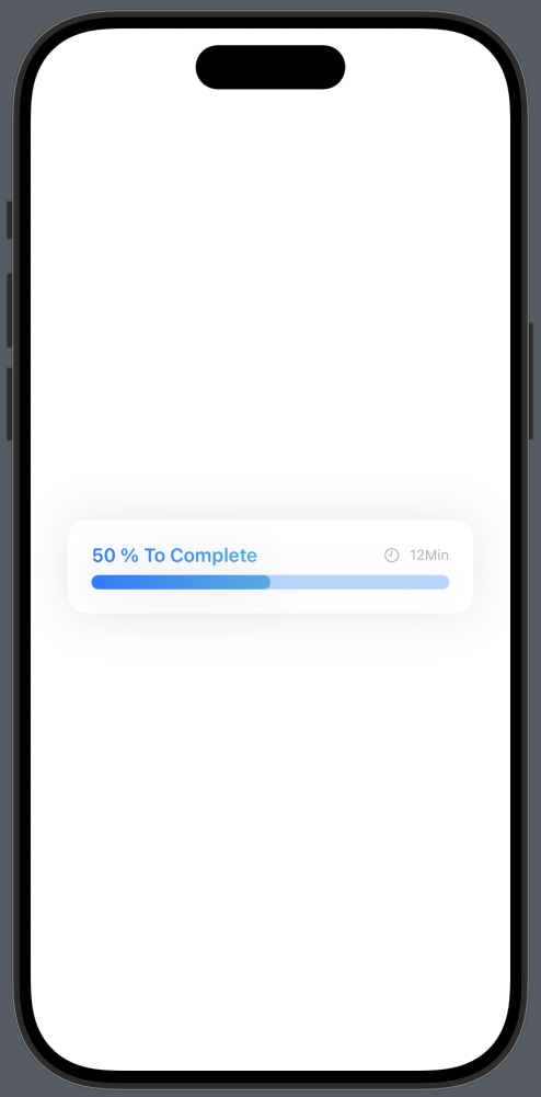
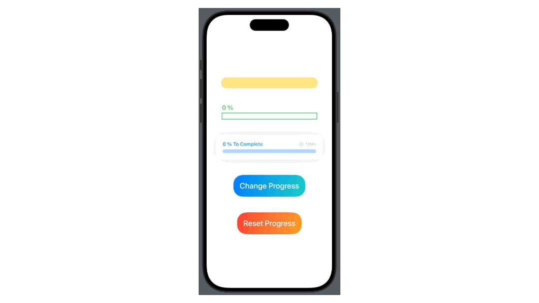
ProgressBar 활용
위에서 만든 3가지 타입의 ProgressBar를 사용하여 버튼을 누르면 랜덤하게 Progress의 값이 오르고 100%가 넘게되면 Alert로 경고를 띄우는 뷰를 구현해 보았다. 또, Progress값을 0으로 리셋할 수 있는 리셋 버튼도 구현해 보았다.
전체 코드
import SwiftUI

struct ContentView: View {

    @State private var progress: CGFloat = 0 {
        didSet {
        	// progress의 값이 1을 초과하지 않게 하도록 1보다 커지면 1로 설정
            while progress > 1 {
                progress = 1
            }
            print(progress)
        }
    }
    // progress 값에 따라 경고를 띄우기 위한 Alert 값
    @State private var isShowing: Bool = false

    var body: some View {
        VStack(spacing: 50) {

            ProgressBar(progress: $progress, width: 300, height: 25, CRadius: 20)

            DashLineProgress(progress: $progress, totalWidth: 300, dashWidth: 8, dashSpacing: 2)

            BrogressBox(progress: $progress, width: 300, height: 12, CRadius: 10)

            // 랜덤하게 progress 값을 올려주는 버튼
            Button(action: {
                withAnimation {
                	// 프로그레스의 값이 1보다 작으면 0 ~ 1(소수점 포함)의 값을 프로그레스에 더해준다
                    // 프로그레스의 값이 1보다 크면 Alert로 경고를 띄운다
                    guard self.progress < 1 else {
                        self.isShowing = true
                        return
                    }
                    self.progress += CGFloat.random(in: 0...1)
                }
            }) {
                Text("Change Progress")
                    .font(.system(size: 25))
                    .fontWeight(.medium)
                    .padding(20)
                    .background(LinearGradient(colors: [.blue, .mint.opacity(0.9)], startPoint: .topLeading, endPoint: .bottomTrailing))
                    .foregroundColor(.white)
                    .clipShape(RoundedRectangle(cornerRadius: 30))
            }
            .alert(isPresented: $isShowing) {
                .init(title: Text("Progress is full"), message: nil, dismissButton: .default(Text("OK")))
            }

            // progress 값 리셋 버튼
            Button(action: {
                withAnimation {
                    self.progress = 0
                }
            }) {
                Text("Reset Progress")
                    .font(.system(size: 25))
                    .fontWeight(.medium)
                    .padding(20)
                    .background(LinearGradient(colors: [.red, .orange.opacity(0.9)], startPoint: .topLeading, endPoint: .bottomTrailing))
                    .foregroundColor(.white)
                    .clipShape(RoundedRectangle(cornerRadius: 30))
            }
        }
        .padding()
    }
}
구현결과

-오늘의 학습 후기-
오늘은 Timer에 대해 학습하고 이를 활용한 이미지 자동 변환 뷰를 만들어 보았고, 커스텀 프로그레스 바를 제작해 보았다.
Timer에 대해서는 아직 학습이 부족한 부분이 많아서 추후에 추가로 학습이 필요할 것 같다. 지금은 기본적인 기능 밖에 못 다루기 때문에 심화학습을 진행할 예정이다.
프로그레스 바는 커스텀으로 만들어 보았는데, SwiftUI에서 기본적으로 지원하는 프로그레스 바가 있는지는 모르겠다.
슬라이더를 활용하면 기본 아이템들로도 구현할 수 있을 것 같지만, 디자인을 위해서는 커스텀을 하는 과정이 필요하다고 느껴 커스텀 프로그레스 바를 제작 구현해 보았다.