Skeleton이란?
Skeleton UI는 React 애플리케이션에서 로딩 중인 콘텐츠의 자리를 차지하는 시각적 플레이스홀더로, 사용자가 콘텐츠를 기다리는 동안 화면의 비어 보이는 느낌을 줄여주는 역할을 한다. 주로 콘텐츠가 로드되는 동안 깜빡이거나 회전하는 스피너 대신 사용되며, 사용자 경험을 향상시키기 위해 널리 사용된다.
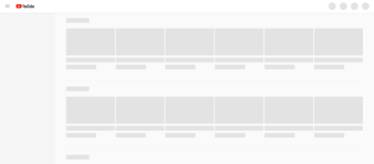
(사이트에 들어갔을 때, 로딩중이면 위와 같은 화면을 띄워 사용자에게 로딩중임을 알려주는 것이다.)
Skeleton 만들어보기
이제 프로젝트에 적용할 Skeleton Component를 만들 것인데, Skeleton을 띄우는 기준은 API연동에서 데이터가 들어오는 loading을 기준으로 한다.
컴포넌트 만들기
Skeleton.tsx
import * as Styled from "./style.ts";

interface SkeletonProps {
    width?: string;
    height?: string;
    margin?: string;
    borderRadius?: string;
}

export default function Skeleton(props: SkeletonProps) {

    return (
        <Styled.SkeletonLine
            width={props.width}
            height={props.height}
            margin={props.margin}
            borderRadius={props.borderRadius}
        />
    );
}
Props를 통해서 width, height, margin, border-radius에 대한 설정을 받도록 해놨다.
style.ts
import styled, {keyframes} from "styled-components";
import theme from "@/shared/theme.ts";

const loadingAnimation = keyframes`
    0% {
        background-position: -200% 0;
    }
    100% {
        background-position: 200% 0;
    }
`;

export const Shimmer = styled.span`
    background-size: 200% 100%;
    background: linear-gradient(
            to right,
            ${theme.colorSystem.neutral["100"]} 8%,
            ${theme.colorSystem.white} 18%,
            ${theme.colorSystem.neutral["100"]} 33%
    );
    background-size: 1000px 100%;
    animation: ${loadingAnimation} 2s linear infinite;
    display: inline-block;
`;

export const SkeletonLine = styled(Shimmer)<{
    width?: string;
    height?: string;
    margin?: string;
    borderRadius?: string;
}>`
    height: ${({height}) => height || '1.5rem'};
    width: ${({width}) => width || '100%'};
    margin: ${({margin}) => margin || '0'};
    border-radius: ${({borderRadius}) => borderRadius || '1rem'};
    display: inline-block;
`;- loadingAnimation: 0%에서 background-position을 -200% 0으로 시작하여 100%에서 200% 0으로 이동한다. 이는 백그라운드가 왼쪽에서 오른쪽으로 이동하는 효과를 만다.
- Shimmer:
- background 속성은 linear-gradient를 사용하여 좌우로 흐르는 그라데이션 효과를 만든다. 그라데이션은 theme의 색상 시스템을 사용하여 정의된 색상으로 설정된다. 여기서 설정된 색은 "회색"으로 보이는 색상이다.
- animation 속성은 위에서 정의한 loadingAnimation을 사용하여 2초 동안 반복적으로 좌우로 애니메이션을 적용한다. 멈추지 않는 디자인으로 로딩중임을 사용자에게 표시한다.
컴포넌트 사용하기
이제 사용할 페이지에서 Skeleton을 import한 후 API연동 상태에 따라 스켈레톤을 불러오면 된다!
...
// 이건 내가 프로젝트에서 쓰던 코드의 변수 이름만 바꿔놓은 것이라, parseInt, dataId등은 신경쓰지 않아도 된다.
const dataSummary = usedataSummary(parseInt(dataId));
...
return (
  ...
  {
	dataSummary.loading ? (
		<>
      		<Skeleton width={"200px"} height={"3.75rem"} borderRadius={"12px"}/>
			<H0 text={`님의`} color={theme.colorSystem.black}/>
            <SizedBox width={"8px"}/>
            <Skeleton width={"200px"} height={"3.75rem"} borderRadius={"12px"}/>
            <SizedBox width={"8px"}/>
            <H0 text={`데이터뭉치`} color={theme.colorSystem.black}/>
        </>
 	) : (
		<H0 text={`${dataSummary.hostNickname}님의 ${dataSummary.title} 데이터뭉치`} color={theme.colorSystem.black}/>
	 )
}
  ...
이런 식으로 삼항연산자를 통해 dataSummary API가 loading상태인지를 판단하여, 로딩중이면 스켈레톤 UI가 나오도록, 로딩이 아니라면(데이터가 넘어왔다면) 데이터를 이용한 인터페이스를 보여주는 식으로 코드를 작성했다.
마무리
위와 같은 식으로 React Project에 Skeleton UI를 적용할 수 있다. 다른 방법도 있겠지만, 현재는 이 방법이 편해서 이렇게 작업하는 중이다.
나는 개인적으로 스켈레톤을 넣는 단계는 기본 UI를 다 작업하고 Server와 API 명세서를 통한 통신을 완료한 이후에 적용하는 것이 적당하다고 생각한다.
(다음 프로젝트에서는 UI작업하면서 바로 Skeleton을 적용해볼까 하는데, 어떤 것이 더 편한지는 나중에 다시 판단해보도록 하겠다!)